Houzz Tour: Antique Meets Industrial in a Colorado Cottage
The family who lives in this once-tiny cottage in the heart of Fort Collins, Colorado, loved the style of the home and its location. But with their second child on the way, they had to make some changes.
Their idea: add a second story to preserve the established gardens around the house. The city’s idea: build an addition at the back so the home’s look would be in keeping with the historic Old Town district it’s located in.
The design-build team at HighCraft Builders was hired to solve the problem. “After months of meeting with the city and going through a historic review, we were able to design a second story that would give them two bedrooms for the kids and satisfy the planning department,” says Kira Koldeway of HighCraft Builders. “We worked hard to preserve the character of the original home.”
Houzz at a Glance
Who lives here: A couple and their 2 kids
Location: Fort Collins, Colorado
Size: Before remodel: 1,378 square feet; after remodel: 2,019 square feet; 4 bedrooms, 2½ bathrooms
Year built: 1907; remodeled in 2013
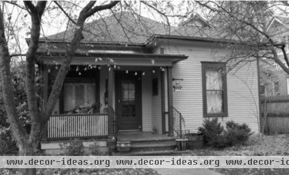
Before the remodel the house, in one of Fort Collins’ most popular and historic neighborhoods, was a single-story cottage.
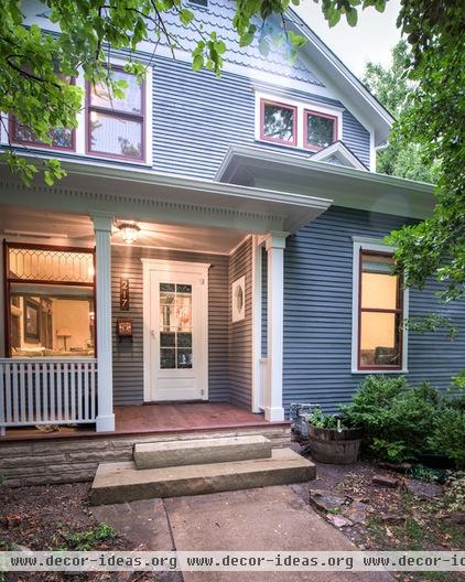
AFTER: The new two-story home retains the charm of the original 1907 home.
Exterior paint: Serious Gray, Sherwin-Williams
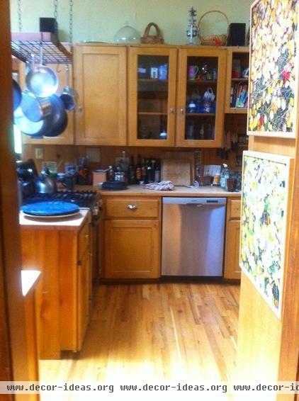
The old kitchen was tired, dark and cramped.
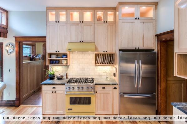
AFTER: The new kitchen is the opposite: fresh, light and spacious. “It was really important to the clients that the room be light and light-filled,” says Koldeway.
The new cabinetry doesn’t match the original wood, but its bicolor nature allows it to live happily with the existing tones. “The clients wanted to retain as much of the original wood trim and floors as possible. The molding was finished in a dark stain, so we chose hickory wood for the cabinets, which has a lot of character and a lot of light and dark tones,” she says.
Backsplash tile: Stoneware Elements in New Ginger Spice, Ann Sacks; countertop: soapstone, M. Teixeira Soapstone; range: Viking
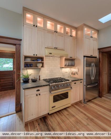
“I am really opposed to areas that trap dust,” says Koldeway. “We like to run the cabinets up to the ceiling, but then the upper shelves are hard to access. We put reeded-glass fronts on the topmost cabinets and lit them. They are great for displaying objects.” Meanwhile, the low open shelves and plate rack make feeding a busy family fast and efficient.
“We always knew we wanted a range in a color,” says Koldeway. “We chose this yellow Viking after selecting a soapstone countertop with a yellow vein.”
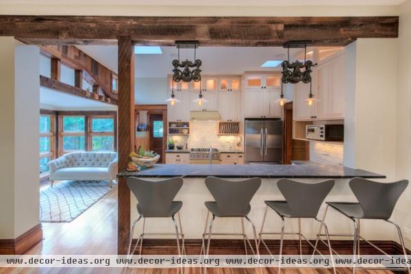
To make the room lighter, the design team removed the wall between the kitchen and the living room. Forty years ago, a previous owner installed reclaimed wood paneling in part of the kitchen, seen at the left of this photo, and the current owners wanted to preserve it.
For the existing salvaged wood to make sense in the space, the team installed a new reclaimed beam and column above the dining counter. “It’s just for aesthetics; it’s not load bearing at all,” says Koldeway. “But it really brings the room together.”
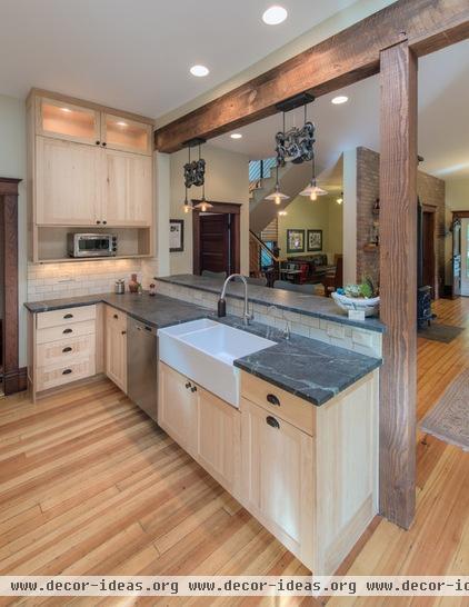
The light fixtures over the counter are reminiscent of old pulley mechanisms. “We mixed antique and industrial style in this house,” says Koldeway. “The owners are young, and they appreciate modern design.”
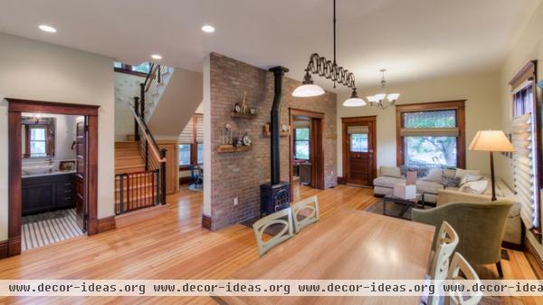
The newly combined dining-living room is separated from the children’s play area by a brick wall. “It started as a plain drywall wall,” says Koldeway. “But we ended up going with brick. In many of the old buildings in this neighborhood, when you pull down the lath and plaster, you find brick, so we referenced that.” The wall is actually crafted from brick veneer, but by wrapping the ends, the designers pulled off the illusion of solid masonry.
Stone veneer: ViaBrick in Cortona, Eldorado Stone
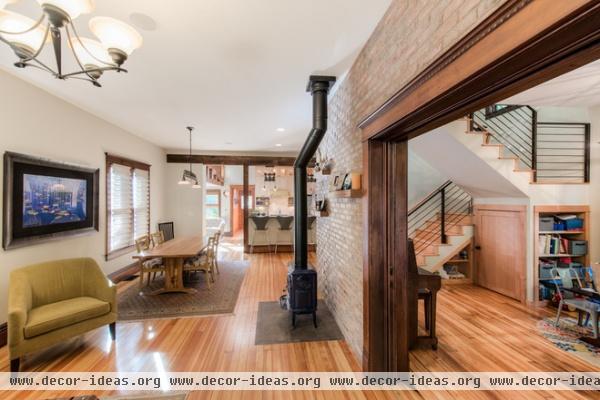
One of the items the builders salvaged and restored was a pocket door that existed in another part of the house. When it is closed, the playroom can’t be seen from the living room.
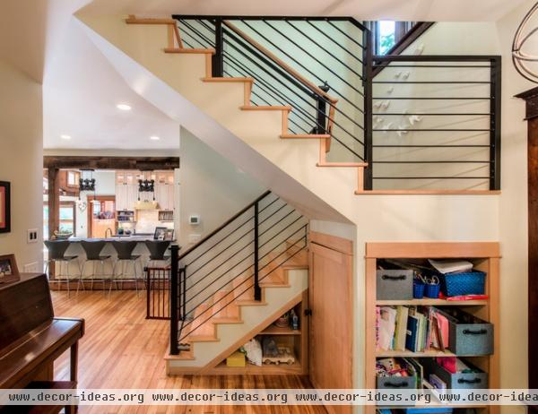
The black cable stair rail is a nod to the couple’s modernist leanings. Open understair storage holds toys and art supplies.
Bird sculpture on landing: ‘Birds of Flight,’ Grandin Road
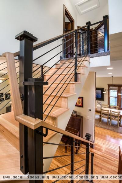
To keep the stair in the style of the home, the designers detailed the vertical posts in a more traditional style.
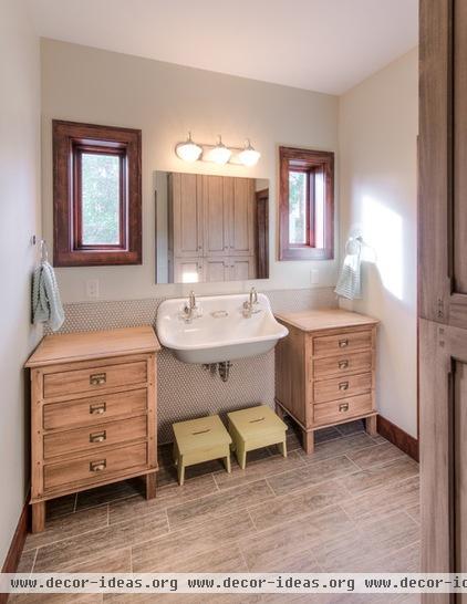
The children share a bathroom upstairs. “When we couldn’t find the right pieces in light-colored wood, we had the chests on either side of the sink custom made,” says Koldeway. “The hardware makes them look like old library pieces.”
The bathroom has two styles of tile. “The penny tile in back of the sink is one of my favorite elements. It looks so cute there,” says Koldeway. “A wood floor in a children’s bath isn’t practical, but we got the look with a tile that has the appearance of weathered boards.”
Sink: Brockway, Kohler; faucets: Schoolhouse Electric & Supply Company; floor tile: Natura in Charleston Brown, Florida Tile
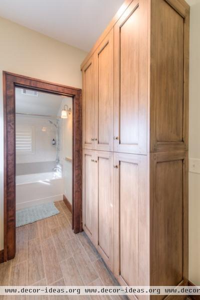
A new linen closet was stained to match the aged-wood look of the tile floor. “I’d like to think that you can’t tell this house is new,” says Koldeway. She adds that during a recent home tour event, visitors seemed convinced of the authenticity of the new addition. “They were talking about the ‘original’ elements of the second story,” she says. “I felt good about that.”


