My Houzz: Sleekness and Soft Touches in a Midcentury Home
San Francisco architect Seth Brookshire of Porro Design was thrilled to find his midcentury dream home in the city. The only problem: The architectural gem had suffered through a series of poorly executed renovations that compromised the home’s modern character. “That gave me carte blanche to tear into the house and — while honoring its midcentury roots — bring it into our era,” says Seth.
After a complete overhaul with the help of Peter Nestler of Nestler Construction and other local craftspeople, Seth transformed the home, which he shares with his wife, Natalie, into the contemporary midcentury haven it was meant to be.
Houzz at a Glance
Who lives here: Seth and Natalie Brookshire, and their cats, Gertrude and Samantha
Location: Laurel Heights neighborhood of San Francisco
Size: 2,800 square feet; 2 bedrooms, 3 bathrooms, office
Year built: 1947

“When it comes to products, I want something that will hold its style,” Seth says. “In the world of buildings and interiors, my goal is to create spaces with timeless character.”
With this philosophy in mind, the Brookshires furnished their home primarily with midcentury modern furnishings with enduring style, such as a pair of Metropolitan sofas from B&B Italia that they set back to back in the living room.

“To me it is the details, the accessories, the items we bring into our home that speak to the now,” says Seth, “while the room and the furnishings stand the test of time and are as beautiful in 20 years as they are the day we put them in place.”
He extended the gray floor tile up the wall to create a modern fireplace surround, and added mahogany built-in shelving. Previously, the walls were painted beige.
Wicker chair: Ikea
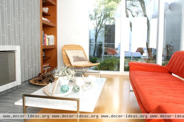
The original design had great midcentury bones but lacked character, flow and light, and some of the spaces were closed off unnecessarily. Seth’s goal was to establish a unified design that celebrated the details of the original exterior, and opened the interiors as much as possible to the yard and central courtyard. “I absolutely love watching the light change and move through the house and the courtyard,” he says.
Coffee table: Skinny, Zanotta
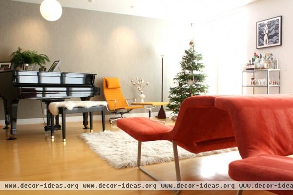
“I love to sit in the yellow chair in our living room,” says Natalie, a floral designer. “The sun comes in the window there, and with a laptop on my lap, I can conduct a lot of business.”
A shag rug adds a touch of warmth to the otherwise streamlined decor. The piano is a Boston from Steinway & Sons.
Chair: Eames Aluminum Group, Herman Miller; floor lamp: Leucos; rug: Crate & Barrel
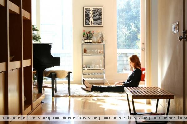
Natalie relaxes beneath a black and white print, which a friend acquired on a trip to Taiwan. The artist is Gong Gan Di.
Bar cart: CB2
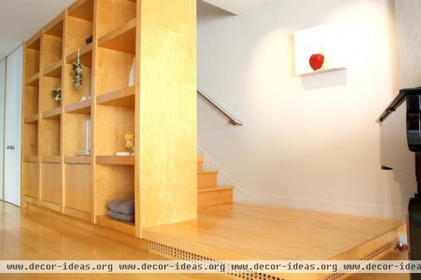
“I do find that I underdecorate, if anything,” says Natalie. “The house itself is the main point of interest, and I see anything that we bring in as an object of support to the beauty that the house holds.”
Seth designed ample shelving units throughout the home for additional storage and to display various art and floral pieces. “I love to create vignettes in different areas of our house,” says Natalie. “I love to include family pieces, things I have collected through my travels, and flowers. Bringing all those together and changing them weekly is a great pleasure of mine.”

“With all my projects, I find inspiration from what came before,” says Seth. “If a building has beautiful original detail, I study the style and strive to complement the quality, either by matching the detail so well it is hard to tell original from new, or by contrasting with a very modern style that brings something extra to the classic original.”
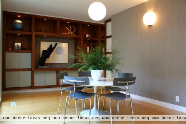
The dining room painting is by a friend; Seth and Natalie made the sculpture in front for the de Young Museum’s Bouquets to Art fundraiser. All of the cabinets were made by Rolf Melander.
Dining chairs: Design Within Reach; dining table: vintage Saarinen replica

Seth added translucent sliding doors to divide the kitchen and a second living room from the dining room and the rest of the house. A Jonathan Adler vase sits on top of a vintage console table.
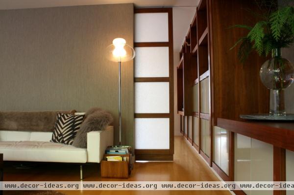
The partition allows the couple to shut out the rest of the home while they’re enjoying time in the second living room. With its walnut built-ins and dark gray accents, the room feels like a cozy den when the sliding door is closed.
Lamp: Karim Rashid; gray wall covering: Maharam; sleeper sofa: Zinc Details; cabinet panel paint: Sea Haze, Benjamin Moore

The Eames chair from Herman Miller was custom upholstered to match the gray wall behind the entertainment center.
Coffee table: West Elm

“I love that we can see green space from every room, which is unusual for San Francisco,” says Natalie. “I adore San Francisco but don’t always love the closed-up, stuffy feeling of Victorians.”
Dining chairs: vintage; cowhide rug: Overstock.com
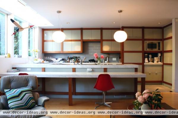
“Our home is bright and open and great for entertaining,” says Natalie. “We love to have people over, and this house is made for it. We cook a lot and find that with an open kitchen, you never really feel as if you are doing work while in that room.” The gray backsplash matches the tile wall in the living room.
Lighting: Sphera S37 Suspension, Leucos

The thick marble countertops are from Fox Marble.
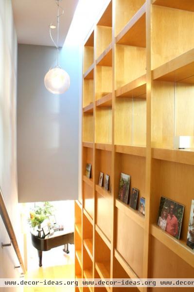
The light in the staircase is from Artemide. Although it is one of Seth’s favorite pieces, he admits it can be challenging — if not dangerous — to clean. Family photos are displayed on the back side of the built-in shelves.

The upstairs bedroom demonstrates the couple’s mastery of simplicity. Modular built-in shelving is paired with white bedding, white walls, classic furniture and few personal knickknacks. An accent wall repeats the same gray tiling from downstairs.
“Overall my philosophy has become ‘Less is more,’” Natalie says. “And ‘Don’t worry what your husband thinks!’”
Chair: vintage Eames; cowhide rug: Overstock.com

Seth painted each of the bedroom walls a slightly different shade of Benjamin Moore’s White Wisp, basing each hue on the wall’s orientation and flow.
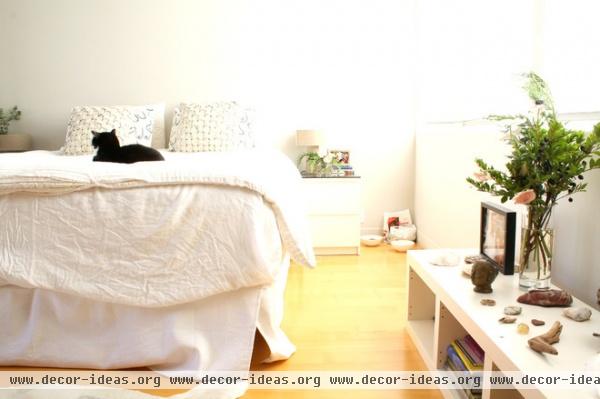
“When I first moved in with Seth, I was intimidated to bring any of my own belongings into the home,” admits Natalie. “I was nervous that they didn’t merge with the sleek, modern beauty of the home. Over time I realized that this is exactly what the home needed. I bring in soft touches and personalize the home with details — and, of course, being a florist, I bring flowers into every room.”
Bookshelf: Expedit, Ikea; duvet cover: Ofelia Vass, Ikea

The first guest bathroom is a vibrant yellow, with art by Renee Huber.
Wall paint: Nacho Cheese, Benjamin Moore
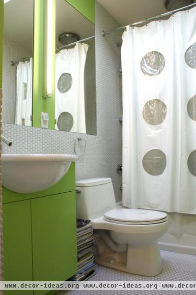
The second guest bathroom is wrapped in white mosaic tile; part of one wall and the vanity cabinet are painted a bright lime green for contrast.
Wall paint: Stem Green, Benjamin Moore
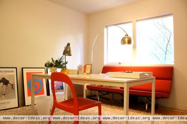
Natalie’s floral design studio, Natalie Bowen Designs, is in San Francisco’s South of Market (or SoMa) neighborhood, but she sometimes works from home in this office. The Arco floor lamp is vintage.
Table: Melltorp, Ikea; chair: Urban, Ikea; sofa: Herman Miller; desk lamp: Ikea; art prints: Modernism Gallery
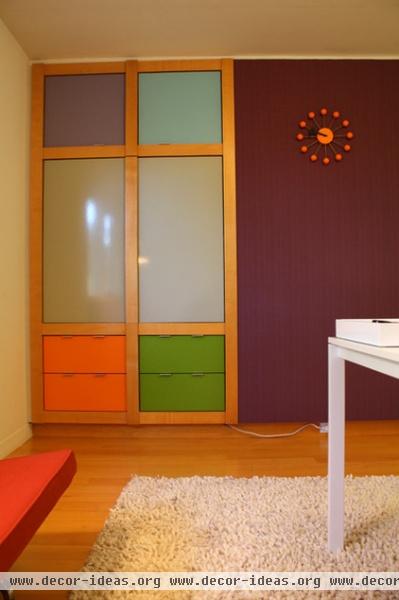
Opposite the desk area are custom cabinets and a textured wall treatment by Maharam.

Natalie and Seth relax in their living room. “With the groundwork laid,” he says, “I turn to my wife to bring the home to life with so many lovely details.”
See more photos of their home
Browse more homes by style:
Small Homes | Colorful Homes | Eclectic Homes | Modern Homes | Contemporary Homes | Midcentury Homes | Ranch Homes | Traditional Homes | Barn Homes | Townhouses | Apartments | Lofts | Vacation Homes
More: Travel Guide: San Francisco for Design Lovers


