Houzz Tour: Taking a Hamptons Cottage Beyond the Ordinary
http://decor-ideas.org 12/31/2013 23:22 Decor Ideas
The owners of a once-humble vacation cottage wanted a brand-new home without sacrificing the things that made their retreat special. The dwelling was built in the early 1900s and, although it had a ton of coastal charm, it didn’t have a lot of space. Patrick Bentivegna of Benco Construction and architect David Sherwood worked together with their design-savvy clients to create a place that retains the look of yesteryear but has all the amenities of today.
Houzz at a Glance
Location: Southampton, New York
Size: 2,400 square feet; 3 bedrooms, 2 bathrooms
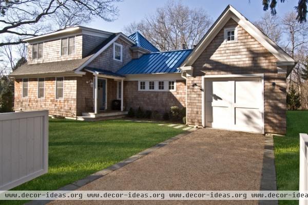
The exterior shows the traditional charm and the new spirit of the house. “We wanted it to have the wood shingles you see around here,” says Bentivegna. “But the homeowners, who have a lot of style, wanted to do something different with the roof. They thought gray or brown was too boring.” The unexpected blue aluminum roof enlivens the classic look.
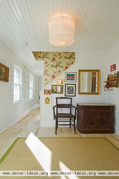
In the entry — a new feature of the home, which once had no formal entry to speak of—a paneled ceiling is reminiscent of the era in which the original house was built.
From the front door, you can see the first of a couple of bold wallpaper choices. Framed this way by the architecture, it reads as a piece of art.
Wallpaper: Orchid, Cole & Son
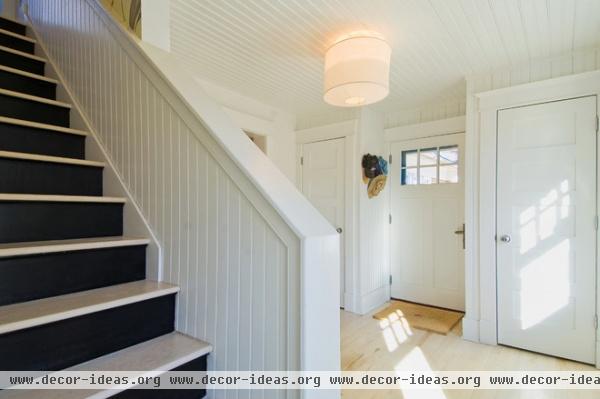
With its pickled finish, the new oak floor strikes a more modern note.
The black stair risers also look modern, but they’re a traditional solution to an age-old problem. “You always find risers painted black in old homes,” says Bentivegna. “It keeps them from getting messed up with scuffs.”
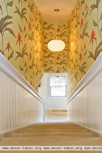
The orchid-print wallpaper is limited to the stairwell. The concept is one designers often apply to powder rooms: It’s a place where you don’t linger, so you can make bold design choices.
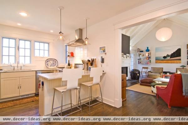
When you walk through the kitchen, you experience a sea change in the flooring. “In the white kitchen and in the high-ceilinged living room, we felt light flooring would make the space feel too cold and sterile, so we switched to a walnut color,” says Bentivegna. “It also makes it seem as if this house has been added on to over time, not redone all at once.”
Chairs: Design Within Reach; light fixtures: Restoration Hardware
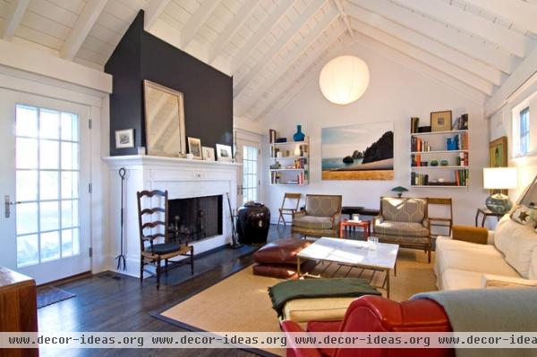
The living room is an addition, located between the original main house and the new garage. “Originally, we thought we would Sheetrock the ceiling,” says Bentivegna. “But during construction, when we saw the exposed beams, we got another idea.” To give the ceiling even more texture, pine flooring was painted white and applied between the beams.
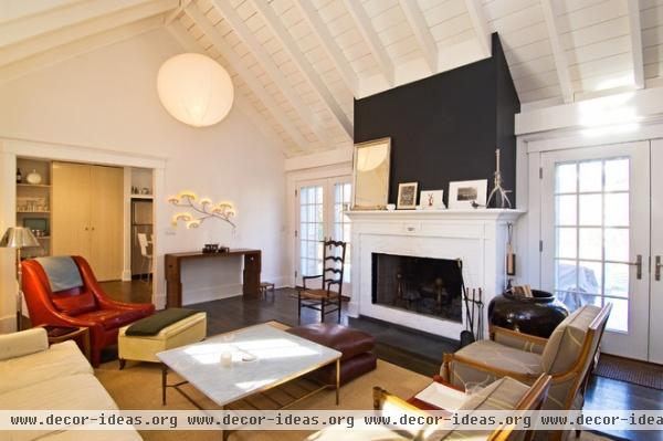
The fireplace, the first one ever in this house, was given a traditional white mantel, but the wall above it was covered in a mod black.
Two paper lanterns illuminate the room. “The homeowners were having trouble finding fixtures that were large enough,” says Bentivegna. “The paper lanterns were a cost-effective solution.”
Light fixtures: Ikea
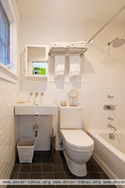
The diminutive guest bathroom had not an inch to spare, so Bentivegna put the storage on a wall-hung rack and left the space under the sink open.
Fixtures: Grohe; sink: Duravit
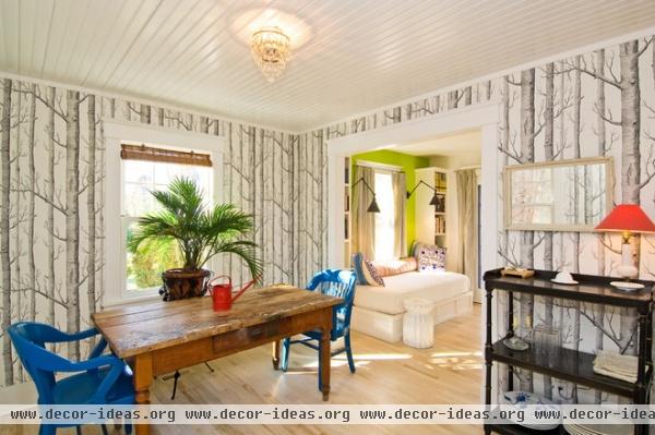
Continue straight from the entry and you will find a dining room that, as the surrealist artist René Magritte might say, is not a dining room. “They wanted a room that could be flexible,” says Bentivegna. “When they are not entertaining, they push the table to the side of the room. When they have a party, it moves to the center.”
Wallpaper: Woods, Cole & Son
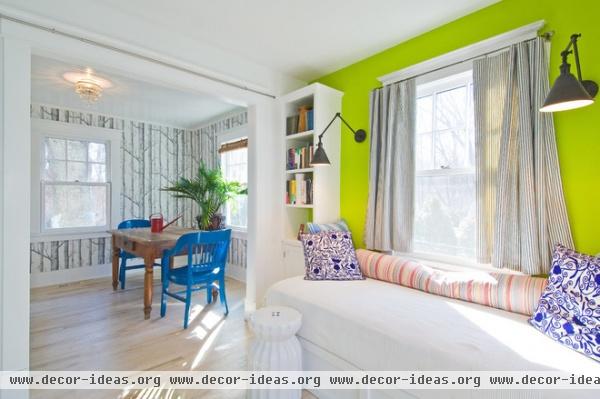
Adjacent to the dining room are a built-in daybed and bookshelves. The light-filled addition, which leads to the garden, is the perfect spot for relaxing and reading.
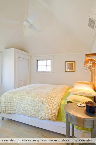
From the outside you see a small tower. This structure houses the master bedroom, and its square form and steeply pitched roof give the interior room an interesting form.
Again, to make it seem as if it had always been there, Bentivegna built closets that intentionally look like later additions. “In an old house, you don’t find built-in closets, or closets at all for that matter,” he says. “The two here look like they were made years after the house was built.”
According to Bentivegna, it’s those kind of details that take the house to the next level. “Throughout the house the clients pushed us to do something out of the ordinary,” he says. “That’s what makes this place special.”
Related Articles Recommended


