Houzz Tour: Parisian Modern Updates for a Toronto Coach House
Stephane Chamard knew that he and his husband would be living in this Toronto coach house only for a short time, but the urge to refresh it was irresistible for the architect–designer. “We rented this apartment after we sold the house we owned and while we looked for a new one. I knew that we wouldn’t be living here for long, but I also knew if I didn’t do something to it, it would drive me crazy,” he says. For Chamard, freshening up the dated two-room, two-level space was more fun than frustrating. As the couple prepares to move into a new home just four months after signing the lease, Chamard says he has no regrets. “It made me happy to fix up this place,” he says. “I complete remodels like some people complete jigsaw puzzles.”
Houzz at a Glance
Who lives here: Stephane Chamard and his husband, Philippe
Location: Toronto
Size: 1,291 square feet; 1 bedroom, 1 bathroom
Photography: Lisa Petrole
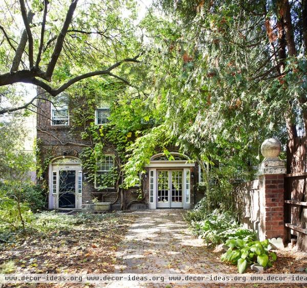
“The history of the coach house is very interesting,” says Chamard. “It is tucked behind a larger house. The way I understand it, a dentist owned the property in the early 1920s. Apparently he really liked to party, but his wife did not. He remodeled the old coach house into a party space with some distance from the house.”
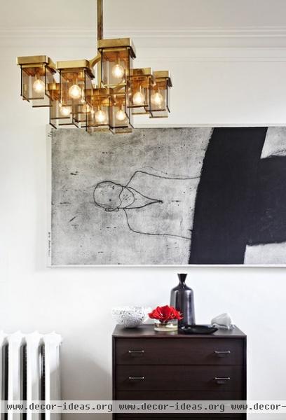
“When we moved in, all of the walls were painted a salmon color and the molding was a light beige. I had to refresh it,” he says. “I am from Paris, and it’s a very Parisian thing to enhance an old home by painting it all white and filling it with modern furniture.” The designer set the modernist stage in the home’s entry.
Art: Max Neumann
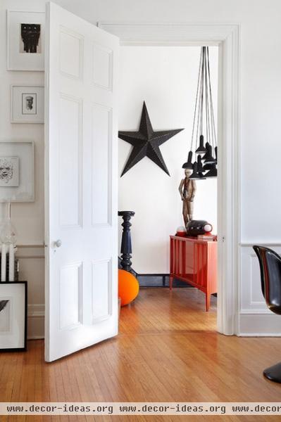
From the front door, you ascend a short flight of stairs to the main living space. Chamard used the landing at the top of the stairs to create another entry to it. “The house is essentially two large rooms. The bedroom is downstairs; everything else is on the second floor,” he says. “There’s also a tiny bathroom.”
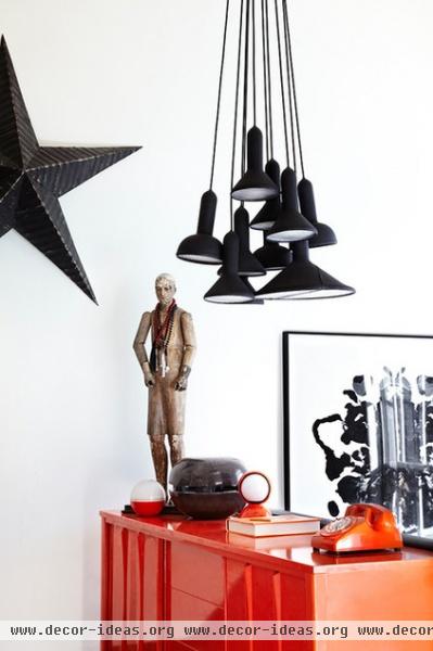
Chamard defined the second entry with a piece of architectural salvage in the shape of a large star, a black rubberized light fixture and a bright orange console. “I moved to Toronto after I met my husband,” he says. “I found this console while walking down the street. You would not believe the things you can find on the street here! It’s one of the things I love about the city.” The modest piece became a showstopper with a coat of shiny lacquer.
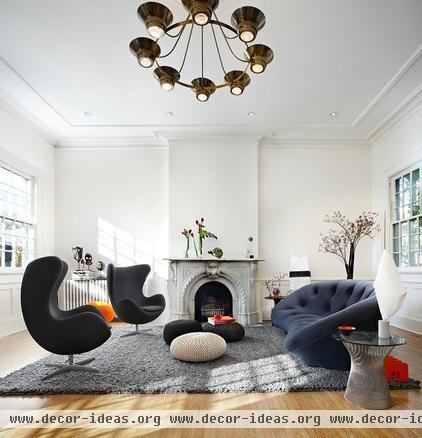
“In Paris we decorate rooms the way a bride gets ready for her wedding,” Chamard says. “We use something old, something new, something borrowed, something blue.” If you define “borrowed” as something salvaged or vintage, Chamard is carrying on the French tradition in his living room. A vintage light fixture hangs above a pair of classic modernist chairs and a blue sofa. The fireplace surround was installed by the party-loving dentist.
Egg chairs: Arne Jacobsen; sofa: Ploum, Ligne Roset
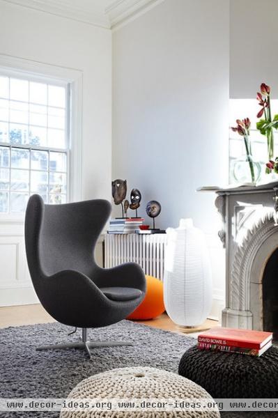
Instead of a coffee table, Chamard has three poufs. “I am not a fan of coffee tables,” he says. “They are so stiff, and they don’t allow people to circulate around a room naturally. The poufs are so flexible; they can be used as party seating or an ottoman. Put a book on one, and you have a place to set your drink.”
Similar poufs: CB2
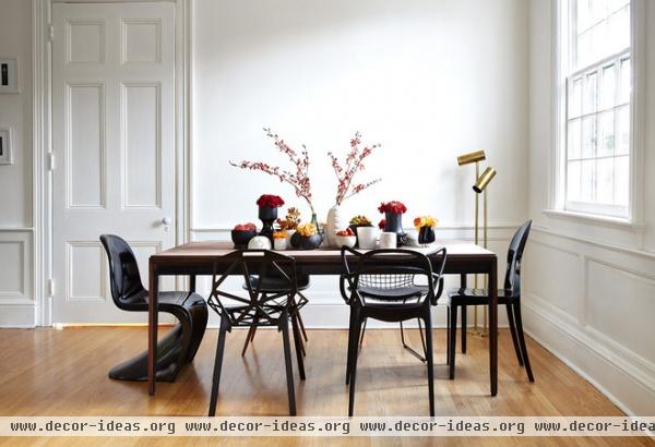
The collection of dining room chairs was a happy accident. “I couldn’t decide on a black chair, so I brought home several to try and intended to pick just one style,” Chamard says. “But my husband and I decided we loved them all, so we kept them.”
The couple, who continue the coach house’s entertaining tradition, like to guess which guests will chose which chair. “It’s interesting. Women always pick the comfortable ones; men always go for the angular seats,” Chamard says.
Left to right: Panton chair, Verner Panton; Chair One by Konstantin Grcic, Magis; Masters Chair, Kartell; Victoria Ghost Chair by Philippe Starck, Kartell
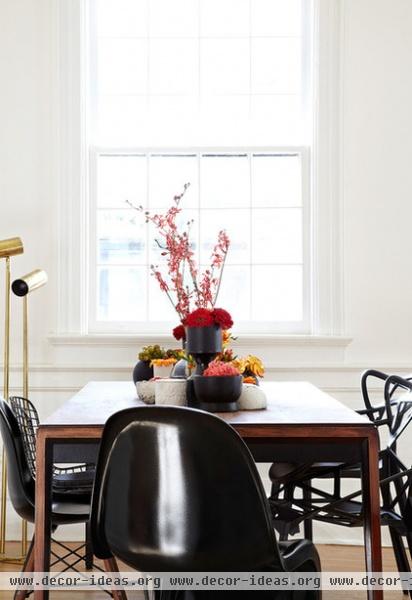
When it comes to dressing the table, Chamard likes to assemble pieces from his black and white pottery collection down the center and fill them with flowers. “I collect only vases in these colors,” he says. “I found that when you stick to a color, it doesn’t matter if the finish is matte or glossy.”
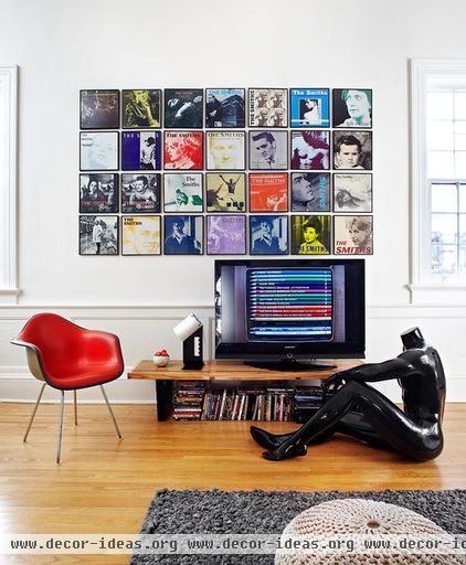
Chamard says that from childhood, he’s had a thing for mannequins. “To me they look like statues,” he says. A standard mannequin sits in the media corner of the living room.
The designer framed a collection of The Smiths album covers for this space. “Because the band used the same art director for all their covers, it reads as one big piece of art,” he says.
Album frames: Urban Outfitters
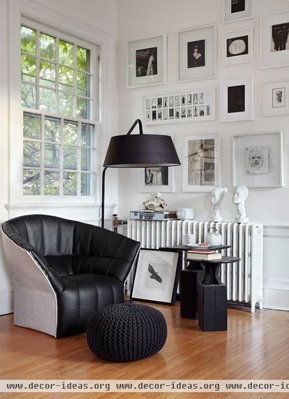
One corner of the living area is for reading. On the wall are framed black and white prints Chamard has been collecting for years. “I have everything from fashion photography to a Miles Davis album cover,” he says. “They all go together, because they are pieces I like.”
Chair: Moel, Ligne Roset
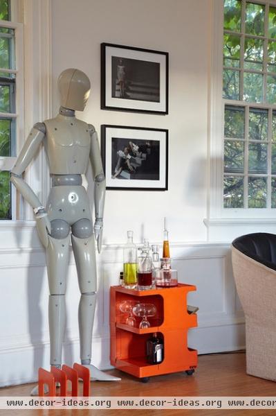
One of the rarest mannequins in Chamard’s collection is this gray jointed model. It stands next to an artist’s cart he converted into a bar.

“This piece probably was beside someone’s desk and held his or her pencils, paints and brushes,” he says. “But I found that it was perfect for bottles and glasses. The fact that it can roll around makes it even better.”
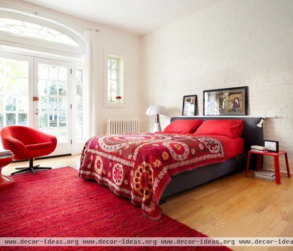
Downstairs, in the master bedroom, the palette heats up to bright red. “It started with the vintage suzani,” Chamard says. “We just kept adding red pieces to it.”
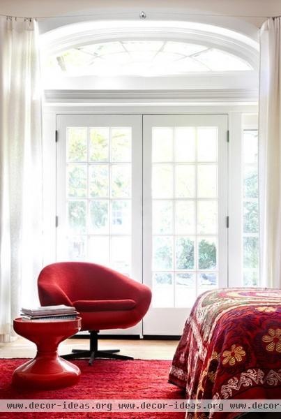
A red chair and table by the window make another reading area.
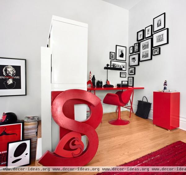
A pair of shelving units at one end of the bedroom screens an office. The shapely piece in the foreground is a collection of letters leaning against one another. “I found them at an architectural salvage shop, and I chose an ‘S’ and a ‘P’ for our names. The heart is a candy box Philippe gave me,” Chamard says. “I might separate them someday, but for now it’s like a sculpture.”
Chamard’s design philosophy is simple: Go bold. “Too many times people are afraid to go for it in their interior, so they tone down their choices and it becomes uninteresting,” he says. “My best advice is, Don’t be afraid to be bold.”


