Set the Right Mood With the Right Lines
You may not think twice about the shape of the legs on your living room coffee table or the swirls on the wallpaper in your front hall, but research indicates you should. That’s because humans have different responses to curvy lines and straight ones. In a nutshell: Curvy lines make us think of comfort and relaxation; straight lines evoke efficiency and vigor.
But that’s not all. People see objects and places with curved lines as more attractive and generally prefer them more than ones with straight lines.
Researchers can’t tell us for sure why we seem comforted by curves and energized by straight lines; they surmise that we may have developed these associations when we were developing as a species and living without modern tools. Way back then the things that comforted us and were vital to our survival, including fruits and our mothers, were generally roundish. Things for which we had negative associations, such as the teeth of carnivores, were more angular.
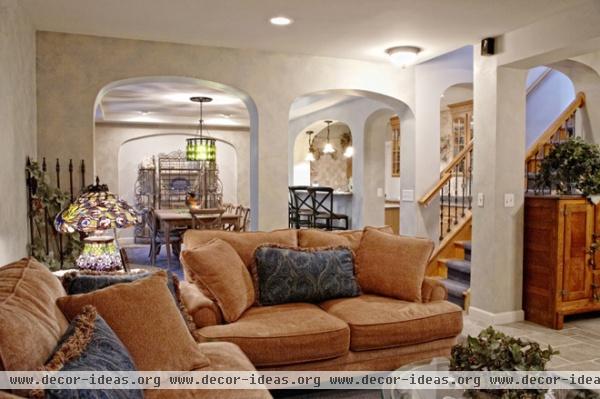
When you’re putting together a space in your home, you make lots of decisions that involve both straight and curvy lines — patterns for wallpaper, upholstery and rugs, but also furniture shape and openings and doorways between rooms.
Because curves and straights have different effects, you’ll want to consider where these lines come up in your home.
Use curves for comfortable spaces. In a space where you’ll do a lot of relaxing, like a sunroom or living room, you’ll want more curves to be visible. The visually prominent upholstered furniture and doorways in this living are curvilinear and set a relaxing mood.
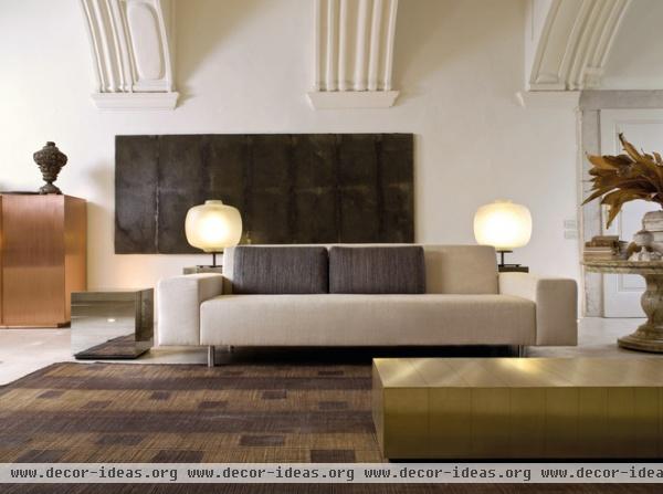
Use straight lines for workspaces. In rooms where you’re interested in focusing and accomplishing something, like an office, you’ll want to go heavier on the straighter lines. In a corporate office or waiting room, straight lines say, “We’re efficient, and we will get to you soon.” In a home office, they signal, “Let’s get things done.”
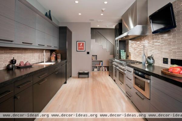
Straight lines in kitchens also encourage efficiency and orderliness.

Mix straight lines and curves. We’re talking about the relative proportion of how varying lines appear in a space. You don’t want strictly one or the other. All curves: You feel like you’ve fallen into a cartoon for toddlers. All straight lines: A futuristic living-in-the-machine type horror movie comes to mind. So a good mix is ideal.
Straight and curvy lines are mixed in this space, so it works as a family room.
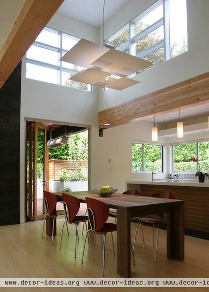
In a room with lots of straight lines, add a few curves — like the ones on the chairs here — to keep the space from seeming too inhospitable.
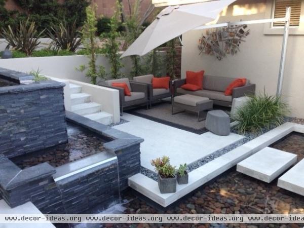
Think about the total sensory experience. The furniture and architecture in this space are very angular, but the sound of moving water here will slow visitors down. That water softens the drive to “do something” generated by all those straight lines meeting at right angles.


