Benjamin Moore Floats Breath of Fresh Air as Its Color of 2014
When I first pulled up Benjamin Moore’s Color of the Year for 2014, Breath of Fresh Air, my husband looked over my shoulder and said, “That’s not a color.” Of course, I should mention that he is color blind. Still, I happened to agree with his assessment. Upon first viewing this color I found it a bit “thin” — too pastel and more than a little underwhelming.
But in my work as a color consultant, I have taken a vow to embrace all colors, since I am asked to work with a variety of hues, regardless of my personal likes or dislikes. So I decided to challenge myself to dig deep and find some love for Breath of Fresh Air, and ultimately figure out how I could use this hue in a home’s interior. I decided that while it’s not a color I would rush to use in my own home, I can see it working well in certain applications, either as a background hue to other, bolder colors or teamed up with shades of white to create a soft, light, soothing palette. Here’s how.
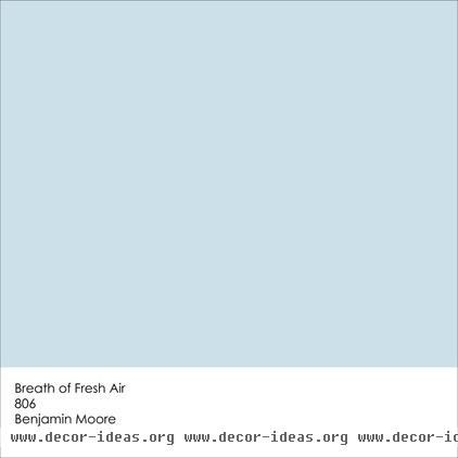
Benjamin Moore selected Breath of Fresh Air as its Color of the Year 2014 because it sensed a shift to lighter colors, and away from gray, which has been an extremely popular color for home interiors for the past several years. Breath of Fresh Air is just one of the many pastels the company is touting in its Color Trends 2014 campaign. It has dubbed these pastels new neutrals; they are not meant to look, according to the press release, too “candy” or “Easter egg.” The color will “make a room happy, flatter your possessions and your art,” says the company.
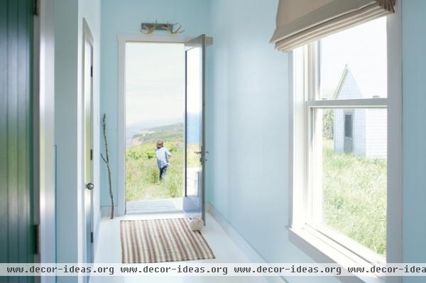
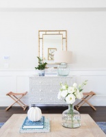
I have to admit, the color is quite pretty in this image, provided by Benjamin Moore. I think it pairs well with the white floor and trim — the space has a supersoft, dream-like quality. The pale blue wall color mimics the sky on a clear and beautiful day, and it also breaks up any starkness associated with having so much white in a space. Of course, white is not the most practical choice for a floor color, but I’m not sure you’d get the same light, ethereal effect if the floor were a darker, more forgiving hue.
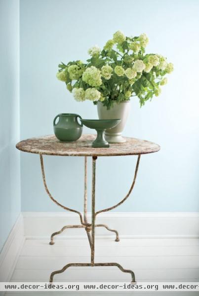
Breath of Fresh Air Paint Here the color works as a neutral base to the more vibrant greens in the flowers and vases. You can add an accent of almost any color to a palette of white and pale blue.
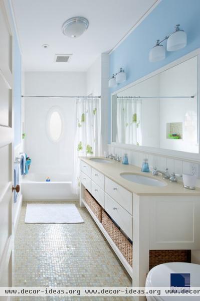
A palette of soft blues, such as Breath of Fresh Air, with white is currently popular in bathrooms for a reason. It imparts a clean look and a soothing, spa-like vibe.
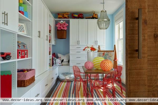
Or go to the other extreme and use the color as a background neutral with hits of other, bolder, colors. Breath of Fresh Air works as an alternative neutral for those who are tired of white, beige or gray walls.
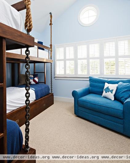
It’s a soft, restful color, so it also works well in bedrooms. Again, I would use Breath of Fresh Air either with lots of white or the opposite: as a neutral base to darker and bolder hues, as shown here.
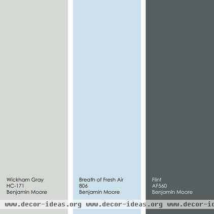
Suggested Palette: The New Neutrals
This palette combines Breath of Fresh Air with two other featured colors from Benjamin Moore’s Color Trends 2014. These new neutrals are an elegant and modern alternative to tan and beige. Use one of the lighter hues for the main wall color, then add smaller accents of all three colors throughout the space.
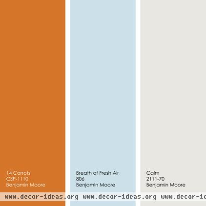
Suggested Palette: With a Dash of Bold Orange
If, like me, you find Breath of Fresh Air a bit too soft, punch it up by adding a splash of your favorite bold hue. Here I added a carrot-orange color to the mix. Because blue and orange are complementary colors, opposites on the color wheel, they offer maximum contrast, making this a bold and high-energy palette. Again, I’d use the lighter colors in larger doses with smaller bits of the bold orange thrown in as an accent.
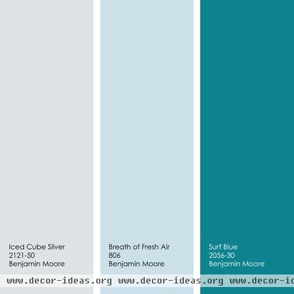
Suggested Palette: Shades of Blue
Or stay in the blue family but add a splash of a bolder blue, such as this pretty Surf Blue.
Tell us: Too light or just right? What do you think of Breath of Fresh Air?
More: Best Ways to Use Radiant Orchid, Pantone’s Color of 2014
Best Ways to Use Exclusive Plum, Sherwin-Williams’ Color of 2014

