Inside Houzz: Rich Wood Transforms a Dallas Bathroom
Because she worked in a hospital as a radiology tech for many years, Theresa Strong just doesn’t do all white. The color scheme reminds her too much of that sterile environment, and she craves something warmer. That’s why her white-on-white bathroom simply had to go.
Like many homeowners, Theresa knew what she wanted for her remodel project: a rich wood vibe and no white; she just had trouble getting others onboard with it. For instance, the numerous contractors that she called all tried to sell her on a different plan than her own.
Discouraged, she went to her Houzz ideabook to look over the inspiration for her dream bathroom. She knew she wasn’t crazy. She knew what she wanted. It was right there in front of her. That’s when she noticed multiple photos from the same designer, USI Design. She clicked on the profile and was shocked to learn that the firm was in Dallas, where she lived with her husband, Ric.
“It was just a chance of luck,” she says. “They came over, sat at the table and wanted to know what was my style. They never once told me what to do. We didn’t see any more contractors. We decided on USI that night.” She was able to get the bathroom she wanted, and she and her husband each got large new vanities.
Here’s what they did.
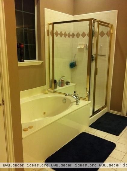
Theresa not only hated the white color scheme in her old bathroom, but she disliked the materials: a ceramic floor, standard 4-inch ceramic tiles in the shower and a cultured marble bathtub and countertops.
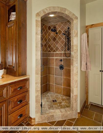
USI gave the bathroom the warm tone and artisan element the Strongs were looking for. Porcelain tiles with artistic designs set the stage for the shower. USI’s Chris Chumbley used tiles in the same family for a cohesive design.
Tile: Arizona Tile
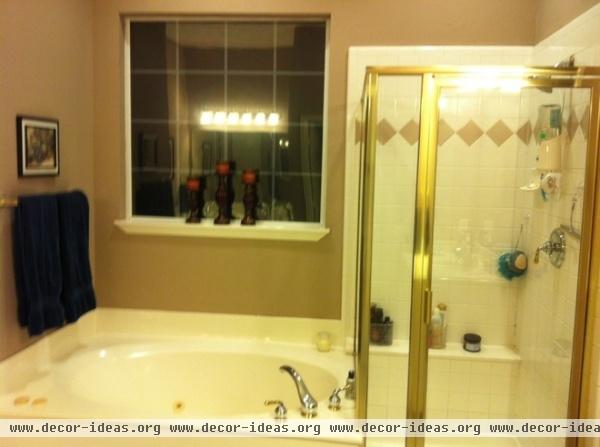
The Strongs never used their bathtub, so they decided to rip it out and create a vanity space for Theresa. Ric then got his own new vanity in her old space.
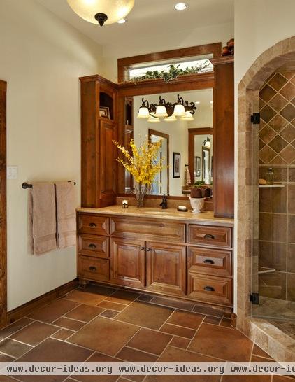
Theresa’s new vanity. Knotty alder cabinets give the space a rustic look. An heirloom finish and extra glazing highlight their deep, dark edges. “We engineered that from the very beginning,” Chumbley says. “Those are details you want to work out with clients in the design phase early on.”
By removing the large window and replacing it with the new vanity, the team lost a lot of natural light, so Chumbley added a transom window above to pull in sunshine.
Cabinets: Hoffman Cabinets
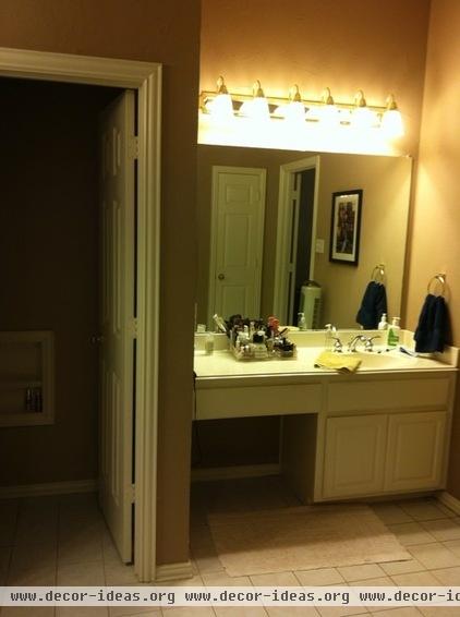
Construction-grade cabinets made up the old vanities, including Theresa’s, shown here. Meanwhile, standard lighting gave the space a ho-hum feel.
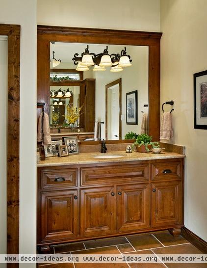
Ric’s new vanity. Chumbley laid the porcelain floor tiles in a modular pattern around the vanity to add texture and to nod to traditional style, similar to a classic pieced-together stone floor.
Lights: Lee Lighting
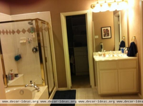
Here’s a shot of Ric’s old corner vanity. USI removed it after gaining the new vanity space and used the corner for a custom linen closet.
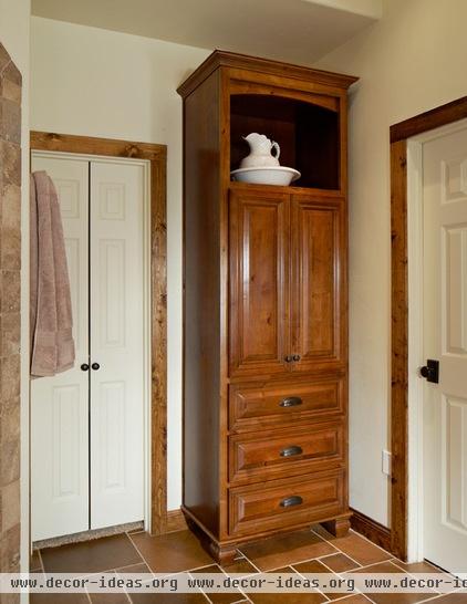
The new linen closet. This custom linen closet basically dictated the whole look and feel of the cabinets. Theresa had seen and fell in love with one of USI’s designs on a previous project and just had to have one.
USI also replaced the trim with pine boards and the polished brass hardware with oil-rubbed bronze.
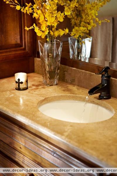
The Strongs didn’t take the cheapest route, but they wanted something more than the construction-grade materials that filled the bathroom before. “If you buy cheap, you get cheap quality, and you’ll have to keep redoing it,” Theresa says. “If it’s good, it’ll last forever.”
Countertops: Home Mexican Noce travertine, Arizona Tile; plumbing fixtures: Ferguson Enterprises

USI also did some work on the Strongs’ bedroom, adding bullnose corners, repainting, recarpeting and adding a pecky cypress accent ceiling. The firm also just finished remodeling the Strongs’ kitchen.
“We’re just doing room by room now,” Theresa says. “We’re taking our time, because we know we’re going to be here awhile.”
Bed: Havertys
More:
Read about another design match made on Houzz
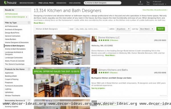
Find a kitchen designer or other home pro near you
See how to contact an architect, designer or remodeler and get your project going


