Houzz Tour: A Modern Home Rooted in Its Place
Very few philosophers have tackled the subject of architecture, and when it has happened, the emphasis has been on aesthetics. Certainly Roger Scruton’s The Aesthetics of Architecture comes to mind, in which the philosopher applies ideas of aesthetic theory to architecture to find its essence. Counter to this is Martin Heidegger’s ideas focused on experience and meaning, summed up in his lecture and essay “Building Dwelling Thinking,” from more than 60 years ago. For Heidegger something could not be called architecture because of the way it looks; rather this label was based on how a building was situated within the world and provided a place for a meaningful existence.
Why do I bring up philosophy and Martin Heidegger here, in an ideabook about a house in Canada designed by Kariouk Associates? Because the clients provided a quote at the beginning of the project that gave direction to the spirit of the design:
“It is proper to every gathering that the gatherers assemble
to coordinate their efforts to the sheltering;
only when they have gathered together with
that end in view do they begin to gather.”
— Martin Heidegger, Logos
This quote is a quite a mouthful, but the four instances of the word “gather” are indicative of a mind that stressed not only particular definitions of words but the strength of the meanings behind them. In the case of this house, the clients and architects came together to strive for a meaningful place, a home where the family could take hold for, in their words, the next half century.
Houzz at a Glance
Who lives here: A couple with 2 boys
Location: Ottawa, Ontario
Size: 3 bedrooms, 2½ bathrooms
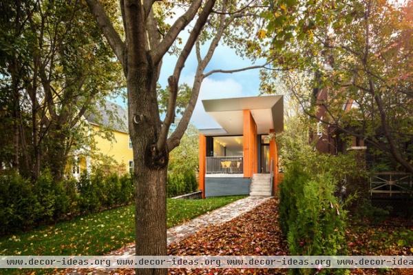
Heidegger did not write “Building Dwelling Thinking” as a prescriptive theory for architecture, so most architects influenced by the essay focus on a wide variety of ideas within it. At its basis the essay argues that building (as the act of constructing) serves dwelling (the meaningful act of living in a place), but he complicates matters by asserting that we can’t learn to build until we’ve learned how to dwell.
Implicit in this notion is that we have forgotten how to live on the earth, how to live peacefully in nature. One place to start, then, is to think of how a house meets the earth and the sky, something this house addresses through its foundation and roof.
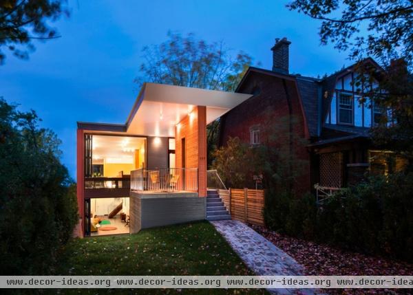
The most overt design gesture from the street is the roof that cantilevers above freestanding orange walls (orange because the clients are Dutch, the architects assert). These overhangs shelter an outdoor space at the front of the house, while also shading the large glazed openings on this side.
The second thing that is apparent is the way the house is sunken into the landscape. The main living floor is up a half level from the walkway, while the children’s bedrooms and family room are downstairs. Even if the decision to place the floors in this manner had a practical reason, I interpret it as a move to root the building in its place, something reinforced by the raising of the living spaces up high and keeping most of the bedrooms near the ground (an inversion of the typical two-story residential layout, in which the bedrooms are upstairs and the living spaces are on the ground floor).
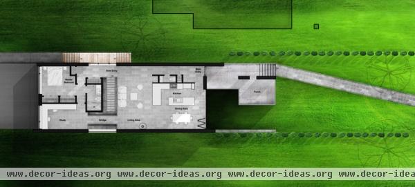
Here is a look at the upper floor plan, where the entrance, kitchen, living space and master bedroom are located. The approach to the house is via the angled walk at the right, past the covered porch. Note how the side walls are predominantly solid, minus a side entrance just above the stairs in the middle of the plan, and a window by the bridge opposite. The narrow site and allowable footprint of the house, as well as the nearby neighbors, made the choice of windows on the short side logical. Daylight therefore reaches both ends of the house, and the center is aided by the windows near the stair and by the skylights and clerestories above the adjacent master bath, as we’ll see later.
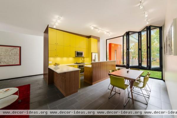
The front of the upper floor is devoted to the kitchen and dining area, behind large sliding windows. Beyond the yellow kitchen is the front door, and beyond the windows is the front porch.
The latter is a great spot for outdoor dining — even as the front of a house isn’t often the logical place for such, it’s covered and within close reach of the kitchen. And I think the idea of having a usable front porch further roots the house in its place; in this case in the neighborhood and with community members that the family will know and even have over for dinner over time.
Note the yellow line atop the kitchen cabinets. What may look like a diagonal is in fact level, since the roof slopes down from a high point at the front porch to a low point at the back of the house.
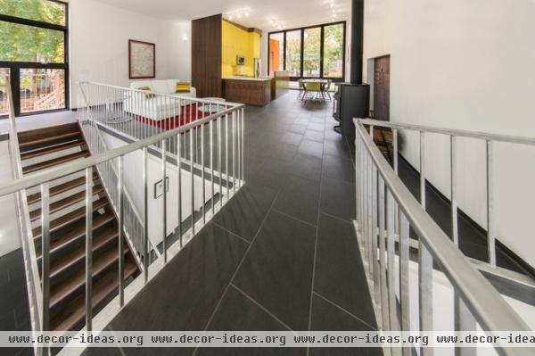
Here is a view from the bridge linking the living space to the master bedroom (behind us). To the left we can see the side entrance atop the stairs, and to the right is a stove that helps to heat the space while also serving as a more traditional hearth.
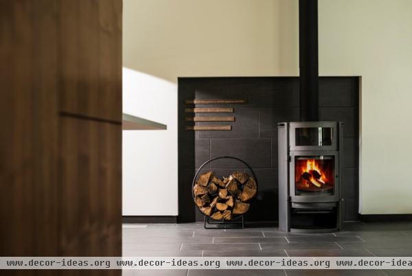
Fittingly, it is here where Heidegger’s lines about gathering are set on bronze plaques. It should be noted that heat also comes in the form of passive heating through the large expanses of glass on the ends, and from the stone floors, which absorb the heat and radiate it at night.
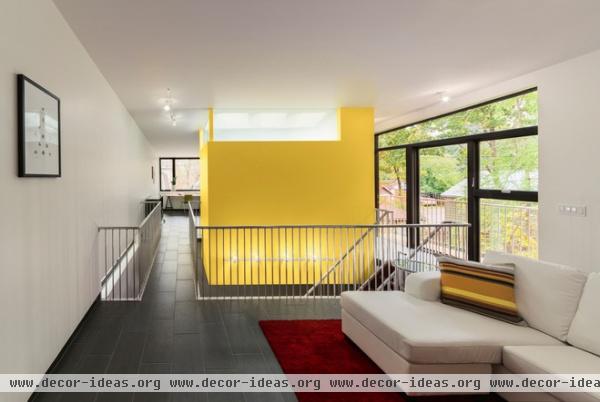
Sitting roughly in the middle of the upper floor is a yellow volume that houses the skylit master bathroom. Clerestories atop the yellow walls allow light from the skylights to spill into the central portion of the plan. Given the stairs and the openings on the side, a good deal of light goes down to the lower level.
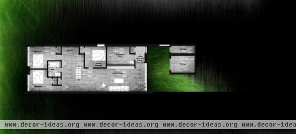
The lower level is fairly straightforward, with bedrooms at the rear, an open family room and a guest bedroom on the side, near the laundry and mechanical space. Detached from the main volume of the house is some storage, which sits below the porch upstairs. There’s a lower-level entry on this end of the house.
The way the architects articulated the floor plans, especially this one, accentuates the way the house is integrated into the site, and the way light infiltrates the house.
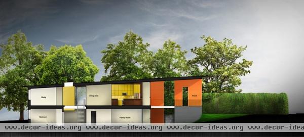
A building section that cuts from the front of the house on the right to the back of the house on the left illustrates many of the pieces we’ve seen above: the covered front porch, the kitchen and its yellow cabinets, the skylit master bath and stair in the middle of the plan.
The slope of the roof helps to reinforce the idea of dwelling with the land, in that it seems to parallel the slope of the site and open itself up where it makes sense (living space) and be shorter where it also makes sense (master bedroom).
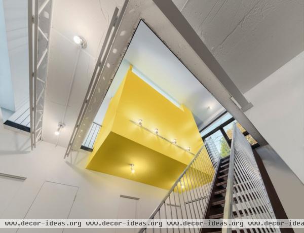
The yellow volume of the master bedroom is a great surprise for the way it extends below the level of the floor to poke out into the space below. This brings a little bit of color to the lower floor, but it also creates a strong visual connection, something that ties the two floors together.
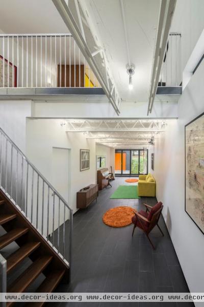
In this view of the lower level from the bottom of the stair, we can see how color punctuates the two realms of the house: yellow inside and orange outside. Furnishings in the family room pick up on these two colors to stand out among the white walls and dark floors.
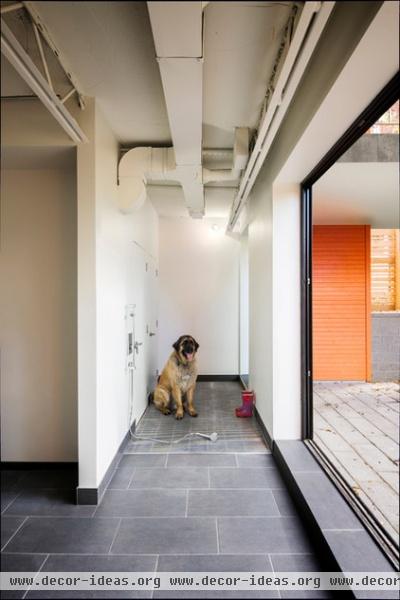
At the lower entrance is a shower area for washing mud off boots and the dog.
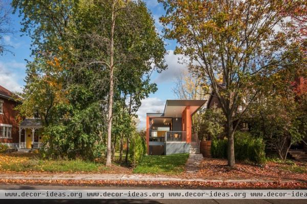
Here is one last view of the house — from the street again — showing how even with its modern form, the house is well integrated into its location. There are strong colors on the front of the house, like its neighbors, but with half of the bedroom level buried below grade, it defers to them in its low profile. Nevertheless, the dramatic roof at the front of the house is hardly shy; it seems to say, “Look at me” and “Come on by; we’re here to stay.”


