Houzz Tour: Tapping Midcentury Mod and Views in Seattle
A love of midcentury modern architecture and ownership of a structurally sound 1950s house may be a match made in heaven. But the owners of this home in Seattle wanted more, specifically mountain views (that could come only from a second-story addition) and an open living and eating area connected to an outdoor space. The architects at Coop 15 preserved the house’s foundation, chimneys and one exterior wall, creating a new house that nevertheless taps into the client’s appreciation of midcentury modern design. Let’s take a walk through the house, focusing on the first-floor open plan that is the heart of the house and the family’s activities.
Houzz at a Glance
Who lives here: A family of 4 and their dog
Location: Seattle
Size: 4,300 square feet; 5 bedrooms, 3½ bathrooms
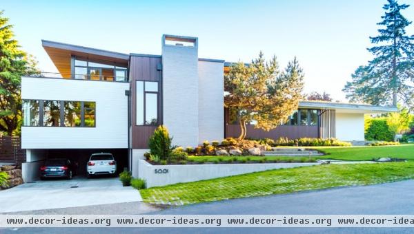
From the street the most prominent element on the house is the chimney, smack in the middle and the furthest forward of any element. This is one of the preserved parts of the house, so it is fitting that it is the hinge upon which the house is laid out. The second-story addition is symmetrical around it; the carport (also original) is found on one side, and the first floor stretches out on the other.
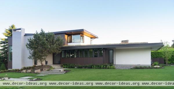
The owners enter the home from the carport on the lowest level, which also houses a rec room, a guest bedroom, storage, an exercise room, mechanical space, a mudroom and a coat closet. Here we see the approach for guests; this side really stresses the link between the new house and the midcentury one it replaced. This view might fool people into thinking that the house was restored rather than rebuilt.
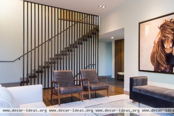
Connecting the three floors is an open stair that is screened by a steel picket guardrail. Here we see the stair from the living room that is immediately off of the front door, whose location is inferred by the stone flooring just beyond the wood flooring.
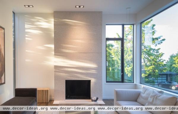
Turning around 180 degrees, we are looking at the chimney, now faced in stone. The placement of windows is strategic: The corner windows open up northeast toward the driveway, while the narrow window at left allows light from the setting sun to stream in.
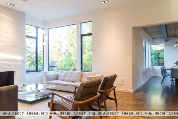
Turning right 90 degrees, we can see how the living room opens to the dining area beyond. In essence the open-plan living and eating area is made up of two shifted rectangles that open where they overlap. This helps to create an intimate, and relatively formal, living room, but one that is nevertheless open to the activities beyond.
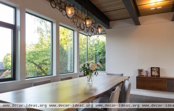
The dining area, whose windows are immediately above the carport seen in the first photo, also has a corner window to bring in more light and a view of the tree. A design feature that stresses the importance of this living-eating area is the exposed structure of the second story. This taps into midcentury design, using black painted steel rather than wood beams.
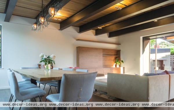
Continuing our clockwise stroll through the open plan, the dining area is directly adjacent to a less-formal living area. From here we can start to see the patio that the space connects to.
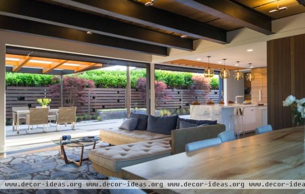
From the dining table we see the L-shaped space that wholly opens to the patio through a nearly 30-foot-long sliding glass wall. Behind the wood wall on the right is the stair, meaning that if we take the living room we first saw into account, the whole living-eating space is a C-shaped plan that is wrapped around the stair.
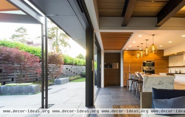
If there is one view that justifies the reworking of the house for the clients’ needs, it’s this view of the almost-seamless connection between inside and outside. The way the stone flooring straddles the threshold between the two realms reinforces the breaking down of any distinction, reinforcing the way the family can freely move back and forth in their daily routines.
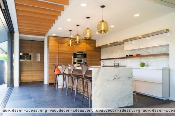
The modern kitchen with island is in keeping with the minimalist, yet hardly sparse, look of the interior. Note the opening at the end of the line of wood beams; a right turn connects the kitchen back to the first-floor entry and the children’s bedrooms, which sit in the one-story portion of the house.
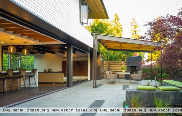
There’s another preserved chimney on the patio; it anchors a corner eating area.
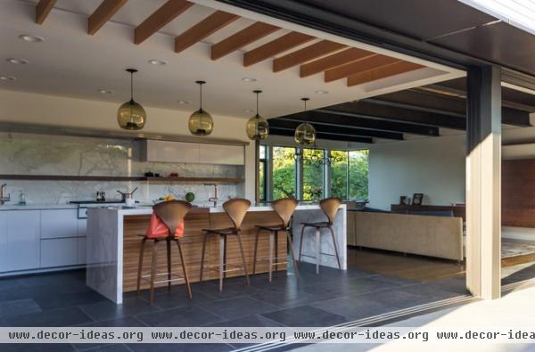
From the patio we can look back through the open plan, across the kitchen, living area and dining area to the corner window over the carport.
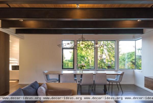
Here’s one last image of the open plan, looking toward the dining area but with a glimpse of the living room and fireplace through the opening at left.
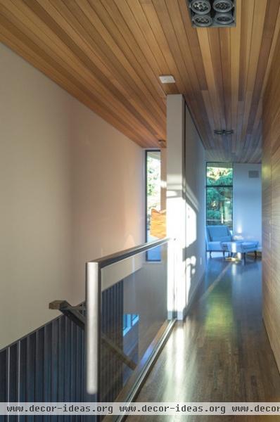
The steel guardrails stop short of the second floor, where a glass guardrail helps to bring more light into the master bedroom (straight ahead) and home office (behind us).
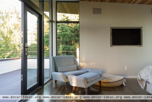
The master bedroom sits above the dining and living area, but it is set back on two sides, creating a wraparound roof deck that is ideal for gazing at the mountain views.
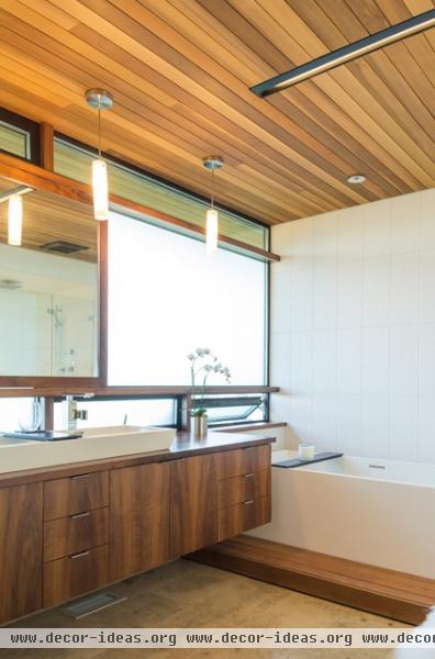
Our last stop is the master bath, which has a wonderful spa-like feel, stemming from the wood ceiling and the use of the material on the vanity and mirror.
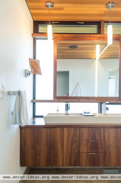
The mirror is a great detail, since it sits in front of the window, creating a halo effect.
More: Why We Love Midcentury Modern Design


