Design Workshop: The Beauty of Humble Materials
http://decor-ideas.org 12/09/2013 11:40 Decor Ideas
Humble materials aren’t costly or luxurious, but using them in residential design doesn’t mean you have to sacrifice interest or refinement. Many architects find inspiration in the humble beauty of simple structures dressed in plain materials that are used honestly. These materials don’t draw attention to themselves or pretend to be something they’re not. They’re chosen to modestly serve their purpose. As we analyze this approach in the following examples, it will be easy to see the appeal of selecting such unpretentious resources.
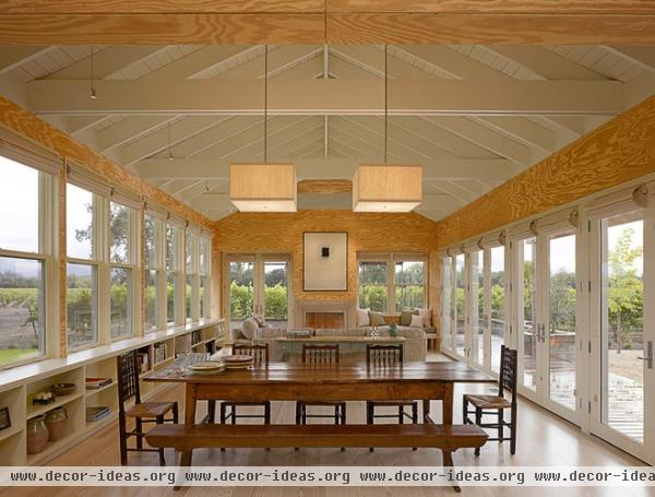
Natural Plywood
Aesthetic: Informal, warm, low tech
When to use it: This is an inexpensive, easy-to-find and easy-to-use material with big potential. Sheet-like and durable, plywood is used everywhere in buildings, but it’s usually covered with more refined, finished surfaces. There’s a certain messiness that accompanies plywood, which can be more or less pronounced depending on the grading of the faces. In general the imperfections are what makes this material so interesting.
For a more refined look, consider using a higher-grade plywood that has been manufactured to be free of knots and imperfections. Boldly figured graining is characteristic of southern yellow pine and functions as a warm ambient reflector in this living space.
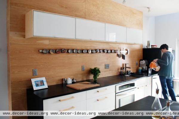
Plywood comes in 4- by 8-foot sheets, so installation labor costs are minimized. It can also be rip sawn into planks of any size, interlocked in a tongue and groove configuration or butted together. Fasteners can be used as accents, concealed or as contrasting elements. The plywood in this kitchen appears refined, utilitarian and, of course, warm.
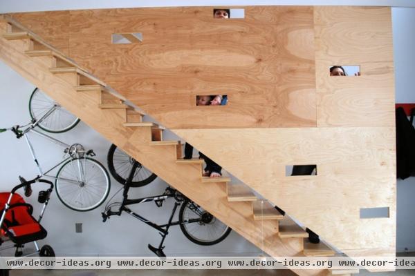
Here it functions as a guardrail that follows a stair to the lower level. The architect cut playful slits into the planar surfaces of plywood, accentuating its lightness.
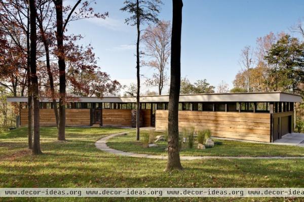
Live-Edge Wood
Aesthetic: Rugged, frontier modern, natural and neutral
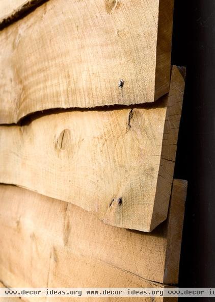
When to use it: As a means to break up and contrast rigorous building geometry. The live edge refers to the meandering, uneven edge of the boards, which are milled to thickness but not squared. This allows the natural shape of the tree trunk from which the board was sawn to remain visible.
This home uses a very modern interpretation of the material and exploits the contrast between the tight sculpted lines of the roof and the natural siding veneer. Clearly displaying its function as a rain screen, the raw siding is a simple means to shed water from the exterior. But the heavily textured wrapper casts sculpted, irregular shadows on the long walls, creating visual interest.
Unfinished Wood
Aesthetic: Scandinavian, warm and modern
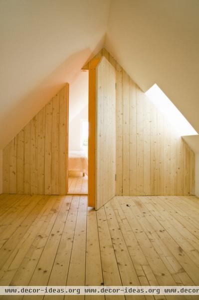
When to use it: To lend a clean, warm and casual feel to a space. Knotty wood, when used in a minimalist aesthetic, without trim or ornate detail, is wholly without pretense and develops a rich patina while withstanding a lot of wear and tear. In this attic loft, the knots in the pine plank floor and wall provide the only adornment. It’s relaxed and informal. Using a single material on both the walls and the floor treats the surfaces with equal weight, creating a warm liner.
Exposed Natural Framing
Aesthetic: Informal, raw, casual, textured
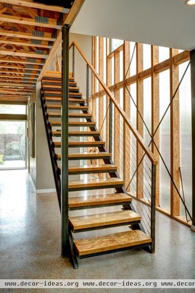
When to use it: As a means of expressing how a structure comes together. It’s generally less expensive to expose the components of construction, though you’ll have to be able to coexist with all of the things that finishes typically hide (plumbing, electrical, framing connectors).
Finishing costs can be conserved as well, because there’s just less material to paint and finish. The architects in this project have used engineered wood framing that’s composed of laminated parallel wood strands aligned for maximum strength. These materials have a very raw functional aesthetic that the architecture displays openly with exposed floor trusses, fasteners and cross bracing.
Exposed Painted Framing
Aesthetic: Informal but tailored, modern, warm, inviting
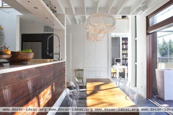
When to use it: To achieve a more tailored version of the exposed framing look shown in the previous example. Painting the framing members renders them slightly more tailored and, especially in this example, much brighter. Used sparingly on the ceiling, the painted framing offers the charm of an informal cottage without the insulation problems one encounters when leaving framing exposed on exterior walls.
White paint is a classic look, but any monochromatic color scheme will highlight the shape and depth of the framing members while increasing the perceived volume of the space.
Reclaimed Wood
Aesthetic: Warm, vintage, loft industrial
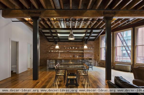
When to use it: To infuse a space with warmth and a story. We all love a good story. Reclaimed wood, whether authentically a part of a structure’s history, as in this Manhattan loft, or repurposed from a demolished structure, adds a narrative quality.
I would argue that there’s nothing more humble than repurposing an old material. Here the beams and framing have been stripped of paint to bring back their natural wood character. Reclaimed barn wood was used for the counters and shelving. The beams display splicing joints, splits and checks that infuse them with character and mark their age.
Painted Gypsum Board
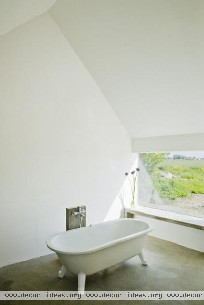
Aesthetic: Minimalist, cool (concrete), modern
When to use it: A classic modern choice used to highlight volume in a home and focus attention toward other elements in the space. In this case the view outside is substantially more important than anything else, and the contrast of color is striking.
Unfinished Gypsum Board
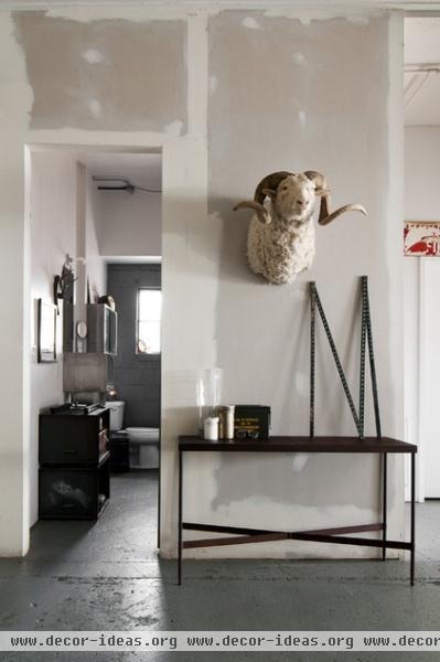
Aesthetic: Industrial, raw, cool, modern
When to use it: When you really can’t commit to a paint color. All kidding aside, this is an industrial look not many can live with or appreciate. The gypsum board here has been partially finished, meaning that it’s been taped, mudded and sanded but left unpainted for its industrial appeal.
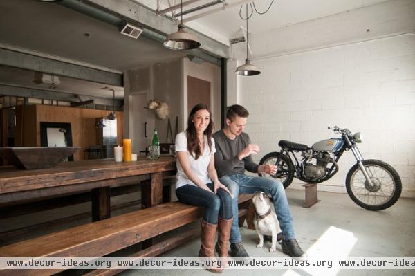
When used in homes where the systems of construction — metal conduit, industrial fixtures, steel beams, exposed mechanical ductwork and plumbing — are laid bare, it can be an apt gesture.
Commercial Steel Components
Aesthetic: Bold, industrial, machined
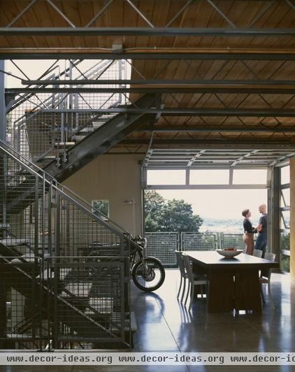
When to use them: If you appreciate the outward and expressive detail of systems, commercial steel components and their simple means of assembly speak a deeply modern kit-of-parts language of authentic ornament.
This custom-designed commercial-grade stairway has wire mesh for the guardrails, metal planks for the treads and various shapes of common steel elements — bars, channels and tubes — for the remaining structure. Note that the fastening and means of fabrication of the welds, bends and bolts are plainly visible.
Concrete Block
Aesthetic: Minimalist, textured, neutral, cool
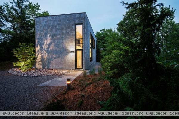
When to use it: To highlight geometric forms. Because of its modular nature, concrete blocks (concrete masonry units, or CMUs) are best used in a regular, orthogonal configurations. CMUs are manufactured in increments of roughly 8 feet, with the most common size being 8 feet wide by 8 feet deep by 16 feet long. With a variety of textured finishes, colors and installation techniques available, the humble concrete block can be used to create a great variety of surface appearances, from angular and sharp to irregular and stone-like, as in this example.
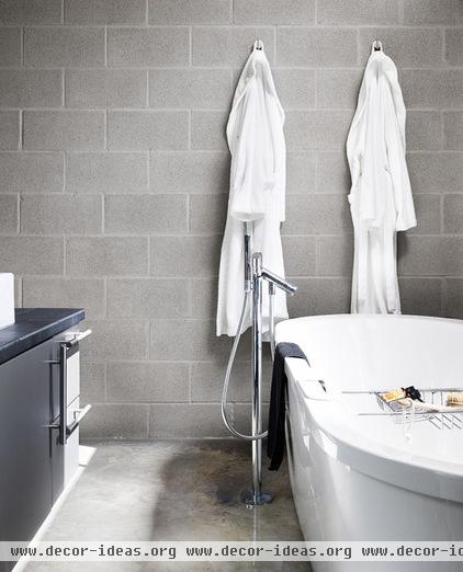
Concrete block is an extremely affordable and durable material that can be used in almost any environment. Perfectly suited to wet environments, the CMU here mimics a muted gray limestone. The even tone and subtle joint tooling make it an unassuming backdrop to the crisp white tub and polished fittings.
Concrete Sheet Goods (HardiePanel, Cembonit)
Aesthetic: Crisp, vibrant (depending on selected color), sculptural
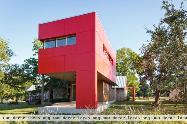
When to use them: To accentuate volume and shape. These are slightly more versatile than plywood, as they have excellent weathering characteristics. They’re sold in 4- by 8-foot and 4- by 10-foot sheets, and joint patterning and module are important parts of the overall design. The rectilinear panel shapes lend themselves to geometric compositions such as the one here. And, while one could argue that the bright red is far from humble, consider the bright red barn: simple in form, volume and material.
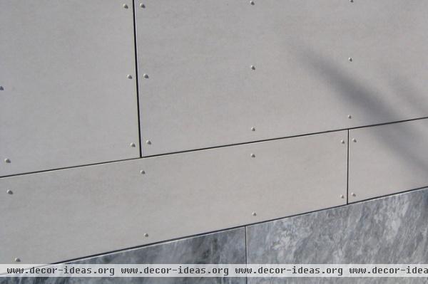
Simple details are the only adornment this humble material requires. Exposed fastener patterns punctuate the planar wall surface here, quietly delineating the supporting wall studs behind. Shadowed reveals at the panel edges hint that the system is acting as a screen to shed water, allowing air to move behind the thin skin, keeping the wall system dry.
More Design Workshops:
Wonderful Material Marriages
Getting a Feel for Steel
Related Articles Recommended


