Best Ways to Use Radiant Orchid, Pantone's Color of 2014
http://decor-ideas.org 12/07/2013 15:10 Decor Ideas
I must confess, I was not a huge fan of Pantone’s 2013 Color of the Year, Emerald, as I tend to prefer greens that have more yellow in them (chartreuse) or blue (turquoise). So I was pleased to see Pantone’s new Color of the Year for 2014, Radiant Orchid — mostly because it represents a complete 180-degree shift from Emerald, as the colors are opposite each other on the color wheel. Let’s take a look at this head-turning — and sometimes head-shaking — color.
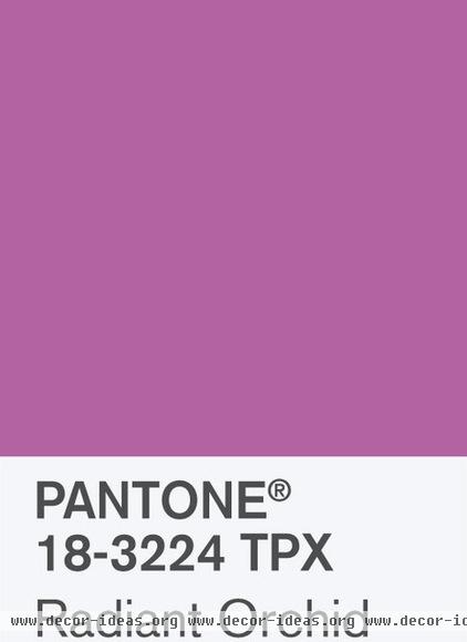
Wondering exactly what color Radiant Orchid is?
Leatrice Eiseman, executive director of the Pantone Color Institute, says, “An enchanting harmony of fuchsia, purple and pink undertones, [it] inspires confidence and emanates great joy, love and health. It is a captivating purple, one that draws you in with its beguiling charm.”
Sounds good, but I was curious to find out people’s reaction to the color.
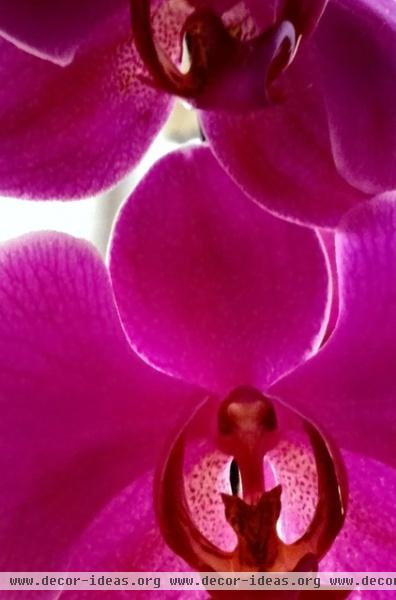
I conducted an informal and completely unscientific poll among my friends on social media, and Radiant Orchid got mixed reviews. One of my friends commented that she likes this color for orchids, and that’s about it. Another friend finds it insipid and too similar to mauve — a color she associates with dental offices from the ’80s. Ouch!
But another friend thought the color would work well for one of her quilting projects, perhaps used with shades of gray or soft green.
A poll conducted by Houzz showed similar mixed feelings, so I decided to find examples of successful uses of the color to see if I could change some minds.
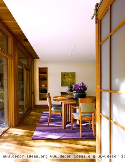
Here’s a nice example of how to use Radiant Orchid in a room, via an area rug. Because it’s rather bold, the color packs a nice punch when used as an accent through furnishings and accessories.

House Pet Carpet Tile, Hummingbird And not that I advocate changing out the colors in your home every year with each passing color trend, but an area rug is a smart way to use a bold color in your home; if you grow tired of the sassy hue, it’s easy to replace it.

While I would advise against painting all four walls of a room in orchid, it does make a terrific accent wall color. Pair it with plenty of neutrals, such as white, gray and tan, to let it take center stage and keep it from clashing with other bold colors.

That’s not to say you can’t add a generous dose of the color in a room. I love how orchid hues are used in this bedroom. The color is cut with neutrals and therefore doesn’t feel overwhelming or monotonous. It’s a sophisticated yet fun space.
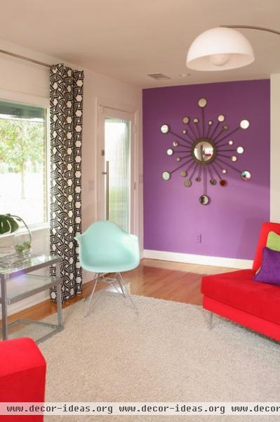
If you want to work other colors into the palette besides neutrals, look to analogous colors, or colors that are adjacent to purple on the color wheel — red and blue. This will give you a palette that is colorful yet harmonious.

For a dramatic and elegant vibe, pair Radiant Orchid with black. This is an unusual color palette for a kitchen, but I like it. The punch of lively orchid adds such personality.
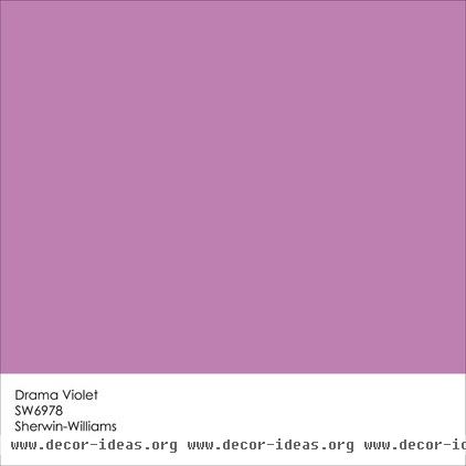
If these orchid hues are growing on you, Drama Violet from Sherwin-Williams is a similar color.
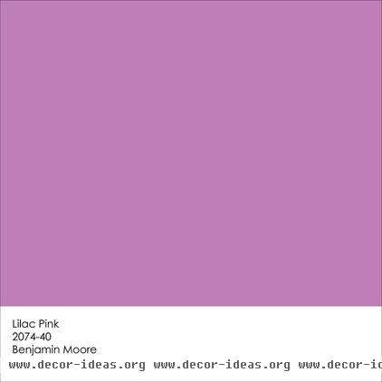
Benjamin Moore’s Lilac Pink is also a nice option.
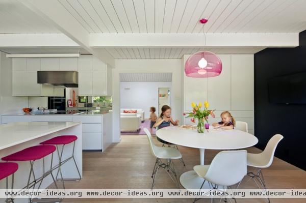
But don’t limit the hue to just rugs or wall color; consider using a shade of the pink-purple hybrid in more unusual places, such as light fixtures.
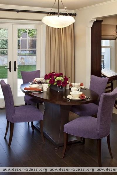
And don’t forget your furniture — upholstered dining room chairs are a terrific place to add a dash of fun orchid.
Cast your vote: What do you think of Radiant Orchid? Would you use it in your home? Take the Houzz poll
More colors of the year:
2013: Emerald
2012: Tangerine Tango
2011: Honeysuckle
Related Articles Recommended

