Kitchen of the Week: Breathing Room for a California Family
A San Francisco Bay Area couple raised their children in this home, which worked well enough during that time. But when the kids moved away to start their own families, the couple redid their kitchen as an open concept, creating a more comfortable place for the growing family to spend time together.
The once-confined kitchen needed to be open and inviting for their throngs of friends too, and function like a dream regardless of how many bodies were in it at any given time. And just as important, it needed to have storage to spare. “In all of our 42 years of marriage,” says one of the clients, “I’ve never had room to have all of my accumulated kitchen stuff in my actual kitchen until now.”
Kitchen at a Glance
Who lives here: A couple with grown children
Location: San Francisco Bay Area
Size: 400 square feet
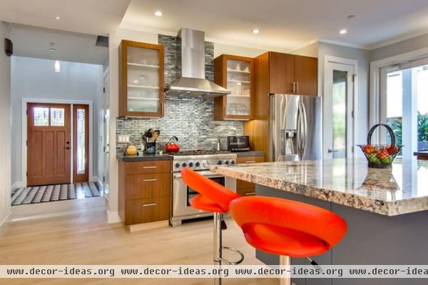
“The project started with the desire to make the kitchen the heart of the house,” says project architect Eugene H. Sakai of Studio S Squared Architecture. “And it is, both functionally and in its location: It’s smack dab in the middle of the house’s floor plan.”
Bar stools: Lamps Plus
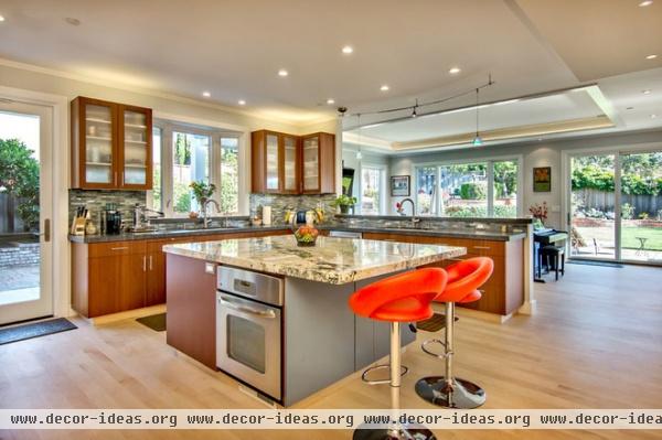
Sakai removed walls from the original kitchen to open it up to the dining room. Additional space came from an adjacent bedroom, which was in turn relocated to another part of the house. “Though there was now plenty of space to work with,” says Sakai, “the challenge was to make it easy to pass through in order to get to the living room and backyard.”
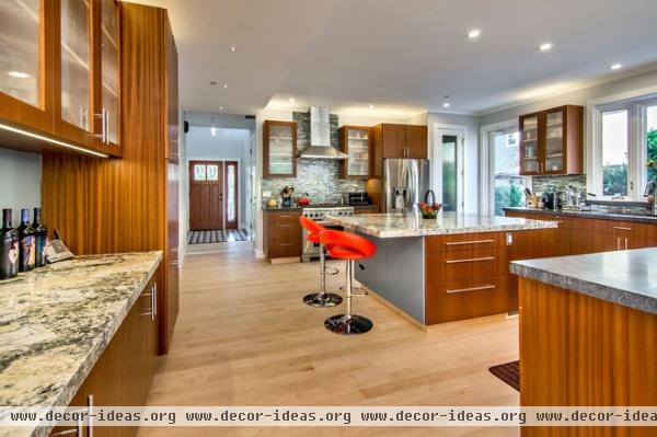
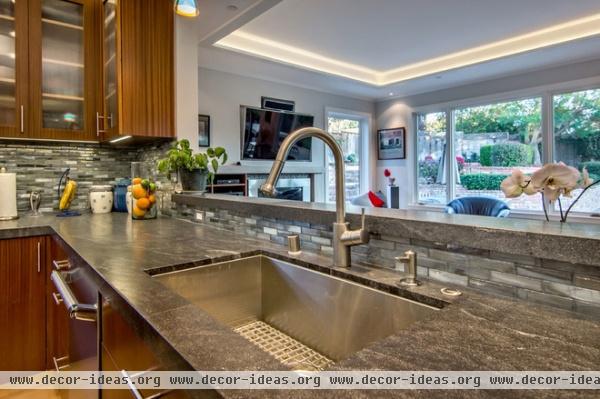
Generous walkways offer ample room for large crowds to flow in every direction. These wide clearances are perfect for the couple’s current social and cooking needs but are also designed for accessibility, should someone in the household ever use a wheelchair.
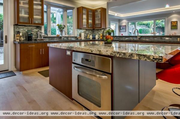
The kitchen centers on the 5- by 7-foot island with special functions on all four sides. “One of the problems with an open floor plan is that there is limited wall space,” says Sakai.
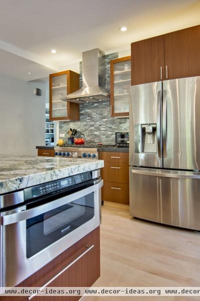
The island solves this by housing a GE oven on one side, a garbage and recycling station and a Sharp microwave drawer on another, and a three-drawer system for everyday needs on a third side. Even the bar seating area offers hidden storage.
Sakai credits the owners for working out the details of the room. “They were very thoughtful with their vision of how they wanted to use the space now and down the line.”
Range hood: Zephyr
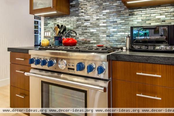
The perimeter of the kitchen is just as functional. Matching drawer systems flank the 36-inch Thermador range, while cabinets with ¼-inch beaded glass border the 36-inch Venezia hood to provide the couple with everything they need to prep and plate food.
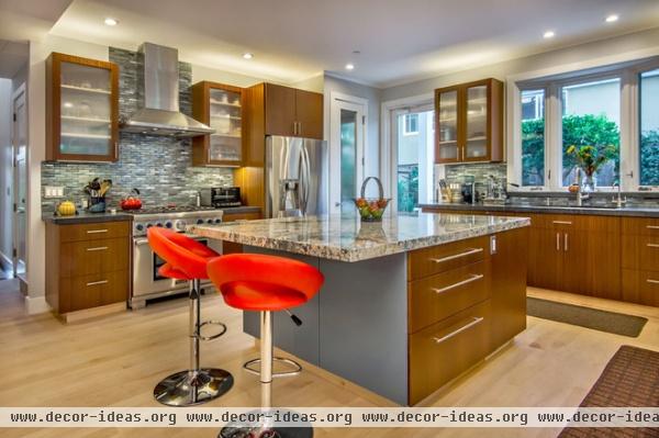
Next to the LG fridge is a walk-in pantry that has the same beaded glass as the cabinets. The 8-foot door and dropped upper cabinets are lit from above to draw the eye to the ceilings, which are 9 to 10 feet high. The original ceilings were 8 to 9 feet tall, but when the clients discovered space above, they took advantage of it.
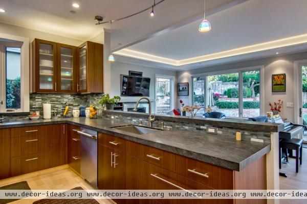
“The tall ceilings, especially the great room’s tray ceiling cutout, opens up the entire space and strengthens the connection to the backyard,” says Sakai.
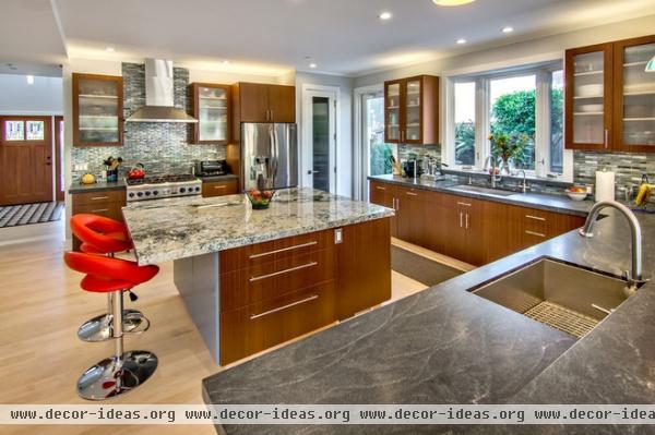
The varying ceiling heights also give the room a chance to play with lighting. The owners worked with City Lights to come up with a design to create the right ambience at any time of day using a combination of recessed cans and Aion LED lighting strips above and below the cabinets. Bulbs that are 3,200 Kelvin provide an even hue that’s not too yellow and not quite blue and shows off the sapele cabinets.
Those sapele wood cabinets were integral to the kitchen’s overall aesthetic. Once the couple settled on that material, the other finishes fell into place.
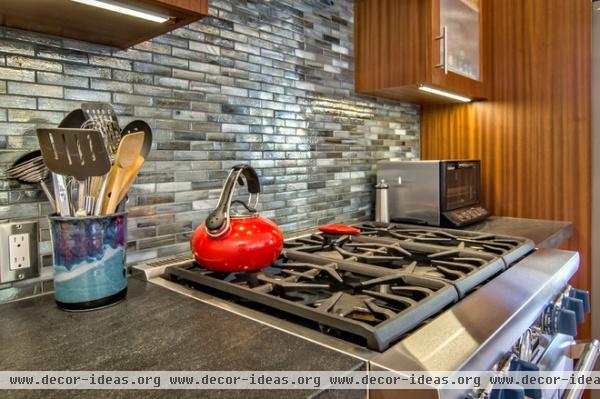
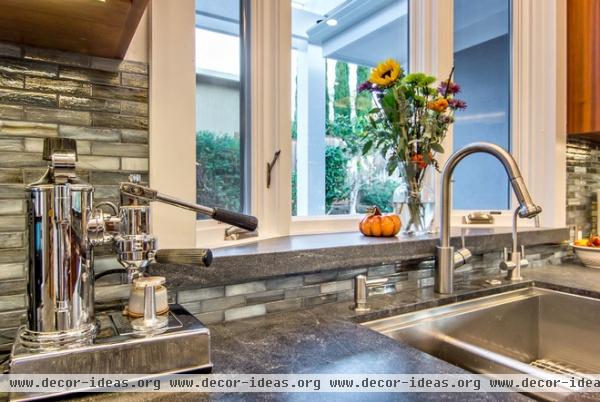
With the help of interior designer Kara Silkwood of KDS Design, the team chose Carpe Diem granite for the island and bar, and honed Virginia Mist granite for the perimeter. The backsplash is made up of 1- by 4-inch Vihara tiles in an iridescent Metta Irid color.
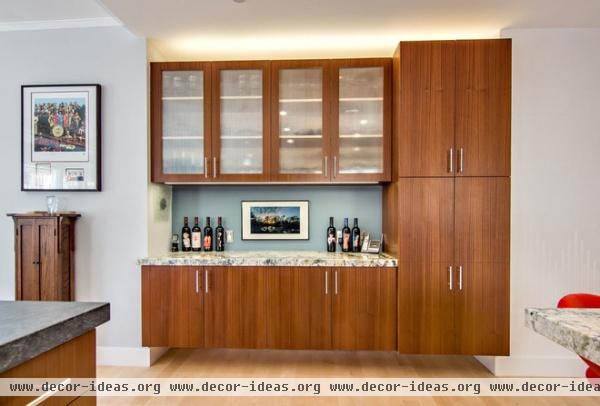
Most of the cabinets have toe kicks that match the maple floor’s natural color. The design makes the cabinets look as if they’re floating. The exception is the bar, which in fact does float 8 inches off the ground. They clients love the feeling of openness it provides.
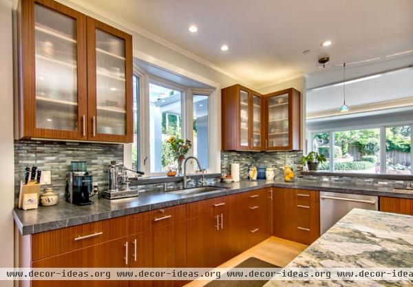
The bay window over one of the kitchen’s two large sinks replaced a flat wall window. “It too gives the space more breathing room that the previous design lacked,” says Sakai.
After 42 years together, the homeowners are finally getting to enjoy the breathing room and storage space they’ve always wanted in a kitchen.
Dishwasher: Thermador


