Timeless Design Ideas for Small Spaces
Inspiration can come in all shapes and sizes, and I’d argue that it can also come from any time. Architects and designers look to the past all the time, if to varying degrees, but generally the 21st-century tendency is to reward the new and the innovative. Publications, both print and online, cover trends that seem to be displaced as soon as they’re written about, meaning that books and magazines 10, five or even one year old are often obsolete and forgotten. I think that’s a shame.
A case in point is a book I found at a used-book store recently, titled Small Spaces, recently republished as a new paperback edition. It was written by Azby Brown and originally published by Kodansha International in 1993, and I was surprised to see how fresh (or is it timeless?) the ideas and projects inside were. It prompted me to considering taking some its 15 chapters and creating an ideabook focused on the book’s theme: “Limitations imposed by lack of space can largely be overcome by intelligent design.”
Not surprisingly, Brown lived in Japan while writing the book (and still does), having moved there from New Orleans. With space constraints that boggle Americans, Tokyo and other places require creative solutions for living in small spaces. Some techniques Brown discusses are:
• Horizontality, so small spaces feel larger
• Lighting, color and pattern, to make small spaces bright and light
• Taking small spaces seriously, so every bit of space is considered important
• Compactness and flexibility, so small spaces are used throughout the day
My interpretations of Brown’s inspiring chapters include Western architecture and interiors. Admittedly, ideas from the East and the West go back and forth fairly seamlessly; cultural norms (for example, sitting on the floor versus sitting on sofas) play a part in defining spaces, but not as much as they used to. I hope the ideas that follow (and the links to past ideabooks with similar themes) will resonate with you, whether you live in a small space or not.
![modern living room by thirdstone inc. [^]](http://www.decor-ideas.org/upload/cases/2013-12-04/photos/middle/2216320131204074503456087142400.jpg)
Thinking Minimalistically
The first chapter in Brown’s book presents a project by Tadao Ando, a Japanese architect known for concrete formed and poured to perfection, and for sparsely furnished abodes.
But minimalism need not be lack of stuff. Another way to think of it is as keeping spaces clear by putting the stuff away. Therefore lots of easily accessible storage (easily accessible being the most important part of this tactic) works best in freeing spaces from clutter.
A Mini Guide to Minimalism
Living Low
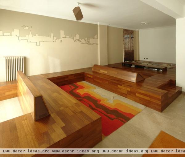
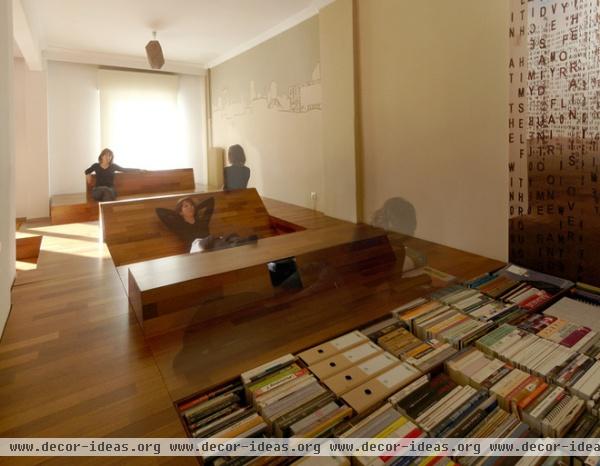
If there is one technique in Brown’s book that would find the most resistance in the West, it’s definitely sitting on the floor or sleeping on futons on the floor. Yet as this apartment in Greece shows, such a tactic is individual rather than cultural. Areas of sitting and lounging are formed by wood strips that snake around the living area to become benches and flooring.
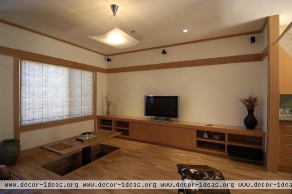
A more directly Asian-inspired precedent can be found in this dining table that lifts from the floor. People then sit on the floor and place their legs in the space below the table; sometimes this space is heated to warm the body in colder months.
See more of this house
Level Changes
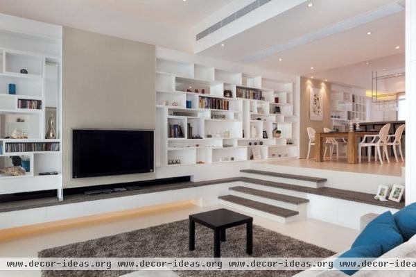
Changes in floor level, even those much less pronounced than what’s shown here, can create zones within a space without the use of walls. This Hong Kong residence has a sunken living room on the way to the rear yard. Here the wall shelving enables the space to work in a minimalist way, and there’s potential for building storage into the face of the raised floor. Some strip lighting occurs below the television, encouraging the owners and guests to live low.
Bringing the Outside In
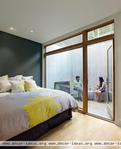
While providing an outdoor space eats up some usable indoor space, it goes very far toward improving the quality of the interior, bringing in natural light and providing a connection to a slice of nature, be it a tree, some plants or even the sky.
The Case for Interior Courtyards
Furniture for Small Spaces
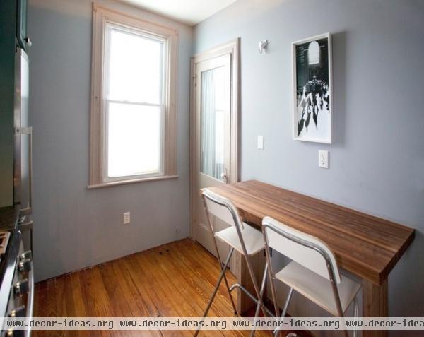
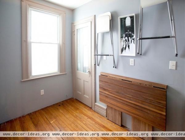
Brown promotes modern furnishings that have more transparency than their traditional counterparts, particularly chairs. But I’m partial to folding chairs for the ease with which they can be stowed away. This small kitchen and eating area is a perfect example, given how both the chairs and table can be folded to be stored.
Voilà!
Know When to Fold ‘Em
Under the Floor
Returning to the apartment in Greece, another part of the room has a built-in bookcase placed 90 degrees from the norm. It is one example of using the space created by building up a floor for storage. Hatches that double as flooring are another good means of providing access to whatever is below the floor, therefore allowing one to traverse the floor.
Stairs
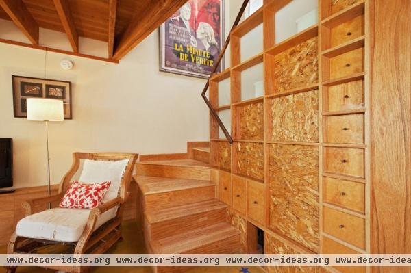
One of the most obvious places for storage is under stairs, a place that can’t really be used for anything else, except for perhaps a desk. There are many ways that storage in and under stairs can work: drawers in riser faces; hinged stair treads; and drawers, shelves or cabinets on the side, as in this example.
What’s Hiding Under the Stairs?
Odd Corners and Dead Spaces
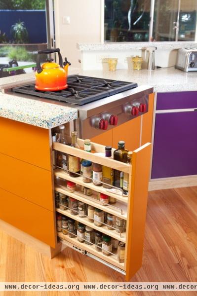
If there is one area in the American home that is designed down to the fraction of an inch for efficiency, it is the kitchen. Every little bit of space outside of appliances and clear floor area is often used for some sort of storage — no dead space. Here is a narrow spice rack that also caps the end of the oven and provides a little bit of counter space.
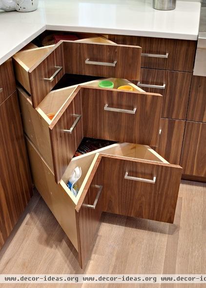
Corners in kitchen cabinets are the most common dead spaces, and kitchen designers go to great lengths to find the ideal fix. One technique (that’s not yet perfect, yet pretty clever) is the corner drawer.
Kitchen Storage Solutions for Every Nook
Storage That Moves
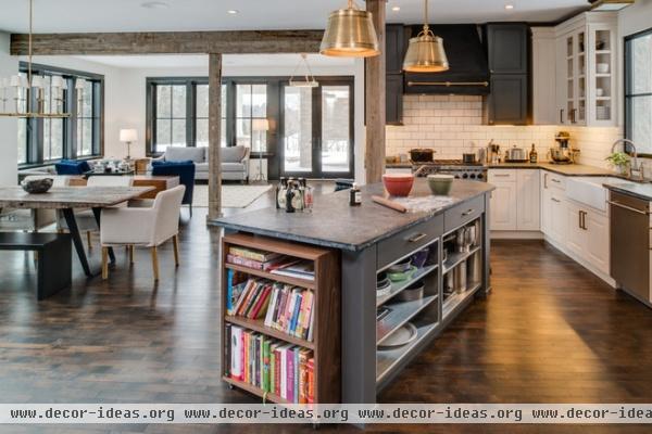
Casters are a great thing for furniture pieces that will be moved on a daily basis, or for items that will be repositioned less frequently. The storage unit in the foreground here fits snugly underneath the kitchen island …
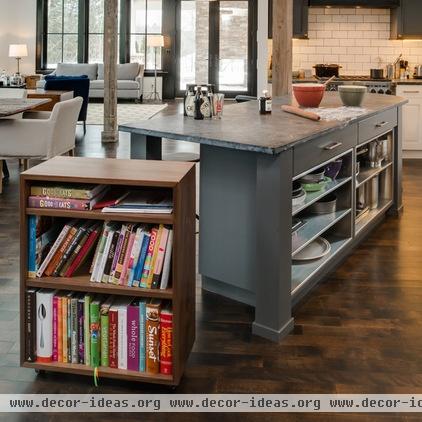
… but it can be rolled out to make room for another person at the island, or it can be moved elsewhere to serve as a side table or something else.
Kitchen Storage Goes on a Roll
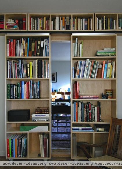
Really daring people should even explore movable bookcases, such as the “bookmobile“ shown here.
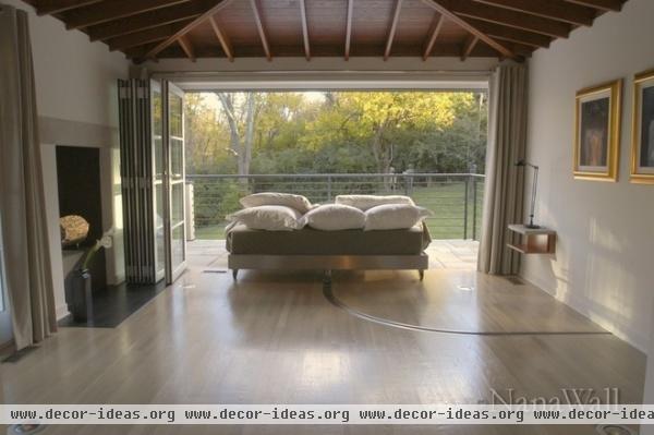
And why limit moving furniture to storage items? In this space the bed moves away from the wall to be positioned in the opening of the sliding wall, just right for soaking in the view.
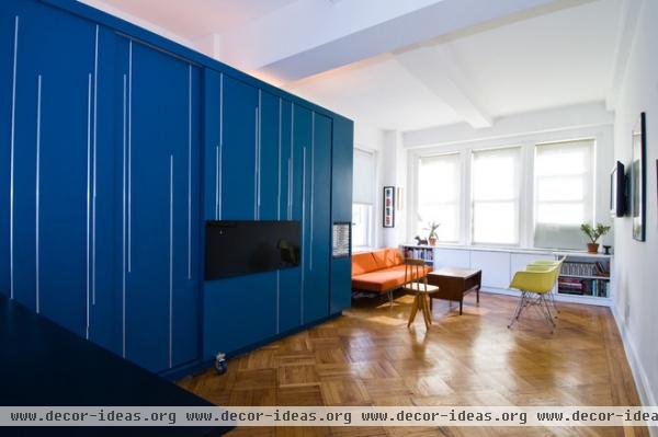
Disappearing Acts
Some of the most creative projects on Houzz are those that make a small space appear bigger with furniture that’s tucked away when not in use. These disappearing acts focus mainly on beds, so that a space can serve as a bedroom at night and as a living room, office or other space during the day. The aptly named 400-square-foot Unfolding Apartment in Barcelona is one of my favorites. (The caster just below and to the left of center hints at the transformation that can take place.)
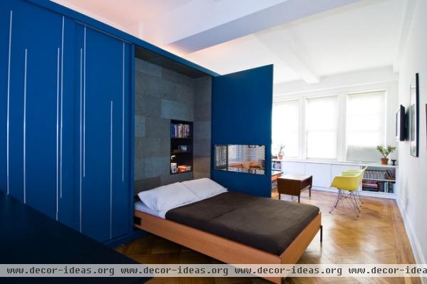
A panel swings and the bed drops to turn the open living space into a bedroom. The panel is a super idea, for it creates a sense of privacy and cuts down on sunlight from the windows.
See more inspiring Murphy beds
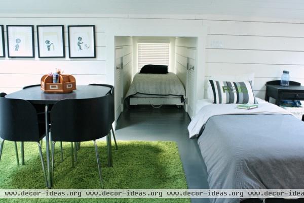
This house for a family with six boys features an alcove in the upper-story boys’ bedroom, where four of them sleep. It’s just big enough for stowing away a bed that can be pulled out for sleepovers. It’s a neat idea (but one that cuts down on daylight, unfortunately), but I’m drawn also to the Ikea Fusion Table and Chairs, which work together to make a small footprint when the chairs are not in use.
Convertible and Multipurpose Pieces
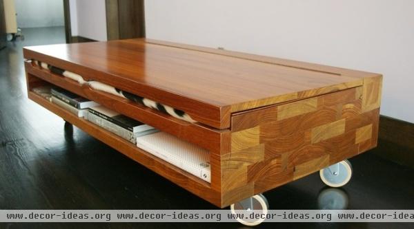
Going hand in hand with flexible arrangements in small spaces is the desire for elements to have two or more functions. Many Americans have had at least one piece of furniture in this regard, most likely right out of college: the futon. Serving as a bed at night and a couch during the day, the futon is the most basic of convertible and multipurpose furniture. Pictured here is a piece that is intriguing: It has casters, some room for storage and what looks like cowhide poking out below the top.
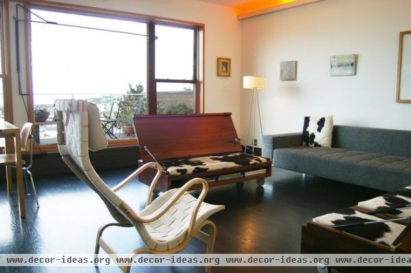
The lid opens to transform the piece from a coffee table to a bench for sitting.
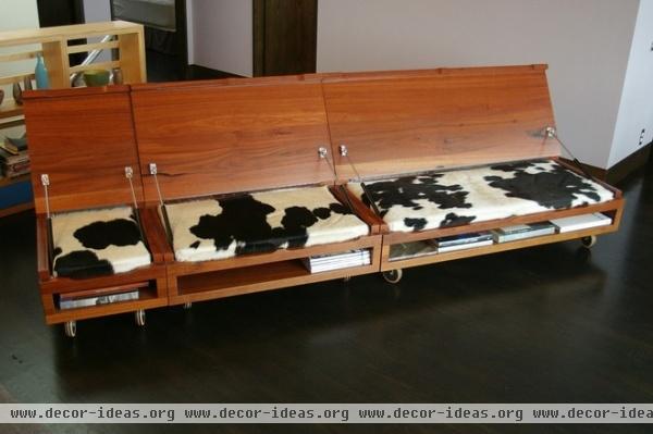
Further, three different-size pieces work together both open …
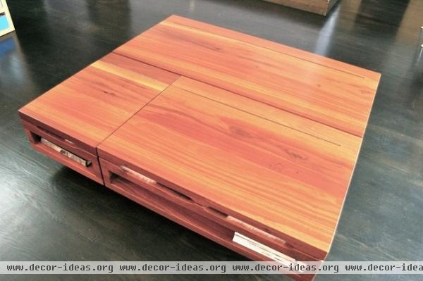
… and closed.
More clever double-duty furniture
Just for Bathrooms
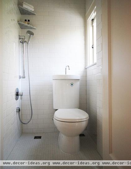
Size and efficiency really matter in bathrooms too. This bathroom is the size of a powder room, but it has a shower, sink and toilet (the latter two combined) packed into a tiny space. The toilet-sink is a clever design from Japan — water for refilling the tank comes through the faucet when flushing, so people don’t use excess water to wash their hands.
Just for Kids’ Rooms
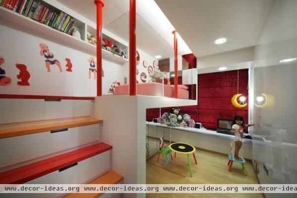
Brown ends his book with a chapter on design ideas just for children’s rooms, which incorporates ideas from previous chapters (level change, for example) but at the scale of smaller bodies. This space has a loft bed, and the steps double as storage. Underneath is a play area with more storage and a wall that wants to be drawn on.


