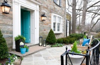
Flower Power: Pick Your Palette From Posies
Fall is a riot of color here in Northern California’s Wine Country. Majestic purple grapes nestle amidst verdant vines that have transitioned from green to brilliant red, bright yellow and even deep burgundy. The rosebushes that border each vineyard are still in rampant bloom, dressed in every possible shade of crimson, pink, orange, yellow and cream. The trees that bow and flutter along the roadside still sport their summer green, now tinged with autumn’s scarlet and gold. It’s so beautiful that I find myself abandoning my writing and scurrying outside to drink it in.
This prodigious display of color feeds my decorative juices, and I find myself designing rooms in these same palettes. Nature surely demonstrates how to approach color for a look that is welcoming, inviting and heartwarming. Your new color scheme may be waiting right outside your front door.
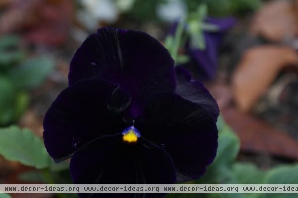
The regal velvety purple of this common pansy reminds me of the Bible verse that says, “Consider the lilies of the field. They never toil or spin, but even Solomon in all his glory was not arrayed like one of these.” This purple is a magnificent color, perfectly accented by intense yellow and a touch of soft blue.

Given its formal furniture, this bedroom could have been stiff and unwelcoming. But the pansy’s color scheme gives it instant warmth.
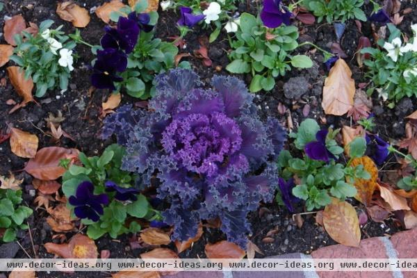
Lavender and purple tinged with sage make for another winning color combination in kale. Add the charcoal of the earth and the brown of the leaves for a completely and naturally scintillating palette.
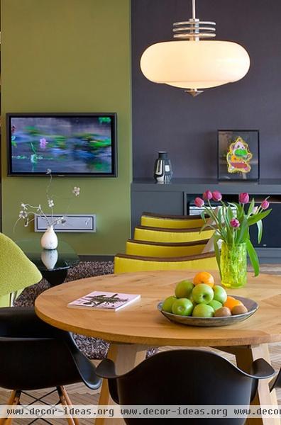
See how that works in this room? Lavender and sage bring life and interest to sleek, modern furnishings. The charcoal dining room chairs anchor the scheme, and the living room’s bright yellow upholstery (a nod to the pansy) is just right. In this setting even the TV looks good!
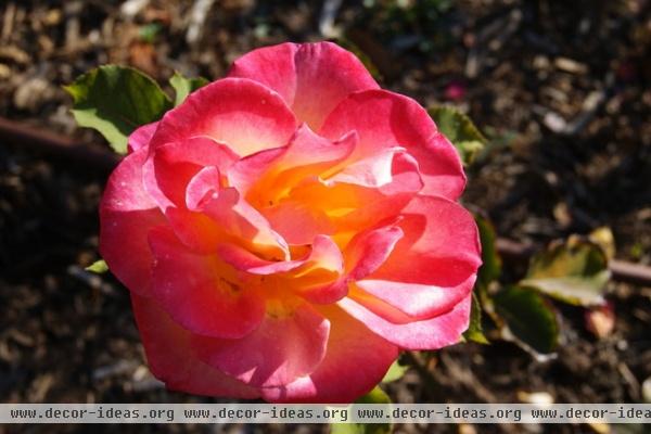
Full-blown roses provide a case study in the relaxed, unmatchy use of color. Reds, pinks, oranges, yellows and creams often coexist gorgeously in the same flower. This particular bloom is practically monochromatic for a rose, so it offers a lovely, soft palette for a subtle but welcoming room …
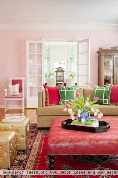
… like this one, whose casual color combination works so well. The warm pink of the ottoman does not match the red of the carpet or the lavender-leaning pink of the walls. But do you see our rose’s color scheme? The spring-green pillows on the sofa bring home the organic influence.
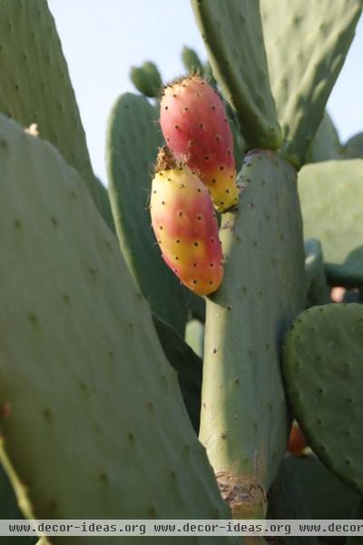
The prickly pear cactus is a textural marvel. And although its flower lasts only one day, it is followed by this tasty fruit, in lovely soft yellows and tangerines. Again, see how the sage provides the perfect backdrop for the colorful fruit.
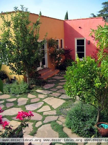
What could be more appropriate to a Southwest exterior than the colors of the prickly pear? I want to live here!
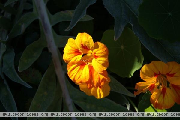
The prolific multicolored nasturtium is one of my favorite flowers, primarily because it thrives on neglect. It also makes any average green salad exceptional! The neon yellow of this variety pops off the rich green foliage, and its red accents insist you take notice.
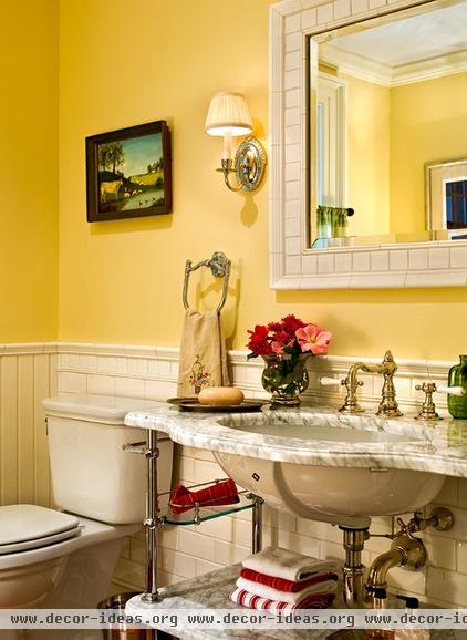
Paint nasturtium’s color on your walls and enjoy the loveliest jolt of color. The red and white towels perfectly mimic this flower and make this bathroom sparkle.
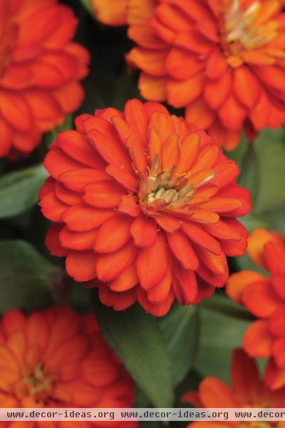
Then we have rust and green. But the rust in these zinnias modulates from tangerine to apricot — even yellow — teaching us to use varying shades of the same color if we want to achieve a natural feel.
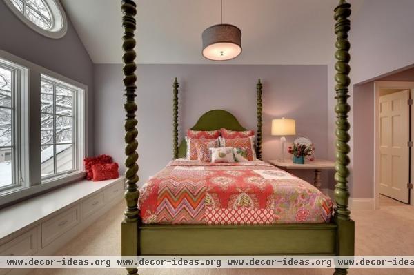
I happily applaud the color courage of this homeowner, who painted her fabulous bed a lively green and then dressed it in multiple tones of rust. Spectacular.
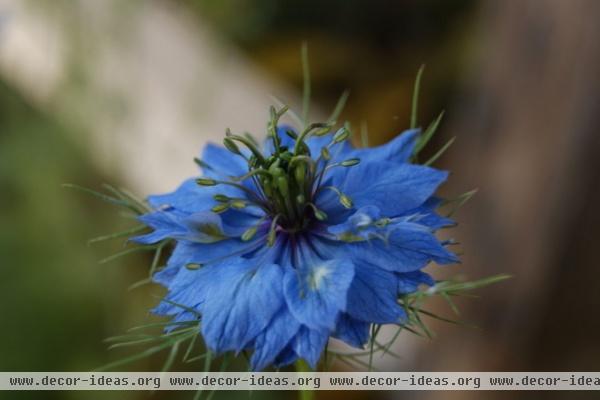
I am going to display my shamefully limited knowledge of botany, but do you suppose this is some exotic kind of cornflower? Whatever it is, the sapphire blue is magnificent, as is the deep olive of its stamen.
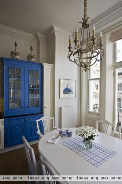
Cornflower blue is a medium to light blue — a color with very little green in it. You can see from this painted hutch that it makes a striking stand-alone color statement.
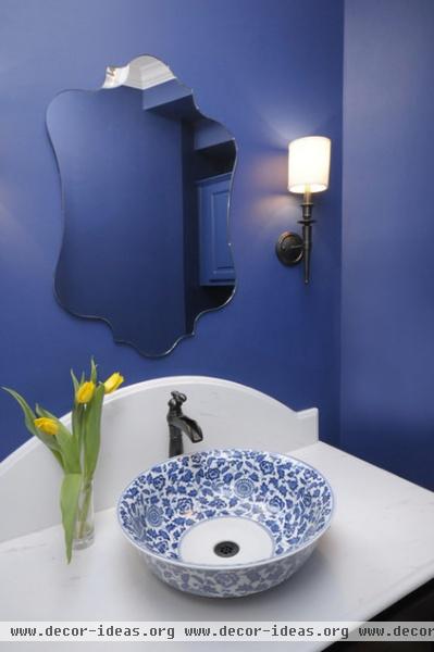
It also makes a dynamic wall color, particularly in a powder room, where you want to create a lot of impact in what is otherwise a small, mundane space.
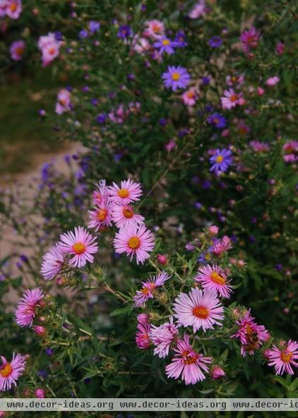
The blues and violets of these asters totally enchant me. I could see a room done in just these colors.
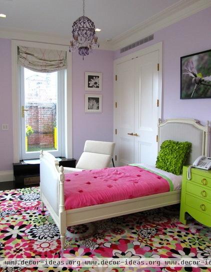
And here it is, with the surprising addition of that fabulous lime green chest. I am entranced and delighted by the insertion of a sleek leather chair into this otherwise cottage-y room.
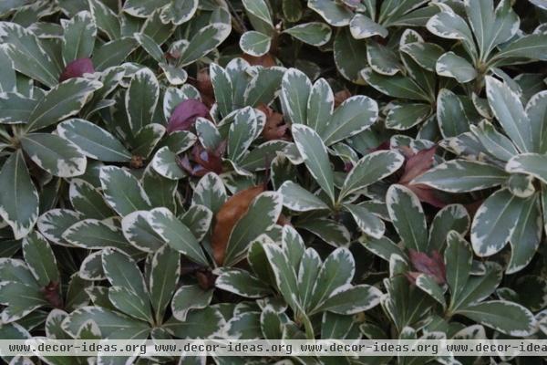
If you love a neutral palette, consider this variegated-sage-colored ground cover. After all, I have long preached that green in all its manifestations is the truest of all neutral colors. It goes with any other color and adds life wherever it is used.
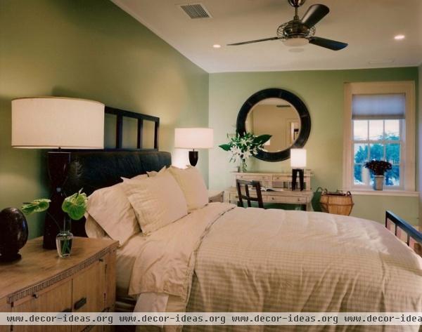
Even though it appears nowhere but on the walls, sage warms and enlivens the neutral scheme of this bedroom. Imagine how the life would drain from this room if the walls were painted the same cream as the bedding.
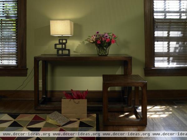
The slightly deeper color of sage on this wall gives interest and life to the dark stained tables, and the pinky-red accents are just right.
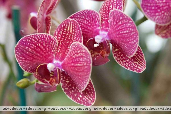
And then there are orchids, in all their wealthy variety of color. I particularly love this lavender-y pink-rust (isn’t that a great designer description?) for the warmth and glow it brings to rooms.
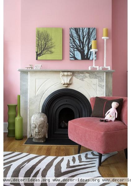
Rooms like this one! Look how the green vases, and the green of the artwork, make this wonderfully colored room sizzle.
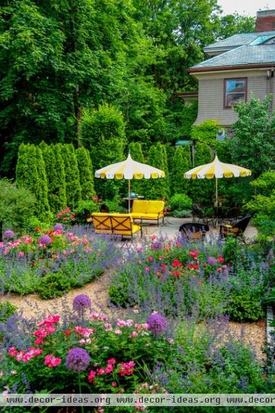
And then there is the English garden, for those of us who simply cannot get enough colors and love to mix them all.
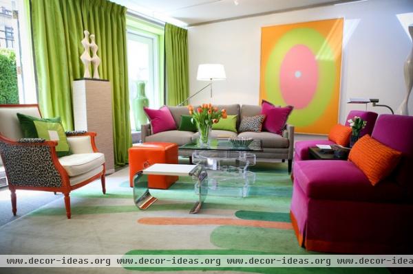
Greens, oranges, yellows, lavenders, purples, pinks — this relaxed, comfortable, inviting and organic approach to color is very hard to get wrong. You are simply mimicking what nature has already done.
And when someone says to you — as will undoubtedly happen — that flower garden colors are meant for outdoors, not indoors, just smile indulgently, proceed to pick the palettes from nature that you love and go for it.
More: Inspired by Nature: Purple and Green

