Traditional Style Even a Modernist Could Love
At the beginning of the year I wrote a list of 10 resolutions for my ideabooks throughout 2013. Like many resolutions, the intent was sincere, based on things I wanted to improve, but the outcome was partial. One of the 10 points that I didn’t delve into much, if at all, is “embrace the traditional,” in which I said: “Some traditional design strikes my fancy, though I’m often at a loss as to why. Perhaps it’s design that isn’t self-conscious about being traditional. Whatever the case, the buildings that strike my fancy, whatever their style, will find a way into my ideabooks.”
If you follow my ideabooks, you know they tend to be almost exclusively in the modern/contemporary vein, though on at least one occasion I dipped my toe into a traditional-yet-modern Houzz tour. So with most of the year over, it seems time to explore the why in my statement above; why do some traditional designs strike my fancy? This ideabook presents some projects I find interesting, but ones that don’t fit into my usual interests. They are neither strictly traditional nor modern/contemporary; they bridge these realms to create interesting hybrids. I’ll try to talk about the appeal of each house, digging below the surface characteristics of style to get at some of the deeper qualities, dealing with scale, space and material.
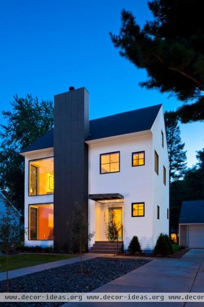
The project that illustrated my resolution to embrace the traditional is the remodeling of a two-story gabled house in Minneapolis. The prominent chimney splits the house into two halves, where the windows on the left are much larger than those on the right. This liberal (and literal) carving of the old house gives new life to it by giving each room its appropriate window (be it big or small), rather than strictly composing the facade through repeated windows in a more traditional manner.
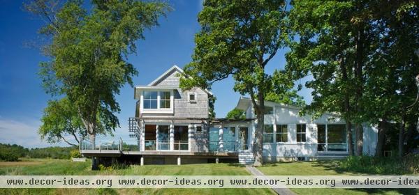
The Marsh House, outside Boston and designed by Estes/Twombly Architects, is appealing for its informal and non-self-conscious architecture. It is made up of a two-story gable form (left) and a one-story volume under a shed roof (right), linked by a glazed walkway. Like the previous house, windows are sized and located depending on the needs of the rooms. One that stands out is the second-story corner window that appears to cut into the gable.
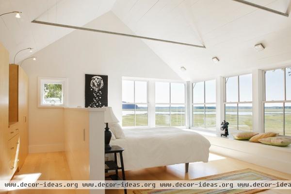
The corner window serves a bedroom that is blessed with a beautiful panorama of the feature the house gets its name from. Note how the small square opening responds to the room, providing light and view but also privacy in the dressing area in front of the wardrobe.
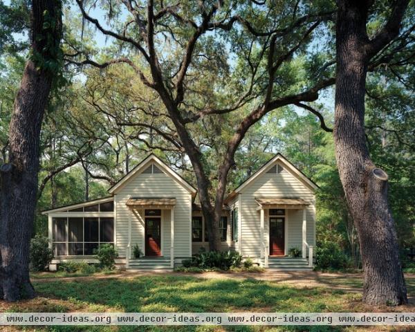
Just like Americans seem to find Southern accents sexy, there is something appealing about architecture of the Deep South, especially houses. Yet instead of the grant plantation mansions with wraparound porches, I’m fond of small houses nestled into their surroundings, like this piece of a residential compound in Spring Island, South Carolina. My favorite part of Historical Concepts‘ design is the way the house splits itself around the tree, saving it but also making it an integral part of the building.
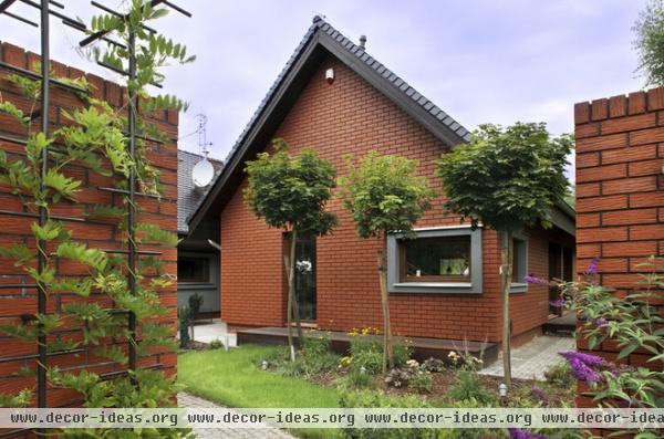
In at least two ideabooks, I’ve professed how much I like gable forms. The gable can be thought of as a traditional form — one that Modernism’s flat roofs tried to abolish — but gables make so much sense in many parts of the world, for shedding rain, cutting down on direct summer sun and other reasons. Therefore contemporary designs that respond to modern construction and conveniences embrace gables as adaptable architectural elements. Such is the case with this “Haus With Stone and Wood.”
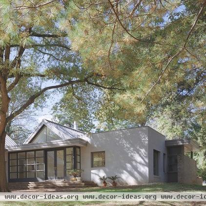
That “gable appeal” can also be found in this house by Randall Mars Architects, where gable and flat-roof forms intersect.
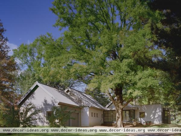
A larger view of the house reveals more gables but also the way the house responds to the site, preserving and embracing a large weeping oak.
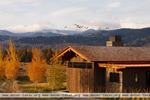
One area where I find the use of traditional forms in new buildings particularly fitting is the American West, in states such as Wyoming, where the rhythm of gable roofs echo the Rocky Mountains. The Watercress Residence designed by Carney Logan Burke Architects for a site in Jackson, Wyoming, is one such example.
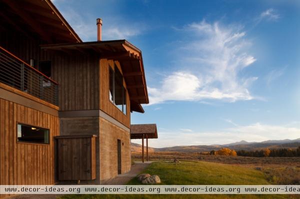
The architects call it “mountain modern,” and here the wood-and-concrete exterior shelters the residents from the often harsh weather, while still opening up the house where needed to take in the beautiful surroundings. Note the large windows above the concrete wall in the center.
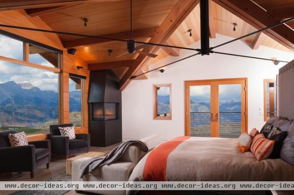
That window, like the Mars House from earlier, serves the bedroom, giving the occupants some stellar views. Here they also have a door to their own terrace.
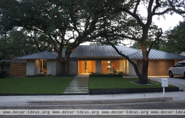
Even though the most consistent characteristic of the more traditional houses that strike my fancy are gable forms, I can also appreciate houses with hip roofs, especially since I grew up in a ranch house in a suburb of Chicago. Webber + Studio’s remodeling of this house in Austin makes it clear how important the roofing material is with hip roofs. The standing seam metal gives the house a contemporary feel, aided by the large windows below the eaves.
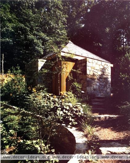
Another aspect of traditional design that I appreciate is mass, be it heavy walls or the appearance of weight in the way materials are articulated. Large windows have their positive (and negative) qualities, but the virtues of solidly rooting a building in its place and being selective about openings is something I really like and should explore at length at some point.
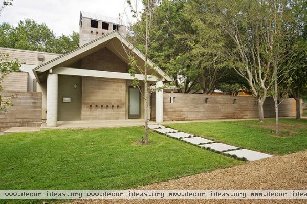
Last but not least, postmodern architecture is something I didn’t appreciate when I was in college in the 1990s — the style started in the 1970s but hitting a peak in the ‘80s and extending into the early ‘90s — but some aspects of it are growing on me. Much contemporary architecture has moved toward forms without precedents, so it’s comforting to discover PoMo buildings with a more understandable scale and link to the past.
More:
8 Gabled Homes Reshaped for Modern Times


