Easy Ways to Hide Your Home's Flaws
Like it or not, most of us do not live in picture-perfect homes with gorgeous kitchens and baths, gleaming wood floors and vast windows that open to stellar views. Take the little California bungalow that Mike and I share. It has some — well, one or two — really great features. The ceilings aren’t spray-on texture sprinkled with sparkly glitter, but wooden planks and beams. The stucco exterior is topped with a tile roof, and tomatoes, artichokes and roses grow rampant around the community pool.
So far, so good. But the carpet looks like 40 years of renters have used it to death (because they have), and the kitchen is an absolutely awful rendition of late-1960s design. Our landlord eschews any paint color but white, and the living room comes with an awesomely ugly heater and air conditioner prominently plastered to the walls.
Can you relate? Have you thrown up your hands in despair and let your flawed or battered home rob you of hope for a beautiful interior? Well, don’t. Almost all spaces will eagerly reflect our personal style and tell our story if we are to willing to overlook, hide or mask their less-than-attractive features.
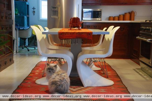
These folks were stuck with dingy and dated flooring, but completely overcame it with a wonderfully colorful area rug. Area rugs are a renter’s best friend.
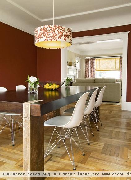
If your landlord allows, take down the invariably ugly light fixture in your dining room and replace it with something you love. This fabric-covered pendant light replaced the existing fixture and made a highly personal statement.
If you own your home, replacing the lights installed by the builder may be the first thing you want to do. Fabulous fixtures do not have to be costly, and what a difference they make!
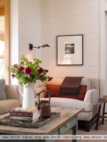
While we’re on the subject of lighting: Older homes and apartments have notoriously poor lighting, and almost all have an inadequate number of outlets. Well-balanced lighting is critical to the comfort and function of a room, so please feel perfectly free to add lamps. If there isn’t room for a lamp table, mount a fixture on the wall, as you see in this picture. (Just hide the cord with a cord cover the same color as the wall.) A word of caution: Our bungalow complex had a fire because a tenant overloaded an outlet strip, so use good common sense.
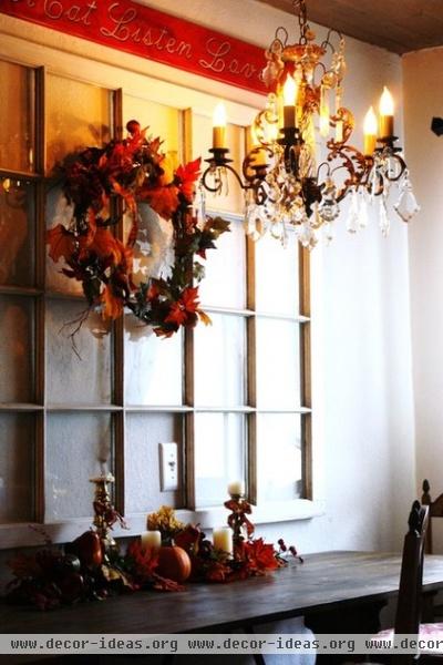
This lovely antique French chandelier has graced our dining rooms in different homes for half of our marriage. So when we hung it in the eating area of our tiny bungalow, we felt immediately at home. But we made sure to safely store the landlord’s light, which we’ll rehang if we ever move.
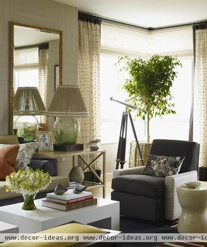
Mirrors are an excellent tool when you want to visually expand an otherwise mundane or dark space, or when you are stuck with those ubiquitous white walls. Look how a spectacular mirror enhances this room. Just be sure your mirror reflects something warm and inviting, as this one does.
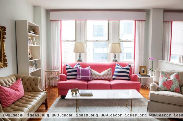
Speaking of white — or worse yet, builder’s beige — walls, don’t let them discourage your design direction. Make them a perfect do-anything-you-want backdrop. This stunning pink sofa makes you not even notice the lack of color on the walls. And the repetition of the color on the curtain trim is just right.
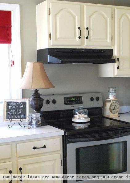
Kitchens and baths can be the most discouraging components of rentals, or of homes where there is no remodeling budget. The best way to love your kitchen is to personalize it, like this tenant did. Add your favorite accessories and your favorite colors.
A tin sign Mike and I bought in Hawaii hangs over my kitchen sink. It features a crowing rooster and the words “Wake the hell up! Rooster Brand Coffee.” Every time it catches my eye, it makes me grin. And you know what? When guests come into my kitchen, they don’t see the dated cabinets; they see my rooster sign, and they chuckle.
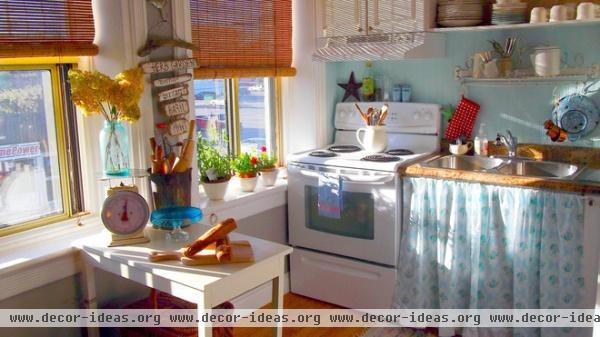
Obnoxious plumbing and improbably limited counter space are standard equipment in many rentals, particularly if they are old. Hiding the pipes with a skirt is one time-honored solution. Another is to build shelving under the sink and around the pipes. Not only do you gain much-needed storage, but you effectively block the plumbing from view. Adding a stand-alone table or island greatly enhances the workspace, if you can make one fit.
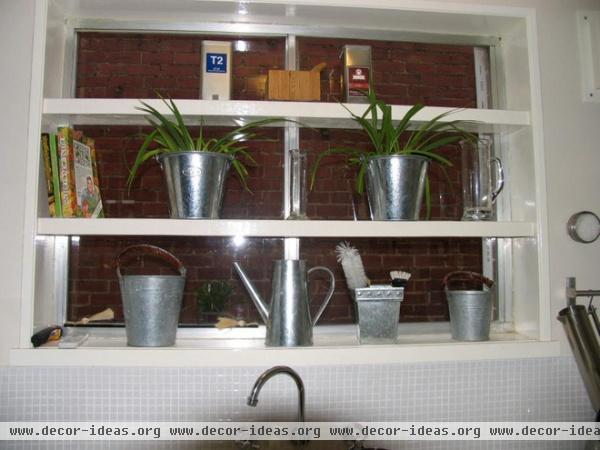
Another frequent feature in apartments is the view — or lack thereof — from the window over the kitchen sink. Adding shelving over the window is such an awesome way to take the focus off what is outside while parading your personal style. And your landlord needn’t fuss; it can be easily removed when you move.
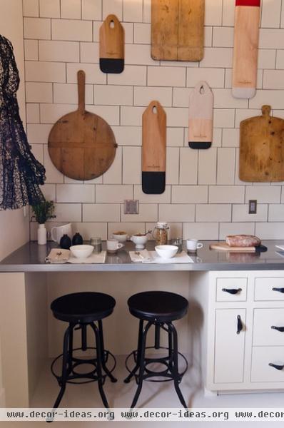
How about hanging kitchen collectibles on the wall? Or displaying kitchen necessities, like the pots and pans that hang in our bungalow kitchen? Anything you do that adds interest and a story to an otherwise nondescript and utilitarian room will serve to increase the feeling of welcome.
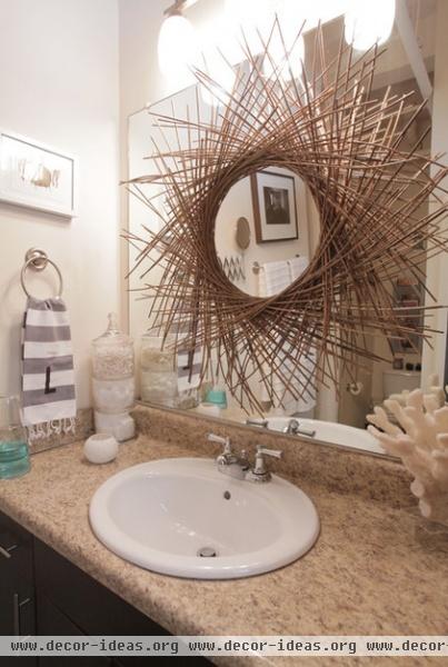
I love the way this bathroom has been personalized. The organic wreath — along with the piece of coral and the striped and monogrammed hand towel — makes this room welcoming and memorable.
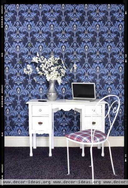
You may even want to consider removable wallpaper, like EasyChange from Sherwin-Williams. This is such a terrific way to put a personal stamp on your home, and if you move, you can take it with you.
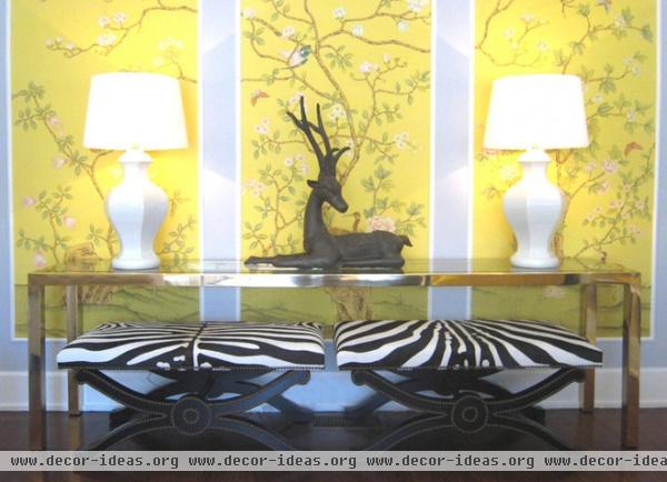
If papering a whole room is more than you want to tackle, consider wallpaper panels, as shown here. Really a fabulous look, isn’t it?
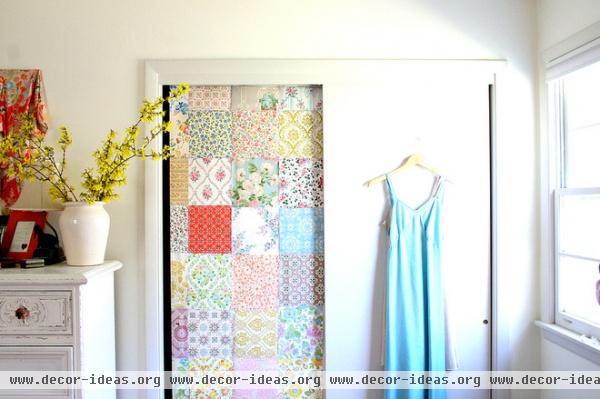
These closet doors started out exactly like the ones in our apartment: big, flat and uninspiring. But they became another opportunity for temporary wallpaper. A treatment like this would be especially effective if the whole room were papered in the same design; that way, the doors would totally disappear.

These renters took a wonderfully inventive approach to decorating using stick-on letters to draw attention away from a rather homely door. I love the sentiment, because it also applies to our imperfect living spaces: Instead of waging war on them, learn to love them.
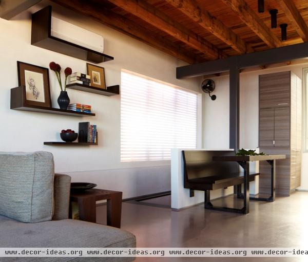
And then there are the air conditioners. I remind myself that at least I’m thankful to be living in sunny California, where long, hot days make air conditioning a good thing. The shelving on this wall does a first-class job of incorporating and hiding the A/C unit.
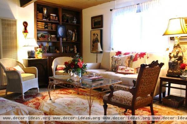
Here it is: the living room of our battered but beloved bungalow. You do not have to look very closely to see the monstrously ugly wall heater and the even uglier A/C unit that came with our home. No problem: We simply ignore the wall heater in the winter, and in our many warm months, we hide it with a fabric screen. The air conditioner is tucked behind a large lamp, which very successfully demands that you pay attention to it, not the A/C. An area rug we bought in New York City years ago covers the trampled carpet, and the white walls accommodate our favorite artwork.
It’s our home, it tells our story, and we love it — flaws and all.
More: How to Make Peace With Your Radiator


