Must-See Mock-ups for Your Remodel
http://decor-ideas.org 11/29/2013 20:20 Decor Ideas
The language of architecture is typically expressed in lines on a page that represent horizontal and vertical spaces. But not everyone can look at a floor plan and envision the design in real life. That’s where 3-D imaging and mock-ups come into play. Sometimes only building a model — mocking it up — in real life allows a client to really understand the options. Here are some design elements in your home that might be worth a mock-up before you make a final decision.
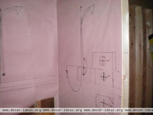
Shower Fixtures
There’s nothing like stepping into your future shower to help you understand exactly where you want the controls and showerhead. If you can, try to measure these out where you are currently showering (elsewhere in your home or at a rental), so they can be placed at the right height during rough-in plumbing. If you can’t be there in person, ask for a mock-up or drawing showing the locations of the controls, showerheads and slide bars, and any diverters if you have two showerheads.
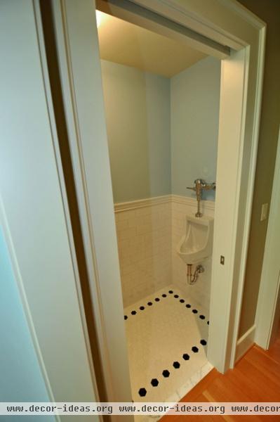
A mock-up for this bathroom, including the urinal, was created for clients who were traveling while rough plumbing was installed so they could see it from afar.
Window Millwork
There are so many ways to install traditional wood trim around the inside and outside of a window that it can boggle the mind. Go too thick, and the trim can look heavy and overwhelm the other design elements in the room. Go too thin or short, bevel the cuts or leave off fillets and skirts, and you can lose the design intention of the rest of your home.
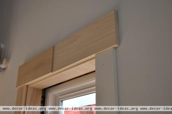
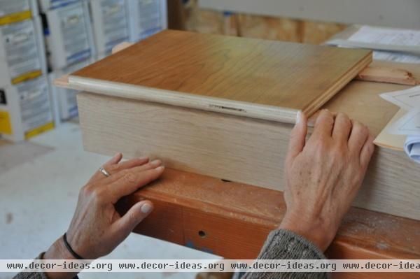
These mock-ups of interior trim in a backyard cottage show a typical window cased with different thicknesses of interior trim at the head and sill.
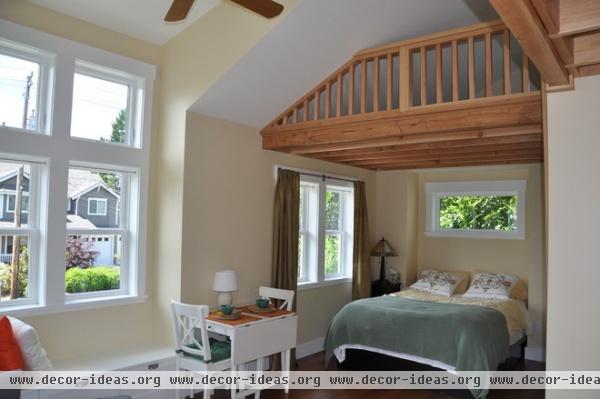
Our clients were able to confidently select a size of millwork after seeing the mock-ups in place in the room where they were to be installed.
Contemporary Details
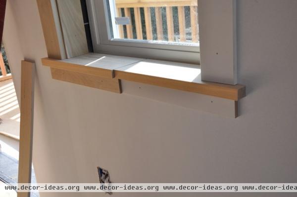
Contemporary homes pose their own questions, starting with whether there should be any trim at all. Millwork can be as simple as a windowsill. In this situation a mock-up was created to show how a wood sill would look with a reveal, or small recess, below it. The question was how deep and high the depression between the sill and Sheetrock should be.
The Truth About ‘Simple’ Modern Details
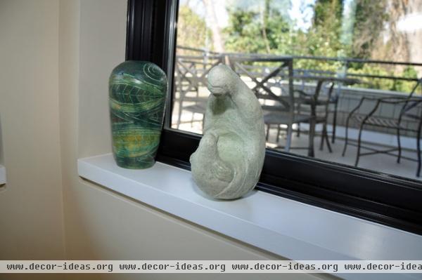
Stacking up the materials at a project meeting allowed the clients to visualize the installation as it would finally be executed: with a recessed metal piece at the Sheetrock and painted sill above. It’s a simple detail that took a lot of thought and benefitted from a mock-up. In this same project, we used the lid of a trash can to see the size of a living room light fixture and determine whether to order the larger or smaller size.
Finalizing the Layout
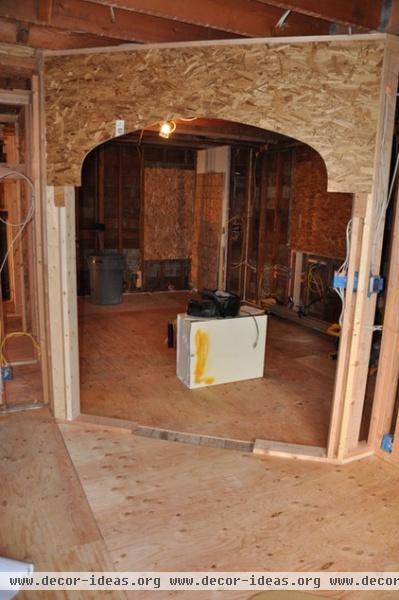
Sometimes what looks fine on paper is not so fine when you walk through. When it doubt, lay it out. This project included a new arched opening to match two others in adjacent rooms. The new arch opened into a kitchen with a large island. Would the arch be too close to the island?
We mocked up the arch, placed an air handler at the leading edge of the intended island location and unanimously decided the island was too close.
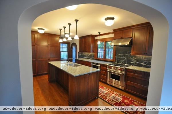
In the final design, we reduced the island by 18 inches to create a more comfortable opening into the kitchen — and avoided an end-of-project crisis around spacing.
Taping off areas where work will happen can serve the same purpose if you don’t want to mock up with wood, though creating the areas in three dimensions will help you figure out head and hip knockers before it’s too late.
Getting a Handle on Handles
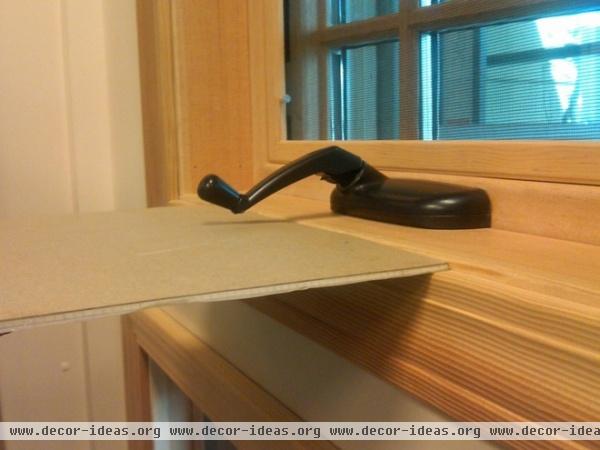
Windows, doors and cabinets all have handles. Where will they go, and what will they run into? Sometimes only a mock-up will tell you. When windows are installed very close to countertops and their handles crank, will they run into the counter and not function? When a faucet is installed close to a backsplash, will it work as expected? Will a dishwasher in a tight corner run into the adjacent cabinet pull? The best way to know the answer is to select the handles early and have them on hand for testing.
Light Fixtures
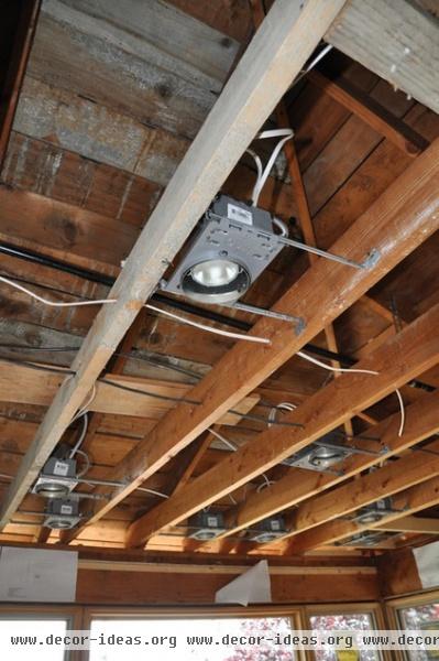
Lighting may not seem like a big deal, but if installed without a lot of thought, it can go terribly wrong. Lighting is complicated in remodels due to things like ceiling joists‘ or studs‘ being exactly where a light or switch was intended to go.
The best practice is to set can lights and boxes for switches and outlets first, before any wiring is pulled. This provides the opportunity to change their location before costly wiring is installed.
The most common lighting mistakes: placing ceiling can lights too close to upper cabinets and installing pendant lights where cabinet doors or room doors will run into them. Thinking in three dimensions is required for a good lighting plan, so if you have trouble visualizing it, insist on a walk-through with cans and boxes placed, or hire someone who can help you.
Mock-ups enhance the design and construction process and provide many opportunities to fine-tune your project while it’s in progress. It’s easier and less costly to catch design challenges before the materials are installed than to be surprised during or after installation.
A conversation with your contractor and architect can help you determine what design decisions will require mock-ups so you can plan for the decision making at each phase of your project.
More:
Find a pro to help with your project
3 classic tools still essential to the modern architect
5 steps for finding the right contractor
Related Articles Recommended


