Inside Houzz: Ideabooks Aid Design Collaboration in Seattle
Style can be hard to verbalize. What’s my personal home decor style? It’s a little bit of this and a little bit of that. I don’t know that I could sum it up in a sentence, but I do know that I could point it out in a picture. Tom and Jessica Freeman discovered this while remodeling their 1902 Seattle home. Both had strong opinions about what they wanted in their new house but were unsure how to communicate that to the right architect.
After browsing the 2 million-plus photos on Houzz, the couple narrowed their search by metro area so they could look at projects in Seattle. They came across architect Michael Knowles’ work. Drawn by his more traditional projects they saw on Houzz, they ended up hiring both Knowles and his wife, Colleen, an interior designer. Sharing and collaborating design concepts via their Houzz ideabooks streamlined the process and helped lead the couple to their dream home.
Houzz at a Glance
Who lives here: Tom and Jessica Freeman
Team: Michael Knowles, architect; Colleen Knowles, interior designer
Location: Seattle
Size: About 2,400 square feet; 3 bathrooms, 2 bedrooms
Photography by Tom Marks
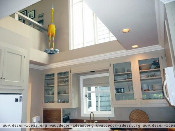
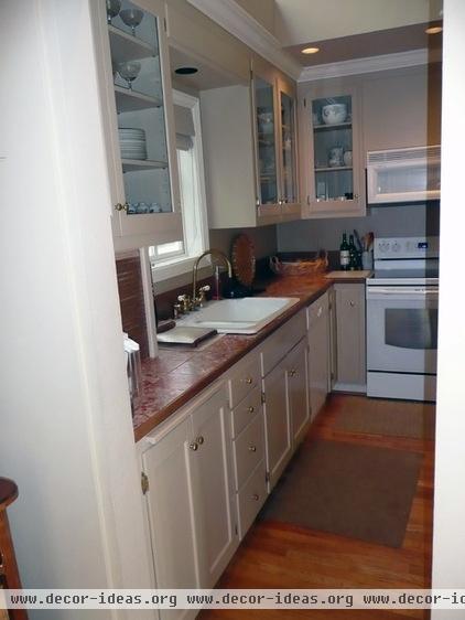
The 1902 house had undergone an extensive renovation in the 1980s, but the bones of the house were good. “We pretty much touched every room, but some had a lighter touch than others,” says Michael Knowles.
The kitchen went through the biggest changes. Although the footprint remains the same, a few structural changes and new surfaces resulted in a dramatic update. Previously it had a vaulted, open ceiling with a clerestory window. Although the window was intended to bring in more light, a neighbor’s house blocked the view, and the open ceiling felt like wasted space.
The floor plan made the most of the space and worked well for the couple’s cooking habits. The Freemans didn’t particularly like the color of the cabinets, but they were solid wood and well made, so they kept them.
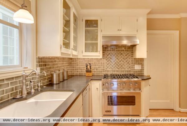
AFTER: After searching through dozens of kitchen photos on Houzz featuring black granite, the Freemans determined the look they wanted very quickly. “The ideabooks allowed us to communicate with Michael and Colleen much faster,” says Jessica Freeman. “It was an absolute dream to work with them.”
Michael closed off the kitchen ceiling and repainted the cabinets in a bright white. The cabinets had to be removed during construction, but he put them back in using almost the same layout. A new granite countertop and gray tile backsplash add contrast to the color palette, while new pot lights and ceiling pendants make the kitchen feel brighter than it did with the higher ceiling.
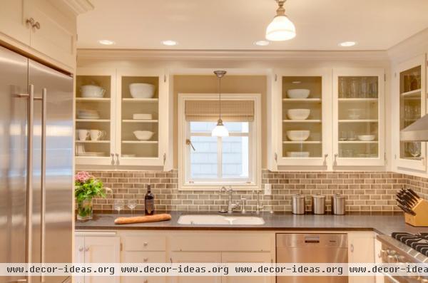
Countertop: Absolute Black granite; backsplash: Crackless Sage, Encore Ceramics; light fixtures: Sutton, Hudson Valley; sink fixtures, sink: Rohl
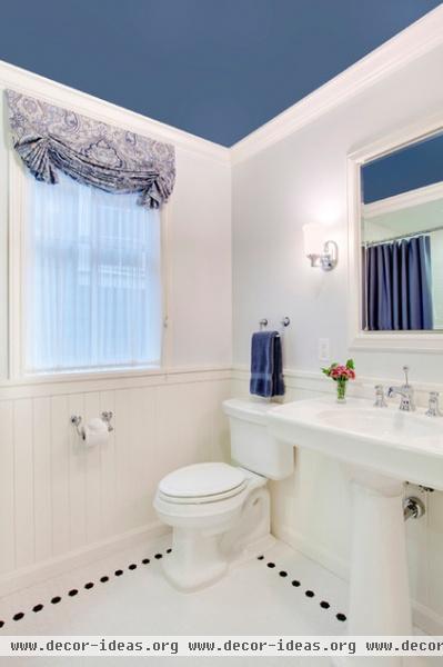
Closing up the kitchen ceiling had an added benefit: It made room for a new guest bathroom on the second floor.
Ceiling paint: Denim, Sherwin-Williams; floor tile: matte glazed porcelain hex tile, Ann Sacks; sink: Kohler
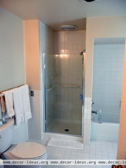
The Freemans also gutted and remodeled the master bathroom, adding amenities such as a larger shower and changing the finishes.
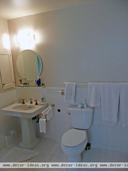
The original master bathroom had a single pedestal sink with the toilet right next to it.
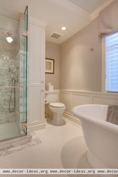
AFTER: With a little rearranging within the existing footprint, Michael fit a five-piece layout into the new master bathroom: two sinks, a separate shower, a freestanding tub and a toilet. Taking out an unused utility closet provided the square footage.
Shower tile: Flannel Crackle, Ann Sacks; bathtub: York, Victoria + Albert
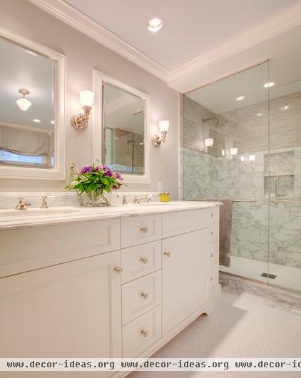
The new master bathroom layout includes everything the couple wanted, including a double sink and a custom vanity.
Floor tile: matte porcelain hex mosaic, Ann Sacks; border tile: honed Calacatta marble; sconces: Carlton, Brass Light Gallery; wall paint: Collingwood, Benjamin Moore
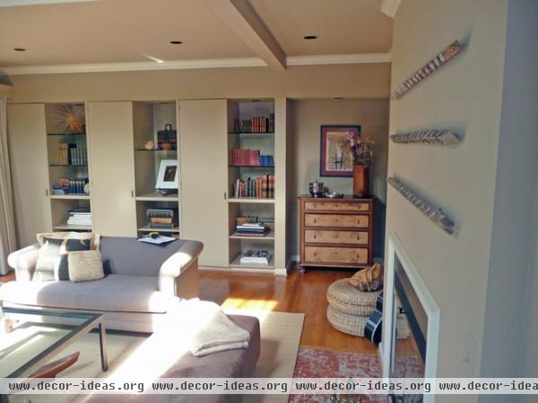
Creating ideabooks on Houzz helped the Freemans communicate their design concepts to their designers and each other. “It was sort of our starting point,” says Michael. “The photos they chose for their ideabooks showed me both the general look and the specific details they wanted.”
The living room is a great example. The Freemans wanted to change the style of the built-ins but had a difficult time explaining their vision. Searching design photos on Houzz, they found several examples of built-ins they liked, and clicked on them to add them to their ideabooks.
Throughout the project, they created additional ideabooks to bounce design photos and ideas off each other and their designers.
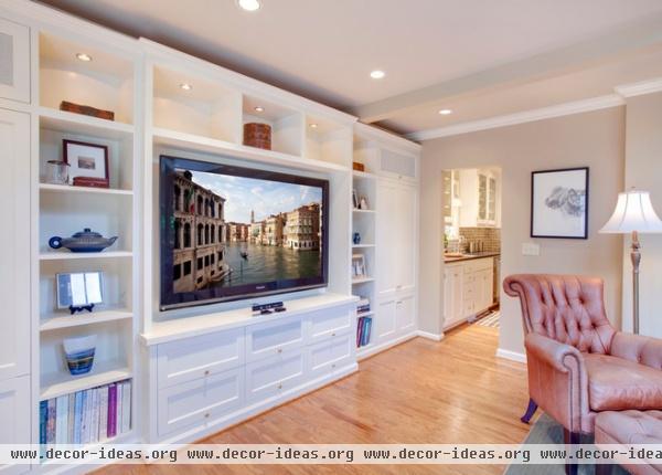
AFTER: Using the photos Tom and Jessica showed him, Michael designed the new built-ins to match the owners’ style. “The Houzz images really helped me get on the same page as Tom and Jess,” Michael says.
As you might expect, Jessica left rave reviews for both Michael and Colleen.
Do you have a Houzz success story? We’d love to see a before and after photo in the Comments.
More:
See how to create your own ideabooks
Find a professional for your own home project
More guides to using Houzz


