19th-Century Gem: The Glessner House Bucks Tradition
Architectural history is full of architects whose abilities were appreciated when they were alive, but very few who have a style named after them. Henry Hobson Richardson (1838–1886) is one who does. He is best known for Trinity Church (1877) in Boston, but his John J. Glessner House (1886) in Chicago is the best example of Richardsonian style. Instead of the Victorian decoration that prevailed at the time, Richardson opted for simplicity and solidity through rough and heavy stone walls.
Architectural critic Lewis Mumford, in his 1931 book Brown Decades, describes Richardson as an early modern architect, partially because he applied the same level of architectural skill and style to various building types: Churches, libraries, houses and even railroad stations were appropriate canvases for his Romanesque style. It was common for railroad stations, for example, to be designed by engineers, rather than architects, and for certain public buildings to be executed in a particular neoclassical style. Richardson went against this tradition.
Richardson designed the Glessner House on Chicago’s then-fashionable South Side for businessman John Glessner, wife Frances and their two children, George and Frances. The family occupied the house for five decades, then bestowed it to the American Institute of Architects so it could be preserved. Today the National Historic Landmark is run as the Glessner House Museum and is open for tours and events.
John J. Glessner House at a Glance
Year built: 1886
Architect: Henry Hobson (H.H.) Richardson
Location: Chicago
Visiting info: Tours available year-round
Size: 17,000 square feet, split roughly between the family’s space and the servants quarters.
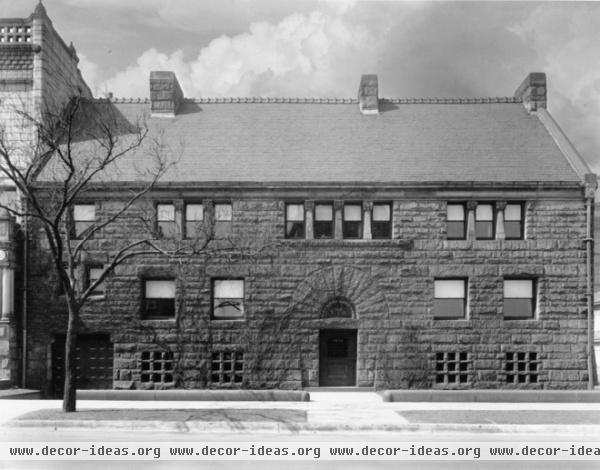
I first encountered the Glessner House in person on a high school field trip from the north suburbs into Chicago for an urban-studies class. Like any kid, I was more excited about getting out of town and into the city than seeing an old building, but the impression of the rough, pink granite walls has always stayed with me. The house, sitting on the southwest corner of Prairie Avenue and 18th Street, was unlike anything in the neighborhood, an area that used to be full of mansions in neoclassical attire, but that declined as the center of the city and its money shifted north of the Chicago River around the turn of the century.
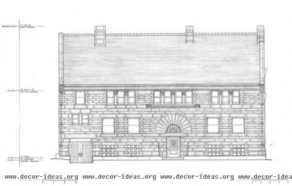
Here we see the formal east elevation with the main entrance facing Prairie Avenue. The front door is under the arched stone. From there one ascends a flight of steps to the first floor; this situation is evident in the small openings near the sidewalk, which serve the partially below-grade basement.
Another reason Lewis Mumford called Richardson a modern architect was because the architect considered windows more for their internal arrangements than for repetition on the facade, as in a Renaissance or a neoclassical building. Such a tactic is evident on this front, where the relationship of windows or groups of windows illustrates the rooms behind the stone.
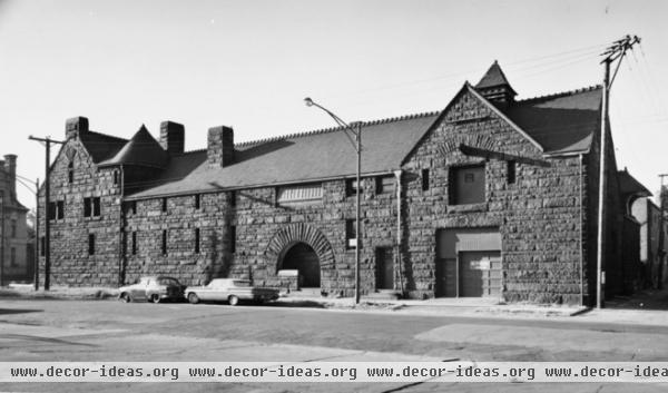
One of the unique aspects of Richardson’s design is how the less-formal side on the north (facing 18th Street) is the more interesting facade. Yes, there’s the garage/stable on the far right, and most of the windows are so narrow that the whole elevation appears predominantly solid, but halfway down the long elevation is a large arched opening with a partial-height wall cutting into it. This opening immediately draws our attention, but as we saw in the previous photo, this is not the front door; this is the service entrance, the equivalent of the back door. The door between the garage and the rounded portal served the boiler room in the basement.
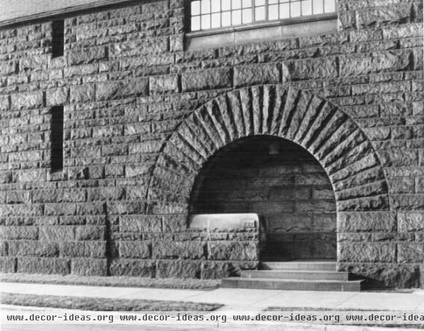
This side entrance is an architectural feature rooted in tradition — the weight of heavy stones wants to be taken up by arches, after all — but it is so idiosyncratic, thanks to the way the short wall makes the entrance asymmetrical. Perhaps the off-center steps, in combination with a door located to the left after a 90-degree turn, are intended to make the entrance appear secondary, rather than as a more formal main entrance.
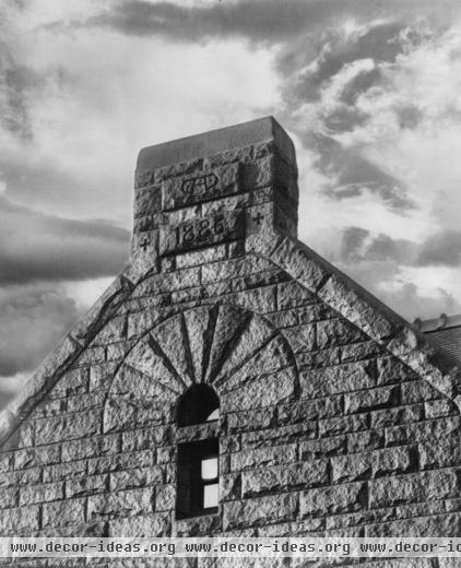
The details on the rest of the exterior follow the same language, exploiting the weight and solidity of stone through arches and narrow openings. Here we see the gable end at the corner of 18th and Prairie, marking the completion of the house.
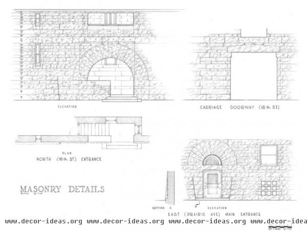
Here we can see how the details of the stone exterior were carefully worked out by Richardson, from the height of the courses to the way the walls except for the front door (bottom right) are slightly battered (angled outward toward the bottom). Note in particular the way the steps work in the servants’ entrance shown in the top-left corner: up to the landing, then a left turn up more steps to the door.
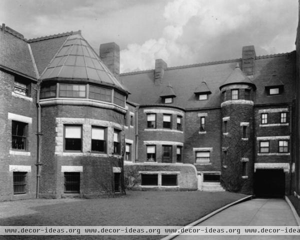
My second encounter with the Glessner House was not for another couple of decades, when I went with my future wife to check out the house as a wedding venue*. While the area on the near South Side had declined throughout the 20th century, encroaching developments from the north made the area more popular starting in the 1990s. But these developments were architecturally questionable, as tall buildings rose across the street and newer low-rises filled in the gaps on Prairie Avenue. The backyard is the space used for weddings, and here we see an even more informal side of the house, where round bays of different sizes project from the L-shaped plan.
*If you’re biting your nails wondering what happened, we passed on the Glessner, among other venues, for the courtyard of the Smart Museum at the University of Chicago.
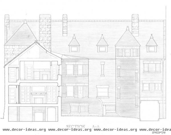
The way Richardson designed from the inside out, mentioned in regard to the front elevation, is also apparent in this building section/rear elevation. Brick was used on these back facades, but stone was used as lintels and sills, some of them spanning from one window to another, expressing the rooms behind them.
Note how the windows are much larger at the rear of the house than at the front; the latter kept out the dirt from the street, not as big a concern with the former. Also note the way the rooms work in the building section — the large room facing the backyard and the corridor toward the street — something we’ll see again in the floor plan.
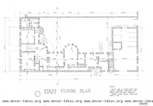
In the floor plan, the intersection of Prairie Avenue and 18th Street is in the lower-left corner. The house has an L-shaped plan from this corner, with a third leg (right) made by the carriage room. In this U-shaped configuration, the rounded bay jutting into the backyard stands out. This space, the dining room, coincides with the end of the main house, such that everything to the right is service; first is the butler’s pantry, then the kitchen, with the pantry and servants’ hall beyond.
The Glessner House Museum addresses the social structure of the house, particularly the split between the Glessners, who lived in the house for 50 years, and their servants, who numbered well over 100 in the same amount of time (needless to say, they didn’t get along very well). The Glessner website describes how “the servants’ quarters are disguised and yet also integral to the house’s design.” The corridor running alongside 18th Street is an important part of this, for it connects the servants’ area to the front hall, bypassing the dining room and parlor with their enfilade connection.
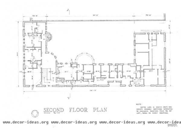
Upstairs is a similar situation, with the Glessners’ bedrooms off the main hall to the east (left) and the servants’ quarters off the long corridor to the right.
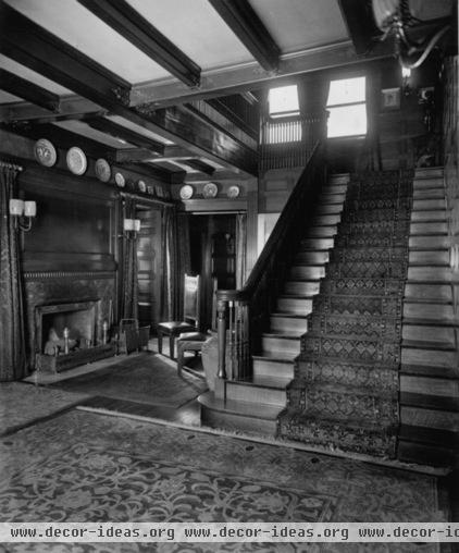
If the outside is Richardsonian Romanesque, the interior is clearly Arts and Crafts, in reaction to the period architecture and decoration that flourished, for example, in the mansions around the house. Simple interiors with exposed wood structure predominate, as shown here in the entrance hall after we’ve ascended the steps from the front door.
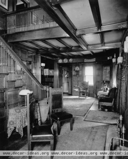
A 180-degree view from the previous photo shows the rest of the entrance hall, a fairly compact entrance for a house of 17,000 square feet.
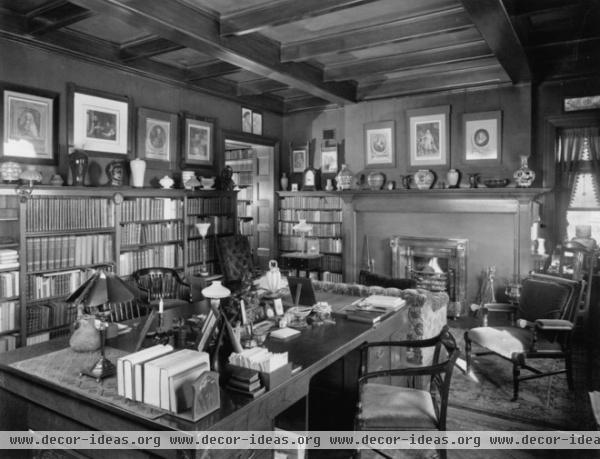
Throughout the rest of the interior, a domestic scale pervades. As do fireplaces — 14 total. Even though the house was outfitted with electricity and other modern conveniences after completion, it was completed at a time when having one fireplace per major room was required.
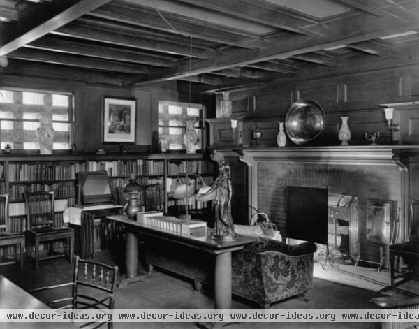
While this room may look like a library, note the grid over the windows. Yes, we’re in the basement, where in addition to there being a boiler room, storage and other service spaces, the kids were schooled.
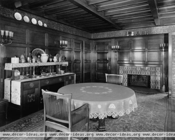
Wood covers just about every surface in the dining room, such that the closet door (to the left of the fireplace) and the door to the butler’s pantry (on the left wall) blend into the surrounding walls.
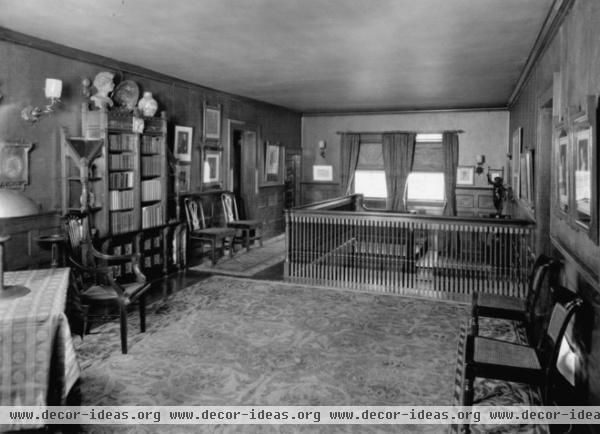
This last view is of the sizable hall on the second floor, whose windows overlook 18th Street.
For more information on the house and the Glessners, visit the Glessner House Museum website.


