My Houzz: Rising to the Renovation Challenge in Toronto
Selene Richards was not surprised when her husband, Mark, a real estate agent, suggested they try renovating one of the homes he was showing. With several large-scale remodels under their belts, they'd been down this road before. But there was something especially challenging about this particular property. It had sat on the market for a good seven months — unusual in an area where three weeks was considered the norm. Years of additions and remodels had left the main floor looking like a bowling alley, while the living, dining and kitchen areas were consigned to the second floor. Most people just couldn't visualize the home's potential. And despite their long history of renovations, Selene and Mark had a hard time, too.
The original house had only a few redeeming architectural qualities, like its size and backyard. Before making an offer, the couple consulted with Greg Cole of Cole Contracting. They agreed to square off the back with a 500-square-foot addition and return the interior to a traditional layout. "Once we had it visualized in our mind, we finally got excited about the potential," says Selene.
Their must-have list included an ample mudroom, a guest bedroom and an open-concept great room with continuous flow to the outside. After months of planning, construction began — and the couple is now reaping the rewards, having moved their own family into the newly redone home.
Houzz at a Glance
Who lives here: Selene and Mark Richards, daughters Brooke (age 7) and Grace (4), and their mastiff, Doug
Location: Upper Beaches, Toronto
Size: 3,250 square feet; 5 bedrooms, 4½ bathrooms
Year built: 1913; renovated 2011
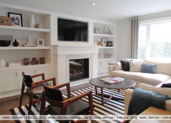
The great room is anchored by a fireplace and the built-ins that surround it. A large, down-filled sectional from Restoration Hardware divides the room in an unassuming way; the couple had coveted it for a long time.
Sectional: Belgian Track Arm Slipcovered Sectional, Restoration Hardware; rug: Elte Outlet; throw pillows: HomeSense and Target; chrome side tables, HomeSense; curtains: Linen Cotton Grommet Curtain, West Elm; paint: Gray Owl, Benjamin Moore
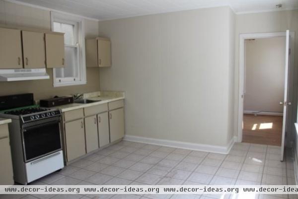
Selene and Mark removed a wall to open up the floor plan and expanded the house another 500 square feet.
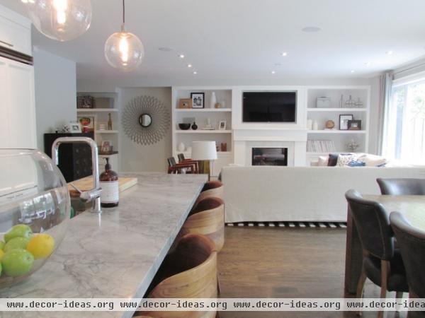
AFTER: The couple toyed with the idea of creating a formal living room and dining room during the rebuild, but opted instead for a large, informal space that serves many purposes and allows everyone to be together. "We can entertain and live in a communal, open space that has great functional flow, and I can take it all in from my perch behind the island," says Selene.
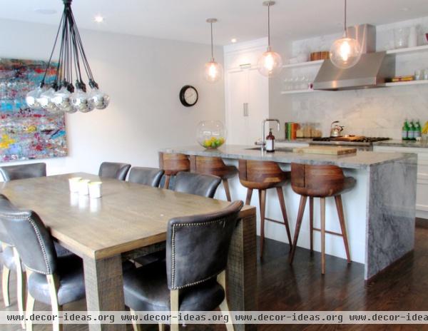
Like any relationship, the Richardses' design collaboration required compromise. "I lean more eclectic, and my husband heads the traditional route," says Selene. The dining table and chairs are juxtaposed against a contemporary chandelier and abstract art, but within the context of the greater space, they all fit together flawlessly.
Selene's dream was to have a waterfall profile on the kitchen island. She desperately wanted marble but was afraid of the upkeep. The couple's stone contractor, Centerline Stone, suggested a Brazilian granite called White Fantasy that resembles marble. They got their marble fix on the backsplash, instead, which was inspired by a photo they'd admired on Houzz.
Bar stools and chandelier, Trinity Gallery; pendants: Globe Pendant, West Elm; art: Paul Cade; dining chairs: Adéle Leather Dining Chair in Slate, Restoration Hardware; table: Elte Outlet; cabinetry: High Craft Construction
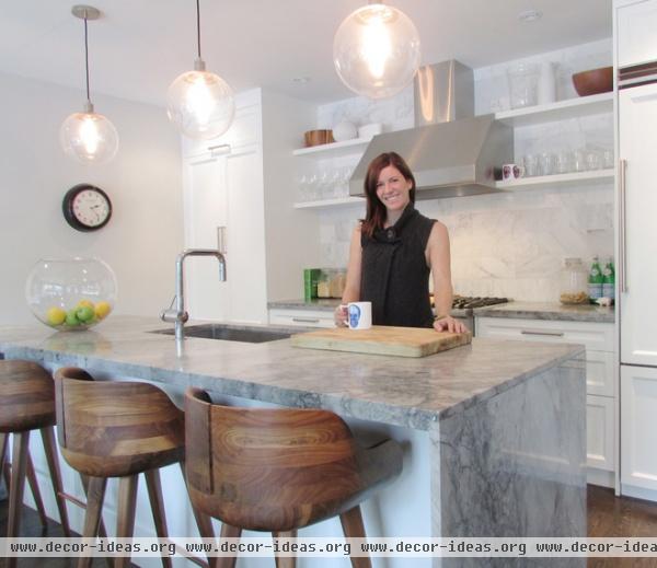
Selene, shown here, designed the kitchen so she could look out over the entire room and backyard. "I only wish we had incorporated a place to tuck in a bar stool on the kitchen side of the island," she says. "Everyone gets to sit down, while I always end up leaning on the counter. I don't know what it is, but I just can't sit on the other side."
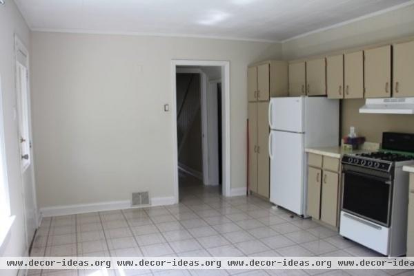
The couple removed this wall as well. The old kitchen has now been replaced with a custom homework area.
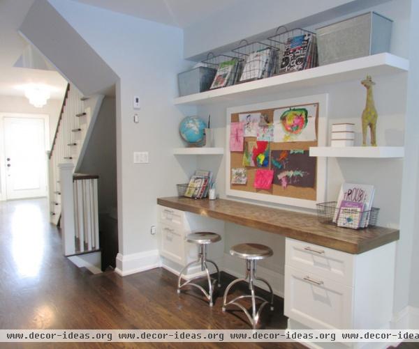
AFTER: Having a space in the great room where everyone can work and play was an important factor in the design plans. In the transitional area, where the addition meets the original home, a craft area was built for daughters Brooke and Grace; vintage pieces dot the shelves.
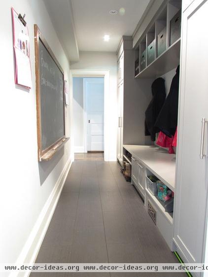
In an area that runs behind the kitchen and is accessed from the garage, the couple found space for their ample mudroom. Custom millwork and a vintage chalkboard keep everyone organized, although Selene laments, "It always looks like a bomb just went off. But I can close a door on the wreckage."
Cabinetry: High Craft Construction; tile: 12- by 24-inch charcoal striéd porcelain, FM Tiles
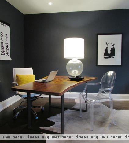
At the front of the house is Selene's home office, with a piano (not shown) for the kids. This was originally a formal living room.
Paint: Hale Navy, Benjamin Moore; Ghost Chair: Casalife
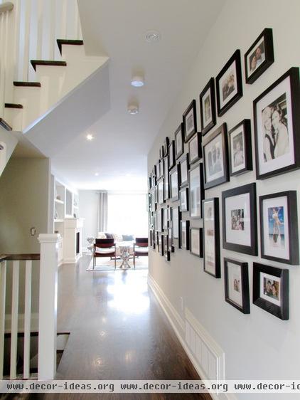
The family refers to the hallway bridging the front foyer and great room as the "wall of fame." Pictures of family, friends and vacations fill the span, united by their black frames. "Everyone who sees it says they want to do the same but are afraid to lay it out," says Selene. "There's no science to the placement; take a nail, take a hammer and start in the middle."

The couple's master bedroom is painted a deep charcoal with a hint of navy that beautifully sets off the chandelier.
Paint: Grey 2121-10, Benjamin Moore; curtains: Velvet Grommet Curtain in Iron, West Elm; chandelier: Great Lighting; rug: HomeSense
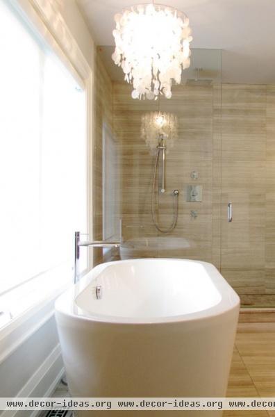
In the master bathroom, a freestanding tub sits beneath a window overlooking the expansive backyard. Selene chose an ethereal shell chandelier for over the tub and discovered a bonus: It tinkles like a wind chime when she blow-dries her hair.
Chandelier: Great Lighting

The bathroom features a 9-foot-wide shower with 12- by 24-inch honed escarpment marble. "Something about that tile just immediately relaxes me," says Selene. "As a gal with dark, long hair, I can't bear the thought of white tile floors."
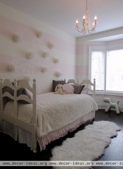
The design for the youngest daughter's bedroom started as an argument between Mark and Selene. "I wanted a soft, textured buttermilk feel, and [Mark] was backing her up on wanting pink. Since when do you let a 4-year-old make the final call?" asks Selene. The couple compromised by painting the walls with pale pink stripes.
Influenced by a song their daughter would sing over and over from the animated movie The Lorax, Selene repurposed white feather ball ornaments purchased on postseason clearance at West Elm, and hand stenciled a tree to "hang" the fluffy accents from.
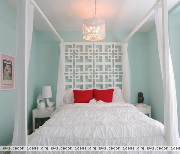
The eldest daughter's bedroom is awash in mint, with a punch of coral and a fretwork headboard that adds a pinch of retro style.
Bed: Casalife; bedside tables: West Elm; paint: Soft Mint, Benjamin Moore
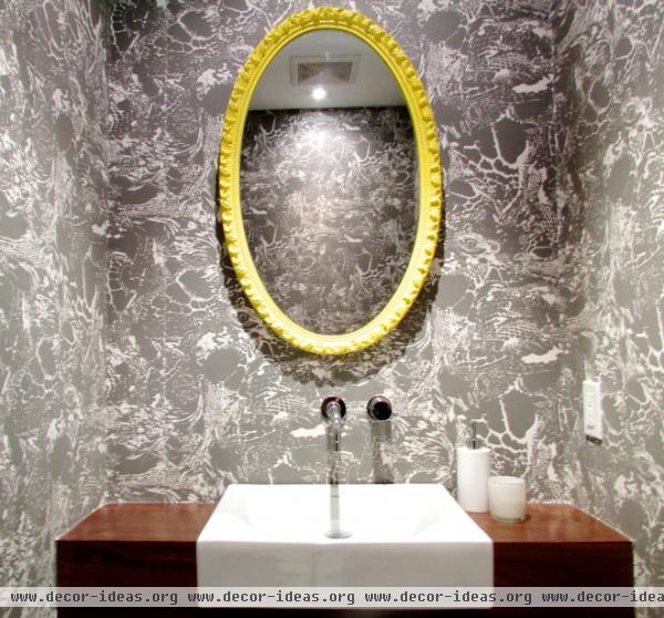
Selene exercised some of her eclectic decorating muscles in the main-floor powder room, where she painted an ornate mirror sunny yellow. "I have no problem spray painting a table hot pink," she says. "Mark has no problem throwing it out afterwards."
Wallpaper: Galápago, Tres Tintas
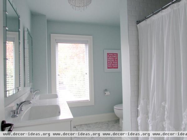
The daughters share this bathroom, which was inspired by a ruffly shower curtain Selene bought from Anthropologie two years before starting the reno. "It was like a frilly white summer dress, and having two girls, I decided to go with it."
She added crystal knobs to the vanity and a fanciful light fixture dripping with crystals. The heated hex tile marble floor provides texture underfoot, while beveled white subway tiles add a classic finish to the shower. A Kate Spade poster caps off the girly theme perfectly.
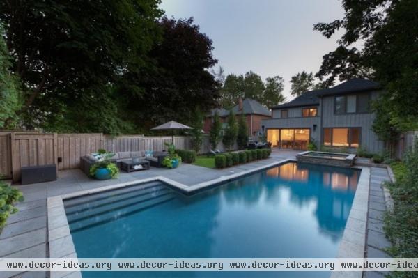
The backyard — a major selling point for the couple — has evolved over the past five years. Before the renovation even started, the Richardses added flagstone pavers and flower beds, and planted vines along the fence. "I am not a patient person, and waiting four years for the vine to cover the fence was pure torture!" Selene says. "But we decided if we were going to be living in a construction zone for a while, we were at least going to start the process of making the backyard a complete oasis."

The pool was initially imprisoned by a 6-foot-high black iron fence, with a row of large hedges that cut the yard completely in two. "We removed the fence and expanded the flagstone patio to allow for a massive U-shaped outdoor couch, upon which many a guest has fallen asleep," says Selene. They also planted a large row of hornbeams that grow tall and fast without eating up too much yard space.
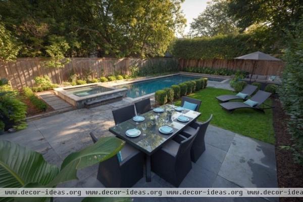
AFTER: This past year the couple installed artificial turf and boxwoods to create a playspace for the kids and a natural barrier for the pool that won't get destroyed by the family's 120-pound mastiff.
"The yard has been host to a plethora of celebrations, including baby showers and birthdays, and there is talk of hosting my mother-in-law's wedding next year," says Selene. "Luckily, we have amazing neighbors who have enjoyed more than a few late nights out back."
Show us your family's home
Browse more homes by style:
Small Homes | Colorful Homes | Eclectic Homes | Modern Homes | Contemporary Homes
Midcentury Homes | Ranch Homes | Traditional Homes | Barn Homes | Townhouses | Apartments | Lofts | Vacation Homes
More: House Planning: When You Want to Open Up a Space


