Kitchen of the Week: Vintage Flair for a Modern Norwegian Family
http://decor-ideas.org 11/23/2013 21:10 Decor Ideas
It's surprising that such a simple, streamlined kitchen could have so many factors influencing it. But Norwegian designer Christine Fikseaunet had a lot to consider when designing her new kitchen. Her house was built in 1920, and staying true to its original feel was a must. But the previous kitchen didn't have any place for eating, and it felt too small for her family. Plus, Fikseaunet needed a special space for herself, too. Thanks to plenty of planning and a smart design, she was able to accomplish all her goals in a clean-lined and inviting space.
Kitchen at a Glance
Who lives here: Christine Fikseaunet, her husband and their 2 sons
Location: Oslo, Norway
Size: About 260 square feet
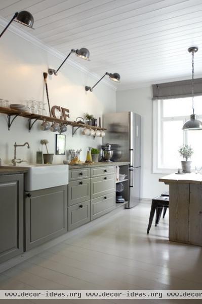
To create an eat-in kitchen, Fikseaunet built an addition, increasing the square footage of the kitchen by about 150 square feet. The greige (a mix of beige and gray) palette is soothing and timeless. New oak flooring throughout the house was painted to look like the original floors.
Fikseaunet installed vintage Jielde lights — once used in factories throughout Europe — above the counter for task lighting and hooked them up to a wall switch.
Hardware: Lama; cabinets: Sivesind; countertop: oak, stained and oiled brown
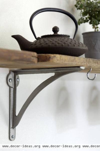
Antique planks mix with new brackets for the shelving above the sink.
Teapot: Mariage Freres
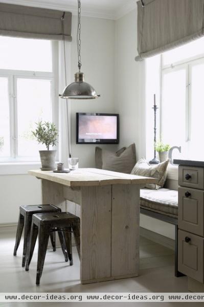
Fikseaunet and her husband love to cook, so the kitchen is a natural gathering place for their family. It's where they hang out together, eat, cook and do homework.
Since she lives with three males who love to watch sports on TV, Fikseanuet turned this dining nook into a comfortable place where she can relax and watch whatever she wants. It's a great place for lazy weekend breakfasts and watching cooking shows.
Blinds, cushion textiles: de Le Cuona; table, bench: custom; stools: vintage; lamp: Lama
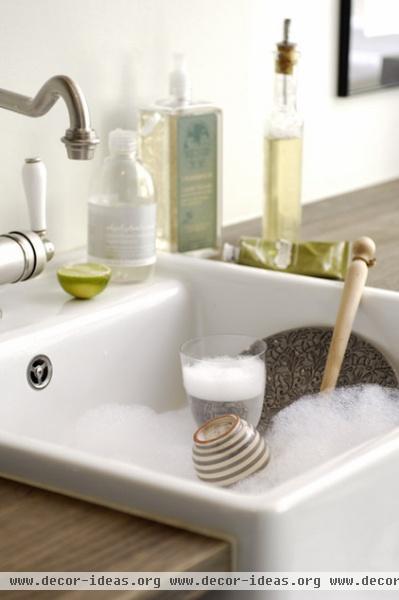
Fikseanuet chose the porcelain sink and antique-style faucet to stay in line with the home's 1920s roots.
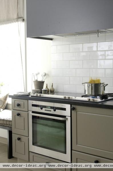
Silestone counters around the stovetop make cleaning up easy. There are two ovens: one under the cooktop, another built in behind the door next to it. The simple subway tile backsplash is made of the same tiles used in Paris Metro stations.
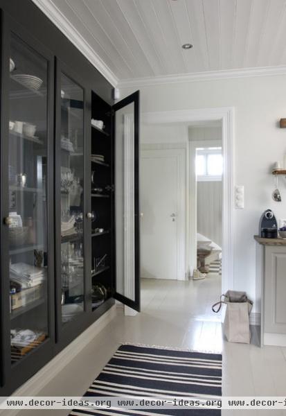
Fikseaunet wanted the kitchen to feel open and bright, so she eliminated upper cabinets and built this large wall-to-wall cabinet at the far end instead. The custom piece stores dishes, glasses, napkins and towels, as well as tea and coffee fixings. The kitchen's base cabinets hold pots, pans and pantry items.
Rug: Day Home
More: 12 Inspiring Real-Life Vintage Kitchens
Related Articles Recommended


