My Houzz: Pure Simplicity Reigns in Salt Lake City
David Nuescheler believes that a home's interior should be able to stand alone "without the disruption of additional furniture," he says. His hillside house in Salt Lake City is a testament to that philosophy: Its spare, airy spaces balance dynamic architecture with minimalist style.
Nuescheler, who recently relocated from Switzerland and works in the technology industry, found the house through City Home Collective; he teamed up with Imbue Design and Sausage Space to create his dream home. "The scope of the design work focused on the interior, aiming to relieve existing partition walls and present the house toward one open living space," says Matt Swindel, an architect at Imbue Design. The result is a home with striking lines and angles, and a canvas of white that helps Nuescheler soak in his treetop view.
Houzz at a Glance
Who lives here: David Nuescheler
Location: Arlington Hills neighborhood of Salt Lake City
Size: 4,030 square feet; 5 bedrooms, 3 bathrooms
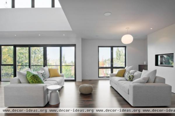
"I find inspiration in the simple but useful or beautiful — such as the artwork of Mark Rothko, furniture by the Eameses and Arne Jacobsen, and modern architecture of Mies van der Rohe, Tadao Ando and Le Corbusier," Nuescheler says. Believing that "individual spaces should be able to be enjoyed in and of themselves," he kept his furnishings minimal.
The majority of furniture and decor items throughout the home are from The Green Ant and Poliform.
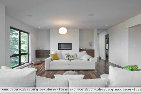
Nuescheler keeps the decor and furnishings simple, to not distract from the meaningful architecture and views of the city. One of his main goals with the remodel was to create a cleaner and more minimalist look. Toward that end he removed exposed wooden beams and kept the walls and furnishings a uniform white.
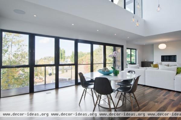
The high ceilings and window-lined walls are among the home's most eye-catching features, and Nuescheler's favorites. "The ceilings in the home's primary gathering space bring in a view of the city skyline, as well as the changing seasons, through glass doors in the front and back of the home," says the owner.
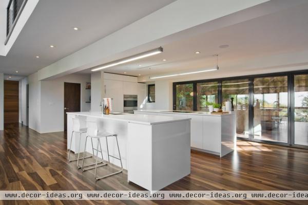
One of the main accomplishments of the remodel was completely changing the location and look of the kitchen. Originally the area shown here was the living space, and the cabinets were a dark brown. The remodeled kitchen now opens up to a large outdoor patio area. "Positioning the kitchen off the street side of the house allowed cooking activities to extend beyond the interior and into the rear patio," says Swindel.
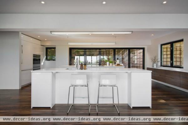
Nuescheler says the house first felt like his when he used the kitchen for the first time. "This space continues to be the most used area of the home — where friends gather and enjoy food, drink and each other's company," he says.
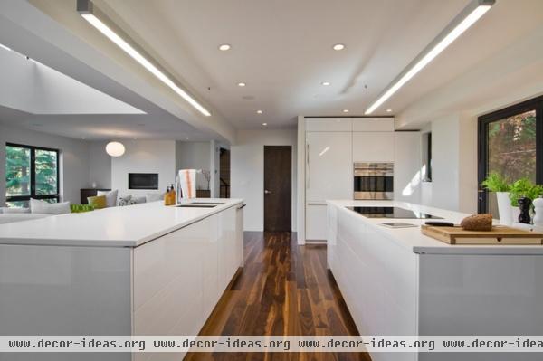
Nuescheler wanted the glossy cabinets and appliances to be the main features of the room. "The double kitchen island — each 10 feet of gloss-white cabinetry — becomes furniture in the space, contrasting the dark matte walnut flooring," says Swindel.
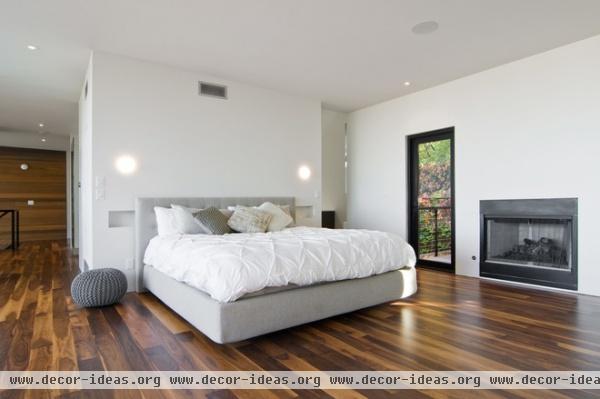
Before the remodel the top-floor master suite felt self-contained, with each part separated from the other. Walls were moved or completely removed to create a more open feeling, so the bedroom, bath and closet now flow into one another.
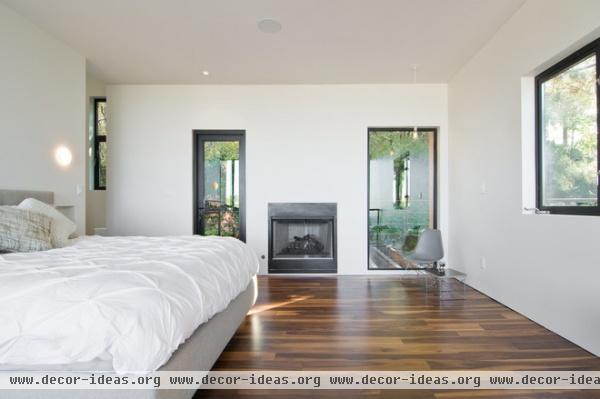
Like other areas of the home, the master bedroom opens out to the hillside behind the house,
with a walkway that runs above an outdoor patio area.
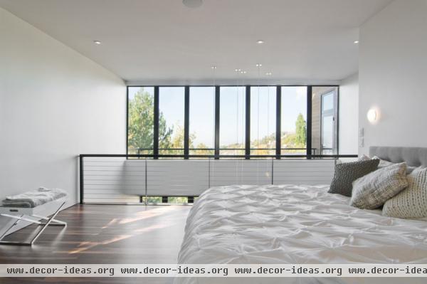
The master bedroom not only has access to the hillside behind, it also has views that overlook the city. Nuescheler has grown fond of Salt Lake City since moving to the area. "It is a community that is exploding with uniqueness, from its people to its landscape," he says. "Every corner of Salt Lake has something to discover."
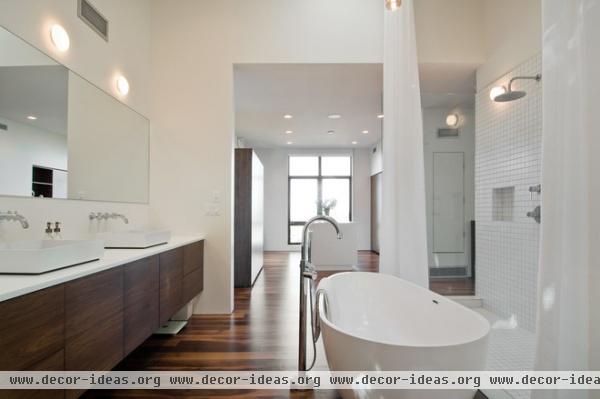
With such a huge remodel, Nuescheler and his team faced a number of challenges. "Ours were numerous, from designing around beams in less-than-ideal locations, to existing structural imperfections, and from crooked walls to uneven stair treads," says the homeowner.
He didn't let any of that stop him from realizing his vision. "If you have an eye for detail, the little things matter, and getting it right can take a few experimental takes," Nuescheler says.
The teams at Imbue Design and Sausage Space made several changes to the bathroom, tweaking the shower and bath areas to make the design more consistent with the rest of the home.
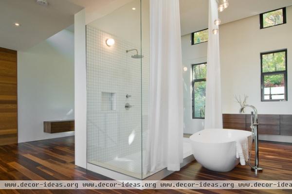
When designing the master suite, privacy was of little concern. "It's high off the street and facing the thickly vegetated rear yard," Swindel says. Diffused natural light fills this upper level, creating a unique shower and bathing experience.
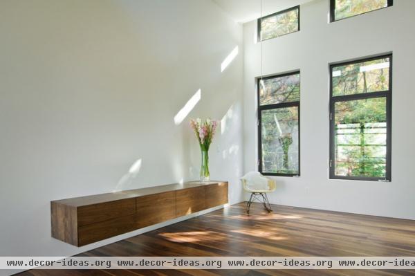
The former master bedroom is now a sitting area where Nuescheler can enjoy the beautiful fall foliage and streams of sunlight.
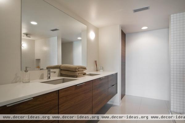
The cabinets throughout the house are from Teerlink Cabinet. They contribute to the clean, minimalist look while adding a subtle organic feel.
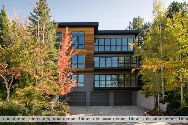
The front exterior was left as is. Nuescheler is currently working on revamping the backyard. "The project matches the home remodel in scale and complexity, but promises some breathtaking views and gathering spaces," he says.
Show us your home!
Browse more homes by style:
Small Homes | Colorful Homes | Eclectic Homes | Modern Homes | Contemporary Homes
Midcentury Homes | Ranch Homes | Traditional Homes | Barn Homes | Townhouses | Apartments | Lofts | Vacation Homes
More: How to make all-white interiors look right


