Here's How to Steer Clear of 10 Top Design Don'ts
http://decor-ideas.org 11/13/2013 08:10 Decor Ideas
Every home design project is beset with its own design challenges, some of which need a trained professional to help solve. But there are things that I see homeowners do time and time again that land them in a situation where their furnishings and interior scheme just aren't working, and they're not sure why. The truth is, if they just avoided a few common mistakes, their space would instantly feel fresh and professionally styled.
Here are the top design don'ts and some successful designs that show what to do instead.
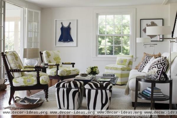
1. Don't push the furniture against the wall. You will have a much more interesting space if you allow breathing room around your pieces of furniture, as we see here. Allow the furniture to float in the room, away from the walls. This will help create a conversation grouping.
The optimal distance for conversational seating is 4 to 8 feet. This is the Goldilocks zone.
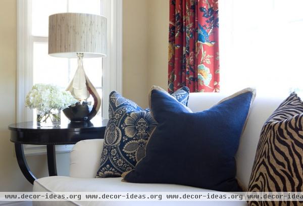
2. Don't buy small, cheap throw pillows with solid forms. Pillows should be generous, overstuffed and formable, like these. Use soft, plush, down-filled pillows that can take a shape. There are great synthetic fill options, too. Use the classic "designer's chop" to determine if they will shape up: a quick karate chop to the top edge to break up the pillow's blockiness.
Get rid of any dead pillows that sit like a lump. Say goodbye to postage-stamp-size pillows and matchy-matchy ones that came with the furniture. Instead, overstuff an 18-inch pillow cover with a 20-inch insert for a professional look.
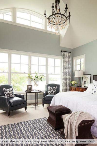
3. Don't use a good-enough paint color. Paint color makes or breaks the look of a room. If it's poorly matched, the result will be weak at best. It takes experience and a trained eye to correctly read undertones. Consult a pro on this one to set your results ahead of the crowd.
17 Things Color Consultants Want You to Know
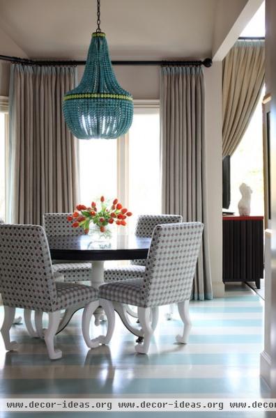
4. Don't sacrifice lighting to trim your budget. The mistake I see most often is light fixtures that are too small or that don't dress the room properly. Use appropriately scaled, relevant lighting. Lighting, more than any other element, asserts style, much like a chosen piece of jewelry defines the style of a little black dress. Don't be afraid to inject personality with a statement piece.
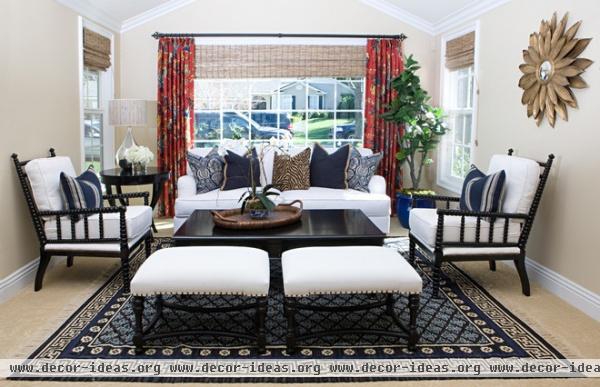
5. Don't skimp on area rug size. An area rug defines a grouping of furniture. Buy one large enough to lie under at least the front legs of each piece of furniture in your grouping.
11 Area Rug Rules and How to Break Them
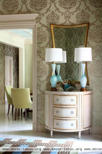
6. Don't isolate rooms. Create flow from one room to the next by visually linking adjacent spaces. Repeat a pattern or carry an accent color or another visual element (such as a leg detaiI) from one room to another.
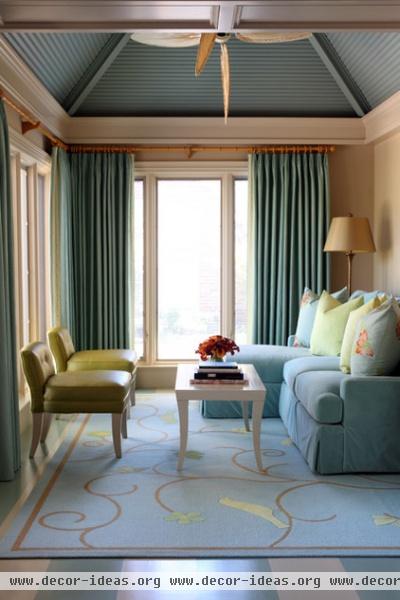
7. Don't skimp on drapery. More is more in this department. Professionals use fabric yardage that's two and a half to three times the width of the window for fully functional drapes. With fixed side panels (for show only), you can get away with fabric twice as wide as the window. Don't skimp.
Custom Draperies 101
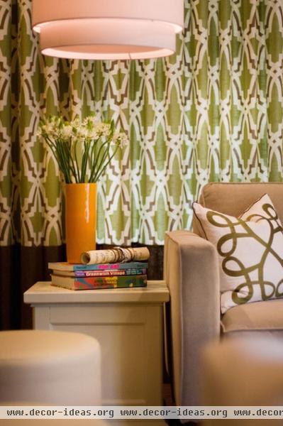
8. Avoid being too matchy. Don't match textiles and furniture — relate them. A designer's task is to create a collected look. Look for a collection of pieces with something in common, such as style, motif, color, history, material or mood.
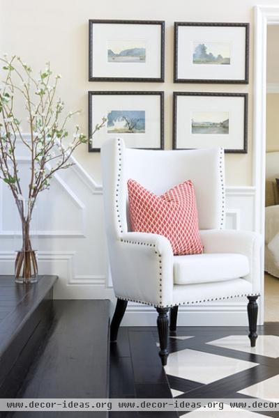
9. Don't forget the details that make a piece special. I sometimes find the hardest things for my clients to understand is that the details make the design. Nailheads, custom pillows, millwork trim and inlaid floors create a custom look that's drop-dead gorgeous in the space here.
Once you train your eye to notice the details, you'll see that a chair with a beautiful turned leg carved by a skilled craftsperson is different than a mass-produced machine-made piece. Custom details are evident in professional work. Contrast piecing or piping on a pillow, or welting, nailheads or trim on a chair. Details, details, details make the result special.
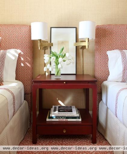
10. Don't stop until you layer. Designers use layering and repetition of elements and motifs to achieve a professional look. Most people get the concept of layering when it comes to fashion. In design it isn't much different. Pick something you love, like this patterned headboard, then repeat the color or the pattern.
The artistry lies in stopping before the look becomes too matchy (it always helps to toss in something unexpected to achieve this). Subtlety is key. Drapery, wallpaper, pillows, throws, bedding, accessories — all are great options for layering in a bedroom. You be the judge as to how much is enough.
Related Articles Recommended


