My Houzz: Living Light in Amsterdam
Romy Boesveldt has a penchant for color. Her husband, Ilya Yashkin, has a knack for building things. Together they make up the furniture design team behind Studio Roof and complement each other's individual creative strengths. "Ilya is more the 3-D thinker, builder and maker," says Boesveldt. "I am the decorator with colors, and we are very symbiotic about it."
With a shared love of simplicity in their designs, the couple outfitted their family's Amsterdam home with a snowy backdrop of whites and creams that highlight each accent hue, architectural detail and furniture piece — including many from their own line. Flea market finds mix with colorful travel mementos picked up during family trips to complete their light and bright two-story space.
Houzz at a Glance
Who lives here: Romy Boesveldt and Ilya Yashkin and their children, Stas, Nika and Sonia
Location: Amsterdam
Size: 130 square meters (about 1,400 square feet); 4 bedrooms, 1 bathroom
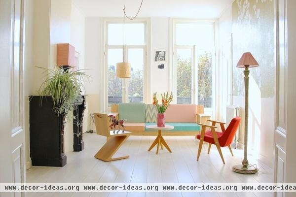
Boesveldt and Yashkin's upper-floor home had been neglected for many years before the couple purchased it in 2009. They gave the whole place a much-needed update, including new flooring and a fresh coat of white and cream paint on the walls. Dusty pink, soft yellow and mint green are some of Boesveldt's favorite colors. She combined all three in the light and airy living room to create a soft and dreamy atmosphere.
The couch is the very first sample of the couple's Bench sofa design. It's complemented by a handmade coffee table by Christien Starkenburg of SlowWood, a vintage armchair picked up at a Berlin flea market and a classic Gerrit Rietveld Zig-Zag chair.
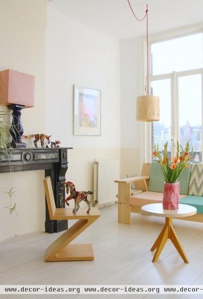
Decorating the home has been a very organic process, with intuition playing a key role in mixing the old with the new. "It's very intuitive," says Boesveldt. "I am always triggered by folkloric, hand-crafted pieces that are colorful and that inspire our own designs."
The couple used cream-colored paint to add some subtle contrast to the bottom half of the walls. "Slightly different than just white, the cream is hardly noticeable but still has a strong effect as a whole," says Boesveldt.
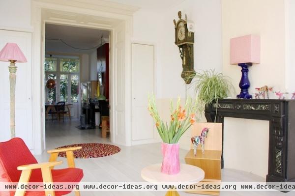
Boesveldt and Yashkin fell in love with their home's original details, like the partition wall (common to older European homes) that divides the living and dining rooms. The mantel is also original to the home. The couple painted it black to highlight its ornate features and to make it stand out amidst the neutral tones of the room. Boesveldt inherited the antique clock from her grandparents.
The cardboard horse displayed on a chair in the living room is from Boesveldt and Yashkin's Kidsonroof Totem collection. The couple originally specialized in designing kids' decor and play items, but as their own three children are growing, they are now working on launching a broader collection of furniture and decor pieces through Studio Roof in early 2014.
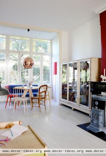
In the dining room, original windows create a light and cheerful spot where the family of five enjoys meals. "The dining room is our favorite place in our home, where we sit as a family for breakfast and dinner, and with friends over a glass of wine," says Boesveldt.
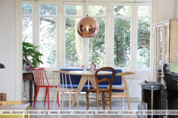
A mismatched set of dining chairs — including two J77 Hay chairs designed by Folke Pålsson, a French antique flea market find and a Hans Wegner Wishbone chair — surrounds the very first sample of the couple's dining table, Table big. A vintage bench purchased from Amsterdam vintage boutique Neef Louis lines the window, providing extra seating.
Pendant: Copper Shade, Tom Dixon
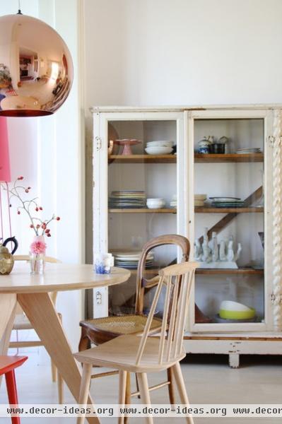
"We get inspired by traveling," says Boesveldt. "Everywhere you look there are little finds from places we have been." The vintage glass cabinet displays an eclectic array of pieces that have been collected over years of traveling and living in various parts of Europe. Before moving to Amsterdam, the family spent four years living in Montpellier, in the South of France.
The couple loves the fact that their own designs meld so perfectly with the eclectic items they've gathered over the years. "The combination of unique pieces that we have picked or made ourselves makes it a home that you will not see twice," says Boesveldt.
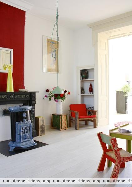
The sizable open plan offers ample space for the family to dine in one area, relax in another and have a devoted kids' area, while keeping furniture and accessories to a minimum. The key to their minimalist style is doing a major clean-out once a year of items they no longer want or need. "It's sometimes a chaotic life, with three kids and our own company, but our house feels light," says Boesveldt. "We can move instantly. We have no heavy pieces, and we do not like to collect too much stuff. We like a house that still respirates. We have moved many, many times, and we have learned to get rid of stuff at least once a year."
Kids' table and chair set: VolumeZero, Kidsonroof; mint-green pendant: Ontwerpduo
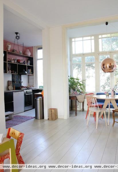
Common to older Dutch homes is a narrow, separated kitchen parallel to the dining room. The first thing the couple did was knock out part of a wall to bring in more light and to create a more open living space. Then they had new floors laid throughout, opting for light-colored wood to emphasize the natural light that floods through the room's large sash windows (one of the features they fell in love with when they first saw the house).
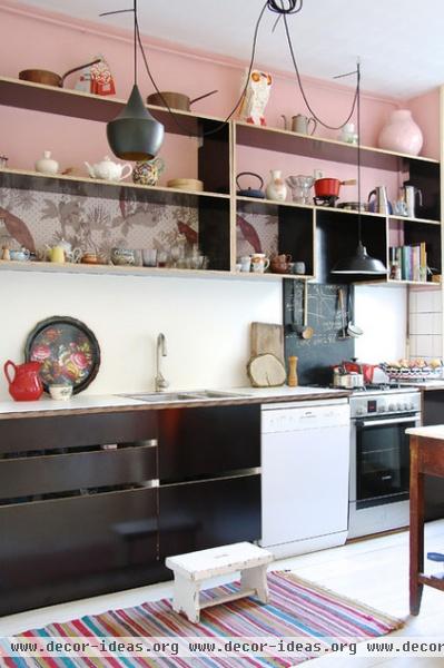
Boesveldt and Yashkin love the combination of black and pink, and stuck to that when updating their kitchen. Inexpensive open shelving lined with Parrots wallpaper by Saint Honoré Wallcoverings made the project budget friendly, while Tom Dixon pendants add a touch of glamour.
The couple avoided sticking to a strict budget during their kitchen update, instead tackling each project as it came along and making snap decisions. "We never do budgeting when we create for ourselves," admits Boesveldt. "We just go with the flow and decide on the spot."
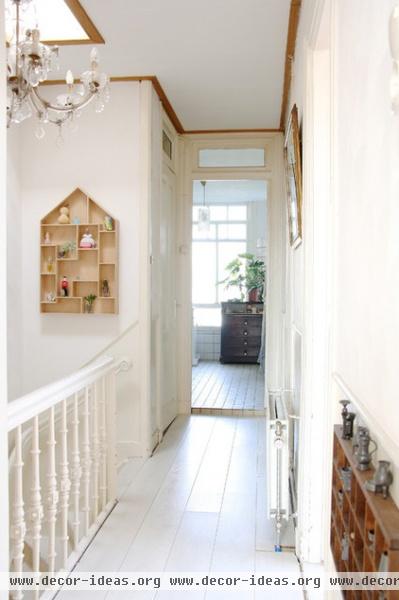
The couple kept things light and bright in the narrow hallway upstairs.
A small wall storage piece (left) from their design line, Collectors House, and a vintage display box on another wall (right) display souvenirs from family trips, while an antique chandelier adds a touch of drama above the staircase.
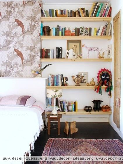
In a departure from the rest of the house, the master bedroom features black flooring. The same graphic Parrots wallpaper used in the kitchen forms an accent wall behind the headboard, while open wood shelving holds books and travel mementos.
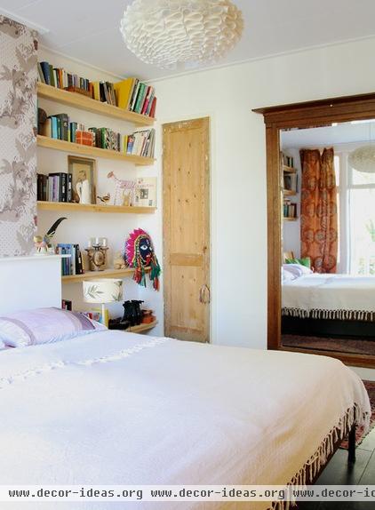
The door to the couple's closet is original to the house, but Boesveldt and Yashkin had it stripped down to the bare wood to add warmth and character to their bedroom.
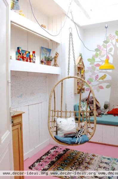
The couple's youngest daughter, Sonia, occupies a colorful room that was once a closet. A skylight was added during the renovation. Pink floors and white walls make for a fun and feminine space for the 7-year-old.
Egg Chair: Sissy Boy
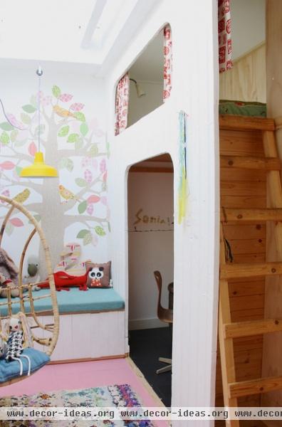
Sonia's space-savvy bedroom features a custom pine sleeping loft built by Yashkin — complete with a window and curtains that slide across — and a desk underneath where she can do homework and crafts. The cheerful tree sticker is by Inke.
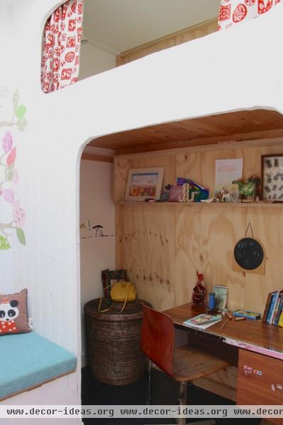
Here's a glimpse of Sonia's desk area. An open shelf displays her collected toys and treasures.
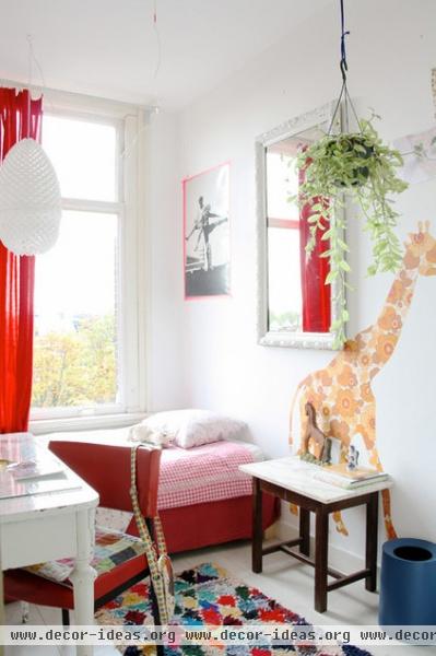
The couple's oldest daughter, Nika, has a small but sunny room that employs pink, red and white. The paper pendant is by a Dutch designer, and the art print is framed with pink washi tape. The giant giraffe wall sticker is by Inke.
Tape, the Multipurpose Decorating Wonder
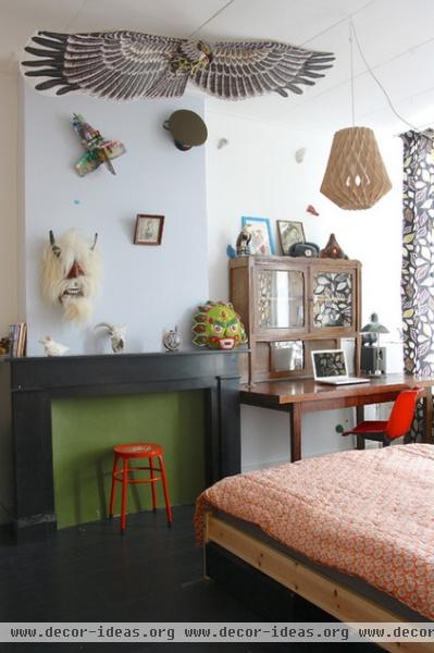
Son Stas' bedroom features a mix of vintage and designer items. Yashkin and Boesveldt painted the mantel black in this space as well.
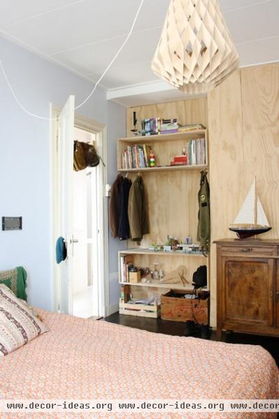
Stas' love of aviation and planes shines through with authentic vintage hats strung up at the entryway to his bedroom, and with aviation uniforms on display in his custom-made plywood wardrobe.
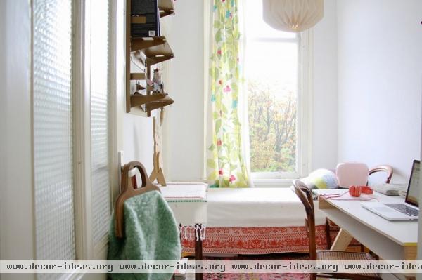
When not at the Studio Roof headquarters, Boesveldt works in this cozy office and guest room. "I love my working room," she says. "Often at night I am on the bed with my laptop and newspapers around me, working and relaxing simultaneously in a very little room."
Curtain: Stockholm Blad, Ikea
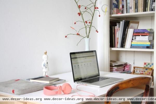
A built-in shelving unit stores books, toys and art created by the children.
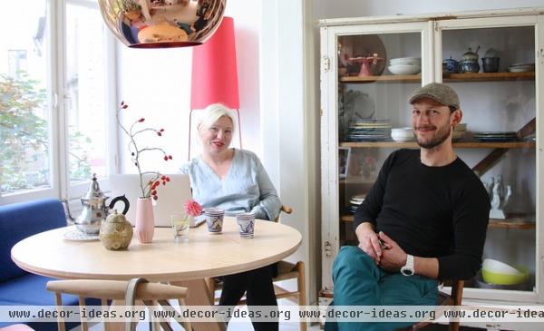
Boesveldt and Yashkin relax in their dining room. The couple admits they do not always see eye to eye on all design-related decisions but, Boesveldt says, they "always agree in the end — sometimes after some discussion, of course." They also share one important factor: an appreciation of simplicity.
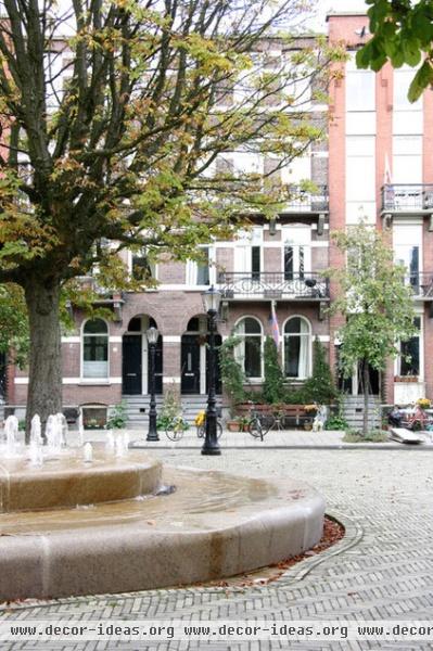
Boesveldt and Yashkin occupy the top two floors of this building. "I love the dynamics of Amsterdam. It's easygoing, with enough to see and be inspired by, and it's international," says Boesveldt. "Our neighborhood is perfect for families. Kids play on the street together, they bathe in the fountain on the square when it's hot, and we're still only 15 minutes from the city center by bike."
Show us your eclectic home!
Browse more homes by style:
Small Homes | Colorful Homes | Eclectic Homes | Modern Homes | Contemporary Homes
Midcentury Homes | Ranch Homes | Traditional Homes | Barn Homes | Townhouses | Apartments | Lofts | Vacation Homes
More: Travel Guide: The Hague for Design Lovers


