Basement of the Week: Warm Modernism in a Notable 1930s Home
“Oh my gosh, it was horrific. It had low drop ceilings, asbestos linoleum floors, and the whole thing was mostly storage," says architect and interior designer Terri Crittenden, recalling her first impressions of this suburban Chicago basement.
Years earlier Crittenden had worked on a renovation of the historic home; the owners called her back to tackle the basement when they decided to incorporate a media room, an exercise room, a bathroom, a minikitchen and storage. The couple wanted to honor the home's modern design but do it in a way that wasn't rigid. "They wanted a 'soft' media room," says Crittenden, who works at Susan Fredman Design Group. The project designer was careful to extend the home's striking modern style into the basement, while also providing an inviting and relaxing hangout space for the couple and their two teenagers.
Basement at a Glance
Who lives here: A couple and their 2 teenage daughters
Location: Wilmette, Illinois
Size: About 1,000 square feet
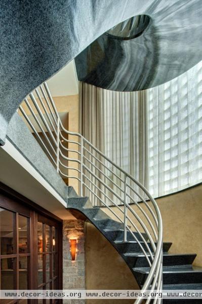
The single-family home was designed by renowned architects Keck and Keck in the 1930s. "The polished terrazzo staircase is iconic," Crittenden says.
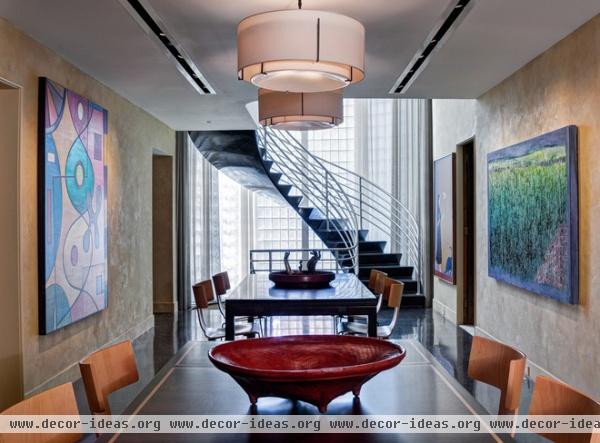
I know we're supposed to be focusing on the basement renovation here, but I just had to share another view of the staircase and the long gallery on the main floor, since the design of the upstairs influenced the look of the basement.
The staircase extends all the way down to the lower level. As you can see, the new design had a lot to live up to.
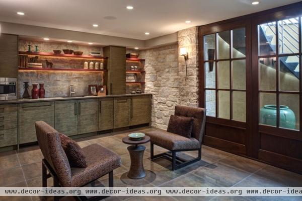
In the newly remodeled basement, three large mahogany doors borrow light from the stairwell and provide a view of the staircase. Rope lights and recessed lights in the soffit over the minikitchen accentuate the purple heartwood shelves, cerused rift-cut white oak cabinets and stone wall. A dishwasher and refrigerator are concealed in the base.
The stone wall is composed of veneers that are applied just like tile. Crittenden says making it look real is all in the mortar; here the joints were filled (rather than raked) to give the wall a weathered and authentic look.
On days when the room is not being photographed, there is a Ping-Pong table in here.
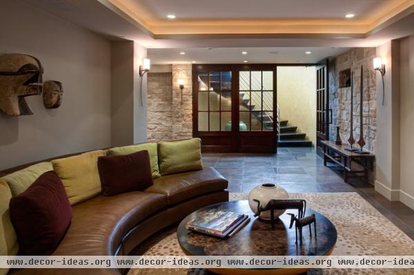
The changes to the basement had to fit within the 13- by 13-foot steel and concrete structural grid of the International-style house. Crittenden carved out comfortable spaces accordingly. In the media room, a custom curved leather sofa faces the television.
"It's a great hangout for the girls and their friends; some may be watching a movie while others are playing Ping-Pong or fixing snacks in the kitchen," Crittenden says.
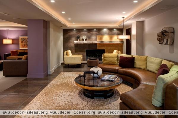
"Having light sources on different planes makes the ceilings feel taller and gives the illusion of volume," says Crittenden, who mixed can lights, cove lights, sconces, rope lights and pendant lights to achieve the proper effect.
The table, which is vintage, has an inlaid wood floret design on top. The rug is a custom design, and large-scale porcelain tiles cover part of the floor. "These floors have worked out so well — they are very durable, and because they are dark, they don't show any dirt," Crittenden says.
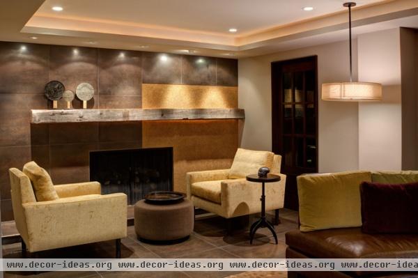
"It's lovely to work with a client who is really thoughtful about texture, lighting and materials, and this one was," Crittenden says. A great example of the play of different textures and materials is this fireplace sitting area. Two soft upholstered armchairs enjoy the warmth of the gas-powered wooden fireplace. (The textures warm up the room as well.) The porcelain floor tiles continue up the fireplace wall, which is punctuated by a reclaimed-wood mantel and a splash of troweled-on gold glass beads.
The French door on the right leads to the exercise room, bathroom, utility room and storage space.
More: Contractor Tips: Finish Your Basement the Right Way


