Houzz Tour: Modern Minimalism in a Multigenerational Home
When designing this house for a three-generation family, architect Joshua Nimmo developed a plan to enhance the relationships between family members by providing smaller personal spaces around larger family ones, indoors and out. The courtyard with pool is the most important; most of the rooms are oriented toward it through large glass walls shaded by roof overhangs. It is a classically modern one-story pavilion where connections — between family members and to nature — are paramount.
The owners are still working out the interiors, so this tour focuses on the architecture as a blank slate — before furnishings and other interior design elements will eventually complete the home. The photos nevertheless highlight the materials and surfaces that help to shape the various rooms and what happens inside them. The photos of the house at this stage also prompt us to consider how to "finish" it. I have my ideas. What are yours?
Houzz at a Glance
Who lives here: A 3-generation family
Location: Dallas
Size: 6,700 square feet; 5 bedrooms, 5 full bathrooms, 2 half bathrooms
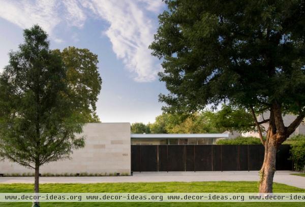
The house is fairly solid and introverted when seen from the street to the south. A limestone wall screens the garage on the left, and weathered steel gates provide access to the front court on the right. The floating roof beyond the gates hints at the transparency of the house.
The house is above average in size at 6,700 square feet, but remember it does serve three generations, and it is in keeping with houses in the area.
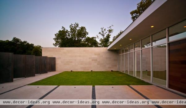
The front court is a generous outdoor space that clearly and carefully creates a transition between the outside world and the realm of the house. One walks along the grass on the concrete hardscape to the wood-paneled front door.
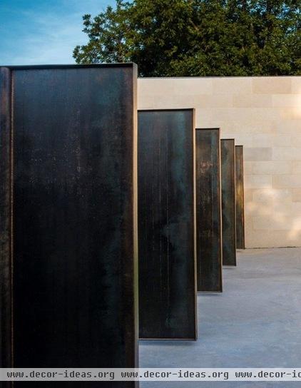
Weathered steel doors pivot in the middle and appear to float over the concrete.
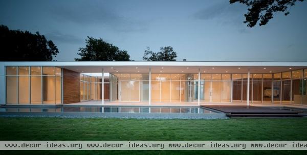
The courtyard with pool is a very large space within view of some of the personal spaces and all of the shared family spaces. From left to right we see the master suite, then the expansive living room and finally a hint of the kitchen at the far right.
The pool, generous roof overhang and glass walls give a definite north-south directionality to the house. (We are looking east, so north is to the left and south is to the right.)
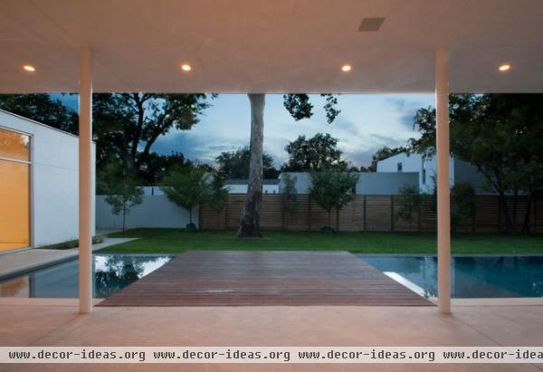
Given the heat of Dallas, the pool is a great amenity for cooling off, and the roof overhang is important for shading the outdoor space (to make it actually usable) and the glass wall, which would otherwise admit too much afternoon sunshine to the interior. Further shading comes from the tall sycamore and other trees on the west side.
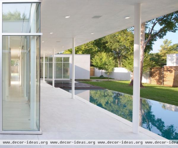
This is my favorite view of the house, for it shows a straight shot through the interior from the outdoor space by the master suite to the front court, as well as the layering of four parallel strips: interior path, outdoor space under the roof, pool and grass. We can also see into the grandparents' suite, which lies at the end of the pool.
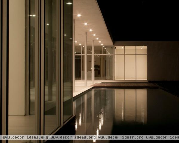
Here is a similar view, but at night, showing how the master suite juts out slightly into the footprint of the pool.
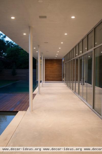
The covered outdoor area totals approximately 1,000 square feet and increases the area devoted to solar panels on the roof.
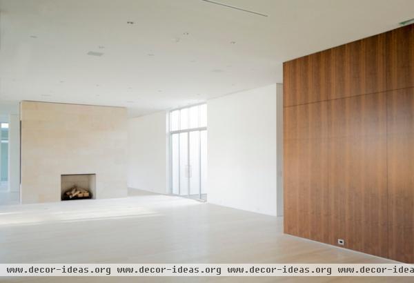
In this photo we are looking roughly from the kitchen toward the formal dining and living room, and at the fireplace that separates it from the informal recreation space beyond. To the right of the fireplace are glass doors leading to a small court that provides a place for family members to be alone outside.
Materials are few and minimally detailed: The fireplace is limestone, like the exterior; the floors are bleached oak; and the wood wall on the right is made with walnut veneer panels.
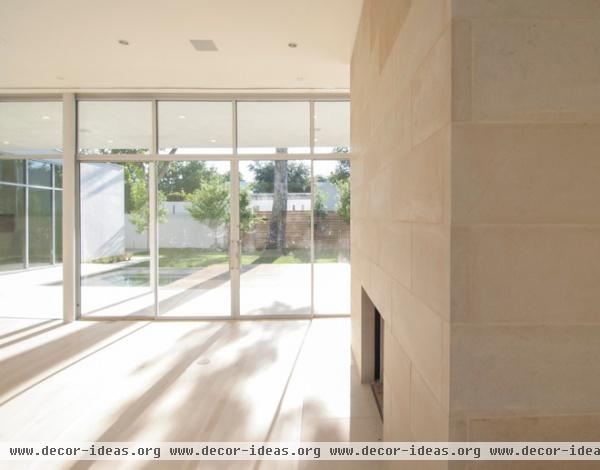
From the fireplace we get a direct view to the courtyard and pool. The west sun is streaming through the glass walls, but it is quite low under the large overhang, meaning the glass and interior have been shaded from most of the afternoon sun and the sun will soon be setting.
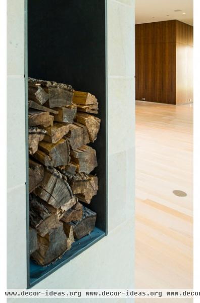
A nice detail can be found in the firewood storage on the side of the limestone hearth; this photo looks toward the walnut-covered walls we saw earlier. As the home is in Dallas, the fireplace won't be used too often, but Nimmo incorporated a geothermal HVAC system to ensure that even in the warm months, the energy use will be kept to a minimum.
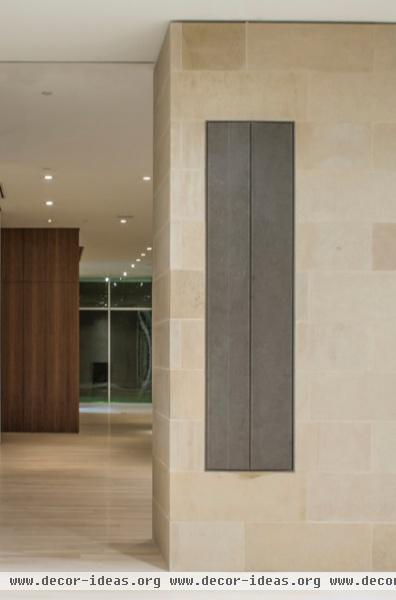
On the other side of the fireplace (facing the small recreation rooms) is some tall, narrow storage behind darker stone doors.
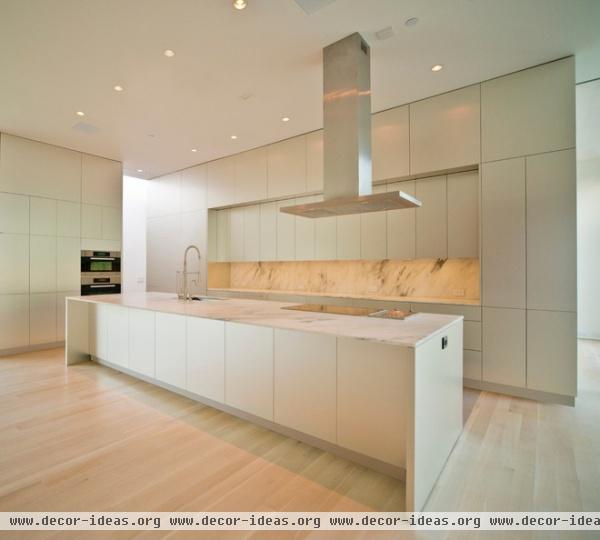
The large kitchen has white flush cabinets and Calcutta Danby stone for the countertops and the backsplash.
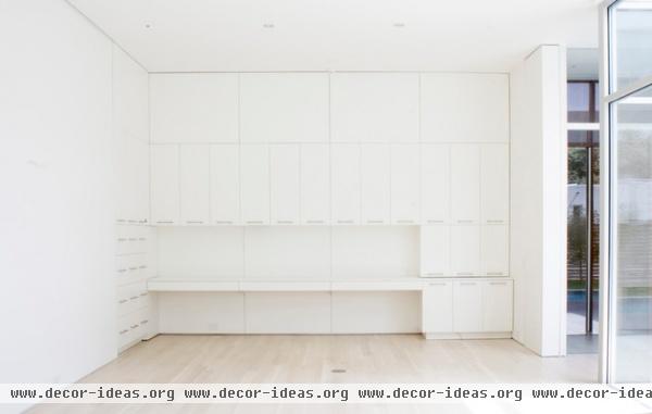
The same bright white surfaces can be found in the home office, adjacent to the master bedroom. As in the kitchen, panels extend to the ceiling to cover the whole wall and create a consistent appearance.
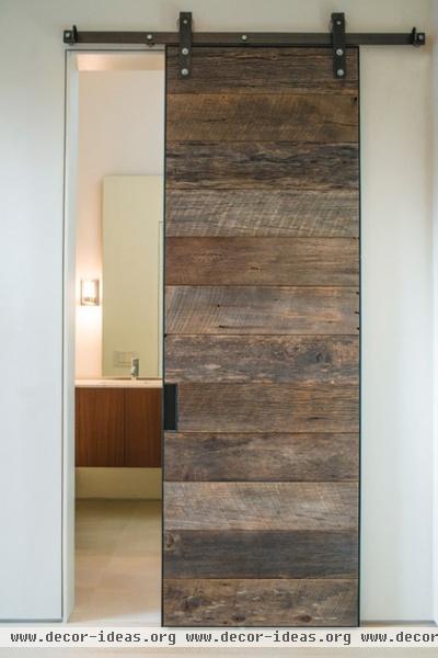
The finishes and details inside the house are resolutely modern and minimalist (note the reveal at the wall base that continues up and over the opening), but they are broken by touches like this barn door made with reclaimed wood.
Credit should be given to Rick Fontenot from Constructive General Contractors, who built these modern, minimalist details that are so much more difficult to pull off than they appear.
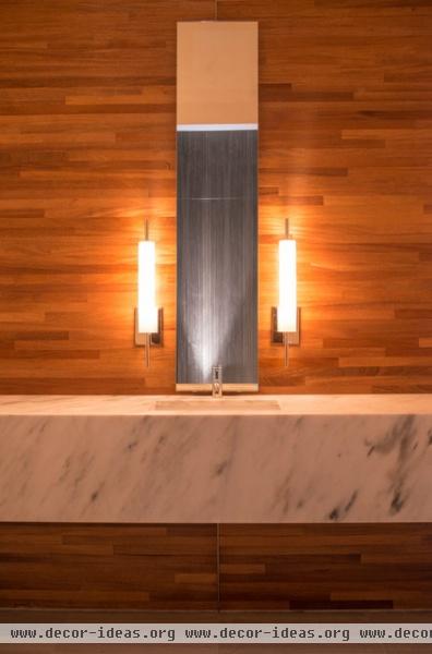
The wood walls and Calcutta Danby vanity really stand out in the powder room, but I'm drawn to the narrow mirror.
The strikingly slender proportion of the mirror connects it to other parts of the house — the firewood storage, the narrow doors set into the other side of the fireplace, the walnut panels, the barn door, even the pool if we turn it vertically — creating an architectural theme throughout the house that relieves the predominantly light and flat surfaces.
If I were lucky enough to be charged with fitting out this interior, these verticals are something I'd pick up on, in addition to finding ways to strengthen the orientation of the spaces to the courtyard.
How would you work with the architecture to complete this home's interior?


