My Houzz: Modern Classics in a 1940s Home
When Bret Ashlee Watson, an interior designer, and her husband, Steve, a graphic designer, bought their 1940s Seattle home, its clean lines and simple styling offered an ideal backdrop for their budding collection of "modern classic" pieces. But two years after they moved in, disaster struck, in the form of a broken sewer line.
"We repaired the sewer line in chunks, over the course of three years," says Bret Ashlee. "At one point this required breaking a hole in our foundation. We realized this gave us the opportunity to plumb for a bathroom, so I drew plans overnight, and we got it done." About a year later, they remodeled the entire unfinished basement. It took $16,000 to complete the sewer line repair, but the misfortune led to a greatly expanded living space perfectly suited to their cheerful contemporary aesthetic and growing family.
Houzz at a Glance
Who lives here: Steve and Bret Ashlee Watson, their 2 children and cats Chewbacca and Luna
Location: Ballard neighborhood of Seattle
Size: 2,100 square feet; 3 bedrooms, 2 bathrooms
Year built: 1941
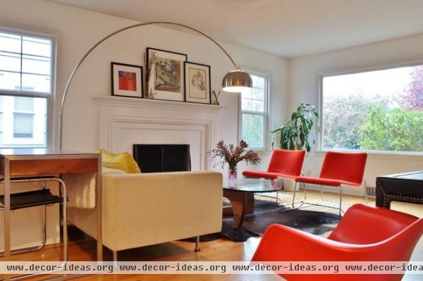
Low-profile chairs and curtainless windows encourage the flow of light from the living room's west- and south-facing windows — an important consideration in cloud-laden Seattle.
With two children to supervise and a business to run, Bret Ashlee staked out a home office by setting a desk against the back of the sofa and pairing it with a Mart Stam cantilevered chair.
Basis Desk: Room & Board; Eames Molded Plastic Rocker: Design Within Reach

The front door opens directly into the living room; there's a layered progression from living to dining to kitchen spaces. The house "is essentially a square box," says Bret Ashlee. "There's great flow, because you can walk from room to room in a big circle, without hitting any dead ends."
A preexisting unused space in the wall became a wonderful focal point for accessories, with the addition of floating shelves. The oak floors are original.
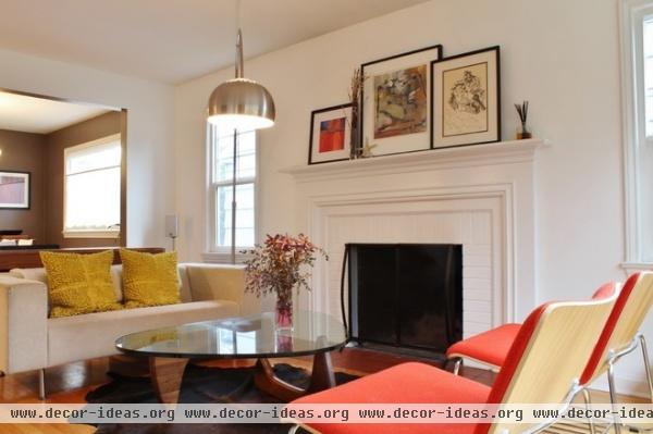
The Watsons painted the living room walls, fireplace mantel and brick surround the same soft white. As is typical for 1940s homes, the living room has no overhead fixtures.
What to know before painting brick
Noguchi Table: Design Within Reach; Pure Cowhide Rug: Room & Board; lamp: Arco, Room & Board; yellow wool pillows: Nordstrom (no longer available)
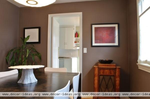
The dining room table has great sentimental value for Bret Ashlee, as it's the first furniture piece designed by her mother, Carrie Stock, in the 1970s. The antique radio once stood in her father's office and now offers a nice contrast to the room's clean lines.
The walls are painted a deep brown-gray. "I sent my husband to get Sherwin-Williams' Gun Flint, and he came back with Stone Metal," says Bret Ashlee. "So we just mixed the two."
Nelson Saucer Pendant Lamp: Design Within Reach; Jake Chair: Room & Board
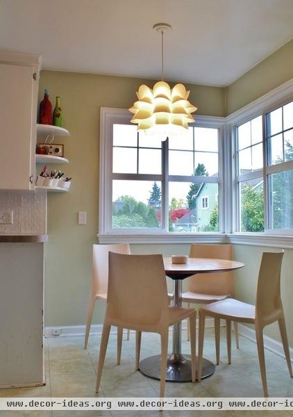
Corner windows (a classic '40s touch) illuminate the breakfast area in the kitchen. The curved shelves are original to the home; the tile floors were added by the previous owner.
Aria 36r Dining Table: Room & Board; Bellini Chair: Design Within Reach; pendant: Knappa, Ikea
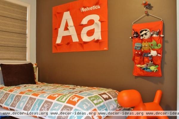
Steve made this large typography art for their son's bedroom using sheets of recycled paper from 2Modern. Bret Ashlee made the custom Roman blind with fabric remnants and dowels, and backed it with blackout fabric. "The dowels placed on the inside created a great horizontal line on the blinds, which I love," she says. "And no break-through light."
Paint: Monk's Cloth, Sherwin-Williams; dog seat/toy: Tottini
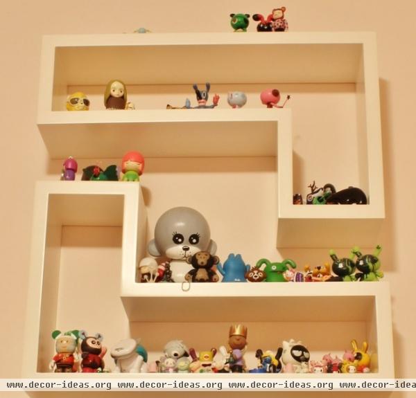
The entire family collects small figurines and displays them in their own ways. The daughter (with the largest collection) shows hers off on a pair of L-shaped shelves.
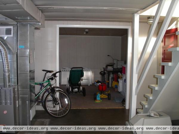
When the Watsons purchased the home 13 years ago, the basement was unfinished. The room in the background became the family room.
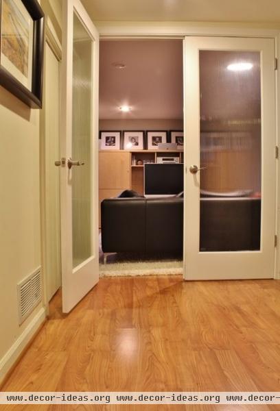
AFTER: Formerly a hodgepodge of cinder block walls, concrete floors, exposed ceilings "and one mysterious room that had all kinds of locks on the door," says Bret Ashlee, the basement became a warm, fully functional space. The family room was enclosed with wide French doors. The owners chose Pergo flooring over thicker bamboo floors to maximize ceiling clearance, and enclosed the furnace inside a closet.

A media unit with extensive storage provides enough room for tucking away just about everything. The soffit was added during the renovation to house the gas line. The Watsons converted the home from oil to gas; they "saved so much money," says Bret Ashlee. "We got tired of getting a $600 bill for oil right before Christmas."
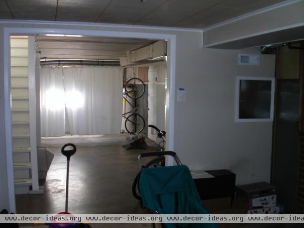
An awkward opening is all that separated this space from the rest of the basement. Instead of knocking down walls and opening this area to the rest of the downstairs, the homeowners turned it into a family room.
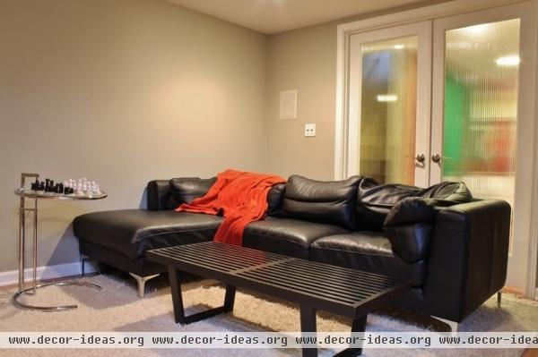
AFTER: French doors were added to the family room to provide privacy without making the room feel disconnected or closed off from the rest of the downstairs.
With the media unit taking care of electronics, DVDs and assorted paraphernalia, all that was needed to make the family room comfy and functional was a sofa, a soft rug and tables for playing games on or holding popcorn on movie nights.
Eileen Gray Side Table: Design Within Reach; coffee table: Nelson Platform Bench, Design Within Reach
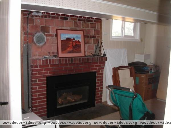
The future family room had an original fireplace that, according to Bret Ashlee, "was just kind of plopped into this unfinished space."
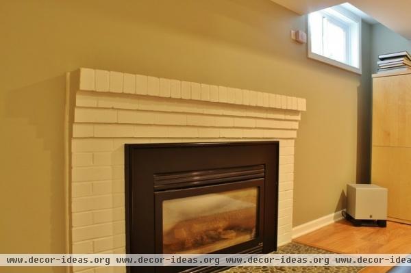
AFTER: Connected to the new gas lines and given a fresh look with white paint and drywall, the fireplace now works seamlessly with the rest of the home. "Someone was forward-thinking when they put a fireplace down here," says Bret Ashlee. "We're just the lucky ones who were able to complete it and reap its benefits."

The opposite side of the basement included a door to the yard, a washer and dryer, and a locked storage room. "We put in all-new electrical and plumbing while everything was exposed, before we put in the ceiling," says Bret Ashlee.
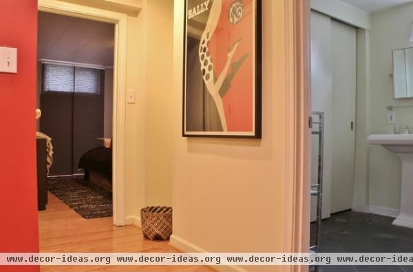
AFTER: A master bedroom and bath were added to the basement, along with a pantry under the stairs. Now the space fulfills many functions and "doesn't feel like a basement," Bret Ashlee says.
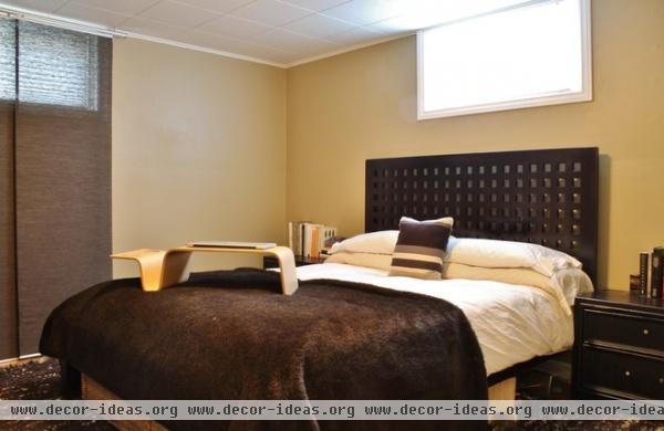
The master bedroom is a warm cocoon, with a neutral palette and great personal touches. Bret Ashlee's childhood side tables and dresser were refinished. The heavy brown blanket, dubbed "The Bear," was a gift from Bret Ashlee's mother.
Bed, rug: Crate & Barrel; striped pillow: Jonathan Adler
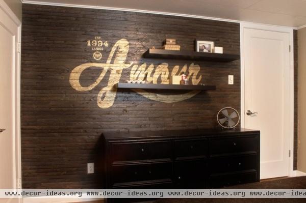
The master bedroom's focal point was a gift of love from Steve to Bret Ashlee. While his wife was out of town, Steve covered the wall in lath, stained it, then projected a custom graphic onto the surface, which he painted a shiny gold. Next to the French word for love, amour, is the year the couple got married, their respective birthplaces and a "WW" logo, representing their entwined last names.
Floating shelves add display space without marring views of the graphic.

Located on a quiet block in the Ballard neighborhood of Seattle, the Watson house is a twin to the home next door. Built simultaneously by contractor Earl Mench, the two homes share a sewer line (and the burden of repairing it) but differ slightly in square footage and architectural details.
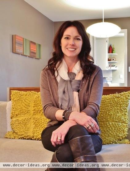
Bret Ashlee, shown here, is happy with the way the house reflects her and Steve's personal style. "This home was built in the midcentury. We knew we could find furniture we love, but which was also designed within the same era as the house," she says. "It's all about modern classics that are clean-lined and stand the test of time, just like the architecture."
See more photos of this home
Browse more homes by style:
Small Homes | Colorful Homes | Eclectic Homes | Modern Homes | Contemporary Homes | Midcentury Homes | Ranch Homes | Traditional Homes | Barn Homes | Townhouses | Apartments | Lofts | Vacation Homes
More: Contractor Tips: Finish Your Basement the Right Way


