Love the One You're With: Honoring a Home's Original Charm
When people first meet a house that's unloved and neglected, or out of date and unappealing, the tendency can be to rush into demolition or take everything away and start from scratch. But tearing down a house means that some of the best features and charm will be lost forever. Plus, a huge amount of waste is created. And everyone's homes start to look the same when the quirky old is replaced with the same, off-the-shelf new.
Whether your budget or your love for older homes prevents you from changing the roofline, walls and tile, it's often necessary to get creative and work with what you already have. Sure, it's difficult to see past a first bad impression, but with patience and a practiced eye anything is possible.
If you've ended up with a house that befuddles you or seems less than perfect, don't despair. The challenge of making something wonderful and unique out of something others might take down can actually be the fun part! Let's look at three examples of homes the owners worked with instead of tearing down.
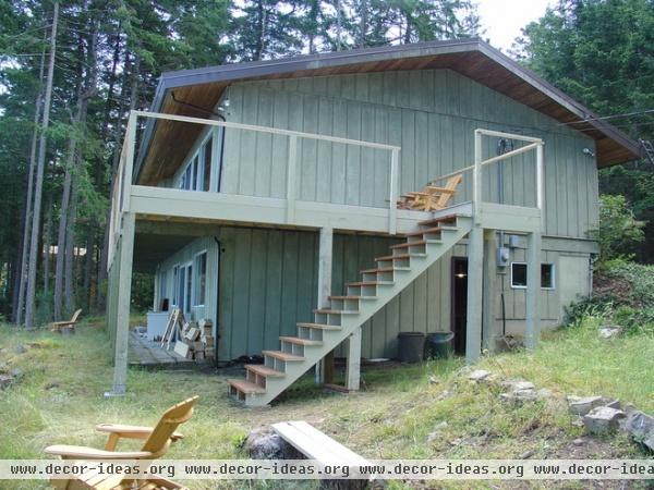
1. Creative Vancouver Cabin
I grew up in Alaska, and this type of house is all the rage there. This is a house that even I would have walked up to and said, "Thank you, I've seen enough." And I usually want to save everything. Most people told the owners, Canadian designers Ian McLeod and Kerry Johnson, to tear it down.
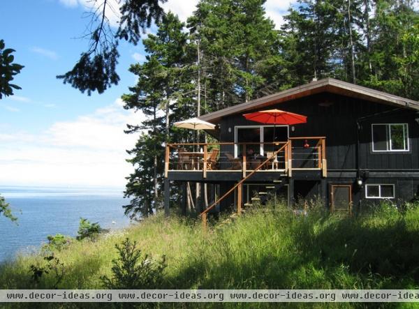
AFTER: But McLeod and Johnson saw good bones and an amazing location. With bold black exterior paint and some subtle design moves — such as adding a more modern porch railing and staircase — they broke up the boxlike feel of the exterior and added architectural interest without making any major changes.
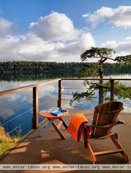
And now they get to wake up to this.
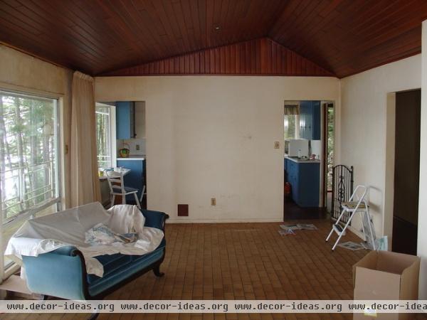
In the interior McLeod and Johnson made a few decisions that completely changed the feel of the house. In this before photo, the wall dividing the kitchen and living room blocks a great deal of light. Because it is dark, it is easy to think the ceiling and floors might need to be replaced or refinished.
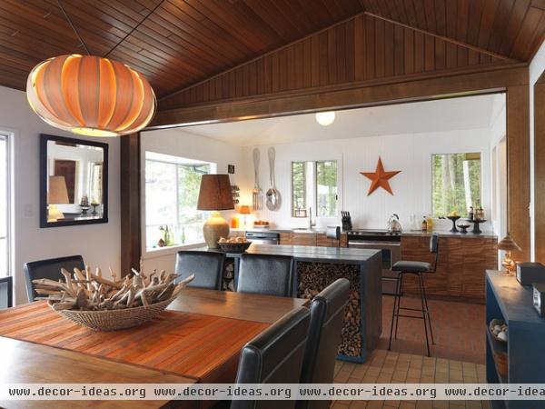
AFTER: Taking down one wall and framing out the opening changed the look of the room without drastically altering the architecture. The pair added a cool modern island, painted the walls bright white, replaced the cabinets with budget-friendly ones and added fresh furniture and lighting. These simple changes allowed them to leave the floors, ceiling and basic shape of the room the same.
See more of this house
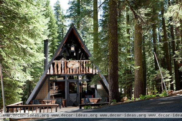
2. Classic Tahoe A-Frame
Another house from my childhood is the A-frame kit home. It's starting to look interesting to me again, but there was a time when I would have run the other way. You want me to live where? In a triangle?
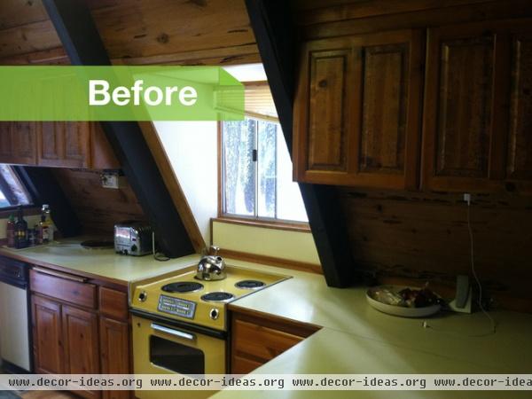
But owner and architect Curtis Popp, of Popp Littrell Architecture and Interiors, saw beyond this home's oddly shaped walls, awkward windows and forest's worth of wood paneling, and used everything to his advantage.
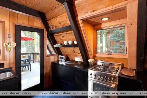
AFTER: Popp defined the angles of the beams with black paint, took out the laminate and added even more wood, ingeniously using the beams as a frame for open shelving to highlight the cool lines of the A-frame's form.
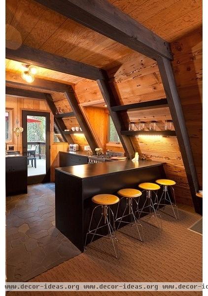
Popp also used a relatively inexpensive black slate floor tile from Dahl in the kitchen and bathroom. It came laid out on mesh, which made it easier to install.
See more of this house
3. Beautiful Virginia Cottage
Another common impulse is to add an addition that changes the charm and scale of the original house, or tear down the original altogether and build out the lot edge to edge. But the best parts of the coveted location can be ruined that way: the shade tree cut down, the sight line destroyed, the yard to relax in gone.
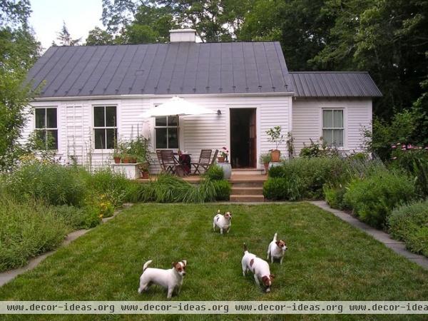
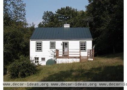
The owners of this 1940s cottage in Virginia wine country kept the modest scale of their cottage intact and added a small bathroom. They moved the entry door, installed energy-efficient windows, added siding and trim, and salvaged the existing metal roof.
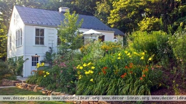
Then the owners, who are landscape architects, brought in 20 dump-truck loads of fill to build up the slope and create beautiful gardens and outdoor spaces. Keeping the footprint of the house small gave them the space and budget to take advantage of the cottage's amazing landscape potential.
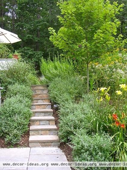
They used stone gathered from the property to build garden walls and steps. Beyond the budget and environmental friendliness of free stone, I think saving and using material found on a property is a great design decision — it's less likely to look out of place, and it grounds the design in the location's natural surroundings.
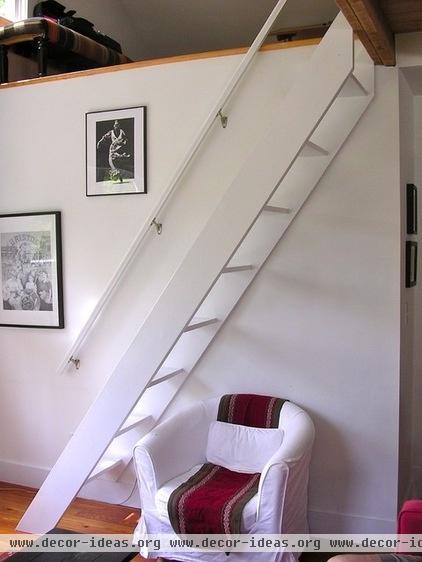
Working with a small footprint can mean making compromises, like a steep ladder to an attic bedroom. But saving an original building means getting a built-in light quality and history that don't come with new construction.
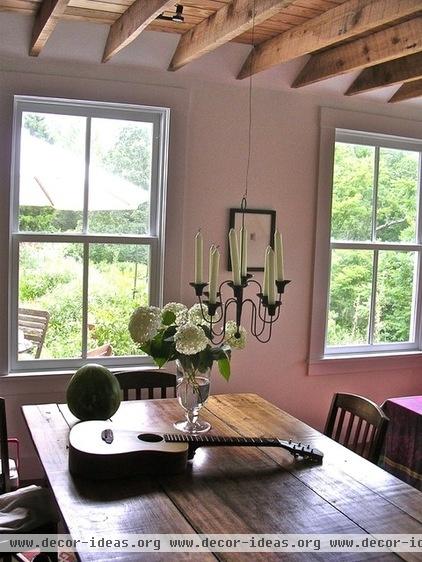
Honoring the original charm of a place and making simple, modest changes can make your home the one everyone stops and admires, because it has a certain something people can't put their finger on. More important, it can raise your spirits a little every time you come home.
See more of this house


