How to Work With a High Ceiling
http://decor-ideas.org 11/12/2013 17:50 Decor Ideas
First of all, consider yourself lucky. Many homeowners would be thrilled to have a decorating dilemma like high ceilings. But I get it. Rooms with enough headroom for an ogre require special attention (as if they didn't already get enough).
Sure, monuments, cathedrals and statues work on a grand scale to create a sense of awe and respect. But in our homes, overly high ceilings can make us feel dwarfed. And if not treated properly, they can create anything but a cozy feeling.
If you want your high-ceiling room to have a cozy feel, bring some elements down into the volume to break up the cavernous space. This approach, together with added attention to the walls, will help it better relate to human scale. Here's how to do it.

Millwork adds importance. A grand room like this warrants detailed carpentry trim on a grand scale. Hefty crown molding defines the intermediate ceiling level. Above that, boxed panel detailing breaks up the planes and adds texture.
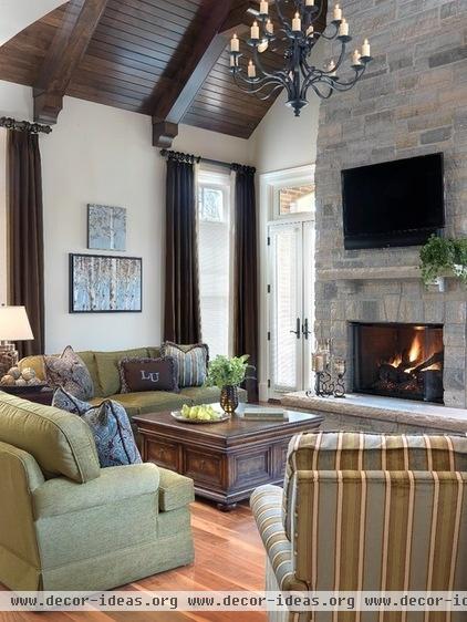
Join the dark side. We're often told that dark colors recede — and for walls, I agree. But when the dark color is on the ceiling, as in the room here, it reduces the perceived distance. Gravity is at play here, too. The dark color works well because the substantial stone fireplace appears as though it could bear the weight.
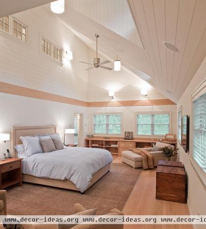
Break it up. If you have a tall wall like this, add a paint line or horizontal material to define where the ceiling typically would be. A subtle change of direction in wall paneling would also help add to the effect.
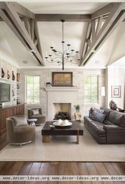
Add structure. Exposed trusses are not just for barns and cathedrals. Here they create architectural importance. Consider arches, horizontal beams and anything else that will relate well to the structure you have.
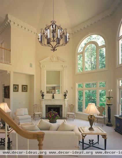
Change the window shape. If you're working on a new build or an addition and doubling up on windows, use curved shapes near the ceiling to help pull everything down visually.
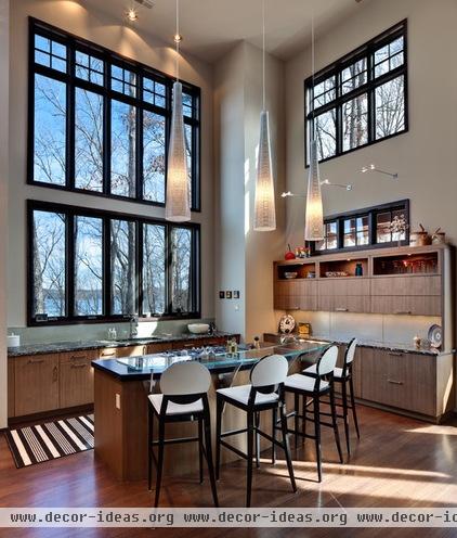
Change the window details. If you are filling a wall with windows, use different arrangements of muntins and mullions for variety.
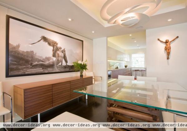
Add sculpture. Sometimes a cove ceiling can just feel cavernous. It's a great place for three-dimensional art, like this ceiling-mounted piece. Bounce light off it and you have instant drama.
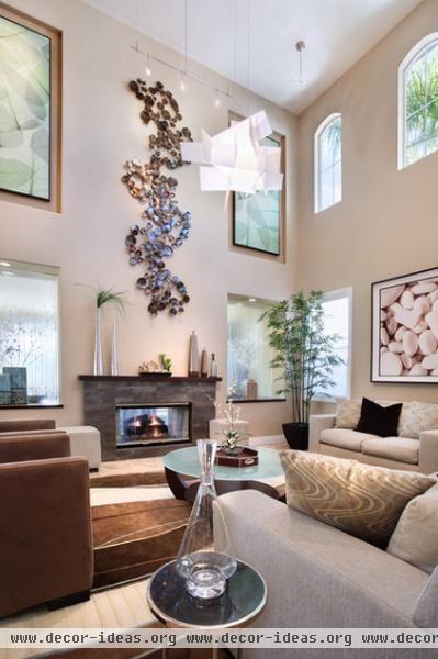
Add unexpected interest. A unique combination of art elements breaks up the wall on the left here. Inset paintings hang above glass panels with trickling water. A central organic piece links the two levels visually.
Too many rectangles here would have been, well, too many rectangles, which could have made the wall feel like it went on forever. The combination of more organic shapes helps relate the upper portion to the lower, bringing everything down a notch.

Make a material change. The juxtaposition of wood paneling (horizontal to keep it modern) and stone breaks up the wall on the left.
Pick a material to repeat and use it to break up an expansive wall. It's beautiful how the wood tones on the wall echo the wood tones of the flooring here.
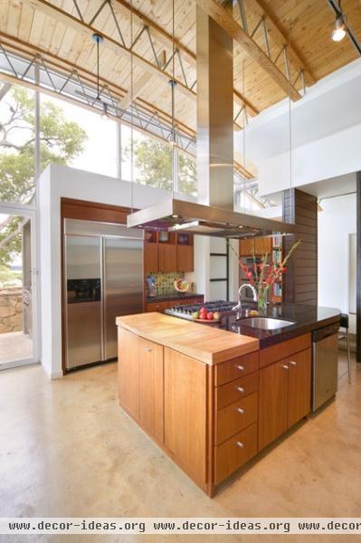
Create a zone. A cooktop hood with exhaust fan and lighting hovers over the cooking station here, creating a more intimate zone. You can bring elements down into a space to define function or work areas.
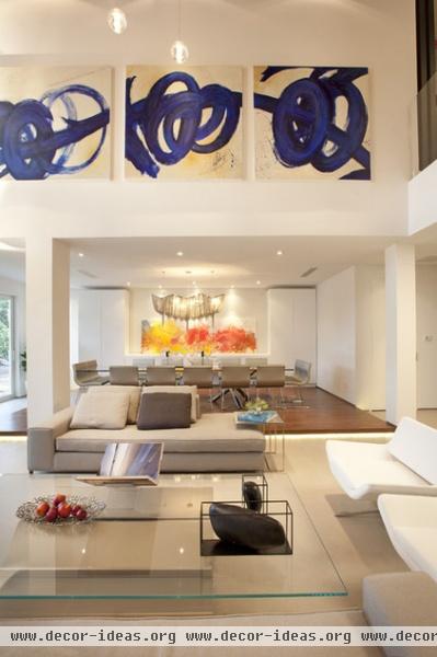
Add art. But keep it large scale. Pick pieces with bold subject matter that are best admired from across the room. They will work beautifully in this unexpected placement.
I just love how the cobalt blue in the paintings here complements the yellow-orange in the paintings below. This sense of connection makes the towering area feel more intimate.
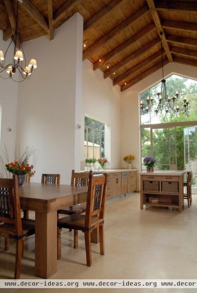
Light it up. I can just picture how this room will look at night — it will have texture and intrigue rather than being a dark void. If you have exposed structural or textural elements, play off them with dramatic lighting.
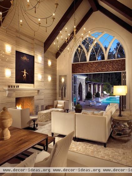
Scale it right. Correct scale is essential. This is not the time to pick a small lighting fixture, unless you're going to install multiples of it. This delicate piece is perfect — oversize but not overweight.
To determine what size light fixture you'll need, start by measuring the room itself. Add the length and the width of the room; this will give you an approximate diameter for the light fixture in inches. For example, if your room is 8 feet by 10 feet, then 18 inches would be ideal.
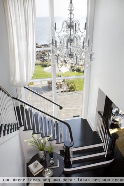
When more is more. A graceful swath of fabric on its own wouldn't be enough to create balance in this room. The tall chandelier is the missing piece.
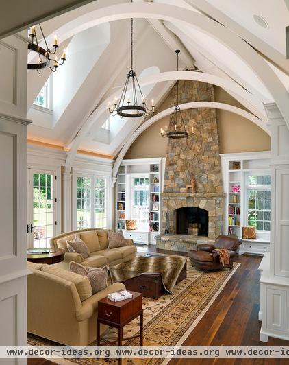
Use several techniques. Arches, large pendants and a color change combined help control this space. If you have a stately stone fireplace that goes to the ceiling, paint the upper half of the wall a warm color to tone it down.
Related Articles Recommended


