The Bay Window Goes Modern
http://decor-ideas.org 11/12/2013 17:40 Decor Ideas
When modern and contemporary architecture "abandon" traditional architectural elements in favor of new forms, one of the elements left behind is the bay window. Yet if we think of these elements as reinterpretations of traditions in architecture rather than abandonments (columns, for example, are turned into skinny pilotis without details like capitals), then the idea of the bay window is alive and well, if less used than it should be.
Here you'll find six examples that show the benefits of modern answers to bay windows — increased area, light and seating capacity — and the various means of expressing the idea in modern houses and in modern renovations of old houses.
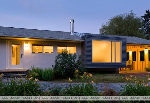
This addition to a ranch house looks like the end of a square tube that runs from front to back, with large windows on each side. The front picture window is partially frosted to maintain privacy.
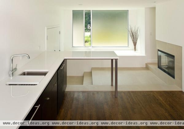
Here we are looking toward the front window from the kitchen before it was furnished. Only one thin strip of glass is clear; the adjacent pieces are translucent. Adding cushions to the bay would make it a great window seat; one could peek outside through the vertical strip or just enjoy the light coming in through the painting-like panes of color.
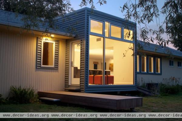
Like the front window, the back window projects from the house, cantilevered a foot or two above the ground. But unlike on the the front, all the glass here is clear, and the area inside is an extension of the floor, giving more space for seating near the kitchen.
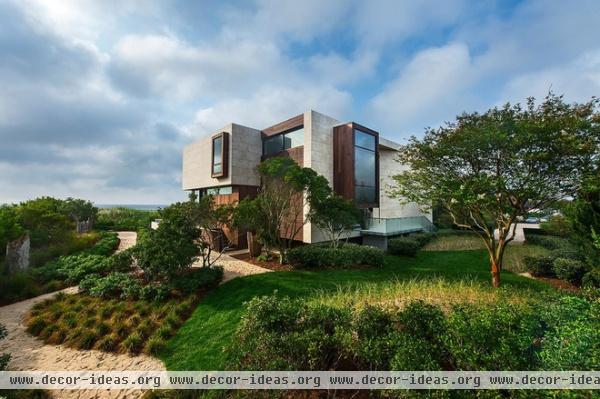
This house on New York's Long Island has a fair amount of ins and outs on its exterior. I'm drawn to the tall portion facing right.
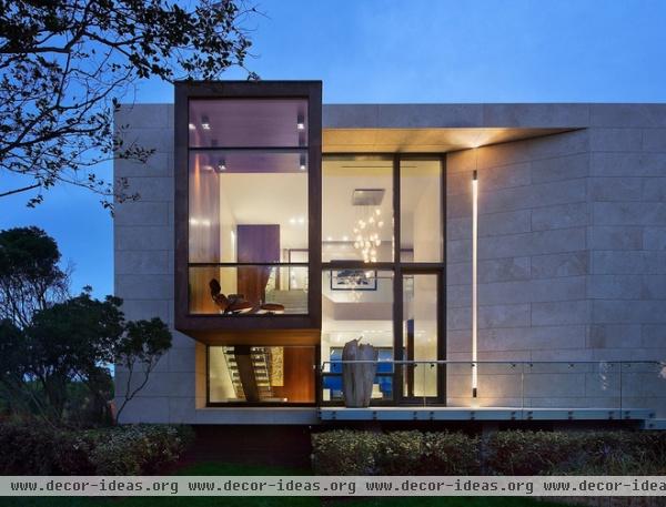
A view from the side reveals a tall bay window adjacent to a section of curtain wall set back from the stone facade. A stair can be seen below the large bay window.
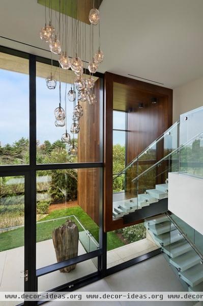
It turns out the bay window is actually an extension of the stair landing. The Eames Lounge Chair in the previous photo indicates that this space is ideal for sitting, relaxing and enjoying the view.
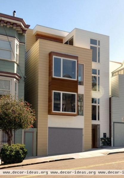
On a more modest scale is this two-unit condo in San Francisco, with modern bay windows above the garage.
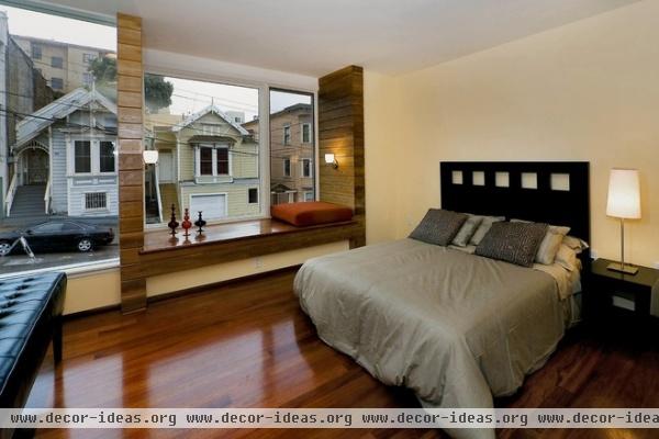
What looks fairly subtle on the outside is impressive on the inside, owing to the relative size of the window (almost the full width of the bedroom) and the way the architect articulated the window seat. The only thing I would change for myself would be the height of the sconces, which appear to be head height, making it hard for someone to lean against the walls while occupying the window seat.
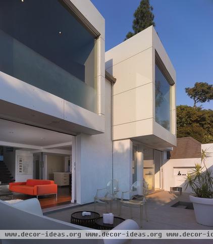
For the transformation of this old house, the architects articulated two second-floor boxes capturing distant views. From the outside we can see that the glass is treated — like bifocals — with a translucent strip at the bottom to maintain privacy.
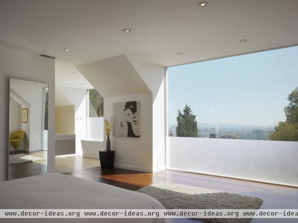
The two bays serve the master suite. The translucent strip is just low enough in the bedroom so one can see the horizon while lying in bed.
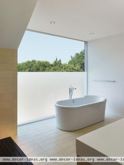
But in the bathroom the translucent strip is higher so one can take a bath in privacy — and still have a view of the sky.
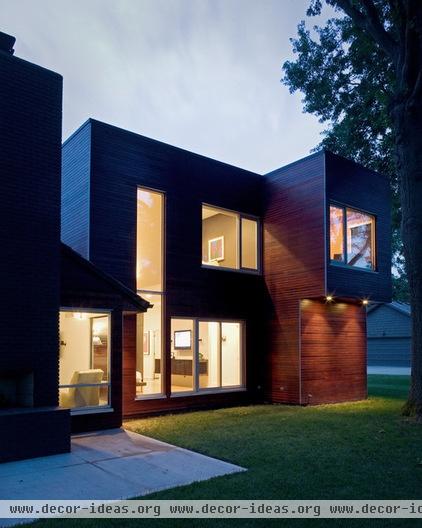
One byproduct of departing from tradition is that elements like bay windows can be located where they need to be, not necessarily in the middle of a facade. On the home here, the bay projects from one corner that is already bumped out in the floor plan.
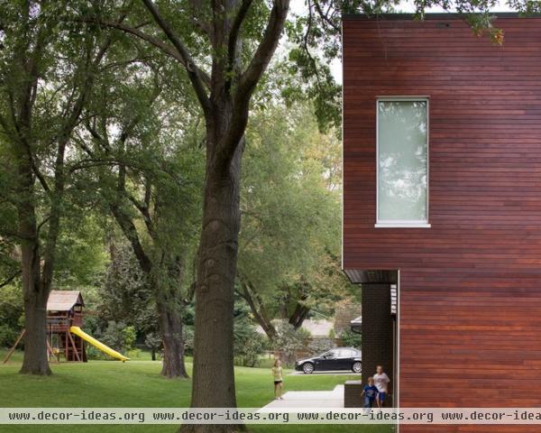
The bay is flush on one side, but as the windows show, the architects used the freedom to do some unconventional things on the outside.
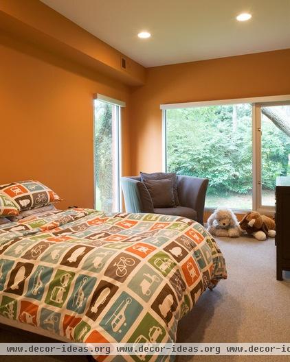
On the inside the bay makes perfect sense, giving the bedroom views and light from two sides and a little extra space for a chair. The solid space on the outside wall is for the bed, so without the bay, the side window would not work.
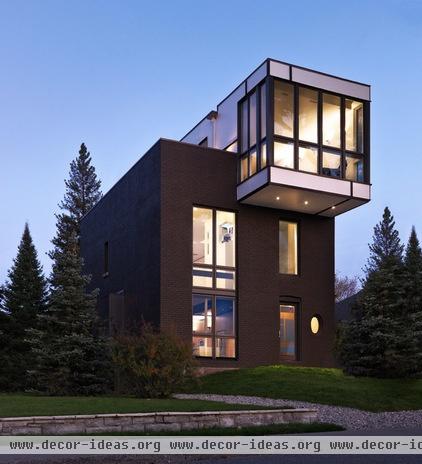
It might be stretch to call this top-story addition to this renovated home a bay window, but it serves similar purposes to the other bays in terms of light, area and seating.
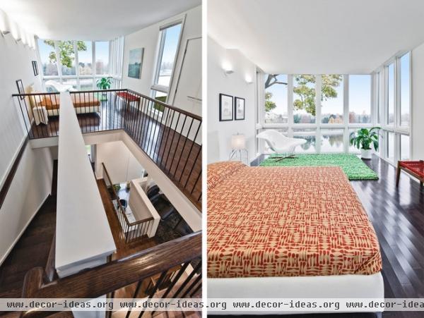
The bay is large enough that it basically doubles the size of the bedroom, creating a sitting area and providing light gain on three sides. The view is tremendous, so it's no wonder that the room reaches toward it through its projection outward.
More: Get More of Everything With a Bay Window
Related Articles Recommended


