How to Get Your Furniture Arrangement Right
http://decor-ideas.org 11/12/2013 07:40 Decor Ideas
Like a blank page or canvas, an empty room can be either an opportunity or a challenge. With so many ways to fill it, how do you know where to start?
I've taken some of the basic rules of furniture arrangement and distilled them into 10 simple tips. They'll help you figure out where to put things, where not to put things and how to prioritize the choices you make.
These guidelines won't turn you into an interior designer overnight. But they'll steer you in the right direction and help you to achieve professional-looking results with a minimum of stress.
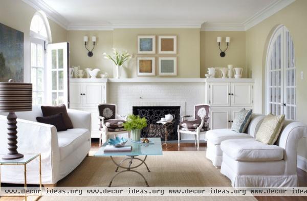
Function. Consider how the room is used and how many people will use it. That will dictate the type of furnishings you'll need and the amount of seating required.

Focal point. Identify the room’s focal point — a fireplace, view, television etc.— and orient the furniture accordingly. If you plan to watch television in the room, the ideal distance between the set and the seating is three times the size of the screen (measured diagonally). Therefore, if you’ve got a 40-inch set, your chair should be 120 inches away.

Priority. Place the largest pieces of furniture first, such as the sofa in the living room or the bed in the bedroom. In most cases this piece should face the room’s focal point. Chairs should be no more than 8 feet apart to facilitate conversation. Unless your room is especially small, avoid pushing all the furniture against the walls.
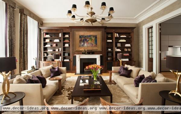
Symmetry. Symmetrical arrangements work best for formal rooms. Asymmetrical arrangements make a room feel more casual.

Traffic. Think about the flow of traffic through the room — generally the path between doorways. Don’t block that path with any large pieces of furniture if you can avoid it. Allow 30 to 48 inches of width for major traffic routes and a minimum of 24 inches of width for minor ones.
Try to direct traffic around a seating group, not through the middle of it. If traffic cuts through the middle of the room, consider creating two small seating areas instead of one large one.

Variety. Vary the size of furniture pieces throughout the room, so your eyes move up and down as you scan the space. Balance a large or tall item by placing another piece of similar height across the room from it (or use art to replicate the scale). Avoid putting two tall pieces next to each other.
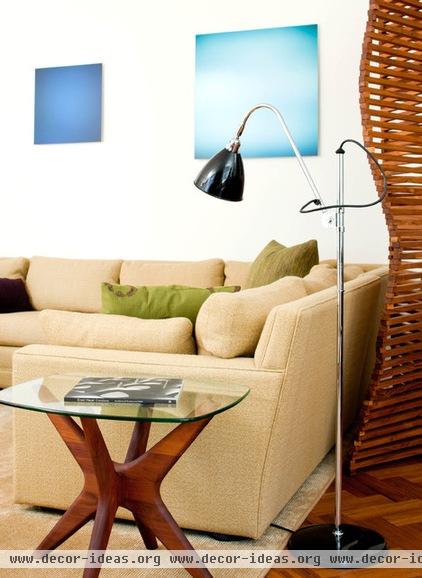
Contrast. Combine straight and curved lines for contrast. If the furniture is modern and linear, throw in a round table for contrast. If the furniture is curvy, mix in an angular piece. Similarly, pair solids with voids: Combine a leggy chair with a solid side table, and a solid chair with a leggy table.

Ease of use. Place a table within easy reach of every seat, being sure to combine pieces of similar scale, and make sure every reading chair has an accompanying lamp. Coffee tables should be located 14 to 18 inches from a sofa to provide sufficient legroom.
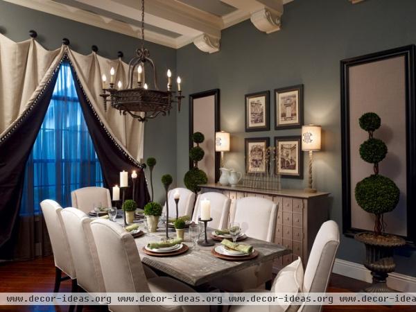
Circulation. In a dining room, make sure there’s at least 48 inches between each edge of the table and the nearest wall or piece of furniture. If traffic doesn’t pass behind the chairs on one side of the table, 36 inches should suffice. In bedrooms allow at least 24 inches between the side of the bed and a wall, and at least 36 inches between the bed and a swinging door.
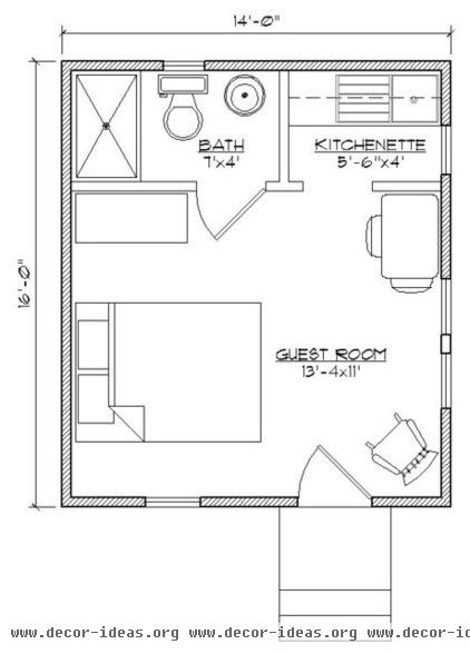
Planning. Give your back a break. Before you move any actual furniture, test your design on paper. Measure the room’s dimensions, noting the location of windows, doors, heat registers and electrical outlets, then draw up a floor plan on graph paper using cutouts to represent the furnishings. Or, better yet, use a free online room planner (I like the one from Jordan’s Furniture in Boston) to draw the space and test various furniture configurations. It’s less work and a lot more fun.
Related Articles Recommended


