5 Ways Rhythm Engages Your Eye
http://decor-ideas.org 11/12/2013 03:30 Decor Ideas
Successful design keeps the eye interested, allowing us to take in every part of a room's design. Rhythm is a key design principle that encourages our eyes to move around a room in an organized way. When used well, it brings an underlying unity and sense of variety to our spaces.
The rhythm in most interior designs is based on one of five principles: repetition, gradation, transition, contrast and radiation. Here I'll show you how to bring these rhythms and a sense of calm to your interiors.
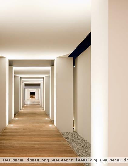
Repetition
Rhythm with repetition is based on similar lines, shapes, forms, textures, colors or patterns throughout an interior. This technique gives a room a clear sense of stability and cohesiveness.
For example, the eye follows the continuous movement along this hallway through the use of the repeated architectural upright posts and floor lighting.
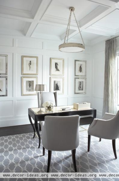
Repeating the same-size framed prints in a similar style and color is an easy way to achieve a lovely, gentle rhythm.
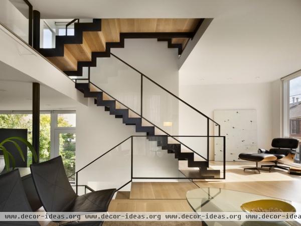
The contrasting metal used as edging on these timber stairs adds real punch. The repeating shape allows the eye to flow smoothly down the staircase to the each floor. The furniture perfectly complements the dark color.
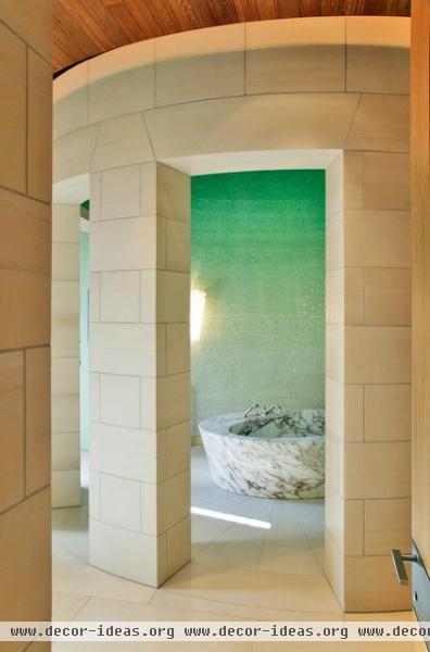
Gradation
With gradation the size of the same objects in a room changes from small to large, or a color from light to dark, creating a subtle rhythm that draws the eye up and down the gradation line. The gradated tile in this bathroom creates an ethereal and sophisticated effect.
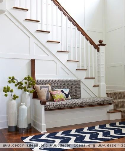
The floor vases and bench seat cushions in different sizes and heights here are a simple example of gradation using objects. These pieces draw your eye to this vignette and invite you to sit.
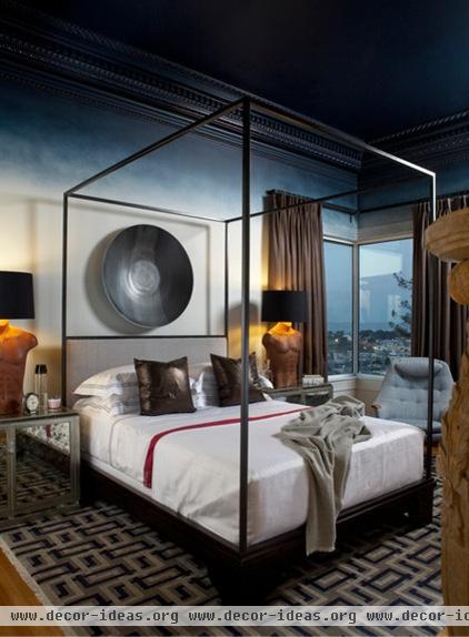
The gradation of this paint color not only is a luxurious detail, but makes the room feel extra cozy at bedtime, as if the night sky were slowly creeping into the room.
Transition
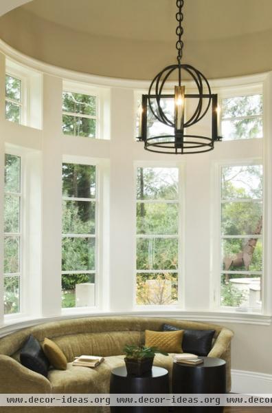
Rhythm through transition subtly leads the eye gently in a continuous, uninterrupted flow from one area to another. In this room the curved lines of this sofa accentuate the curve of the bay window, leading the eye around the space.
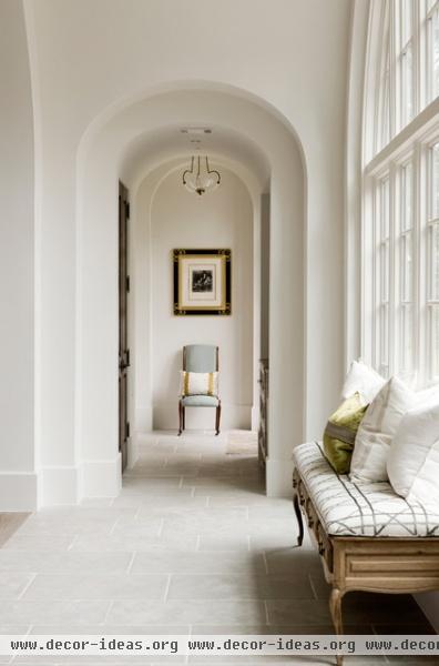
The charming curved lines of these arches draw the eye down the hallway, making it appear longer.
Contrast
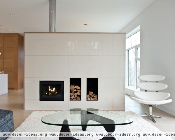
When a shape or color directly opposes another, it creates contrast — another form of rhythm. This sitting room's contrast comes from the strong square lines in the fireplace and the curves of the chair and coffee table.
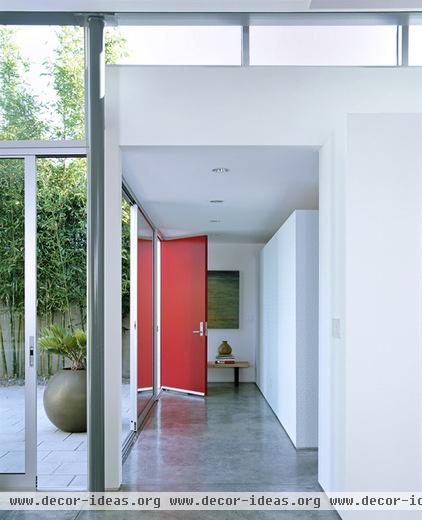
Red and green, opposite each other on the color wheel, create contrast in this hallway. The eye travels from the greenery in the garden to the striking red door and finally settles on the green wall painting.
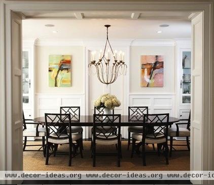
Contrast can happen with style, too. This traditional dining room has plenty of architectural details already, but the modern paintings hung in a row add an interesting rhythmical contrast.
Radiation
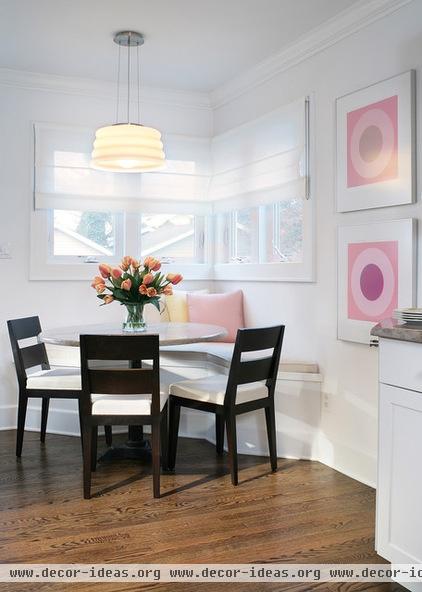
With rhythm through radiation, design elements are balanced and repeated around a centerpiece. Here the chairs and vase of flowers radiate off the circular table. The circular light fitting and two wall prints add extra visual stability.
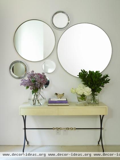
These circular mirrors radiate and repeat around one another, creating a balanced and soothing look that's much more appealing than just one would have been.
Tell us: How do you use rhythm in your home's architecture or interior design?
More:
Why There's Beauty in Grid, Column and Row
How to apply the principle of rhythm outside
Related Articles Recommended


