Design Workshop: Explore the Magical In-Between Spaces
Connected, grouped building compounds can be found all over the world. In New England, where I practice, the connected farmstead or Big House/Little House/Back House/Barn typology evolved out of a need to create sheltered outdoor workspaces adjacent to the farmstead. The Big House contained living spaces, the Little House contained the kitchen, the Back House stored the carriage and all were connected to the Barn. Buildings were positioned to shield outdoor spaces from northerly winds and gather light from the south.
The environmental advantages of siting a home to special views, natural light or other local prevailing climatology aside, much of the appeal of separated structures today lies in the variety of spaces this layout offers. It's easy to imagine how the separate spaces could function as self-contained — a workshop, a writing or painting studio, a guest suite, a screened porch or theater.
Groupings of structures by their nature also create exterior spaces and indoor/outdoor spaces between them. I liken these spaces to the great piazzas in Europe, defined by building edges. If you've ever been, you understand how wonderful these places can be.
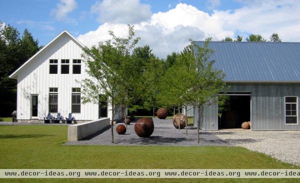
Groupings of structures create varied experiences within and outside a home, foster connections between building and site, and reduce the overall scale and mass of a larger footprint. They can also be positioned to avoid site features: a specimen tree, a water course or erratic boulder. When broken down into smaller components, each structure can respond to very specific individual functional and environmental cues.
Their cellular nature speaks to a desire to retreat and get away from it all in a smaller, almost cabin-like space. The structures shown here create exterior spaces with the aid of various landscape elements: A pea stone sculpture garden, hard-edged grass surfaces and concrete wall elements all work in concert to weave these structures together. Intervening spaces can be formal or informal and treated with a variety of textures to further break down their scale.
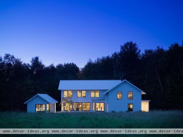
Positioning a small portion of the footprint of the overall structure to one side of the courtyard defines the edge without constraining the view or connection to the landscape.
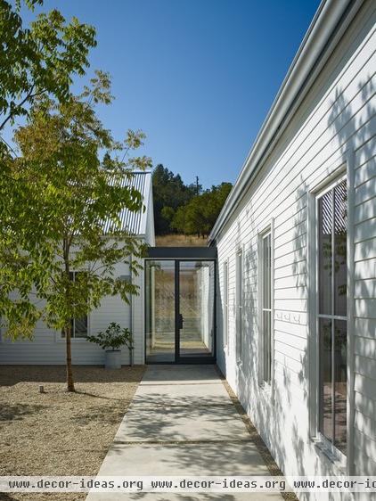
This glassed-in walkway contrasts the solid-walled building. Picture walking from one structure to the next as an experience.
You're drawn toward the light in the connector, then to the view, and then your field of view is visually compressed once you enter the adjacent structure.
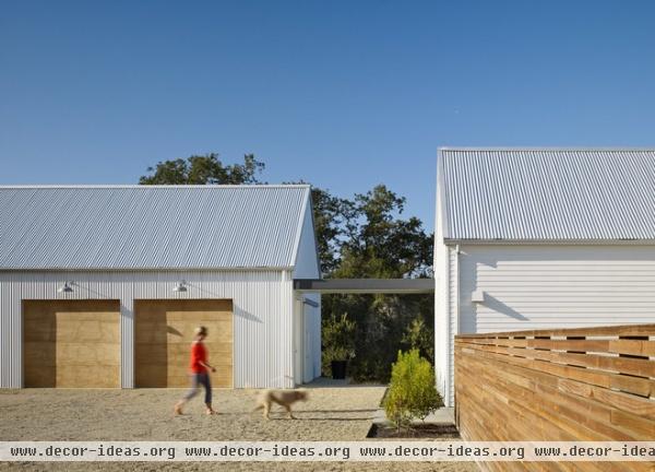
Separating structures creates dynamic exterior spaces. When you cross-reference materials to unify design elements, it's a win-win. Here, the wood planks used on the garage doors reference the wood fence.
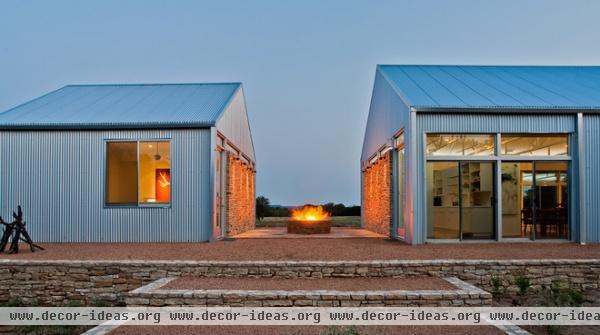
Drawing the mass of this guest suite away from the main structure accomplishes great things with little effort. It establishes privacy for guests (and hosts). And it creates an inviting space focused around the fire pit — enclosed and sheltering — while preserving the connection to the landscape.
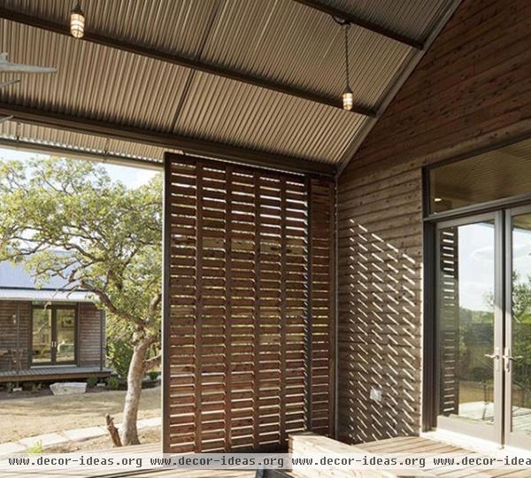
Views to the adjacent structure connect interior and exterior spaces, establish a comfortable human scale and expand the perceived size of this indoor/outdoor room.
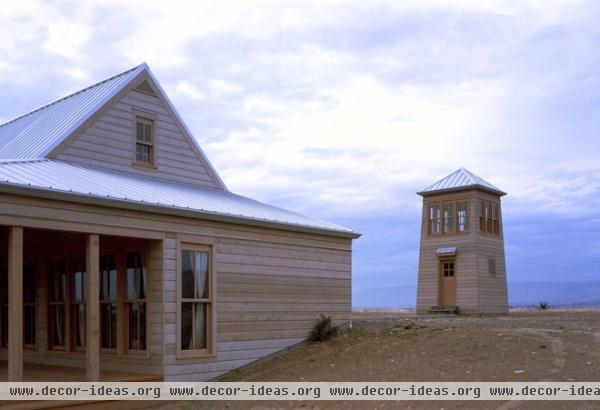
This grouping suggests a parent/child relationship. The hierarchy is clear, but the interplay between the structures is interesting. The playfulness of the tower folly and the seriousness and sheltering nature of the main structure create two distinct experiences on the same property using the same architectural language.
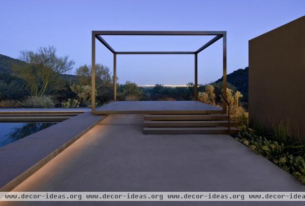
Proof that space need only be defined by the simplest of gestures. Here, the lined volume of a cube marks a place (and space) in the landscape. Defining, marking and creating space is architecture.
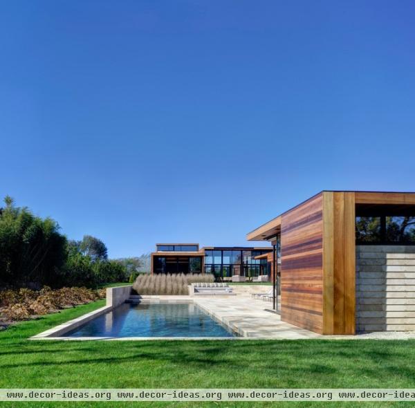
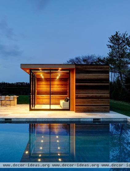
This simple pavilion is part of a larger building grouping and serves to mark the corner of the pool while establishing a human-related scale in the composition.
In the evening, this serves as a lantern in the landscape that, when viewed from the main house, creates a place to view rather than a dark wall of glass.


