Houzz Tour: Beachy Casualness in Landlocked Minneapolis
http://decor-ideas.org 11/12/2013 01:10 Decor Ideas
Anyone who thinks a breezy beach theme can't work in a traditional Midwest setting hasn't seen this Minneapolis home. Interior designer Martha O'Hara took a subdued approach for her client, with warm grays, white millwork and rattan neutrals balancing shades of turquoise and aqua for an elegant, laid-back feel.
Since this house is in Minnesota, a landlocked state, "we didn't want to go way over the top with a coastal theme," O'Hara says. "The play with different blues and beachy accessories allowed us to use color to draw the eye to different parts of each room, much in the same way color blocking works in fashion."
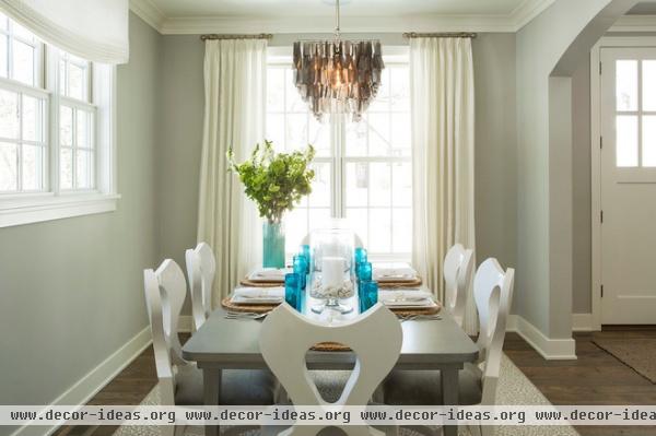
The rooms in the open layout have a consistent use of neutral tones, anchored by cerused oak flooring and accented with hints of blue. "The trend is to layer neutrals on neutrals," O'Hara says. "But without color it loses interest."
She set off the neutrals in the dining room by painting the millwork and chair frames white, and the table and walls the same gray color. Vivid blue glassware draw the eye, but the true focal point is the shimmering shell chandelier, which picks up colors from the gray walls and wood floors.
Paint: Stonington Gray HC-170, Benjamin Moore; most furnishings and accessories through Martha O'Hara Interiors
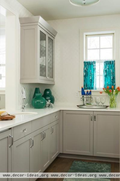
A butler's pantry off the dining room serves as a staging area when the client is entertaining guests. The gray carries through to understated cabinets, while sleek white quartz countertops complement the neutrals and evoke the airy feel of the beach.
"You shouldn't be afraid to use white countertops," O'Hara says. "Especially if you're using a quartz product, which is virtually indestructible and impossible to stain, as opposed to some of the more expensive white marble options."
The playful blue floral café curtains, vases and cushy blue floor rug continue the coastal theme.

It made sense to incorporate a different color in the living room, and pink turned out to be just the thing, from the vivid side chair to accent pillows in lighter shades of rose.
"Years ago we thought we had to have a busy fabric or wall hanging that tied a room together as a road map," O'Hara says. "Today that’s not true so much. Instead we use blocks of color in certain areas to create interest. This pink is a gorgeous color on a neutral background that pops so beautifully."
Sun-faded shells and corals recall the beach, and an avant-garde side table from Oly looks like it popped straight out of the ocean.
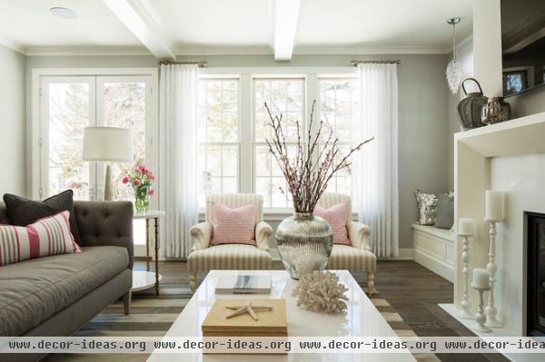
This wide-striped natural-fiber rug would look right at home seaside. The sheer window treatments play into the simplicity of the overall design.
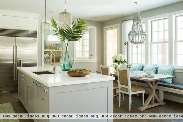
White quartz countertops and neutrals continue in the kitchen, where burlap-covered chairs convey casual beach style.
The island is a functional workspace that allows easy interaction with family and guests. A beaded basket chandelier is a playful focal point reminiscent of a fishing basket raised from ocean waters.
Paint: Stonington Gray HC-170, Benjamin Moore
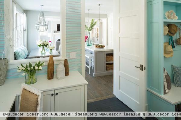
The design team deviated from neutrals in the home office, where aqua wallpaper and painted millwork reign supreme. A peakaboo window brings the sea-soaked color into the white and gray kitchen.
Paint: Forget Me Not, Benjamin Moore; wallpaper, pendant lights: through Martha O'Hara Interiors
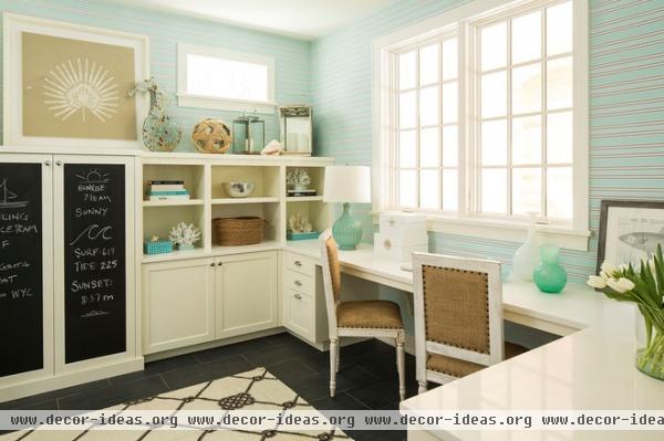
The resource room is a multiuse room for working, doing homework, filing and hanging out. The horizontal stripes of the wallpaper add casualness that O'Hara likens to a comfy cotton T-shirt you might wear at the beach. The burlap-upholstered chairs are the same as in the kitchen, and the custom cabinetry along the far wall showcases myriad beach-themed accessories.
Note also the nautical rope pattern of the floor rug. "The general feel of this room tells you, 'I might be working, but I'm at the beach, so it doesn't matter,'" says O'Hara.
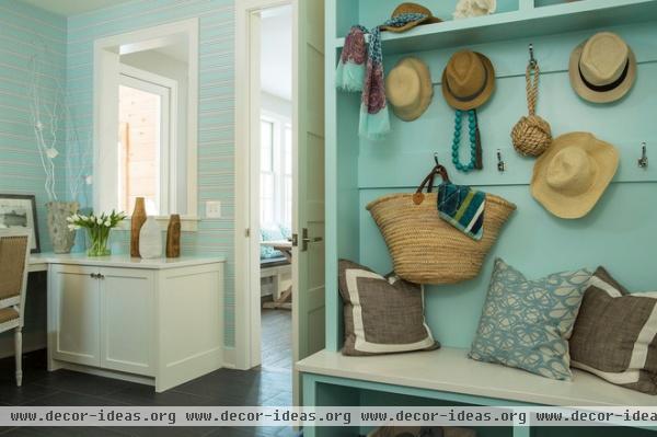
Family members can drop their bags, hats and coats in a mudroom behind the work area.
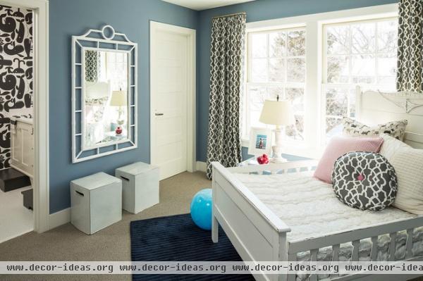
The focal point in one of the children's rooms is an antique 1800s bed originally built for twins. To maintain an antique look, the frame was painted in a distressed white that lets the original oak show through.
The homeowner wanted the space to be a child's room with a few grown-up touches, such as the patterned curtains and oversize framed window. But the whale-theme wallpaper in the bathroom keeps things playful.
Paint: Oxford Gray, Benjamin Moore
Related Articles Recommended


