My Houzz: A Paean to the 1950s and '60s in Pennsylvania
Call it kismet. Call it a pipe dream come true. Matthew and Bobbie Fisher fell in love with a renovated midcentury modern house designed by architect Irwin Stein. But it was so out of their price range that they stayed put and kept house hunting. A year later Craig Wakefield, the Realtor who’d shown them the Stein-designed home, sent the Fishers an email letting them know that the house was still on the market — at a drastically reduced price.
The Fishers landed their dream home, which turned out to be in nearly pristine condition. Perhaps that's because the previous owners were dentists who had operated a practice out of the house. They had built a wing that included a waiting room, exam rooms, a reception area and a parking lot. The Fishers turned the latter into a sprawling meditative lawn, while the rooms became extra living spaces and storage. For the rest, all they had to do was fill it “with things we love,” Bobbie says.
Houzz at a Glance
Who lives here: Matthew Fisher and Bobbie Ann Tilkens-Fisher, and their cats, Lucha and Lincoln
Location: Wallingford, Pennsylvania
Size: 2,600 square feet, plus a 600-square-foot attached former dentist office; 4 bedrooms, 2 full bathrooms, 2 half bathrooms
That's interesting: The house was originally designed for a young dentist and his wife, and included space for a fully operating dental practice.
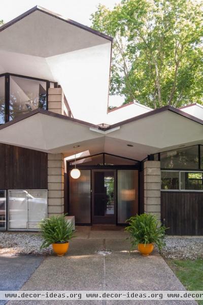
Simple lines come together to create dramatic planes and volumes across the exterior. While Stein's designs often incorporate wavy rooflines, he designed this home to mimic the leaves of the landscape's tulip poplar trees, some of which still remain on the property.
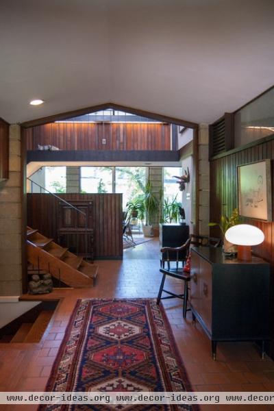
The foyer offers an impressive view of what lies ahead. Repeating materials and a neutral color scheme give the home a sense of flow that feels as natural as the surfaces themselves.
Bobbie found this vintage Turkish rug at auction; the sideboard was inherited from Matthew's grandmother.
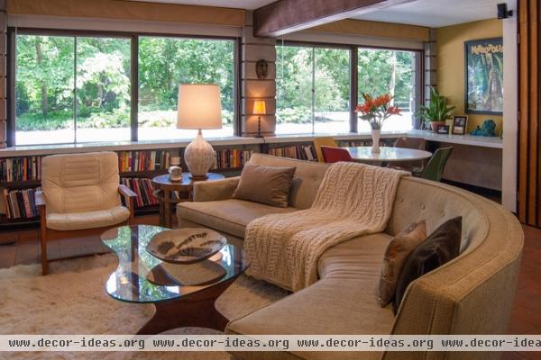
A sunken den off the foyer receives abundant light from a bank of windows. This room was added in 1968 after the original owners requested more space to accommodate their growing family.
Bobbie bought the curved 1950s secondhand sofa for $10 and had it reupholstered in durable Crypton fabric to save it from their cats' claws. Built-in bookshelves clad in white laminate wrap most of the perimeter.
Cocktail table: vintage Adrian Pearsall
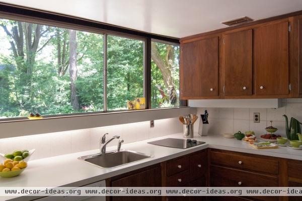
While the Fishers might appreciate a little more wiggle room, they are in no hurry to make drastic changes to the kitchen, which bears the original cabinetry. "Matthew and I always said our next house would have a big gourmet kitchen and a big bathtub, and we have neither," Bobbie says. "When we first moved in, we thought we would definitely need to replace the two-burner cooktop with a four-burner, but we haven’t. The kitchen is surprisingly efficient."
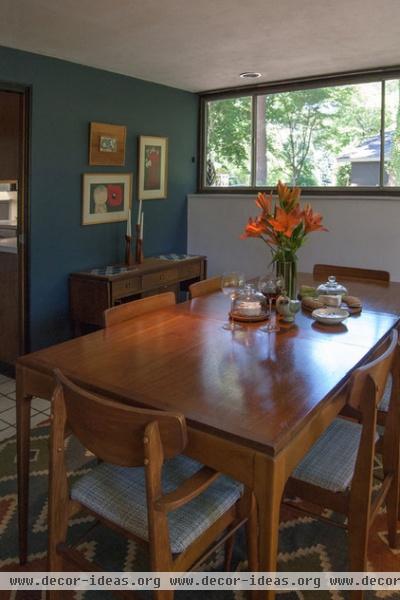
"There are only three walls in the house that are not white, and two of them were painted that way when we moved in," Bobbie says. She chose a very dark blue for the wall in the dining room to set off the warm wooden furnishings.
The 1960s Lane dining table was an auction win. "Ninety percent of our home decor is vintage from the 1950s and 1960s, and we use everything," she says. "Other than electronics, kitchen items, towels and bed linens, I rarely buy anything that is brand new anymore."
Wall paint: Mysterious, Benjamin Moore
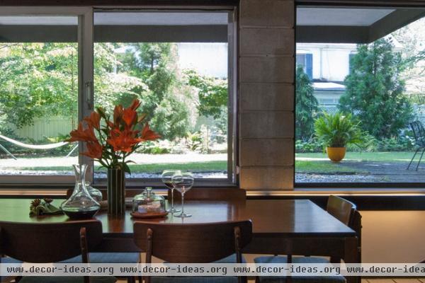
Floor-to-ceiling windows line the south side of the dining room, keeping the sunken space from feeling buried underground. The windows glide open on tracks, opening the space up to the outdoors.
With regard to the original single-pane windows, the Fishers continue to research other options for greater efficiency. "Replacing them would be astronomically expensive and tamper with the aesthetics of the house," Bobbie says. "Matthew has researched interior storm windows, so that may be an option for the future."
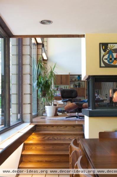
A three-sided fireplace connects the dining room and adjacent living space.
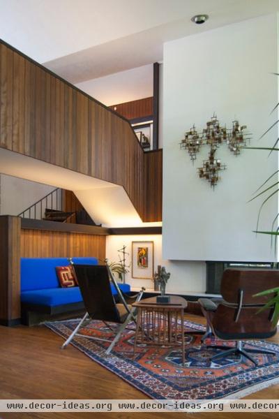
In the living room, the ceiling soars two stories high. An overhead walkway covered in original wood paneling spans the width of the room, carving out volume below for extra seating.
Both the lounge chair and Turkish rug were Craigslist finds, and the Maison Jansen campaign chair was passed down from Matthew's grandmother.
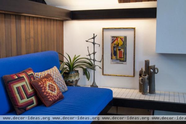
Built-in details like this cushioned bench and cove lighting pleasantly surprised the Fishers. Bargello needlepoint pillows are the perfect complementary gesture.
Upholstery: Yves Klein Blue, Maharam
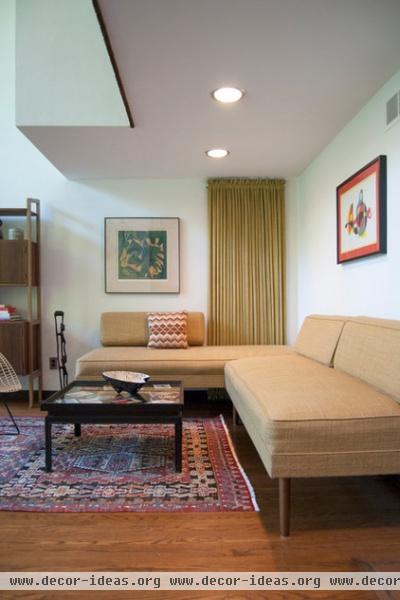
A living room sectional with its original fabric represents the Fishers' philosophy that worn and slightly used pieces add character, and makes having parties and overnight company less of a worry. (The Fishers did an eight-week house swap with three European families in summer 2013.)
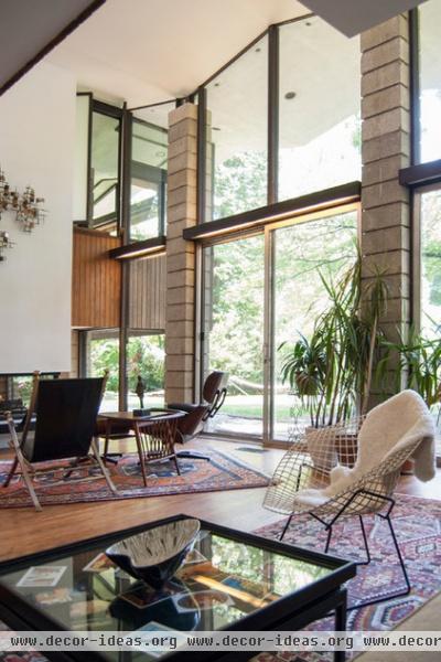
Twenty-four-foot windows span the back of the living room. "Rainstorms are very exciting in our home," Bobbie says. "The diamond roofline creates waterfalls during a downpour, and the glass wall in our living room provides the perfect theater in which to watch them."
Stein strategically placed cove lighting constructed out of fluorescent tubing, wood and milky Plexiglas throughout the house to highlight doorways, windows and walls.
The cocktail table, inherited from Matthew's grandmother, displays the couple's travel mementos and postcards.
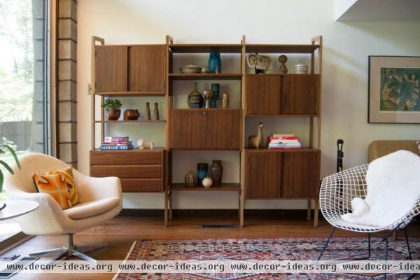
Moving into the larger home from their previous 1880s row house meant that a lot of their furniture didn't work. So Bobbie hit auctions, flea markets and Craigslist for new furnishings, including this unmarked bookshelf, which displays her vintage ceramics collection. "This house really dictates what kinds of furnishings will work in it," she says.
The Overman swivel chair and Bertoia chair are vintage.
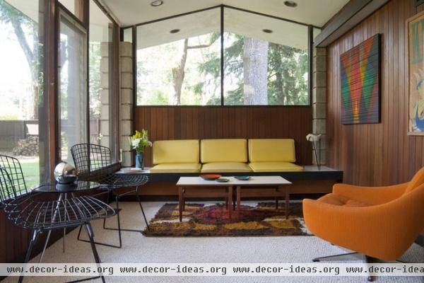
This contemplative sitting room at the far end of the house was the former waiting room of the dentist's office. It connects to what had been exam rooms and a reception area. Bobbie uses this side of the house to store inventory for her midcentury furnishings and decor service, At Home Modern.
Side chairs: Bertoia, Knoll
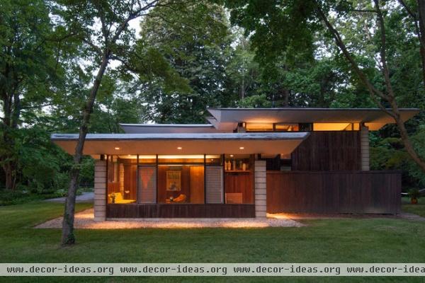
While the interior was pristine, the landscaping needed major work. After removing overgrown shrubs, pruning trees and replacing the old fencing, the couple tackled the largest part: the parking lot. Outside of what had been the dentist's waiting room, the entire side yard had been covered in asphalt, with a separate entrance to the street. That has since been removed and replaced with grass, resulting in a tranquil spot under the trees.
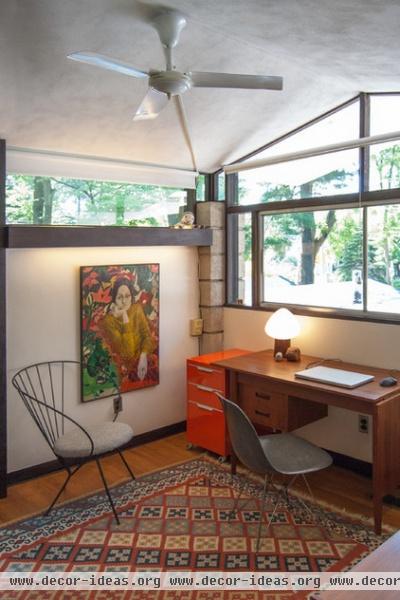
An upstairs bedroom now serves as the administrative office for At Home Modern. This painting is a vintage E.A. Evans, while the tomato-red file cabinet is one of the few items bought new.
File cabinet: TPS, CB2; desk chair: Molded Eiffel Side Chair, vintage Eames
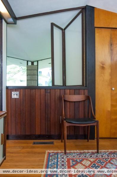
A screen in the office opens to the living room below. Constructed of frosted Plexiglas and wood, the screen reflects the roofline and filters the natural light when closed.
This concept repeats in the main bedroom directly opposite. The setup led Bobbie to believe that this room was once a nursery, with the screens acting as makeshift baby monitors. "The parents could go to sleep with each set of screens open and hear whatever was stirring in the nursery," she says.
Chair: vintage Johannes Anderson
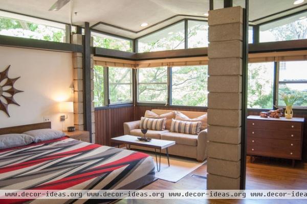
Ample glass promotes a tree-house-like environment in the main bedroom. While part of the original floor plan, this room gained extra square footage during the home's 1968 expansion. "If you notice the concrete pillars," Bobbie points out, "you can see that that is where the original wall once was." The area beyond the pillars previously served as an outdoor patio.
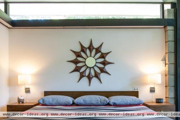
The ever-changing quality of the light throughout the day is one of the home's most prominent features, especially in the bedroom. "There is an east-facing clerestory window in our bedroom behind our bed. In the winter mornings, the rising sun shines through this window and casts shadows of tree leaves onto the wall above the fireplace at the foot of our bed," Bobbie says. "Black leaf shadows and orange sunlight combine to make gorgeous moving shapes. I love to lie in bed and watch this."
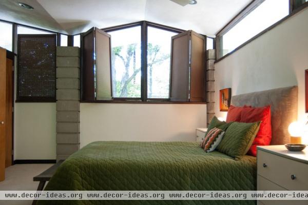
To gain privacy in the guest bedroom, the previous owners had made screens to cover the windows. Constructed out of ordinary pegboard, the screens, which Bobbie considers "an elegant, inexpensive midcentury solution to blinds," allow light to pass through even when closed.
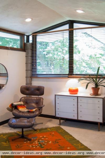
A 1960s Plycraft lounge chair was inherited from Matthew's father. The chair and ottoman match a kilim rug from the same decade.
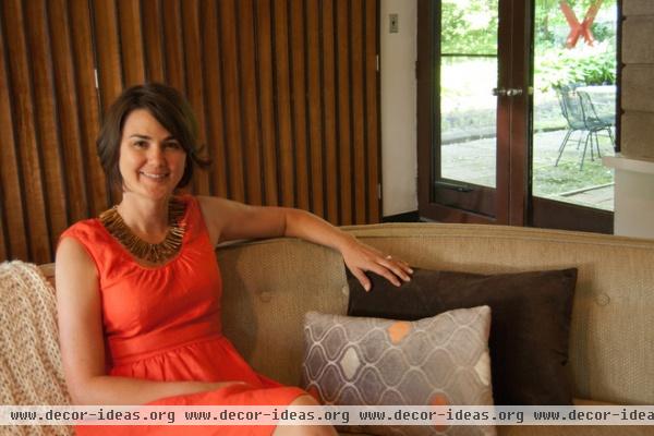
"My philosophy is to love what you have and use it," says Bobbie, shown here. "There is no plate or piece of furniture too precious or pristine to use. How can you truly enjoy a chair if you never sit in it?"
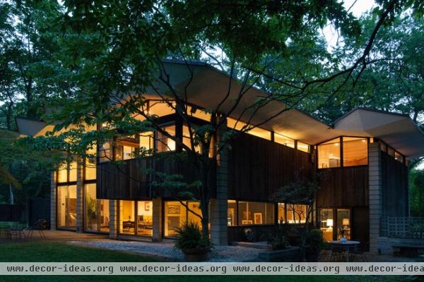
The rear facade comes to life as the sun sets. Concrete-block pillars, rather than load-bearing walls, carry the structure's weight in a discreet manner. Clerestory windows beneath the eaves give the impression of a floating roof, releasing light across the landscape. "One friend said our house looked like a spaceship ready for takeoff when lit up at night and viewed from the street," Bobbie says.
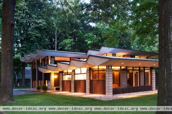
Every angle the house is seen from seems to offer a captivating new geometrical view.
See more photos of this home
More: Why We Love Midcentury Modern Design
Browse more homes by style:
Small Homes | Colorful Homes | Eclectic Homes | Modern Homes | Contemporary Homes
Midcentury Homes | Ranch Homes | Traditional Homes | Barn Homes | Townhouses | Apartments | Lofts | Vacation Homes


