Houzz Tour: Modern Renewal for a Tired Texas Ranch
http://decor-ideas.org 11/11/2013 20:30 Decor Ideas
This 1970s ranch had a mix of great potential and big problems. After 10 years of piecemeal fixes and additions, this family was ready to take the plunge into a major renovation. The design–build team, Finn Sigurdsson and Taryn Hall of ísARK Studio, gave the house a modern feeling, improved the flow and added new spaces where the owners could enjoy views of the lake. It "went from being the lackluster home on the block to the freshest home on the block," Hall says. Here's how they did it.
Houzz at a Glance
Who lives here: A family of 4
Location: Outside Austin, Texas
Size: 3,500 square feet; 4 bedrooms, 3 bathrooms
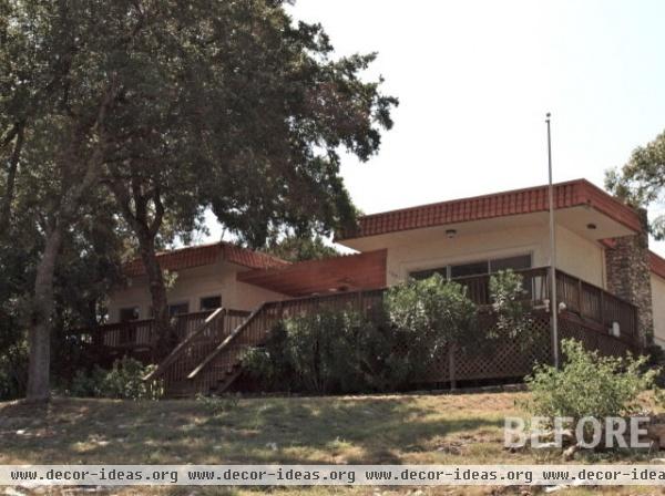
"The flat roof had rot, there had been leaks, the home was hard to keep cool, the deck was in a poor state, there was peeling paint and a great deal of wear," Hall says. Scruffy plantings cluttered the front, adding to its uninviting facade, which was also confusing. "Delivery trucks often knocked on the side door, which was actually an HVAC utility closet," Hall says.
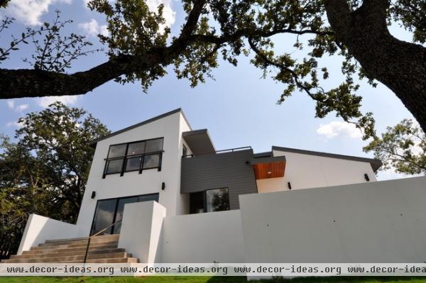
AFTER: The new facade is a mix of white stucco, gray HardiePlank punctuated with mahogany and black metal trim details. "The Grizzle Grey color on the boards is the perfect contrast to the bright white stucco and the warm FSC-certified African mahogany," Hall says.
Stucco paint: Extra White, Sherwin-Williams
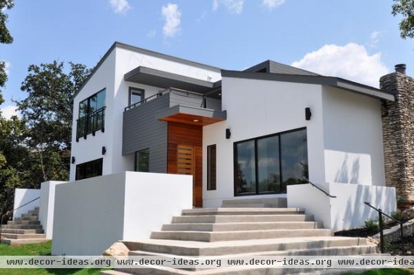
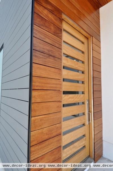
"It was important to establish a welcoming approach to the home," Sigurdsson says. Grand terraced steps now lead you to an unmistakable new front entry and into a foyer. A mahogany door and trim work ensure that no one will be knocking anywhere else.
To save money on the mahogany, Sigurdsson grabbed less-expensive rough-sawn boards of irregular widths at the fine lumber yard and milled them himself. "We hate to waste, so we used the thinner pieces on the trim work in the foyer and the railings upstairs," Hall says.
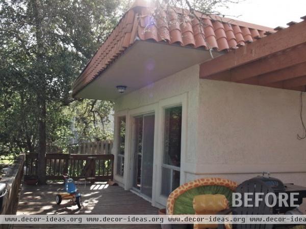
This is the view of the master bedroom before construction. The rough stucco and strange trim details all had to be removed, and the room was gutted and enlarged.
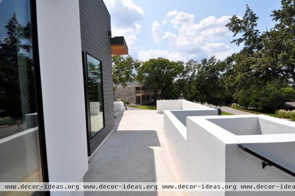
AFTER: Turn around 180 degrees from the previous photo to enjoy the view down the new terrace. It creates a relationship between the house and the street, and adds additional living space. The master bedroom has its own separate access to the terrace, adding a second connection to the rest of the house.
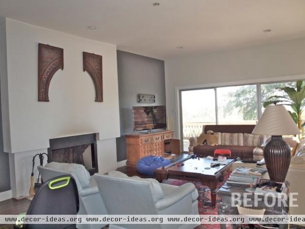
In the family room, the fireplace wall had sat unfinished for years; a previous leak and repair had left the fireplace without adequate fire blocking and not up to code.
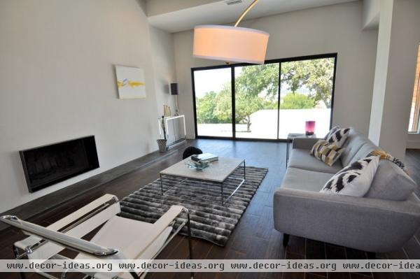
AFTER: The team reframed and extended the fireplace wall and transformed the fireplace into a floating version with a steel surround for a simpler look. They added fire blocking and redesigned the hearth to fit the scale of the room.
The family also traded in many of their furnishings for new, sleek pieces.
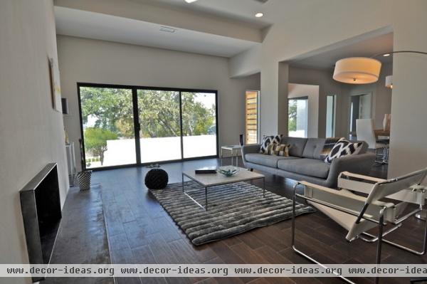
The new design enhances the large windows that lead to the new terrace and open the room to big views. Anodized black bronze window frames punctuate the large openings.
Windows, doors: Milgard; sofa: Harlow Mid-Mod, Copenhagen; coffee table: Sandor in Carrara marble, Copenhagen
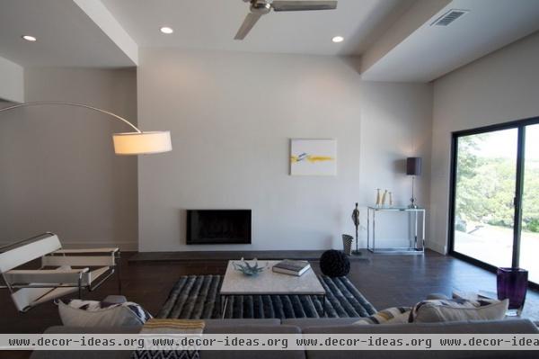
The fireplace wall can serve as a gallery wall as well as a spot for the TV when the family is fully settled back in. While the home was styled for photos and may look extra clean, it was designed with extra storage areas that will help the family keep their new spaces clutter free.
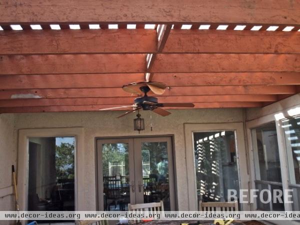
A good place for the dining room was a must. The deck just off the family room was plagued with peeling paint and semirotted joists. To cut down on construction waste, Finn stripped the pergola wood and gave it, along with brush removed from the site, to a farmer, who is using it to improve his soil for cultivation.
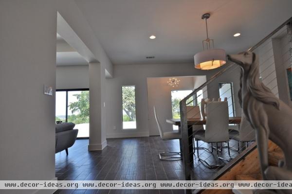
AFTER: Sigurdsson enclosed the former deck area, creating a new dining room open to the family room.
The ceramic tiles that look like wood were existing; luckily the team was able to find the same tiles at Floor & Decor.
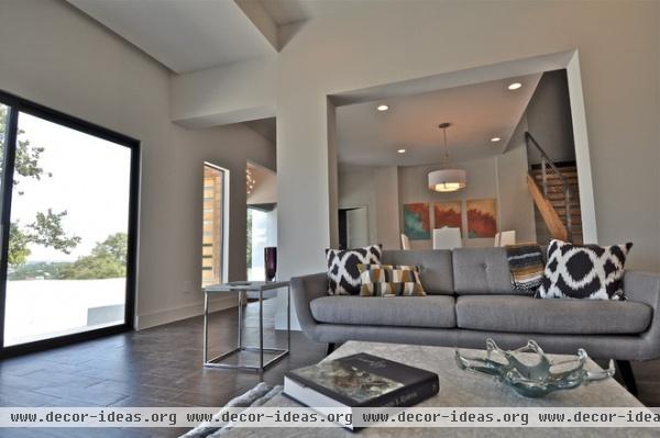
Now there is a clear view from the family room right into the dining room. The openness makes the home feel much larger.
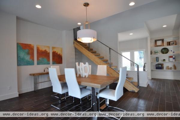
Two pillars crafted from framing and drywall frame a niche area for artwork and a console. "With just a little bit of extra framing, you can add architectural details and lines with drywall; when you're on a budget, it's more pragmatic than adding a lot of expensive material cladding," Sigurdsson says.
"We really liked the idea of playing with shiny chrome and more rustic elements," Hall says. "There is a contrast and balance of rustic and refined elements throughout the house." A wooden tabletop and staircase warm the contemporary room and add texture.
Artwork: E. Wildman Gallery; framing and painting team: Jose Castillo and family
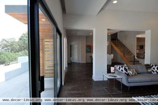
During construction the clients loved the openness of the space, so the designers took the ceilings up to 11 (feet, that is, from 10). They also created a recessed curtain nook to conceal the hardware. The door at the end of this open hallway leads to the master suite.
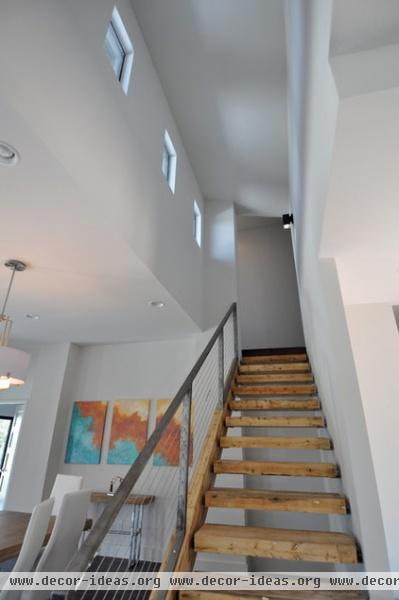
Locally sourced salvaged glulam beams add rustic style in the form of the stairs, which contrasts with the very contemporary metal railing and the white drywall. Glulam is a sustainable material crafted from smaller pieces of dimensional lumber.
Relationships with expert craftspeople were very important on this project. The designers worked very closely with metal fabricator J-Ru Garage to create all the custom metal details.
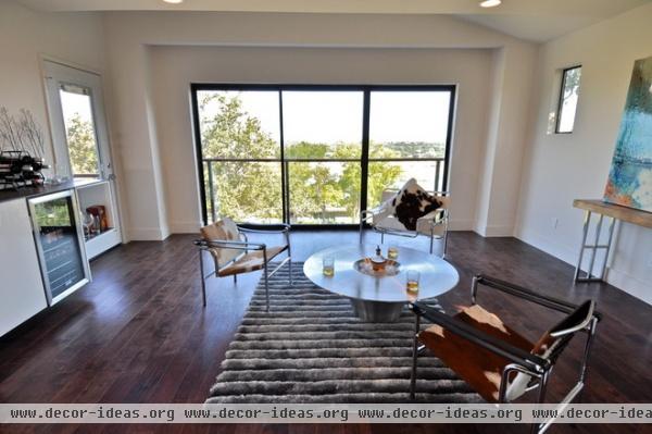
The stairs lead up to this bright solarium, which extends the family's entertainment area to the second floor. The room works works triple duty as a lounge, media room and bar for the adjacent roof deck (the door to the left leads there). A Juliette balcony allows them to open up the sliding doors to safely welcome the breeze.
Pony sling chairs and Wassily chairs mingle Texas ranch and modern styles.
Artwork: Erica Wildman; console: Marshalls; pony sling chairs: Copenhagen
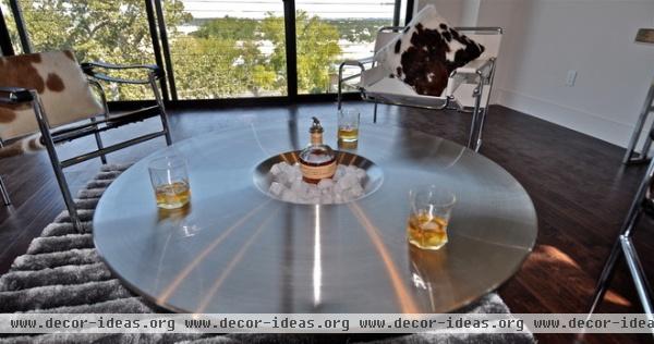
"A lot of lounges are dark and moody, and that's cool, but here we wanted to let in the light and the views," Sigurdsson says. A system of concealed curtain coves can darken the room for use as a media room.
Table: Alien Coffee Table, Copenhagen
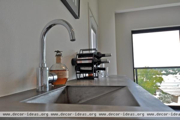
The solarium's raw steel bar with integrated sink houses Lone Star beers right along with the good Scotch for roof deck parties. "This was the biggest nod to industrial style we've made," Hall says.
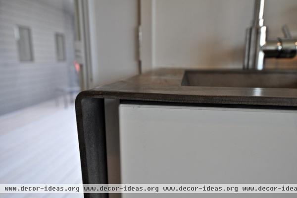
Finn custom designed the bar. "Raw steel is a perfect material for a bar; it will patina and age as much as you want," says Justin Rutherford of J-Ru Garage, who fabricated it. "You can then just use a wool scouring pad to buff away any patina that you don't want to see."
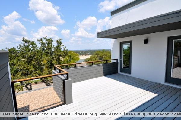
Steel cables suspend the cantilevered roof canopy, which protects the interior and part of the deck from the Texas sun.
The gray composite decking was not originally in the budget, but the team scored a deal thanks to a leftover order at a local lumberyard.
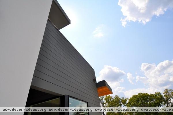
"Instead of the traditional lap-siding technique, we suspended the Hardie boards with a quarter-inch gap on top of a rain screen for a more modern look," Sigurdsson says.
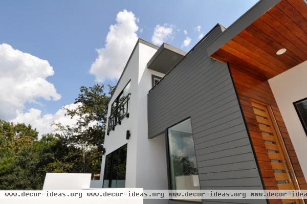
When the family is ready for the next phase of renovations, the kitchen, master bathroom and converted garage bedroom suite are all on their list. For now the new flow and addition have made their house brand new to them.
Just for fun: Hall has a background in set and prop design, and she loves to sneak meerkats into her clients' homes right before all of ísARK's photo shoots — a kind of an architectural "Where's Waldo?" for them. Did you spy them?
Related Articles Recommended


