Design Workshop: How a Site Can Shape a Home
Good design is the result of strong, simple concepts that give meaning to a home's shape, form and materials. When you look to your site for inspiration, these ideas often arise very naturally. A site is composed of many things: topography, plants, trees, regional and local climate, surrounding structures, water bodies and zoning and code regulations. Each site has very specific solar orientations, views (good and bad) and often a very explicit character. Each one of these areas is an opportunity to generate a meaningful conceptual approach for your home design — a way to devise its shape, layout, form and materials.
The following examples employ one or more of these as starting points; each site is interpreted in different, yet poetic, ways in the home.
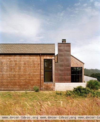
At the edge of the sea, two simple, elegant building elements create a courtyard sheltered from the prevailing winds. The material selections were born of the site's textures, amber color and coastline.
The structures will weather with time, further reinforcing their connections to this place. The building's shape, location and materials all work to connect it to the site.
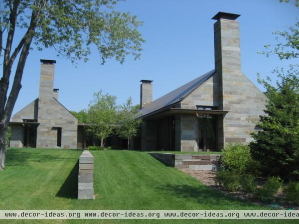
Appearing chiseled from stone monoliths, these simple sculptural forms are elegantly tied to local materials: stone walls cut into the landscape, recalling an agricultural past.
The vertical reaches of the stone chimneys mark important gathering places in the home, visible from all points on the site. Contrasting areas of airy, open windows and heavy stone speak to notions of shelter and thoughtfully control light and views.
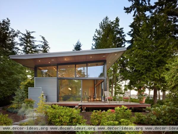
Views, light and a position carefully tucked into the surrounding landscape convey the concept for this home. The architect envisioned the space between the roof and floor planes as a "porch" to the Puget Sound.
The glazing and openness reinforce this concept. The roof gestures toward views and, like the plane of the deck below, extends outward to the land. The deck appears to hover above the undulating terrain and connects the interior to the exterior.
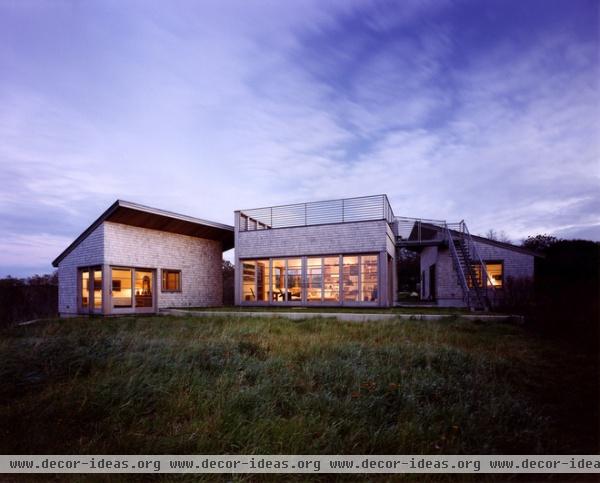
Here three playful building volumes were arranged to shield the owners from the coastal winds and create exterior courtyards for playing, gathering and viewing. The shed roof forms were derived from the rounded land forms, and the central flat roof volume makes perfect sense as a raised viewing platform.
A desire to capture and exploit all aspects of the site informed this simple detached-structure concept. Moving between each structure refocuses the inhabitants on a variety of experiences, not one particular view.
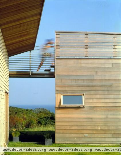
In another view of the same house, we see that the architect had ideas about how people would interact with one another and the unique surroundings.
The different shapes and the decision to separate and reconnect have been reenforced. The framed views, passageways and variety of vantage points are all ways to appreciate the site.
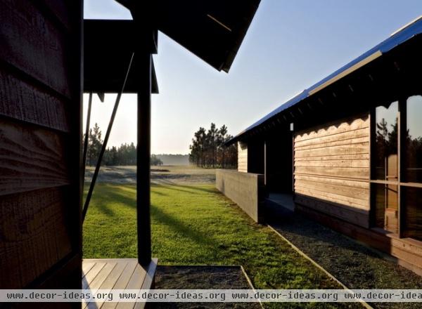
The shotgun style of house was developed in the U.S. South in response to the local climate. Breezes passively cool these long, narrow dwellings. Using deep overhangs and an understanding of how the sun moves across the site, the architect positioned the long axis of the shotguns to take advantage of wind patterns. Separating the buildings into individual shotguns, the architect maximized this cooling effect and created additional pockets of shade between the structures.
More about designing around sun and shade
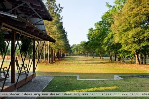
The architect oriented the long axis of this building toward a stand of oak trees to take advantage of cooler pools of air created by their shade.
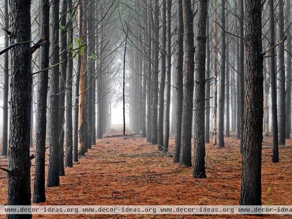
Linear view corridors on the site are echoed in the building forms and the long views through the shotgun structures. Notice the family of colors and tones of the forest represented in the building materials.
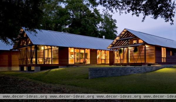
The coloration of the siding and building materials also draws from the site. The russet pine needles and the gray bark correlate to the hues on the home's siding and roof.
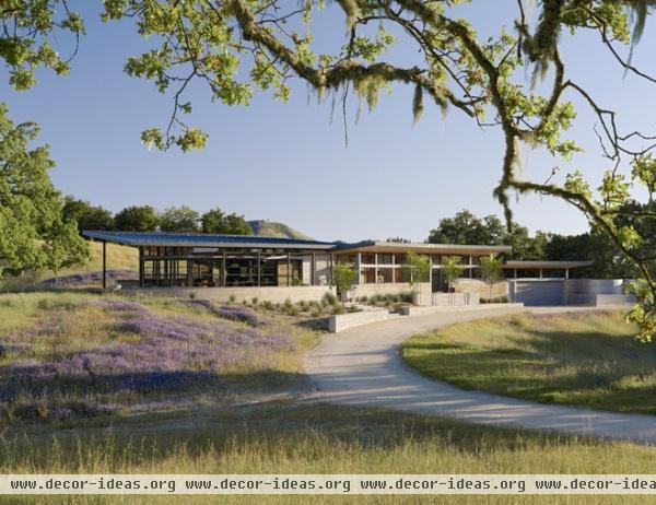
Topography informs the shape and massing of this home. The meandering floor plan follows the existing contour of the site and pays homage to the topography: The excavated soil was used for its rammed-earth walls. Keeping all of the spaces a single height minimized the building's mass and allowed it to stretch out along the hillside, opening to views and light from all sides.
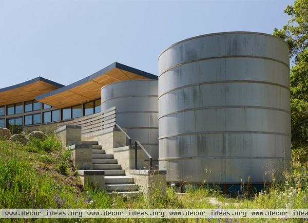
Meanwhile, the roof shape echoes the land form and gathers rainwater for reuse as landscape irrigation.
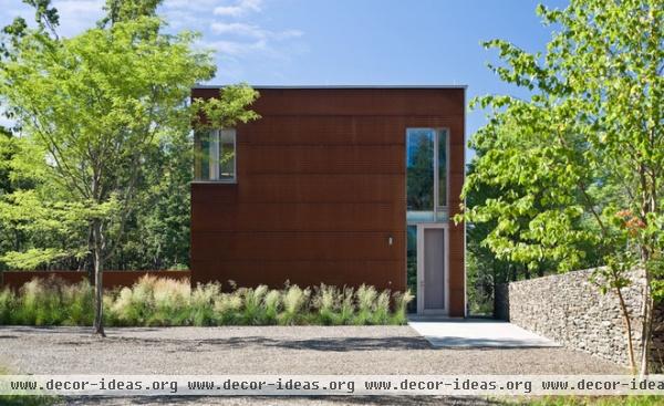
This site's agricultural history suggested the building idea. And while this modern barn doesn't rely on the archetypal barn roof to signify "barn," its materials, bold massing and proportions communicate it. Cor-Ten steel recalls rusted farm implements, and dry-laid-stone walls recall the site's agrarian past, when stones were stacked at the edges of cultivated plots.
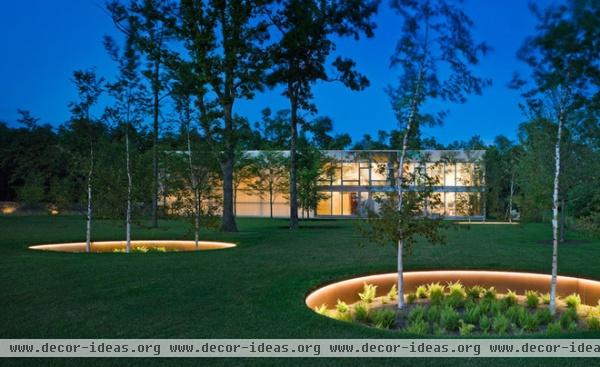
The barn stretches across the landscape. Both building and site are intentional, designed elements that support a story about cutting into and living within a site. Changes in elevation have been artfully handled; Cor-Ten steel retaining was used around the trees to link the landscape with the barn cladding. The length of the structure references the tobacco barns of New England. Almost an inversion of typical barn siding, the glazed walls open the large volume of the home to the site beyond. These gestures speak to the idea of a barn without relying on mimicry.


