Houzz Tour: Mixing It Up in a Century-Old Edwardian
We get to see the results of designers' hard work for their clients here on Houzz, but we don't often get to peek into their own homes. For interior designer Shirley Meisels, her house is a reflection of her family's lifestyle and collections, and it also serves as a design laboratory where she can experiment with ideas and test products and materials.
"Over the years I have had the opportunity to collect various objects and furnishings that I love — since this has happened over time, my home has an eclectic, almost 'accidental,' feeling," she says. In her work she strives to give her clients' homes that same casual yet pulled-together, collected-over-time look.
Meisels and her blended family moved into this hundred-year-old Edwardian house in Toronto in early 2013. They chose it because it was the right size, it was structurally sound and it had a nice flow. It only needed a facelift, which she pushed hard to complete in six weeks. Here's how this self-confessed "clutter nut" has chicly organized and designed the house for family life.
Houzz at a Glance
Who lives here: Shirley Meisels and her blended family: her husband and his two kids, ages 9 and 11, and her daughter, 10.
Location: Midtown Toronto
Size: 2,850 square feet; 4 bedrooms plus office, 4 bathrooms
Photography by Stephani Buchman
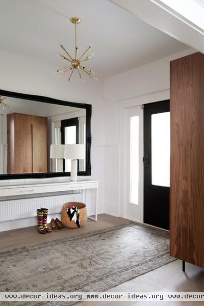
"We love the flow of the house and that it has the perfect amount of space when we are all together, enough to feel spacious but not vast. I hate the idea of heating rooms that no one uses," Meisels says.
She makes the space work by having a place for everything. In the entryway she insists upon a designated place to drop bags, keys, mail, coats and shoes. A custom wardrobe by Mhouse serves as a coat closet.
"At the same time I like some kind of dramatic design detail that will wow guests as they first enter — in this case the oversized mirror really has impact," she says. A Sputnik chandelier foreshadows more retro style moves in the rest of the house.
Console table: Ikea; rug: Elte
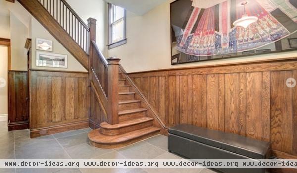
The home originally had transitional style, with yellow walls and oak trim. Meisels painted everything with Benjamin Moore's Chantilly Lace, using washable flat on the walls and satin finish on the trim.
In addition to all of that painting, renovations included replacing all the flooring, cutting a window and sidelights into the front door, adding air conditioning, renovating the powder room, replacing radiators, completing a master bathroom that had been roughed in, working on the kitchen (more on that later), adding built-ins and reconfiguring closets. Later on the couple dug down and finished the basement, which took another six weeks.
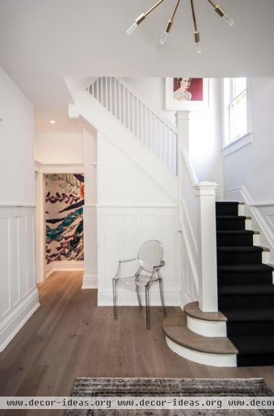
AFTER: Through the entryway a glimpse of a wall mural by Lulie Wallace draws you into the house. "I thought that would be a fun corner to add a pop of color and pattern without overwhelming the hallway," Meisels says.
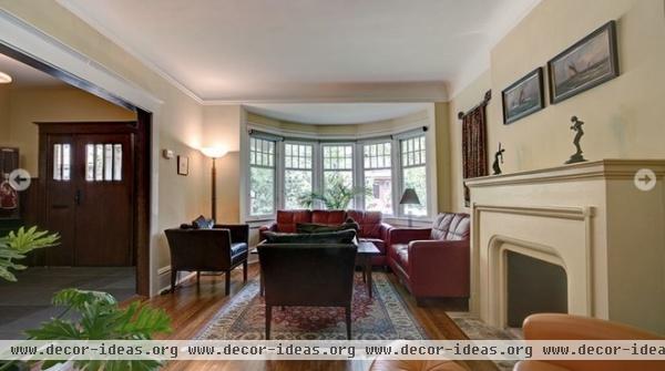
Just off the entryway, the living room features a beautiful bay window and fireplace. This is the old furniture and rug setup.
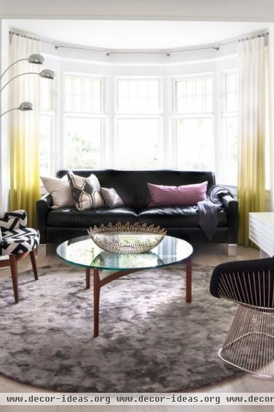
AFTER: The bay window inspired the circular rug, which allows for a casual furniture layout and creates an intimate conversation area. The couple uses the room when they have friends over, and the kids like to watch TV in here while they wait for dinner. After dinner they often head to the basement for movies and video games; it's a larger playspace.
Floors: Baltic oak, rustic gray; table: vintage; rug, lamp: EQ3; sofa: custom through Mhouse, bowl: Crate & Barrel
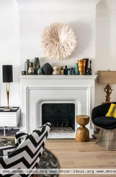
Meisels painted the previously yellow fireplace surround white and replaced the hearth with a marble mosaic and black marble border.
"I love vintage pottery for its color, texture and shape," she says. "In former homes the collection was scattered, but here I grouped them all together for big impact and a focal point the moment you walk in."
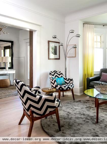
The room has a balanced mix of vintage, new and midcentury modern pieces. For example, an iconic Saarinen Executive Chair was re-covered in a graphic chevron fabric from Schumacher.
Window treatments: custom through Mhouse
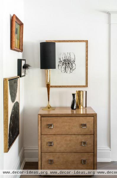
"I like mixing metals — as long as there is an equal balance between all, they can work together," Meisels says. Here she mixed brass and chrome.
The 3-D vintage art piece is an embroidered horse made out of horsehair (who is missing his tail because he is made out of it; Meisels enjoys displaying a bit of dark humor too).
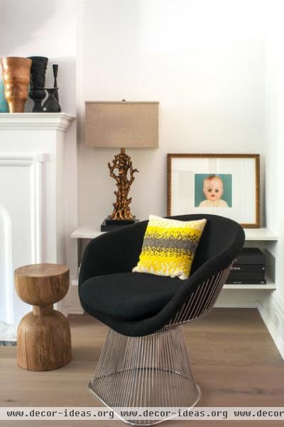
"Color just makes me happy," she says. "By adding pops of color in strategic spots, it can be really easy to live with without being an overwhelming commitment." Pillows and ombré window treatments add the right dose of electric yellow to the living room.
"I liked the way this lamp has a quirky organic feeling to it, reminiscent of branches, and the gold adds a hint of glam," she says.
Lamp: HomeSense; throw pillow: Crate & Barrel; Platner Chair: Knoll
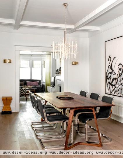
The living room opens to the dining room, which has a glamorous retro vibe.
Tip: Take inspiration for an entire room from one piece. A favorite 5- by 7-foot painting set the tone for the rest of this room, which is largely black and white; the only other colors come in through the wood and chrome.
Chairs: CB2; art: Jason Schwartz; light fixture: vintage

Kitchen renovations included refacing these old cabinets with walnut doors and removing the upper cabinets, adding a new backsplash and installing a new eating counter/desk at the back window.
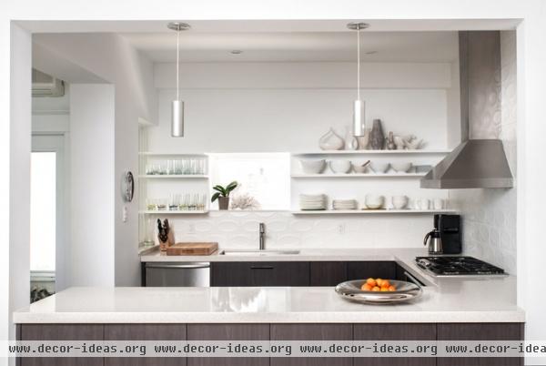
AFTER: "The kitchen looked as if it had doubled in size after taking down the upper cabinets," Meisels says.
With open shelving, Meisels recommends storing a matching set of dishes to make the look more uniform. Note how neat and artistic the white china looks against the white tile and shelves here.
Tip: "The best trick for kitchen storage is to keep what you use close at hand. The rest needs to be purged," Meisels says. "Items that are a must but hard to store, I keep in the basement — for example, that superhuge stock pot only used a couple of times a year."

A new corner breakfast counter overlooks the garden. "There was enough space left over to add a comfy chair — the best seat in the house!" Meisels says. The Womb Chair and Ottoman make for a great spot where someone can keep the cook company and enjoy a morning coffee.
Tip: To cut down on clutter, have a place for everything. "I think that if there is an easy and reasonable place for everything, then the clutter can be contained," Meisels says. The counter has three drawers in it, one for each child's drawings and other things. "When they start to overflow, then that child is responsible for cleaning it out and only keeping what's important to them," Meisels says. "I tried to find practical solutions like this so that everyone can feel comfortable and at home ... and I could keep my sanity!"
Side table: CB2; pendant: Universal Lighting; floor lamp: custom through Mhouse
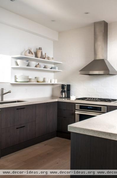
An oval tile backsplash contrasts with all of the crisp lines and is a nod to Meisel's love of retro style.
Counters: Ceasarstone; range: Thermador; vent hood: Vent-A-Hood
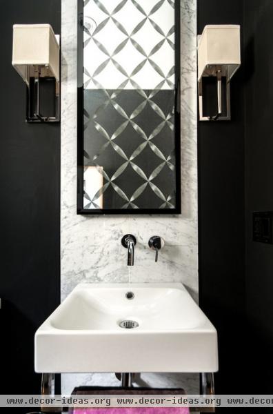
In the powder room, a large marble slab framed with black paint on each side serves as an elegant backsplash.
Tip: A floating sink creates a feeling of more space in a small room. This one has a built-in rack for a hand towel.
Paint: Black, Benjamin Moore; vanity: Duravit; mirror: custom through Mhouse; sconces: Universal Lighting
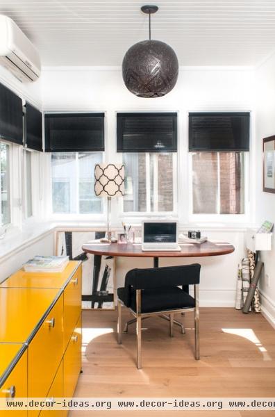
A long, narrow room upstairs serves as Meisels' office, complete with a desk for her and a desk for her assistant. A USM Haller Credenza gives her a place to keep files and samples organized and out of sight. It also adds a bold dollop of golden yellow.
Shades: Hunter Douglas; chair, table: vintage; pendant: West Elm; table lamp: base from Restoration Hardware, shade through Mhouse
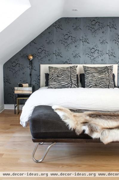
Sloped ceilings dictated some of the furniture layout in the third-floor master suite, and also make things cozy.
Tip: For easy mixing, go monochromatic. "The trick is not to fuss about matching," Meisels advises. "Creams and white, grays and beige ... being a bit off is a good thing." She also recommends varying textures within the monochromatic scheme.
Bench: vintage; zebra pillows: custom through Mhouse; wallpaper: Elitis
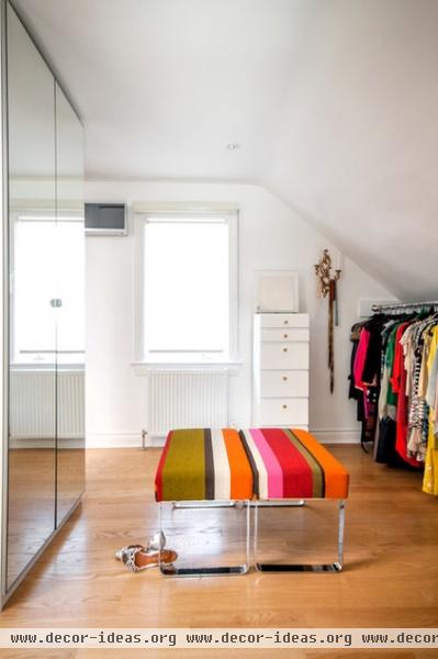
Meisels had benches from Target upholstered in Missoni fabric for the master closet. She fit a rack for hanging clothes under the sloping ceiling and stores shoes and folded clothing in the tall dresser and mirrored cabinets.
Cabinets, dresser: Ikea
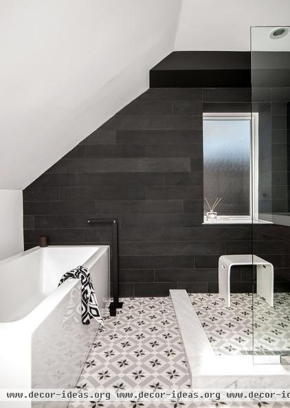
The master bath had been roughed in already, leaving a blank slate for Meisels' design ideas. The sloped ceiling presented some layout challenges. "At first the room seemed so huge, until I realized half of it was unusable for anything else other than a tub," she says. "In the end I'm very happy with it — the sloped roof highlights the clean lines of the tub."
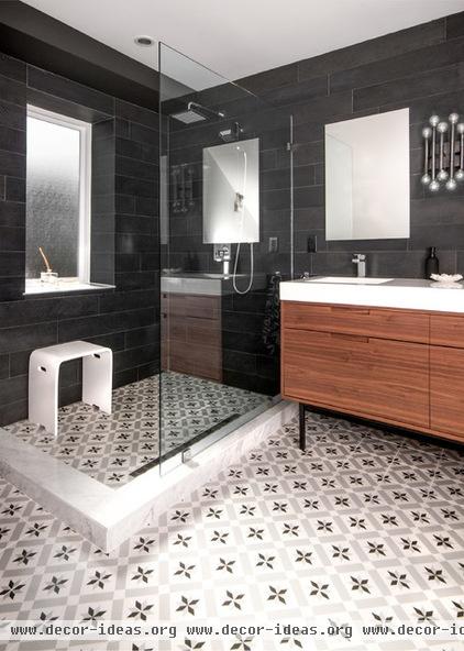
Tiles: Mettro; bench: Roman Bath; vanity: Mhouse; mirrors: Maxx; sconce: Jonathan Adler
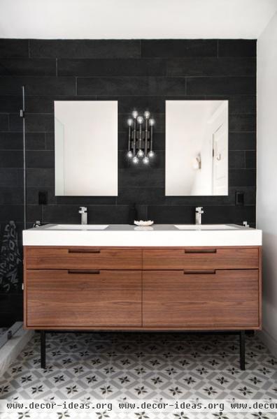
A vanity on legs helps make the room seem larger; recessed medicine cabinets provide storage behind the mirrors.
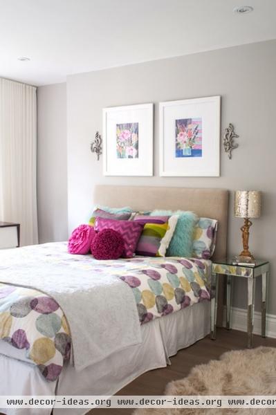
This bedroom's neutral base can evolve and grow up with Meisels' stepdaughter. The room gets pops of color from the bedding and added glamour from the mirrored nightstand.
Bedding: Ikea; art: Lulie Wallace; lamp: vintage; nightstand: Target
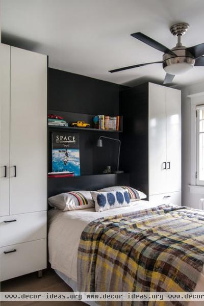
Meisels' stepson's room doesn't have a closet, so she created lots of storage by flanking the bed with cabinets from Ikea. The shelves are custom and give the whole wall a built-in look; they also serve as a nightstand.
Blanket: CB2; fan: Universal Lighting; paint: Black, Benjamin Moore
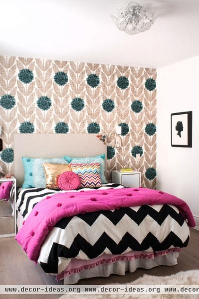
A mix of bold patterns enlivens Meisels' daughter's room. "Kids' rooms are a great place to throw caution to the wind and just mix what you love," she says. "Though the patterns are disparate, they are graphic and simple — this makes them marry together in a cohesive way."
Bed, nightstands: custom through Mhouse; bedding: Urban Outfitters; wallpaper: Orla Keily
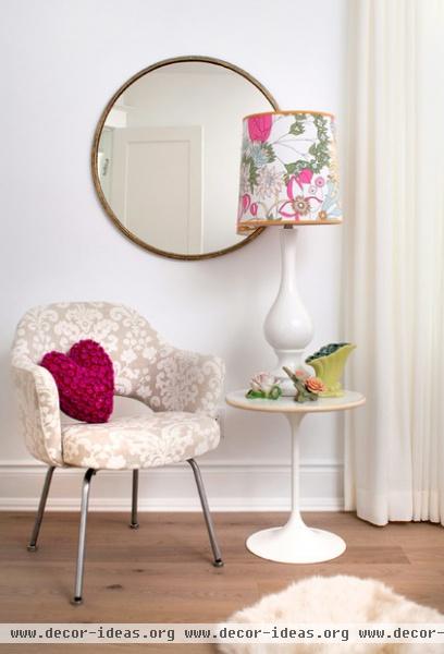
Both daughters have this same vignette in their rooms: a comfortable occasional chair, a mirror and a tulip side table.
Mirror: CB2; chair fabric: Robert Allen; lampshade: Liberty of London; heart pillow: John Lewis


