Discover a Hobbit House Fit for Bilbo Baggins
Nestled into a craggy embankment in the foothills of the Rocky Mountains, this combination art studio and guesthouse looks like something straight out of The Hobbit. Rugged stone walls seem to emerge out of the landscape, framing deep-set windows and a fairy tale door fitted with a functioning porthole window. Stout pine trusses and a stacked-stone fireplace wrap the 500-square-foot interior in a rustic embrace.
While the place looks like it’s been around for ages, the structure is actually new — a collaboration between Peter Boes of TKP Architects in Golden, Colorado, and the couple who owns the primary home on the property. “We wanted to match the look of the main house, which feels like an old turn-of-the-century cottage,” says one of the owners.
Houzz at a Glance
Who lives here: This is an art studio and a guesthouse for a married couple.
Location: Golden, Colorado
Size: 500 square feet
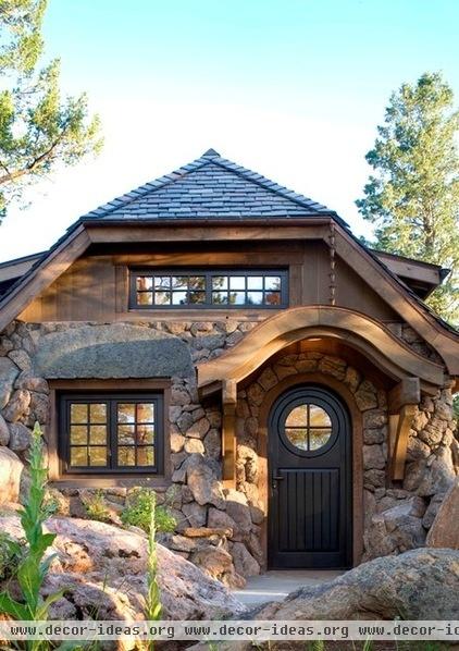
The owners had originally planned to build a much larger structure to replace the shoddy old shack that sat behind their home. But the authorities intervened, ruling that the new structure had to conform to the footprint and size of the old structure.
To get the steep roof that the owners wanted, Boes gingerly excavated 8 feet into the surrounding rock, so that the top of the new building wasn’t any higher than the old one. “It was very important to keep the rock outcrop looking like it was,” says the architect, who resorted to hand excavation — rather than blasting — to preserve the setting.
Door: Konnen Glashaus
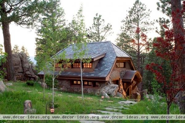
The house is just a short walk from the main residence, an 1890s cabin built during the region's copper, gold and silver boom. Although the main house was dramatically remodeled in 2001, it still retains its historic flavor.
In building the new cottage, the owners were eager to do justice to both the property and the original building. By sinking the new structure into the hillside, they both diminished the cottage's presence on the site and preserved views from the main house above.
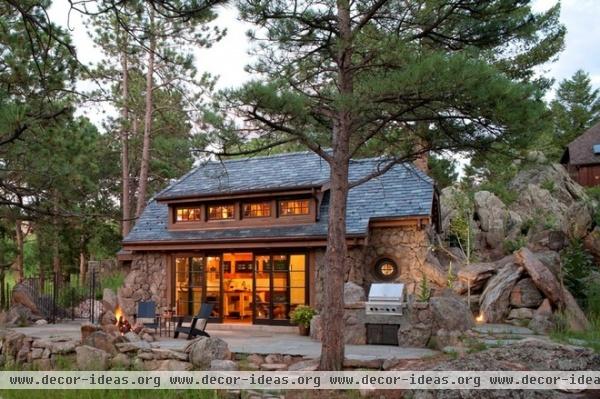
The exterior walls were originally supposed to be vertical. But on a bicycle trip through the Black Hills of South Dakota during construction, the couple passed the Peter Norbeck Visitor Center, an old Civilian Conservation Corps building from the 1930s, and were instantly smitten with the battered stone walls.
"It was a real 'ah-ha' moment," recalls the client, who told Boes about it when she got home. Cherry Masonry obligingly altered its plans, massing large boulders around the stone base and shrinking the size of the rocks as they progress upward. "It almost looks like the whole structure is growing out of the stone," she says.
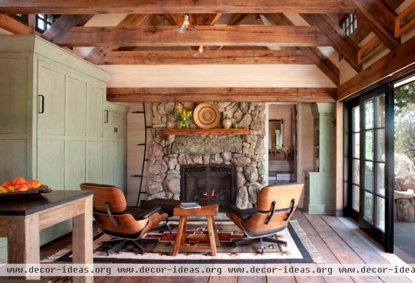
Ordinances limited the structure to just 500 square feet, so the plan had to be extremely efficient. The interior is just one open room with a bathroom tucked behind the fireplace and a sleeping loft above. A quartet of sliding doors unites interior and exterior.
Cabinetry: Martin Shea Millwork; sliding doors: Konnen Glashaus
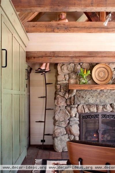
Since there wasn't room for a conventional staircase to the sleeping loft, the wife devised this vine-like "Jefferson stair" with alternating treads. Climbing up to the bedroom is like climbing a beanstalk.
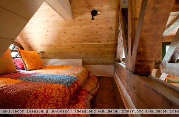
Those who venture up the ladder are rewarded with a snug sleeping perch illuminated by an arched window.
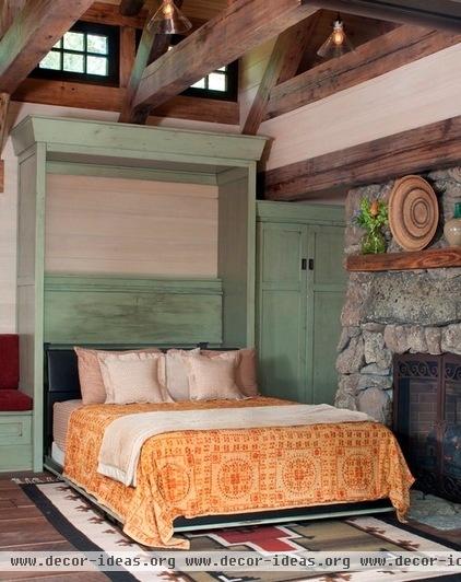
Alternatively, guests can take advantage of the Murphy bed in the living area.
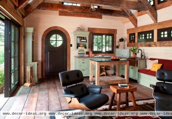
The cottage was designed to serve as both a guest retreat and a studio for the wife, who makes jewelry when she isn't working in the medical device industry. The challenge, she says, was to make it so that guests didn't feel like they were sleeping in an art studio. (And to keep bits of jewelry from falling into the cracks between the floorboards.)
Boes devised storage for all the jewelry-making supplies, so they're tucked out of sight when not in use. The resulting space looks like a kitchen, although building codes prevented the owners from installing an actual kitchen in the cottage.
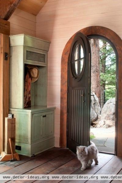
Madison the Persian cat strides in the front door, which is fitted with an operable round window. The door's shape echoes that of the front door of the main house.
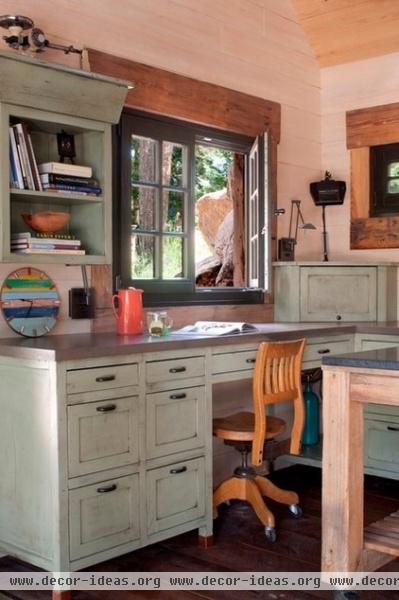
The painted cabinets provoked a lot of discussion, since they represent the sole touch of color in the space. It was decided to paint them green, inspired by an old farm table the owners had. Unfortunately, that color didn't work, and no one could come up with an alternate shade that looked any better.
As the architect and the owners deliberated over swatches one day, cabinetmaker Martin Shea stood up, walked outside and plucked a leaf from a sage plant. Everyone agreed the color was perfect.
Counter: Silestone
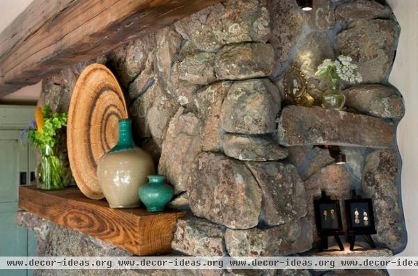
Niches were integrated into the interior to display some of the jewelry created here. The husband, an oil and gas industry executive, also relaxes in the guesthouse on occasion.
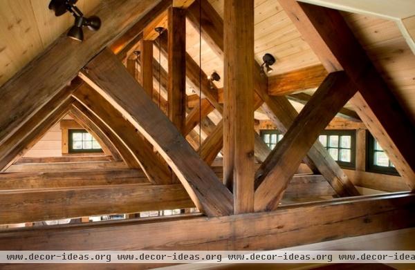
The ceiling trusses were made from longleaf yellow pine salvaged from a Civil War–era munitions factory in Louisiana. The same wood was used on the plank floors as well. The walls are new whitewashed hemlock.
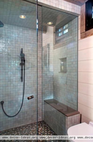
Glazed Moroccan tile adorns the walls of the shower, which has an integrated bench. The floors are glass tile.
Wall tile: Ann Sacks; floor tile: Oceanside Glasstile
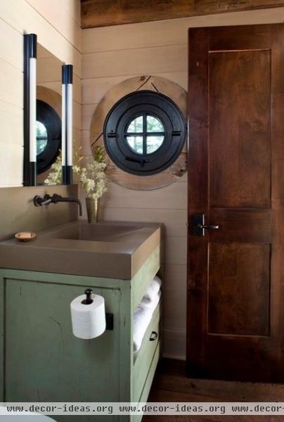
The bathroom features a custom concrete sink. Towel storage was integrated into the vanity to conserve space.
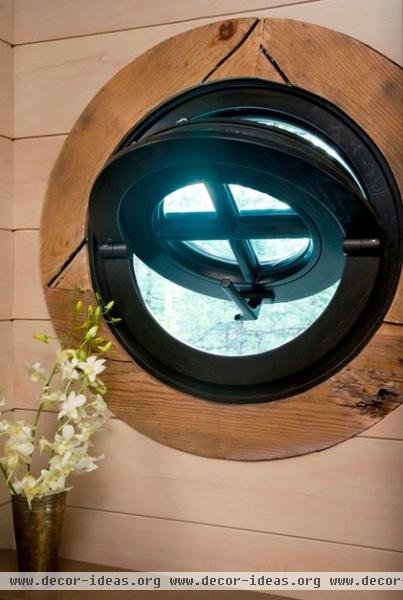
The bathroom's porthole window echoes the window in the front door.
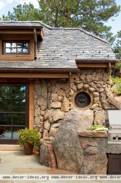
A tapestry of gray, green and burgundy slate adorns the roof, which is dotted with copper snow fences and trimmed with copper gutters. Japanese rain chains take the place of downspouts, which the architect says just wouldn't have looked right on this kind of home.
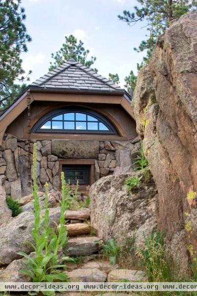
An arched window in the sleeping loft peers over a pathway wending through the rocks. Contractor Old Greenwich Builders of Denver took pains to blend the house into its setting, so each feels like an extension of the other.
See more Hobbit houses


