My Houzz: Full-Tilt Reinvention for a 1950s Ranch
“It has always been my dream to renovate a '50s rancher," says Patti Houston, owner of the home staging company Flüff Designs and Decor. Houston and her husband, developer Rick Williams, made it their mission over a year to completely transform their Vancouver house — marked by pale green carpet, brown linoleum and worn wallpaper — into a modern oasis.
The house "is on a slope-away lot with a killer view. It had great bones but needed a lot of lipstick and rouge," says Houston. "When we started peeling off the first layer, we decided to go full tilt and took it right down to the studs."
Houzz at a Glance
Who lives here: Patti Houston, Rick Williams and their youngest daughter, Jordan (age 21)
Location: North Vancouver
Size: 3,600 square feet; 1 bedroom, 3 bathrooms, 2 offices, plus an 800-square-foot 1-bedroom apartment
Year built: 1954
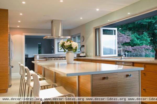
The kitchen is the first room the couple worked on. "We removed all the walls between the kitchen, dining and living areas to create a totally open space," says Houston. "I love to cook, and that’s where we all hang out."
The couple sought help from Curt Olbrecht, a cabinet builder, who installed their new teak cabinetry.
Bar stools: Glenn, Ikea
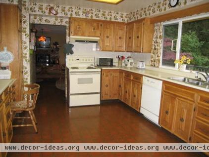
The kitchen originally had dated wallpaper and cabinetry. The couple completely revamped this space and added a new island.
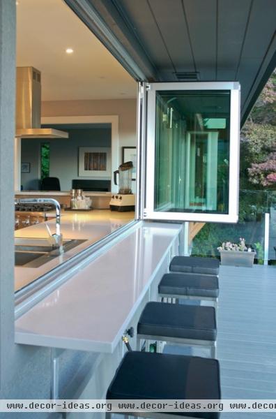
AFTER: Folding windows by NanaWall connect the indoor and outdoor entertaining areas. "Hands down, our favorite feature of the house is the view and our connection to the outdoor spaces," says Houston. "We installed walls and windows that can be totally opened up in the summer. It really suits our lifestyle."

Houston and Williams added a 10-foot-long island and a second breakfast bar behind the stove. "Guests can chat with me while I cook. I call it my risotto bar," says Houston.
Refrigerator, dishwasher: LG; range: six-burner Viking. All from Trail Appliances.
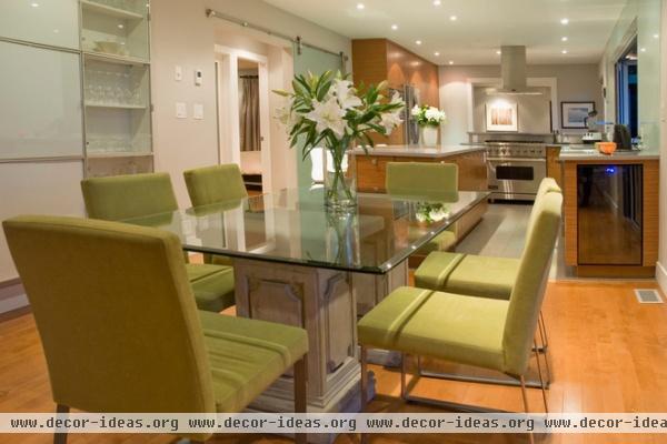
The couple added sliding sandblasted-glass barn doors to create an intimate dining area. "I wanted to be able to close off the hallway from the main living area, and there definitely wasn’t room for hinged doors," explains Houston.
The dining table bases are concrete gate posts with a patio block on top. "There was a company in Vancouver some years ago that made incredible glass and concrete tables, but they were very expensive," says Houston. "This was an effective way to get the look for less. The table has moved with me many times."
Dining chairs: custom, Flüff
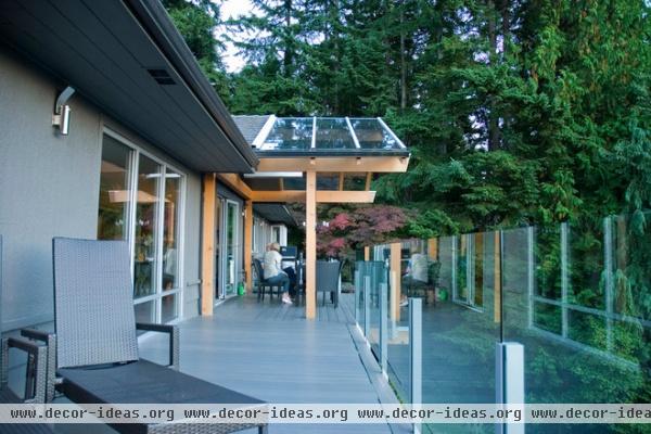
Due to significant structural changes, the original pair of smaller decks could not support the couple's desire to expand their outdoor living spaces and create a wraparound deck. The homeowners worked with Bob Turner, an engineer and architect, who redesigned the deck space, taking structure and support into consideration.
The glass roof over the outdoor dining area required large beams running the entire span of the house. The treated fir timbers were manufactured in Squamish, British Columbia, by FraserWood Industries. The owners also changed the deck surface, trading wood for a low-maintenance product from Eon Outdoors.
Lush surroundings add a sense of privacy, while the soothing sounds of a backyard stream contribute to the ambience.

This is the amazing west-facing view from the wraparound deck. Poking out through the treetops and beyond is Vancouver Island. "It’s so private and serene," says Houston.
The active homeowners enjoy living close to nature, with hiking and biking trails at their doorstep. "Plus it's so quick to get to our place in Whistler," adds Houston.
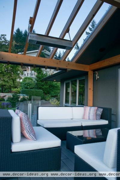
A heated pergola provides protection from the elements and allows for year-round outdoor living and entertaining. The sliding doors in the background open up to the living room.
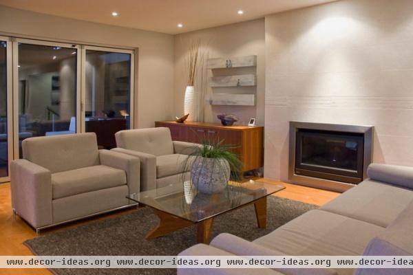
"I love clean lines, texture, and never compromise on comfort," says Houston. She and Williams made over the living room with a white accent wall, using tiles from Ican Ceramic.
Fireplace insert: Maxwell; vase: 18Karat; area rug: HomeSense; artwork: Snap Gallery (now closed); sofa, lounge chairs: custom, Van Gogh Designs
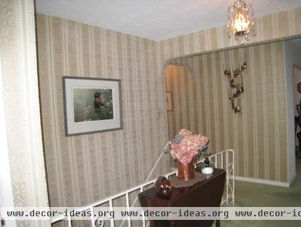
The entryway originally had dated wallpaper, pale green carpeting and a metal banister.
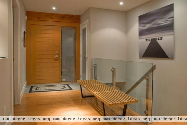
AFTER: The couple replaced the wallpaper with crisp, pale gray paint. The railing was modernized with satin nickel hardware and glass, while the green carpet was swapped out for maple hardwood.
The fir entry door is from Jim’s Pre-Hung Doors; the company installed all the doors in the house. "I love the horizontal lines along with the stainless inset," says Houston. "It’s simplicity at its best."
Her favorite piece of art is this serene Michael Levin photograph hanging in the stairwell. "He's brilliant. This is a limited-edition print on aluminum; it’s called 'Zebrato,'" says Houston. "He won International Photographer of the Year for that image."

The original main-floor bathroom had an awkward floor plan and tired floral wallpaper illuminated by cold, institutional lighting.
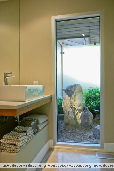
AFTER: The couple added a large picture window with a view to a rock garden and a Buddha statue. Due to its weight, the ornamental rock had to be installed with a crane.
All the windows in the house are commercial-grade storefront windows. "I wanted them to go to the floor, be aluminum and have a sense of being connected to the outdoors," Houston says. The bathroom floor tile is honed limestone from Ames Tile & Stone; all the tile floors in the house are heated.
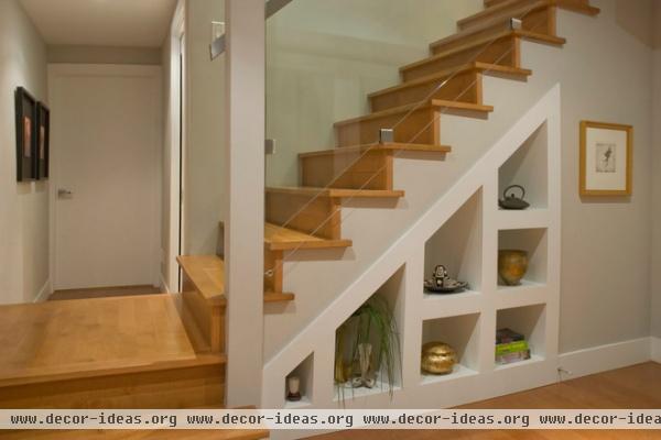
Building codes have changed over the years, so redesigning the stairs to the lower level proved tricky. The minimum headroom requirements have increased since the 1950s, and meeting those was a bit challenging. Houston explains, "We stole space from the entry closet — it now has a raised floor — and from the main-floor bathroom, which has a floating sink instead of a vanity." The lower level includes a one-bedroom suite, plus an office area for Williams and an extra bathroom.
Houston designed the custom millwork underneath the stairs, and contractor Eamonn Hindson built it. "It’s only half the depth of the stairs," she says. "The other half is storage accessed from the downstairs suite for a snowboard or other such things."
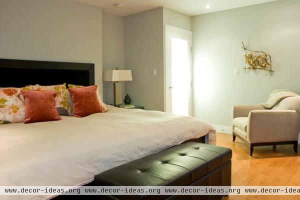
The couple modified the original floor plan. What used to be two bedrooms is now the couple's extra-large master bedroom with a walk-in closet, an en suite bath and a laundry room.
Headboard: Baronet Furniture (now closed); nightstand: Huppé Furniture; lamps: HomeSense; bedding, pillows: custom by Bandit Decor
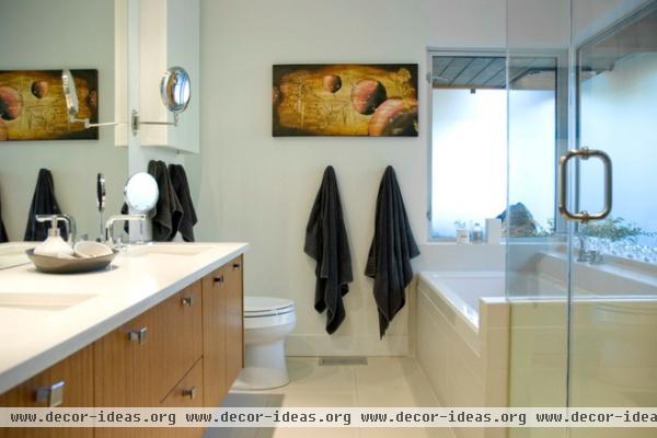
The master bath was originally a smaller bedroom. The Zen garden seen from the main bathroom is also visible from here. Frosted glass panels allow natural light to filter in, providing privacy without window treatments.
Artwork: Shane Edwards; sinks: undermount, Kohler; faucets: Hansgrohe, Emco; vanity: custom by Eamonn Hindson
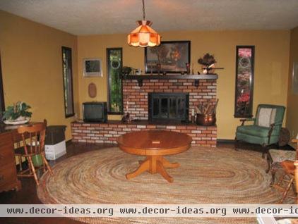
The main-floor family room had an off-center fireplace. Houston and Williams removed the traditional brick surround and installed a contemporary gas insert (with centered placement) in its stead.
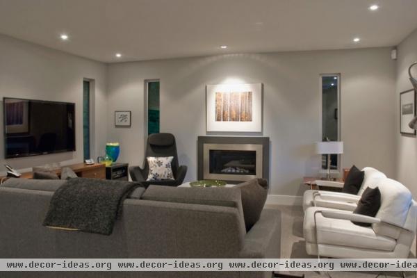
AFTER: Now a sophisticated neutral palette enhances the space. Houston added gray wool carpeting, decorating the room in a style inspired by London interior designer Kelly Hoppen.
The couple replaced the old windows with new aluminum ones. The couch is a queen-size sofa bed, allowing this space to double as a guest room.
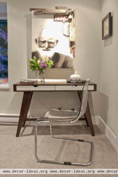
This artwork in the family room was a collaborative effort by Eben Bender, an airbrush artist, and Neal E. Nolan, an installation artist. "There was an amazing gallery in Vancouver called Snap — now closed — owned by Barry Dumka. He always represented interesting artists," says Houston.
Desk: Nood (now closed); chair: acrylic, Tobias, Ikea
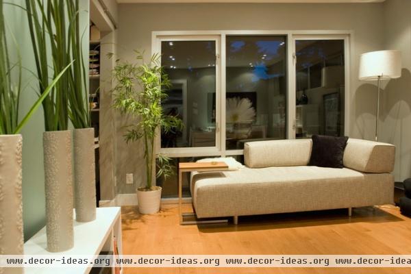
Houston's home office was once a dark room with wood-paneled walls. The paneling came down, along with the closet's doors. The closet now stores electronics and office supplies, while new sliding sandblasted-glass barn doors hide the clutter when the space is used as a guest room. The sofa bolsters come off, making this a perfect bed for an overnight guest.
Vases: 18Karat; side table: Gus Design Group; sofa: Flüff
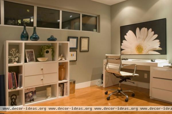
The daisy artwork in the office is a photo Houston took and printed on canvas.
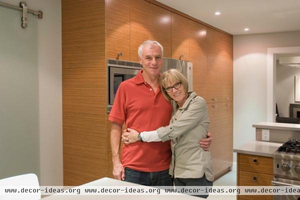
Williams and Houston, shown here, waited until the house was complete before moving in. "After searching for over a year, we finally found The One. We have never regretted it for a moment," says Houston. "This was the perfect project. We are just enjoying it now."
Browse more homes by style:
Small Homes | Colorful Homes | Eclectic Homes | Modern Homes | Contemporary Homes |
Midcentury Homes | Ranch Homes | Traditional Homes | Barn Homes | Townhouses | Apartments | Lofts | Vacation Homes


