10 Bathroom Standouts From Italy's Big Expo
I spent some time recently at Italy's biggest international expo for ceramics and bathroom furnishings, the annual CERSAIE, in Bologna. Multinational companies use it as an opportunity to show off their newest products. Often working in collaboration with well-known designers, they create exhibition stands that serve as mini tributes to ingenuity in bathroom technology, water efficiency and creativity.
Many of the products that caught my eye I suspect will influence future trends in bathroom design, as many CERSAIE products have done in the past. I should note that I have a personal interest in anything that makes a bathroom easier to clean. You’ll probably notice that I tend to like products that liberate floor space and avoid seams or joints where water can settle.
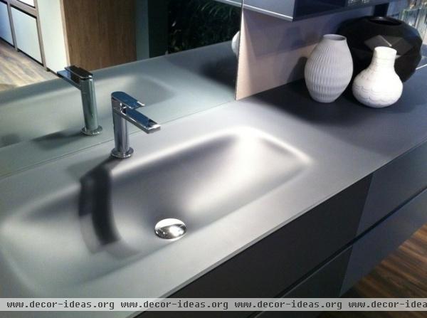
First of all I can confirm that the matte-finish look is alive and well. This countertop gives the appearance of a depression in a sheet of solid surface that looks like frosted glass. It's part of a set of modular pieces that fit together to form an entire bathroom furniture set; the same material can be extended to the cabinets and drawers.
Elsewhere at the expo, I saw solid surfaces with a matte finish on countertops, standalone sinks, bathtubs and faucets. Many were white, but there were matte black finishes as well. With the flexibility of solid-surface materials, the color options are limitless.
My Fly Evo bathroom set, IdeaGroup
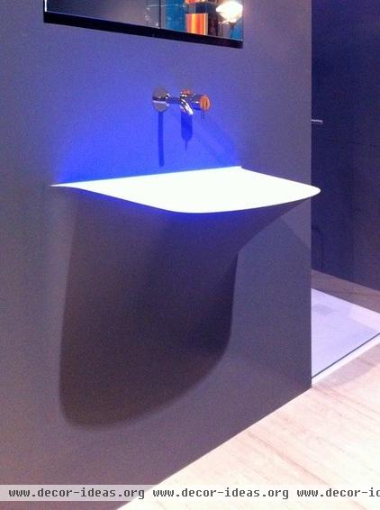
More companies using solid-surface materials such as Corian is great news for those of us who hate to clean bathrooms, and even better news for designers. Solid surface is usually composed of a mixture of marble dust, bauxite (an aluminum ore), resin and color pigment. It can be cast in all kinds of creative shapes, avoiding seams and gaps that could harbor bacteria.
This sink, for example, seems to emerge from the wall, as if someone had made a horizontal cut and pulled it out to form the basin. The basin form hides the plumbing, and once the Corian is brushed, it can be finished to match the material of the wall. In the end it appears seamless.
Silenzio and Soffio series, Antonio Lupi
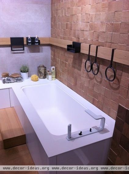
As smooth, sleek matte-finish furniture pieces become more popular, so is juxtaposing them with tactile and patterned ceramic tiles. This demo bathroom by a Spanish company shows how well a contrast in textures works.
The tub is made of a solid-surface material with a white matte finish, for a feeling of cleanliness and simplicity. Wood-recalling ceramic tiles in a mosaic then pop out of the wall, just asking to be touched. They keep the rest of the bathroom from feeling too sterile.
Porcelenosa
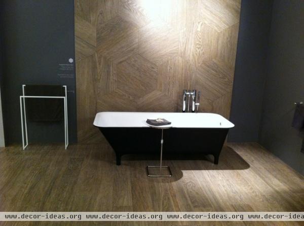
The wood look for ceramics has been gaining traction over the past few years. The tactile, warm aesthetic of wood grain, combined with the practical advantages of ceramics, makes for ample opportunity to create more natural-looking bathrooms.
In addition, the subject of environmental advantages has come up, leading to the question of which material is truly more sustainable: wood or wood-look ceramics? Sant’Agostino, for example, has a dedicated environmental mission that points out some of the advantages that ceramics have over wood (durability, longevity etc). It would be interesting to see a life-cycle comparison between the two; I haven't been able to find one.
I Legni ceramic tiles, Sant’Agostino
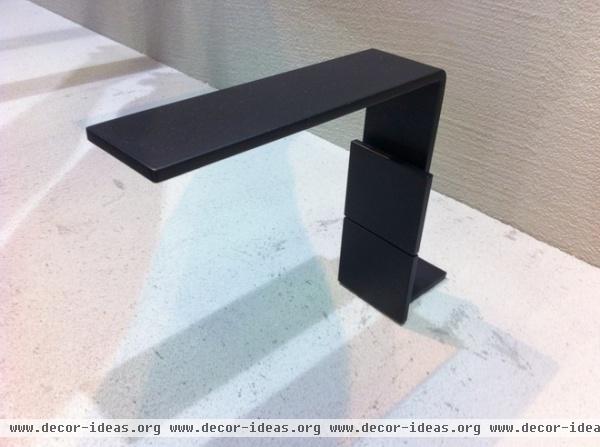
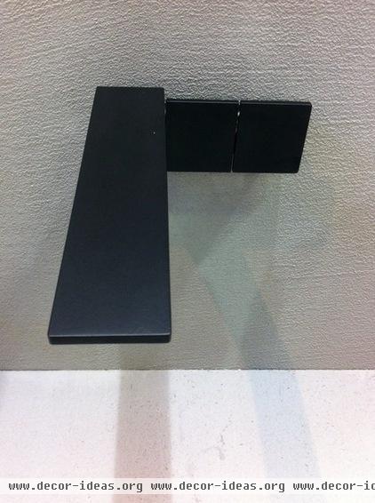
In line with the trend in matte finishes on solid-surface materials, brushed steel and brushed chrome faucet designs prevailed at CERSAIE. This prototype faucet in particular caught my eye for its beautifully simple design, both in the wall-mounted and countertop versions.
The 5-millimeter-thick faucet echoes many other products that are going for the slimmer look. The fact that this one uses small panels to adjust the water flow, instead of a handle, caught people’s attention, too. Generally speaking, most people I spoke with didn’t seem to like the thin profile on the models with handles, saying that there wasn’t enough to grab on to. However, with these squares, the action is to push the lever instead of to hold something.
Unnamed prototype for 5MM series, Treemme Rubinetterie
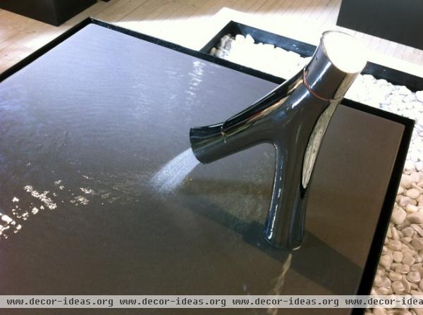
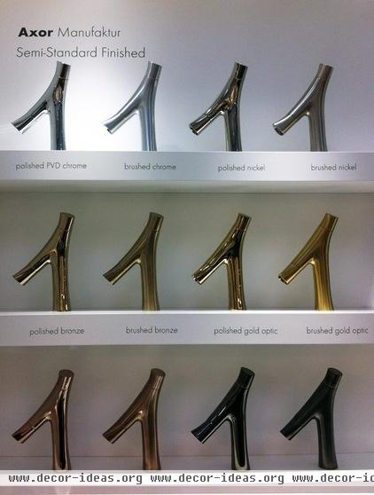
Once you wrap your eyes and fingers around this faucet, you'll understand why its ergonomic and environmental design has received so much attention this year. Designed by Philippe Starck, in partnership with Axor, the Organic series has received several accolades, including the Best of the Best in the Red Dot design awards (no easy feat).
There are two regulators: one for the flow of water, and one for the temperature. That means once you've set your ideal temperature, you can waste less water waiting for it to heat up or cool down. Its design allows for conservation of raw materials, both in its manufacturing and in its lower water consumption (with a flow rate of 3.5 liters per minute). At the same time, it feels and looks natural.
Note: Based on my quick but thorough testing, it seems that the brushed chrome finish leaves more dirty fingerprint marks than the shiny one.
Axor Starck Organic faucets, Hansgrohe
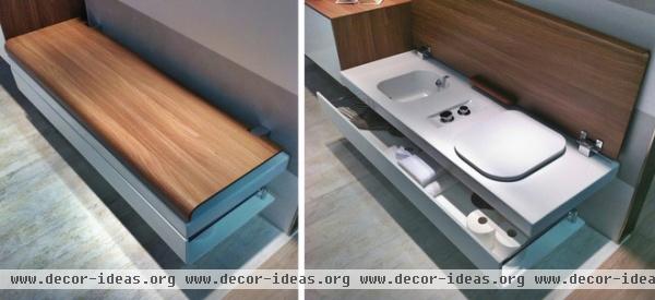
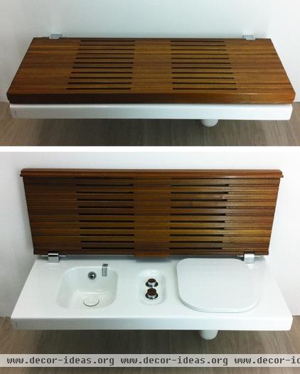
Another award-winning design that caught my attention is this toilet-bidet combo, designed to hide as a bench. I know some Americans may not fully appreciate this, but after living in Italy now for five years, I have come to appreciate the bidet as a necessary part of any hygienic bathroom.
I can imagine it as a stylish feature in a guest bathroom, especially one that you may be able to peer into from another space. It’s never pleasant to see a toilet through an open door while gathering with guests in a neighboring living room. This could eliminate that problem and leave your guests talking about your small sitting room, and wondering why it has a sink.
G-Full models, Hatria
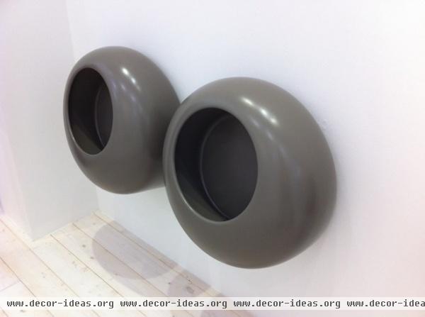
Urinals in residential bathrooms are not a completely crazy idea. Especially when the design doesn’t make you think of a high school bathroom. In a house full of boys, they may even make cleaning a bit easier.
These were just one example of several urinal designs I saw that actually seemed to be marketing themselves for residential applications.
Cielo
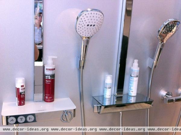
In the realm of high-tech developments, this idea caught my eye, if for no other reason than to justify throwing out those shower caddies that collect hard water stains and ruin the simplicity of a shower stall with their bulky presence.
These, instead, are a thermostat for the shower that doubles as a shelf for shampoo. There is also a flow control so you can limit how much water you use.
Ecostat Select, Hansgrohe

Not everything needs to be sleek, clean and modern. Every once in a while, you’ve got to have some fun. This little Pinocchio faucet garnered its fair share of attention at the expo, with the phrase “La fantasia é di casa” written above it. This serves as a pleasant reminder to us all: Imagination starts at home.
Pinocchio by Nagn Design, at Emmevi
More: Tile Goes High Tech at Italy's Biggest Expo


