Kitchen of the Week: A Budget Makeover in Massachusetts
Elizabeth Miller didn't have the usual suspects (granite, stainless steel and an open concept) on her kitchen wish list. The Massachusetts interior designer craved history instead. Miller's background in historic preservation and her architect husband Rick's love for older homes pushed them to purchase this faded 1937 colonial with the intention of bringing it back to life.
Although the kitchen was closed off and covered floor to ceiling in wallpaper, plastic laminate and sheet vinyl, the couple used their professional skills to work together and hold down the remodeling costs. Repainting cabinetry, maintaining decorative details and keeping structural changes to a minimum helped them stick to their budget while paying tribute to the kitchen's original architecture in a fun, fresh way.
Kitchen at a Glance
Who lives here: Elizabeth and Rick Miller, and their 2 children
Location: Milton, Massachusetts
Size: 130 square feet
Cost: $2,700, not including appliances or professional fees
Photos by John Gillooly/PEI
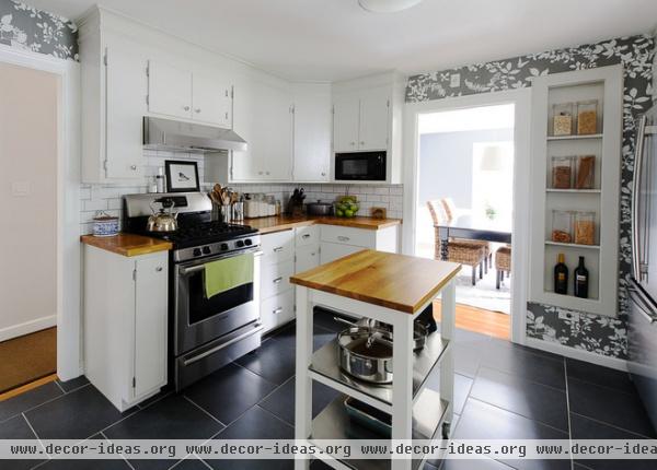
The Millers saved what they could to preserve the style of the kitchen and their budget. Most of the cabinetry is original; since it was in good condition, they simply sanded it down and applied semigloss paint. The kitchen layout allows for limited cabinetry, but the movable island with shelves adds both storage and counter space.
"I had to convince my husband to go for the wallpaper," says Elizabeth. Although it's unexpected, the classic pattern in a contemporary color palette brings life to the kitchen's simple design.
Backsplash tile: The Home Depot; cabinet paint: Smooth Stone, Glidden; cabinet pulls: Duluth, Restoration Hardware; cabinet knobs: The Home Depot; wallpaper: Shadow Vine, F. Schumacher
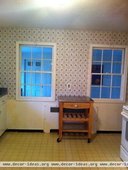
The original kitchen had two windows on this wall, which used to be one of the home's exterior walls. At some point in the home's history, a screened-in porch was enclosed and turned into a family room — but the windows remained.
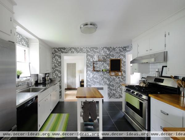
AFTER: Elizabeth and Rick wanted to connect this sunny space with the kitchen, so she turned one of the windows into a doorway and closed off the other to make the space feel cozier. The adjoining room is now a breakfast room, family room and playroom where Elizabeth can keep an eye on the children while preparing dinner.
Island: Stenstorp, Ikea; rug: Thyme Ticking woven cotton rug, Dash & Albert
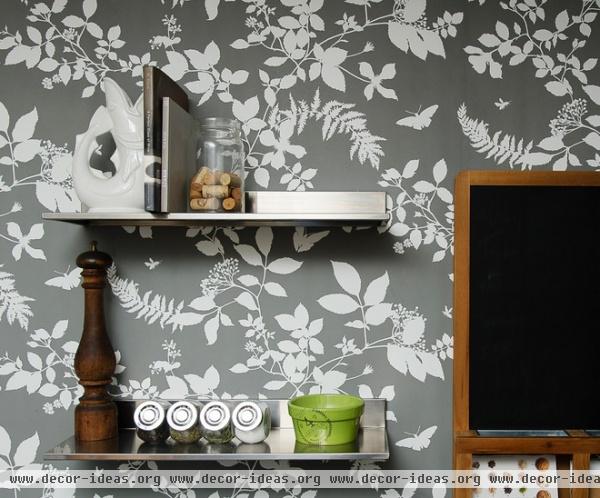
Metal wall shelves and a hanging mail holder keep letters, paperwork and knickknacks off the limited counter space.
Wall shelves: Limhamn, Ikea
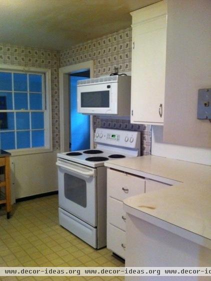
"The kitchen was pretty scary when we first moved in," says Elizabeth. The stove and microwave setup were particularly unstable.
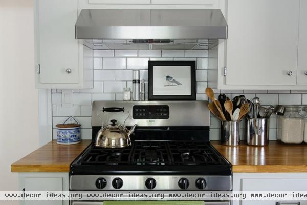
AFTER: The Millers added a new cabinet on the left side of the range and hood for a built-in look. Each narrow cabinet is the perfect size to hold cookie sheets, serving trays and other awkward items. The Ikea butcher block countertop fit the budget and warms up the stainless steel appliances on this side of the kitchen. The simple, sophisticated and affordable subway tiles were sourced from The Home Depot.
Hood: Gust, Zephyr; range: Bosch; butcher block countertop: Värde, Ikea
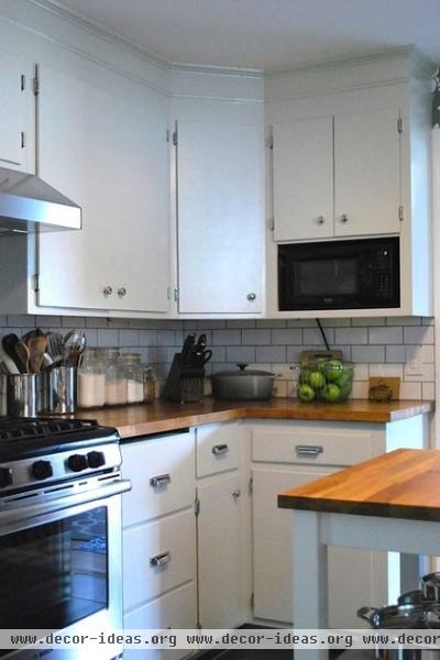
The microwave looks built in too, thanks to a customized niche that the Millers added to the lower portion of an existing cabinet. The black appliance helps balance out all the stainless steel in the kitchen.
Elizabeth and Rick copied and extended the original crown molding above the cabinets, tying old and new together.
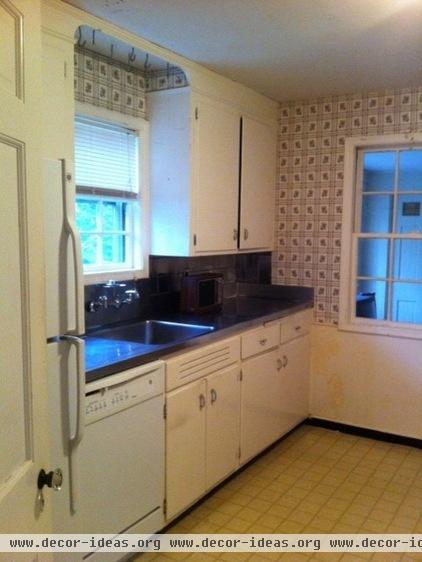
This side of the kitchen required little structural work. Elizabeth and Rick loved the original stainless steel sink and counters, as well as the deep molding detail overhead.
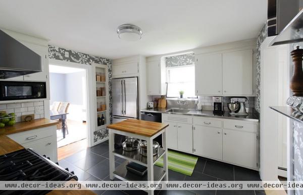
AFTER: New cabinets above the refrigerator give it a built-in look, similar to the range and hood. The dry-goods shelf next to the refrigerator held a built-in ironing board in the original kitchen. Elizabeth loved the look but knew she wouldn't be ironing in her kitchen, so she turned it into open shelving for pantry items.
The couple crossed their fingers, hoping for hardwood floors under the old vinyl, but found asbestos instead. The new 18- by 18-inch porcelain tile took up most of their budget, but it is superstrong and has a solid color that won't show chips or scratches.
Refrigerator: Jenn-Air; window treatment: DIY with fabric from Jo-Ann
Browse more beautiful kitchens on Houzz.


