Inside Houzz: An Interior Design Match Made Right Here
Dana and Patrick Knorr didn't really know anyone in Seattle after moving there from Kansas and buying a 1970s house. So when they needed a designer to help them remodel, they didn't have a network of friends or resources to tap. Patrick got a few referrals from coworkers, but the professionals he contacted offered only references — they didn't have examples of work to show.
Frustrated, Dana began browsing profiles of interior designers in her area on Houzz. That's when she found Kayron Brewer.
Dana loved the projects she saw in Brewer's profile and hired the designer before she and Patrick even closed on the house. As is so often the case, what started as simply a kitchen remodel ended up becoming much more. By the time they finished, they'd overhauled the dining room, powder room and master bath as well. “Pretty much the whole first floor,” Knorr says.
More guides to using Houzz
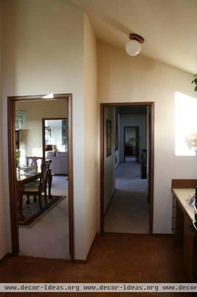
Walls and a small hallway separated the kitchen, dining room and powder room, blocking views of Seattle and Lake Washington.
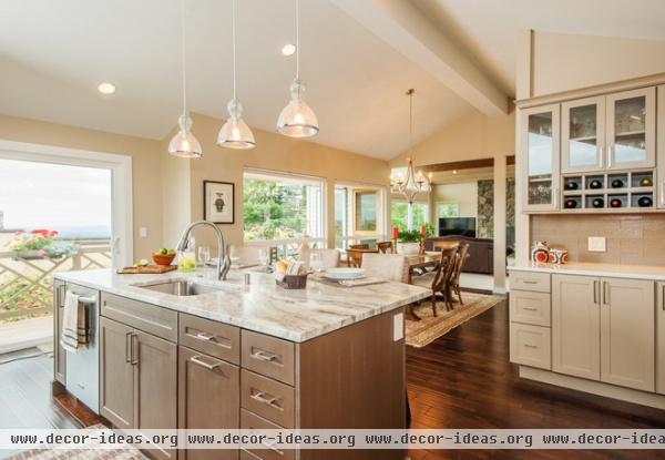
AFTER: Brewer removed the walls and added a support beam to open up the space, making it more family oriented and suitable for entertaining.
Wall paint: Sandbar, Sherwin-Williams; island cabinets: maple, Pendleton door with mahogany paint and brushed vintage oatmeal glaze, Showplace Wood Products; countertop: Fantasy Brown natural quartzite stone
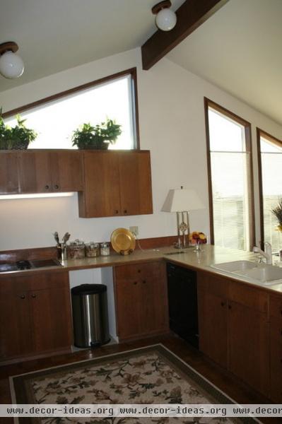
Well-worn cabinets and checkered parquet floors made the kitchen feel dated.
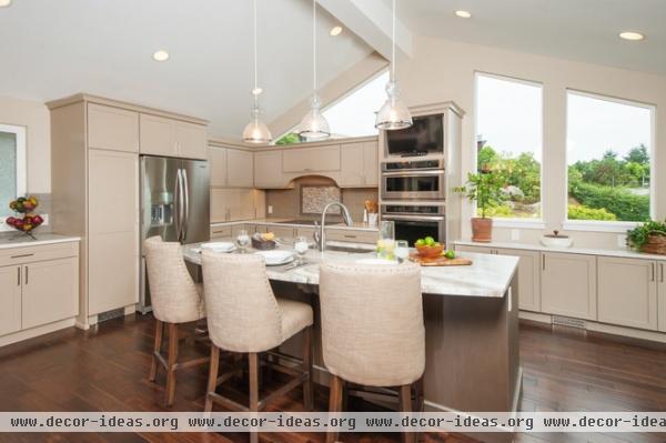
AFTER: Brewer replaced the floors in the kitchen and the carpet in the dining room with engineered acacia wood. Then she installed new cabinets, which she topped with engineered quartz around the perimeter and a natural quartzite slab on the island. Recessed cans, pendant lights and LED undercabinet lighting replaced the woefully inadequate globe fixtures.
"I’d never used a designer before," Dana says. "We’d never done any project this extensive. I’ve always picked stuff out and then hired contractors. Brewer is the first time I’ve used a designer, and it’s been worth every penny."
Floors: Sable Mist 5-inch-wide plank acacia, Dansk Flooring
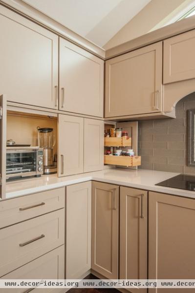
Smart storage like an appliance garage and pullout spice rack make the space superefficient.
Cabinets: Pendleton door with Sandstone paint, Showplace Wood Products; countertop: Lattice, PentalQuartz; backsplash: Washed Slate, Creekside by Bellavita
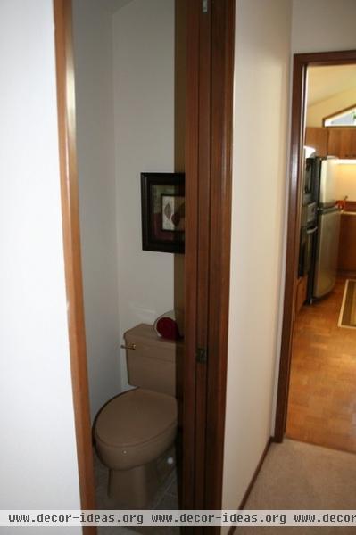
The powder room off the kitchen was previously a cramped space. "You could sit down on the toilet and wash your hands at the same time," Brewer says.
The Knorrs didn't want to remodel the powder room initially, because they feared it wouldn't fit into their budget. Brewer showed them that by folding the hallway into the powder room, they could gain more space in the bath and open up the rest of the kitchen to accommodate more storage.
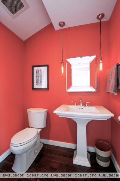
The toilet stayed in the same place (a great budget saver), while the rest of the room expanded significantly. There's even space for a corner cabinet on the opposite wall.
Wall paint: Quite Coral, Sherwin-Williams; mirror and pendants: Restoration Hardware; faucet: Metrics C, Hansgrohe
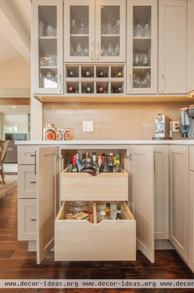
Removing the hallway allowed Brewer to create this bar and storage area for entertaining.
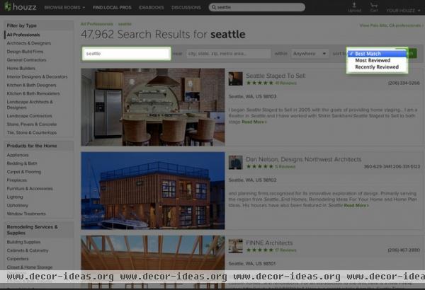
How the Knorrs Found Their Designer
Dana went to the Find Local Pros section on Houzz and searched under "Seattle." (You can filter by type of pro on the left, such as general contractors, cabinetry experts or tile installers. You can also sort by Best Match, Most Reviewed or Recently Reviewed to customize your search.)
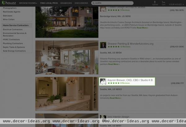
After looking through a few profiles, Dana landed on Brewer's page.

Brewer's profile gave Dana a sense of the designer's style and experience. She looked at her ratings, reviewed her portfolio of past projects (it showed just what Dana was looking for in her own home), and got a sense of Brewer's personality by seeing how the designer interacted with the Houzz community in the Discussions section.

Then Dana pulled up verified client reviews about specific projects that Brewer had worked on. “It was great to see the reviews of people," Dana says.

The Discussions section is where Dana really got a feel for Brewer's professional attitude. “One thing I really liked was how responsive Kayron was to people on Houzz," Dana says. "She really interacted with them up to a reasonable point. I really liked that.”
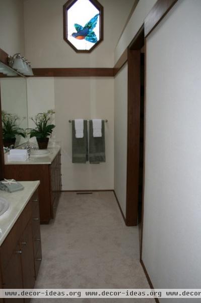
And that's how Dana went from having this dark, constricted master bathroom ...
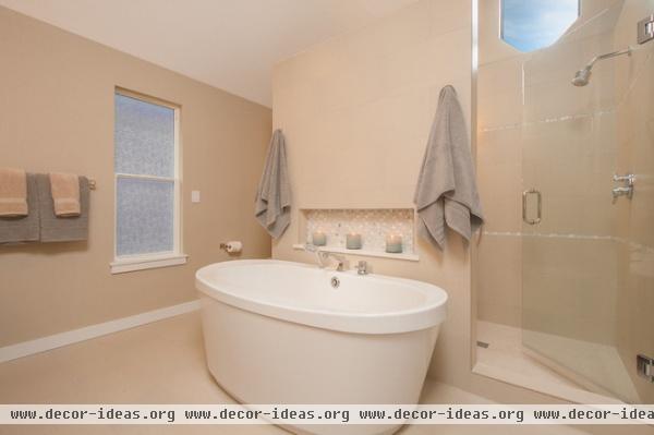
AFTER: ... to this completely transformed haven. The only thing Brewer left in place was the toilet and the octagonal window, which is now located over a new shower (sans stained glass bird).
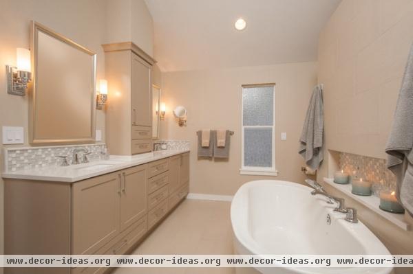
Bathtub: Jazz, Maax; fixtures: Hansgrohe; cabinets: Pendleton door with mahogany paint and brushed vintage oatmeal glaze, Showplace Wood Products; sconces: Sussex Tube, Pottery Barn
Have you found a pro on Houzz to help you with your house? Please upload a photo below and tell us about your project!
More: How to Contact a Pro on Houzz and Get Your Project Going


