Design Workshop: Thinking Differently About Doors
http://decor-ideas.org 11/10/2013 20:10 Decor Ideas
The massive doors of the great cathedrals in Europe were intentionally designed as humbling constructions. That's because door size and treatment in architecture are excellent ways to shift scale with little effort. By contrast, residential construction has historically employed essentially one size door: 3 feet wide and 7 feet tall, drawn from the rough proportions of its inhabitants.
With common ceiling heights in the 8- to 9-foot range, these doors act as apertures in wall planes — framed openings, touching neither the ceiling or adjacent walls. While this size of door functions well, allowing us to bring in our groceries, keep cool and warm air inside or outside, and have both openness and privacy — doors can be so much more.
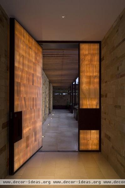
Subtly shifting our thinking about doors as just apertures or openings to thinking about them as wall elements that pivot or slide can create myriad design possibilities. These possibilities can transform the proportions of spaces and more seamlessly integrate the humble door into the architecture of a space.
Onyx fills a thick steel frame that spans the entire entryway here, challenging the very notion of what a door can be. Pivoting hardware sets the door in the floor and ceiling, which suggests passing through a secret wall. One can imagine that when closed, the door functions as an elegant, luminous art object.
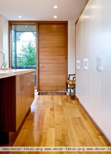
The door here reaches vertically to touch the ceiling. It's clearly larger than it needs to be functionally, and thus is playing by a different set of rules.
Notice that it matches precisely the proportion of the glazed opening. I particularly like that the solid mass of the island contrasts the glazed opening, while the open walkway leads to the solid door. These reversals and contrasts are complex and engaging experiences enhanced by the bold door choice.
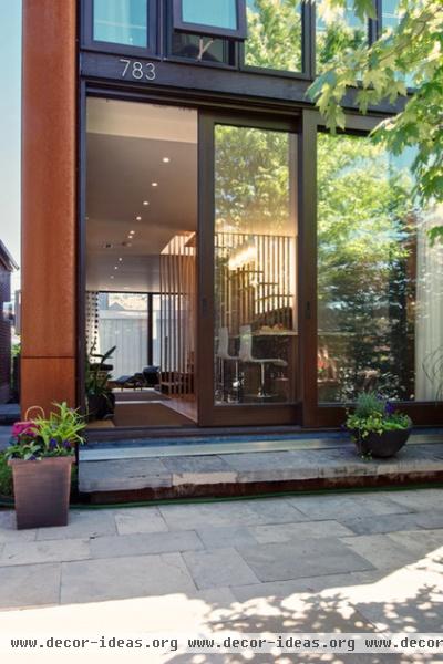
Large sliding doors span floor to ceiling and move completely clear of the opening to create a seamless connection between indoors and out. The color and frame size of the doors match the window system above. It's hard to distinguish what is wall, what is door and what is window, because each is treated as part of a compositional whole.
By increasing the height of this door to match the ceiling height, the architect has hidden the sliding track of the door elegantly within the floor thickness above, effectively dissolving the boundary between inside and out. Many types of spaces can benefit from thinking about the elements of buildings as part of a larger system. Doors specifically tailored to room dimensions are strong statements of intent in design.
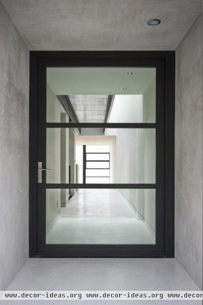
By contrasting the frame of this door with the entry hall it presides over, the architect has signified this as an important threshold linking inside and out. The scale denotes "front door" and, more important, sets up the experience of the space beyond. (The project is appropriately named Sunset Overlook.)
The glazed entry door becomes a frame for the views that unfold upon entry. In a home full of layered axial views and transitions, the front door sets the stage for this experience.
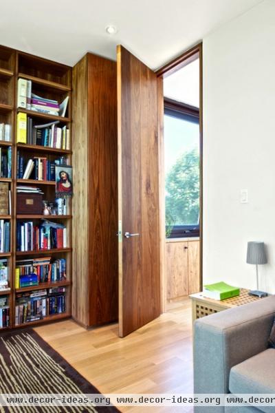
Relatable size and material tie these elements together. The designer has treated this passage door much like the cabinetry: as a fine furniture piece. Whether open or closed, this door feels like part of the overall composition of the shelving unit.
Integrating passage doors into walls of cabinetry establishes a common language between elements. This is an advantage in spaces where many disparate elements are closely positioned.
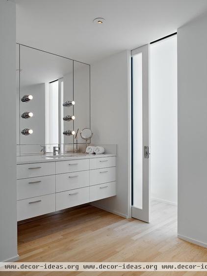
This door becomes another planar element in the room's composition. Note how everything in this space supports this treatment: The cabinetry spans wall to wall, floating above the floor; the mirror fills the alcove; the plane of the floor is a contrasting material. Each element is treated as a plane that extends to an adjacent plane. These gestures, while simple, all work to reinforce one another.
The floor-to-ceiling pocket doors effortlessly change the nature of a space. When they're open, space and light flow freely between rooms. When they're closed, the large pane of etched glass provides privacy while remaining luminous.
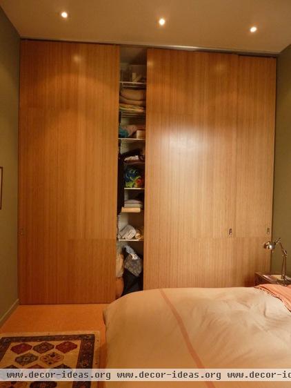
Simple closet doors conceal storage and clutter here. But because they've been extended from floor to ceiling and wall to wall, and have no trim, they form clean planes that fit with the aesthetic of the room. When closed the doors become a warm, wood accent wall. Small spaces, where each surface carries greater weight, can benefit enormously from this treatment.
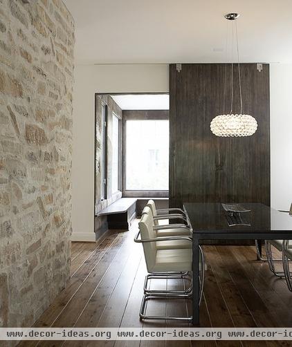
Here's another example of a sliding door functioning as a wall. The architect made a conscious decision to conceal the sliding track in the ceiling to allow the proportions of the room and the adjacent stone wall to dictate the panel size, rather than the opening its meant to conceal.
So the wall panel has become another tonal element in the architectural material palette, along with the wood floor and stone wall. It's rendered here in wood, but a sliding door panel such as this could be almost any material — cast glass, perforated metal, etched stone — and function as both a sliding art object and a door.
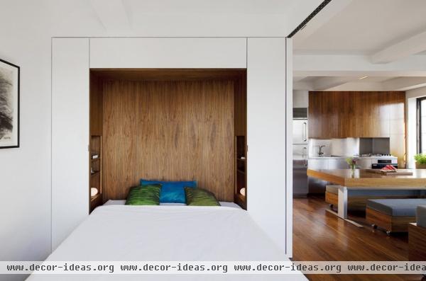
A transformer loft illustrates the degree to which a space can be manipulated and changed by the use of doors as sliding walls that separate space. The door track, barely visible in the ceiling, allows this large room-dividing door to create a private sleeping space within the larger living volume.
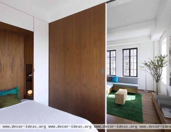
The living room side of the same panel is painted to match the adjacent white walls, while the bedroom side receives the warmer wood tone to match the bed alcove.
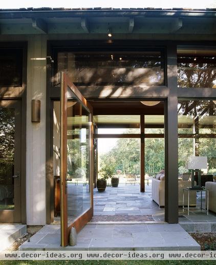
The structure here dictated the scale of the pivoting door. A door sized to the proportion of a person would've meant more divisions in the wall and more separation between inside and out in this design, which relies instead on breaking down those barriers. Care has been taken to match the size of the stone threshold to the size and reach of the pivoting door, lending the open panel a natural point of repose.
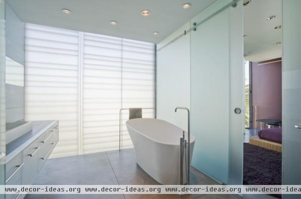
The sliding glazed door panel here matches the proportion of the exterior wall openings, reinforcing the translucent, light-filled bathroom. When closed it completes an all-glass wall that divides the bath from the room, while windows separate it from the outside.
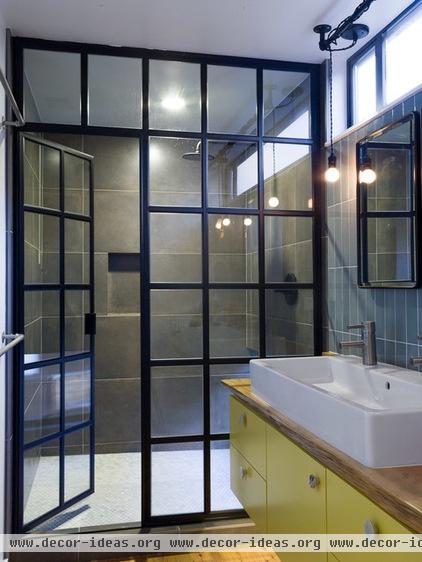
Commercial and industrial door systems are excellent devices for changing perception of scale. In this shower wall, small mullion divisions stack to make this space seem taller than it is. Bringing an exterior window and door system inside has created an interesting public counterpoint to a very private space. The door here is one part in a larger ordering system, and the system itself lends a refined industrial flair to the space.
Related Articles Recommended


