Houzz Tour: A Victorian Cottage in Sydney Opens Up
Despite its sunlit garden and Sydney location, this Victorian cottage felt dark and dreary. As with many homes built during the 19th century, the rear was cluttered with small rooms and low ceilings, and it had a bathroom that blocked views into the backyard.
After considering other design options, architect Danny Broe and homeowner Linda Carmichael gutted the back of the house and rearranged the rooms into an open and bright configuration. Dashes of color break up the modern addition and add personality, while original Victorian architecture at the front of the house preserves the home's unique character.
Houzz at a Glance
Who lives here: Linda Carmichael
Location: Enmore, West Sydney, Australia
Size: 871 square feet; 2 bedrooms, 1 bathroom
Remodel cost: $284,000 Australian (not including professional fees)
Photos by Karina Illovska
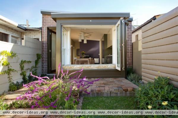
A new bay window at the back of the house is visible from the combination living room, dining room and kitchen. The windows in the bay fold back, eliminating any division between interior and exterior, and allowing Carmichael to rest her feet on the elevated patio while sitting on the spacious window seat.
Broe created that patio — as well as the garden's paths — using brick and stone salvaged from the demolished parts of the house.
Window seat fabric: Fingers, Signature Prints; doors, windows: Windoor
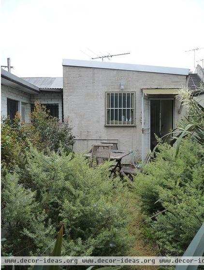
Here's a look at the back of the house before the remodel. This door led to a small bathroom, which blocked views of the back garden from the interior living spaces.
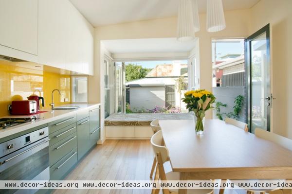
AFTER: The north-facing bay window (important in the Southern Hemisphere) fills the space with sunlight. Broe even installed a small window at counter level to capture extra light and illuminate the workspace. The Tasmanian oak flooring added throughout the house has a matte finish for a light and airy feel.
The ceiling of the window bay is much lower than the ceiling in the rest of the space, making the window seat feel cozier and more intimate. Translucent blinds and a fence outside the back door provide privacy if needed.
Kitchen counter: Snow, Caesarstone; hardware: Hettich; sink: Olivieri; faucets: Sussex, Reece; blinds: Rolletna
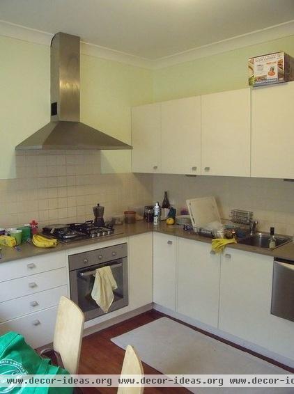
The previous kitchen had updated appliances and materials, but it felt cramped due to the lack of space and light.
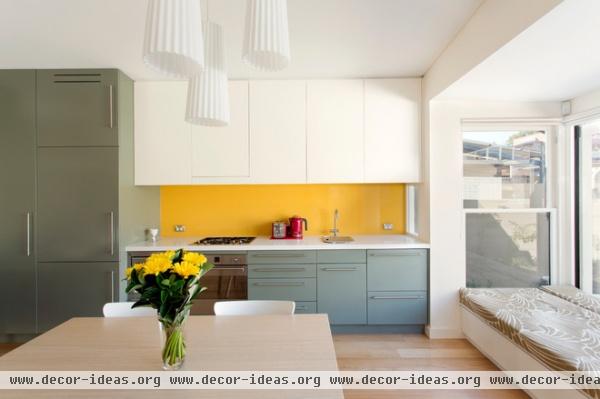
AFTER: The new open floor plan affords plenty of space. Four different colors divide the kitchen into zones, reducing the visual bulk of this efficient, single-wall layout. The different colors also make the cabinetry look more like freestanding furniture than built-ins.
Cooktop, oven: Smeg; range hood: Ilve; refrigerator: Fisher & Paykel
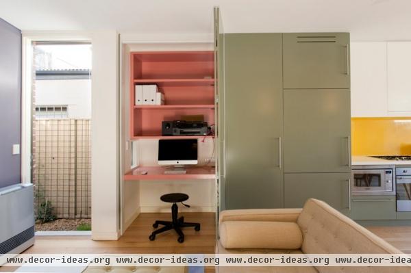
A door next to the pantry opens to reveal a surprising pink office. "Pink is such a strong color, so it's best revealed only occasionally," Broe says.
A small window in the office wall lets in light and looks out on the home's small courtyard. Broe added the courtyard so he could introduce windows to the bathroom, bedroom and office, and bring light into the middle of the home.
Couch, ottoman: Jazz, Oz Design; rug: Orbit, Dinosaur Designs; ceiling fan: Revolution, Hunter Pacific
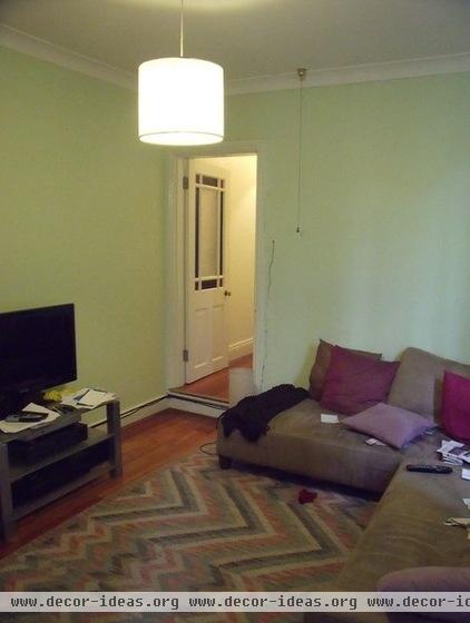
The living room had little natural light. The single ceiling pendant didn't do much to eliminate the dim, dark feeling.
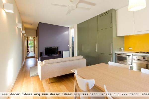
AFTER: The new living room gets plenty of natural light. Additional pendants in the kitchen and wall sconces in the living room project light in interesting ways and add warmth.
Lighting: ECC and Ikea; Tranetorp table, Nordmyra chairs: Ikea
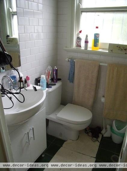
Shoved into the back of the house, the home's sole bathroom had limited square footage and could be accessed only by walking through the living room.
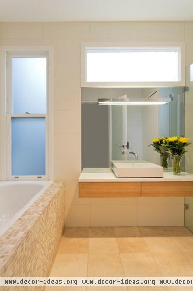
AFTER: The bathroom was moved from the back of the house to the middle, where it's now easily accessed from the public areas and the bedroom. The new bathroom also has a separate tub and a washer and dryer (not pictured).
Showerhead: Raindance, Hansgrohe; tub: Kaldiwei; sink: Alape; bathroom counter: Corian; heater: Rinnai; tiles: Bisanna
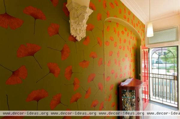
The details in the ornate front hall lent themselves to an equally ornate wallpaper. Biloba wallpaper from Marimekko greets guests with a splash of bold, contrasting color.
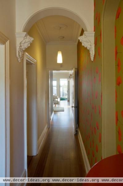
Careful remodeling maintained the original Victorian character in the front hall. Broe and his team had the plaster cornices and ceiling roses repaired, and fixed a nose on one of the plaster ladies, too.
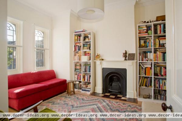
All of the front rooms, including this informal parlor, were simply restored to their former glory. The bay at the back of the house mimics the bay in this room, connecting the original Victorian with the modern spaces in back.
Light: Yvette, Beacon Lighting
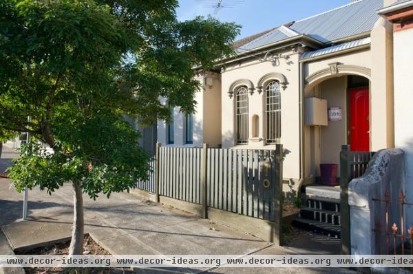
Although the house is in close proximity to its neighbors — like many homes in the Sydney suburbs — the sidewalls and limited number of side-facing windows give the home privacy. Broe installed a new metal roof but kept the original contours to maintain the interior's high ceilings.
Roofing: Lysaght; interior paints: Dulux; exterior paints: Murabond
Design team:
Architect: Danny Broe
Builder: AS & KB Constructions
Engineer: Partridge Structural
Landscaping: Mason Smith, Grandiflorum Landscapes


