How to Make a Room Easier on the Eyes
http://decor-ideas.org 11/10/2013 16:50 Decor Ideas
Our eyes work hard. They continually scan the world around us, looking for changes and registering what's stayed the same since their last sweep. When there's lots to see, they have lots to do, and all that "eye work" distracts us from whatever we're up to — hanging out with friends, cooking dinner or tackling work we've brought home from the office. And this can cause stress.
But the tricky thing is that having too little visual stimulation isn't ideal either. Too little and our brain registers that something unnatural is going on, which can also stress us out. So how can we create spaces with just the right visual stimulation?
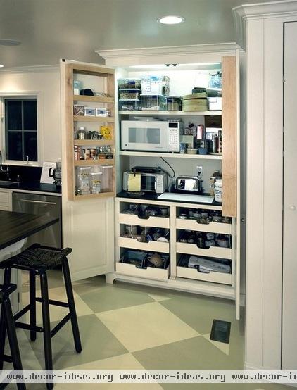
Keep most of your things out of sight. We all have stuff — usually way too much stuff. And having lots of things in view is stressful, because it makes your eyes work hard. You don't have to be a minimalist, but having adequate storage is key to reducing stress.
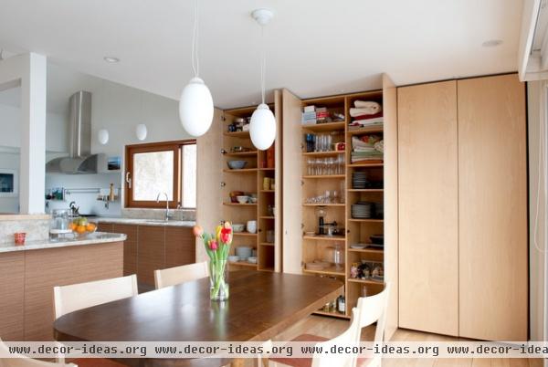
Put opaque doors on cabinets. Glass cabinets and open shelving show too much of your stuff, causing your brain to take in an overload of visual information as your eyes scan your environment, whether you know it's happening or not. Using solid doors lets you shut everything off to create smooth surfaces and less distraction.
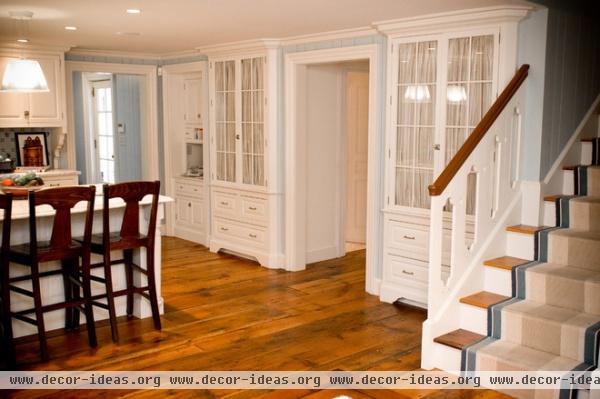
Add curtains. If you've got cabinets with glass windows, use curtains to partially block the view of what's inside.
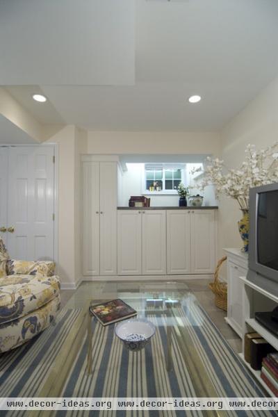
Paint cabinet doors the same color as your walls. Your cabinets will disappear into your walls if both are the same color. That means your eyes need to process less as they roam around. (Note: The cabinets and walls don't need to be white, just the same color.)
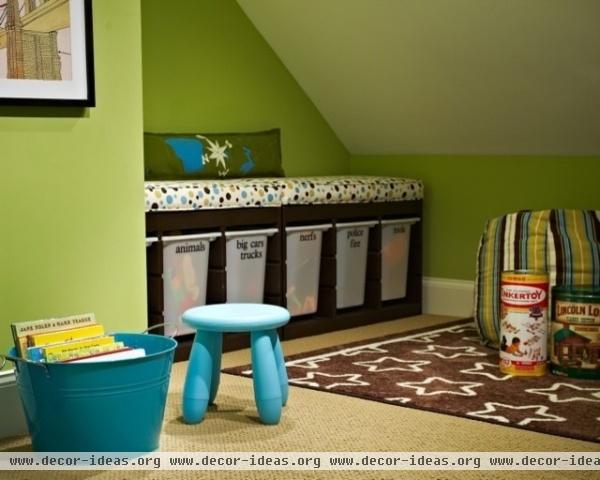
Keep storage simple looking. If putting possessions behind doors isn't an option, make sure that the view you have of whatever is holding your stuff is simple, as with these bins that have a smooth surface.
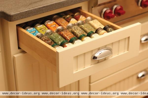
Don't let small objects roam free. Things that are little add up fast visually. Specialized drawers like this one, as well as other customized cabinetry, can keep the things you need available when required and out of sight otherwise.
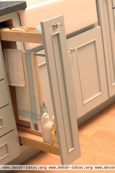
That goes for the bathroom too. Towels, soaps and other frequently used objects all make your eyes work to process them. Find a way to keep them accessible but out of sight when not in use.
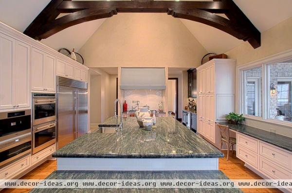
Everything doesn't need be plain. This space is moderately complex visually, which is your design objective. The countertop and the arch overhead are enough to process visually, and with the relatively plain cabinets and appliances, they make the room interesting, not overpowering.
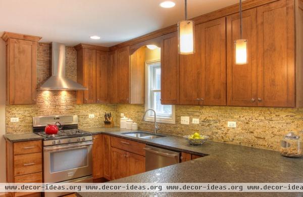
Here's another good example of balance. The backsplash is visually complicated, but the overall room is only moderately complex.
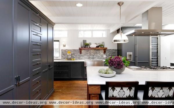
And here the backsplash and chair backs are a lot to process, but everything else is simple visually.
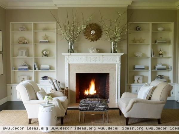
Display only the important stuff. A room that's moderately complex visually doesn't have to be devoid of things you love. There are multiple objects on display in this space, but it is only moderately complex visually, because the items on the shelves are simple shapes and colors and are symmetrically arranged. If they were more complicated shapes or in multiple colors, fewer could be presented at any one time.
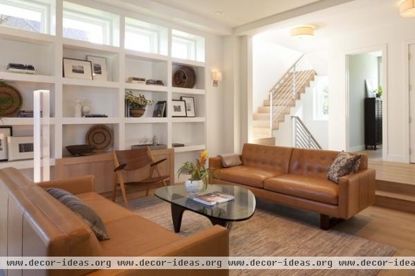
Here's another example of the right tone to set with your display shelves. Not much "eye work" is required to take it all in.
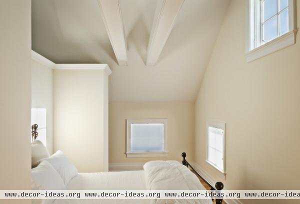
This space is visually simple, but multiple square windows, architectural details on the ceiling and varying shadows add just the right amount of visual complexity — and there's daylight to boost mood and performance.
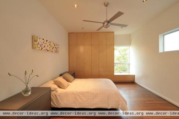
This space makes excellent use of unpainted wood, which research has shown actually de-stresses us. It is also visually simple. The higher window is also a good way to let natural light into a space while blocking a view that's not the best.
Related Articles Recommended


