Houzz Tour: Bamboo Gardens Inspire a Serene California Home
When interior designer Tim Clarke was hired to work on a house in Pacific Palisades, California, the home had already been gutted down to the studs. "My clients needed to make a 1960s house with large rooms but low ceilings feel great, modern and up-to-date, while also taking advantage of an indoor-outdoor lifestyle," Clarke says. "I find inspiration in the open-plan tropical homes in places like Bali, Hawaii and Brazil, where the separation between interior and exterior is sometimes nonexistent."
Clarke took his signature "native woods" approach, which celebrates natural materials like stone, wood, sand, glass and shells, and the elements of earth, air, fire and water. "The decoration is vaguely Asian and contemporary, relaxed and comfortable," says the designer, who drew inspiration from the beautiful bamboo gardens surrounding the home.
Houzz at a Glance
Who lives here: A young family with a small son and daughter, and their dog
Location: Pacific Palisades, California
Size: About 4,000 square feet; 4 bedrooms, 5 bathrooms
Photography by Noah Webb
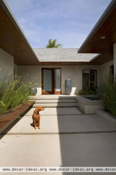
To create a welcoming entry sequence that worked with the home's style, Clarke designed a pivoting door and added indigo-glazed, highly textured pots to serve as sculptures. "This gives a definite destination and a processional arrival sequence," he says.
The model here is Becker, the family's Vizsla, who also welcomes visitors.
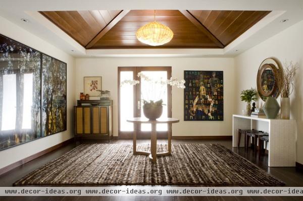
The entry hall sets the tone for the rest of the home's interiors. Inspired by pavilions in Bali, Clarke broke through the low ceiling to create a pyramid-shaped one, and lined it with Douglas fir stained to resemble teak. The large artwork on the left gives the feeling of an expansive view into the trees.
"I used this Balinese pavilion idea to help create some height and break up the large expanse of ceiling that the houses of this era have," Clarke says. "The rooms are often really big, but because the ceilings are often only 8 or 9 feet high, you really notice them."
By raising the ceilings where he could, he opened up the rooms and solved the problem of the oppressive giant flat lid the old ceilings created.
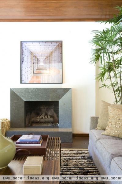
Part of Clarke's design philosophy includes celebrating the elements of earth, air, fire and water. In the living room a bluestone fireplace combines earth and fire; a plant and light paint colors remind us of air; and nautical-inspired elements like the nickel and mahogany coffee table and optical photograph reference water.
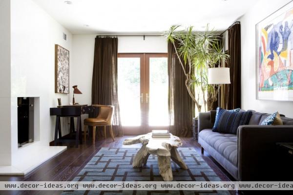
Although the natural materials have a very elegant look, they can withstand abuse. "I always try to use materials that are kid and pet friendly — never too precious, and often with nice texture and/or colors that can mask the wear and tear that kids and dogs can cause," Clarke says. The children use this room a lot, and the designer admits that just out of view, the camera's tripod is straddling a pile of toys.
A bamboo garden just outside the windows inspired the color palette. "I don’t usually use any color that feels fake or manufactured; I use colors that occur naturally outside," he says. "In a home like this, the connection to nature is very important, and the view becomes art."
Clarke added pattern in carefully considered touches, often on accents like throw pillows and rugs; the patterns are often ethnically inspired.
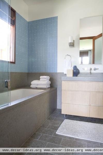
This kids' bathroom is simple and streamlined. "The tile is sanded glass, installed vertically as a modern take on bamboo pattern," Clarke says. By working hard to get the materials flush with the drywall, he eliminated the need for trim pieces that would have taken away from the clean and crisp look.
The wainscoting, floor and counter are Lagos Azul limestone. A bifold glass door protects the rest of the bathroom from splashing when someone showers, but won't make bathers feel closed in. "The door folds back so you don’t feel like you are bathing in an aquarium," Clarke says.
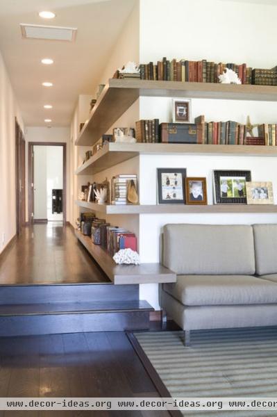
A long hallway connects the kids' bedrooms, parents' office and gym to this small playroom. Floating oak shelves finished in a warm gray driftwood stain extend down the hallway and wrap around into the room. "The hallway was quite long, and the room at the end was on the small side, so connecting it with the shelves borrowed a little space from the hall," Clarke explains.
He also used one of the shelves as a side table next to the sofa. "The lack of a bunch of small end tables simplified the space and made it less visually cluttered," he says.
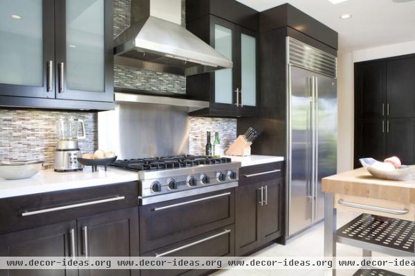
Ebonized walnut cabinets are topped with Silestone countertops in the kitchen. Glass tile from Ann Sacks adds a calming pattern and movement. "These handmade tiles are slightly irregular, causing them to have a wonderful touched-by-hands quality that reflects light in an uneven way and sparkles," Clarke says.
In addition to the tiles, frosted glass cabinet doors also reflect the light and prevent the dark wood from overwhelming the space.
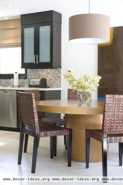
A lighter wood on the kitchen table, rift-cut white oak with a cerused finish, helps define a breakfast area. Woven chairs and a large painting that resembles wood grain add warmth and texture.
"Kitchens can be cold, hard spaces without many chances for any texture," Clarke says. "These woven leather chairs are really durable and add an earthy, organic texture to the room."
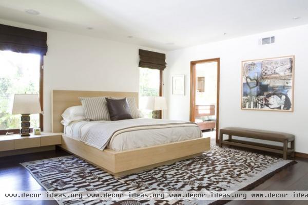
In the master bedroom, Clarke added long windows that almost extend to the floor, to complement the very vertical bamboo garden outside. "We decided to design a bed that had a wonderful Japanese quality, feeling almost built in and low, with the nightstands running under the window," he says.
The lamps were lucky vintage finds and have the signs of the zodiac on them. "I love the introduction of vintage when possible; it keeps things from feeling stale and soulless," Clarke says. The Moroccan rug is also vintage and has a great, deep wool pile that's very cozy underfoot.
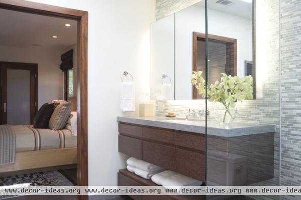
The master bathroom is calming and light. "I really wanted to make the bathroom feel like one giant room instead of breaking it up too much," Clarke says. A clear glass wall separates the shower while keeping the view open and plays off the glass in the mosaic tile.
The mosaic glass tile has some stone tiles mixed in and recalls a waterfall. "The mixture gives a great in-and-out depth, because you can see the wall behind the glass but not the stone," he describes.
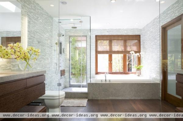
The room is uncluttered, which lets the eye rest on the beautiful tile and the outdoor views. The mirror floats, and the light comes from behind it. This eliminated any glaring light as well as the visual clutter of light fixtures like sconces.
The counters are Lagos Azul limestone, and the cabinets are stained oak.
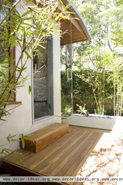
The door in the shower leads to a private garden with an outdoor shower. "The idea was that they could shower every day with the door open for an outdoor shower-like experience without freezing," Clarke says. "On those really amazing sunny days, it is great to shower outside with all this bamboo around in the outdoor shower — the space is completely protected from wind, so the full outdoor experience happens more times than not."
The deck is made of teak, which is smooth enough to stand on in bare feet. While every room in the house has strong connections to the surrounding landscape, the master bathroom is the best example of a seamless transition from indoors to out. After all, the family can walk right from the indoor shower to the outdoor one au naturel with total privacy.
To learn more about Tim Clarke's signature design styles, pick up a copy of his book, Coastal Modern.


