Houzz Tour: Original Charm and New Light in Seattle
The Fremont neighborhood in Seattle boasts a fair share of bungalows built around 1920, despite all the newly built condos and homes. Open the door of one bungalow in particular, and you'll discover an intriguing mix of contemporary and traditional style that keenly represents the neighborhood's character. Sara Imhoff with Imprint Architecture and Design and her husband Jeremy Imhoff remodeled their 1918 bungalow to create a comfortable balance between the original features and the new construction. “Retaining the original character of the house helped to give it a more laid-back, relaxed quality,” Jeremy says.
Houzz at a Glance
Who lives here: Sara and Jeremy Imhoff
Location: Seattle
Size: 1,100-square-foot main floor plus 900-square-foot rental unit
Photography by Miguel Edwards (interiors) and Aaron Leitz (exteriors)
The Imhoffs completed most of the renovation on their 1918 bungalow on their own, redesigning, remodeling and reconfiguring between their architecture day jobs, studying for licensure exams and starting their family. Six years, one toddler and surprise twins later, the dynamic duo has completed the extensive remodel.
The couple love that the house has its own history; as both Sara and Jeremy grew up in newer homes, living in a space like this is exciting to them. Built in 1918 and moved to this particular plot in the 1940s, the house has character that new homes just can't match. "There were many things that needed to be updated, but we made it a point to keep some of the existing attributes," says Sara.
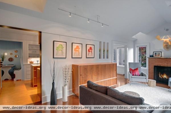
The couple opted out of a completely open plan by retaining the existing wall between the kitchen and living room, yet modified the space to feel more open by vaulting the ceiling.
Pinto Armchair: BoConcept; couch: Bensen, Canyon Sofa; credenza: custom, designed by Imprint Architecture and built by Kerf Design
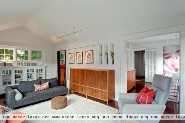
Every new element the couple created was modern, to act as a counterpoint to the existing features. "We let the space help guide the moves we made," says Sara.
The existing opening to the dining area with its traditional wide frame was left intact and painted white. The new opening into the kitchen is lined with a thin dark steel plate, standing out against the white walls and giving the opening a minimalist and contemporary quality.
Existing pieces, like the original built-in cabinets in this room, were painted white to blend in with the white walls. The couple designed the contemporary walnut plywood credenza.
Artwork: Jennifer Whitlinger; moose head: Vlaemsch; rug: Lowe's
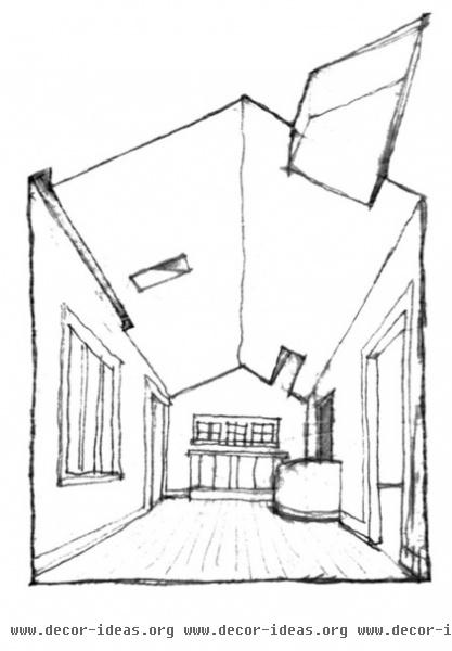
This sketch shows their plan for vaulting the ceiling in the living room. Two existing windows and a vent to the old attic became a place for new skylights. “We decided to capture the windows from the attic and turn them into sculptural light wells that serve the living room,” says Sara.
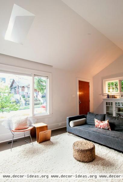
The smallest light well was put in place of the old vent to the attic. When Sara and Jeremy took the attic vent out and framed in the opening, they saw that the view would be looking right up at a power line, so they frosted the window for a nice, diffused light.
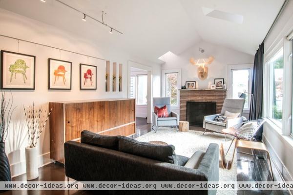
The light wells also have hidden recessed lighting to create a soft ambience at night. They open for ventilation in summer.
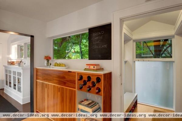
Sara and Jeremy designed low cabinetry with a long horizontal window in the kitchen. It pays homage to the form and proportions of the existing built-in and single-pane windows in the adjacent living room.
The 11-ply walnut plywood on many of the new built-in components sets them apart from the existing white painted original built-ins.
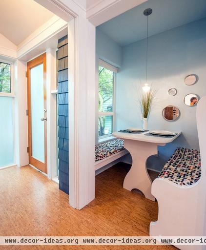
The owners were intent on retaining this original breakfast nook. With fresh paint and newly covered cushions, it transitions easily from a casual spot for meals to a cozy work zone.
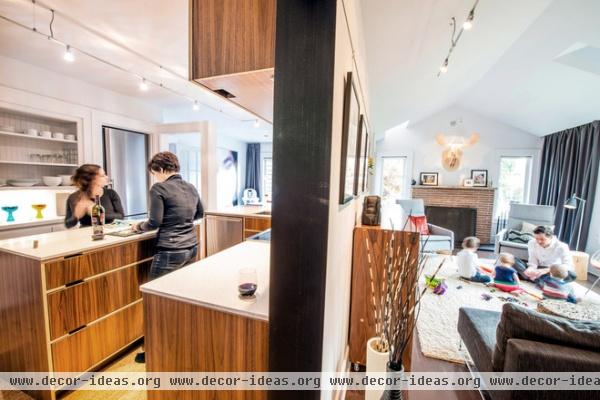
The couple lived in the house during construction. “The key was planning and phasing our construction,” Sara says. “We worked from the front of our home to the back and lived in whatever room we were not currently doing construction in.”
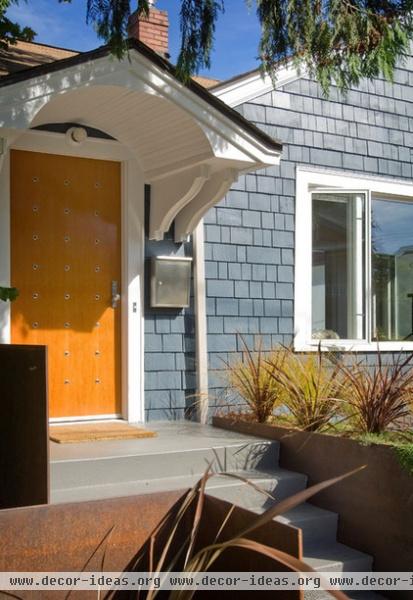
Of all the changes, the front door gets the most comments. “The funniest response I have received was from a delivery man who said, ‘That door is intimidating,’" Sara says. “We wanted privacy and security from the urban neighborhood, but at the same time wanted the door to be intriguing. A single peephole just didn't feel right. So we talked about three peepholes, which then turned into a grid of 24 peepholes.”
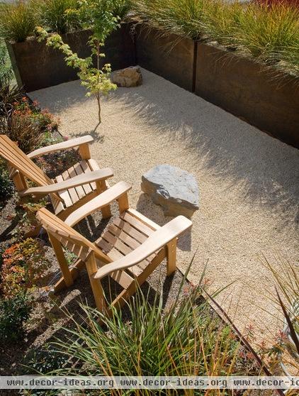
The front yard, their only outdoor space, faces a busy sidewalk, but a low contemporary Cor-Ten steel fence gives them some privacy.
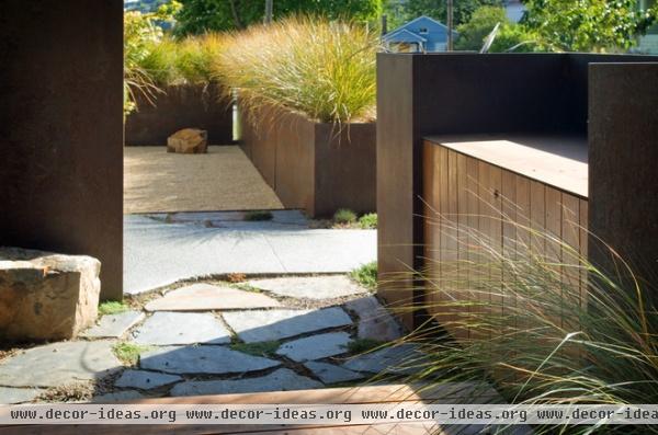
After hoisting the steel side plate into place, the couple decided it was far too obtrusive, so the crew dropped it down and bolted it to the side of the concrete steps.
“I think one of the great things about working on your own house is the ability to easily shift your mode of thought or thinking in the middle of a project and tweak the design to make it better," says Jeremy. "Sometimes what looks good on paper doesn't always work out as planned.”
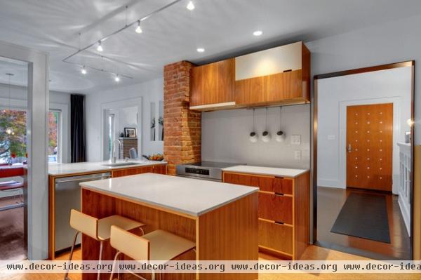
Demolishing the wall between the kitchen and dining room gave both rooms some extra space and eased the traffic flow from the front door to the kitchen, to the dining room, to the living room.
The brick chimney is from the original house but is now hooked up to the range hood ventilation system.
The couple chose simple Caesarstone countertops, cork flooring and stainless steel appliances to show off their custom cabinetry from Kerf Design.
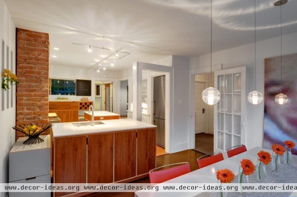
A Liebherr refrigerator sits in a hidden niche next to a built-in open shelf.
The renovation work also created the opportunity to celebrate original elements. Here Sara and Jeremy retained the original opening when they removed the wall between the dining room and the kitchen, keeping it installed as a memory piece.
Light fixture: Bocci; table: Strut, Blu Dot; chairs: Design Within Reach; cabinets: custom, Kerf Design
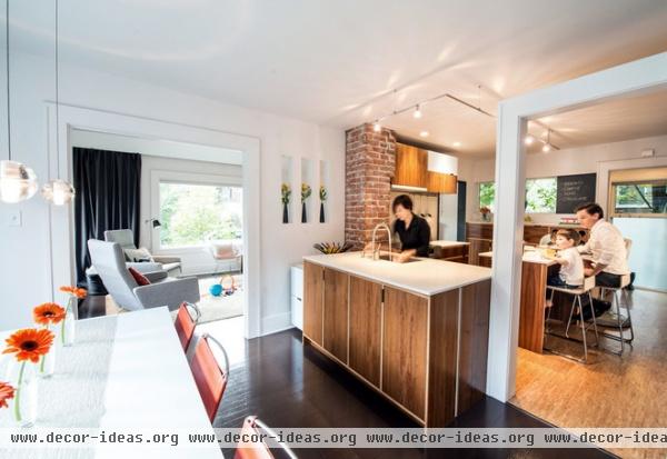
"We had no idea how crooked our house was," says Sara. To counter the odd angles, the couple installed new items completely level and away from out-of-plumb work when possible. The floating kitchen cabinet is a good example of this: Since the existing ceiling has a slope, Jeremy and Sara held the cabinet down away from the surface to make the slope less noticeable.
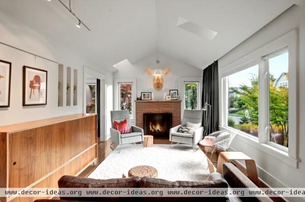
Organization and furnishings kept things tidy as the family grew. "The upper floor of our house is mainly dominated by our three children," says Sara. "Everything has a place, and if it cannot fit, we do not keep it."
Since the couple moved into the house, they have modified the furniture to more kid-friendly pieces while still maintaining sophistication. For instance, the walnut toy cabinet matches the style of the kitchen cabinets but has no sharp corners.
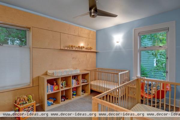
The rooms took on new roles as the little ones began to arrive. To keep things simple, the Imhoffs stayed away from drastic kids' color schemes or anything that would be difficult to change should they wish to convert any of the kids' rooms back to an adult room.
Plywood: birch; wall paint: custom color
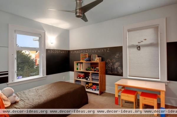
Chalkboard paint and small, sturdy furniture gives their eldest a place of his own and allow him plenty of wall space in which to channel creative energy.
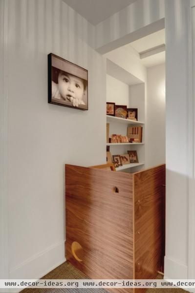
A gate at the stair to the lower level keeps kids safely on the main level. It's made of the same 11-ply walnut plywood found elsewhere in the house.
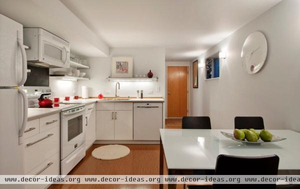
The biggest change to the way the Imhoffs lived was incorporating a rental unit on the lower level.
In 2010, the year their first child arrived, the recession was still in full effect, but they took the initiative to use the remaining savings they had and built out a small studio rental space in their unfinished basement. Although it felt like a huge gamble at the time, this lead to extra income to help feed that extra mouth and allow Sara to work part-time.
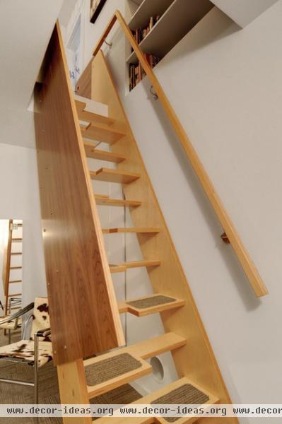
Simple alternating stair treads save space on the lower level.
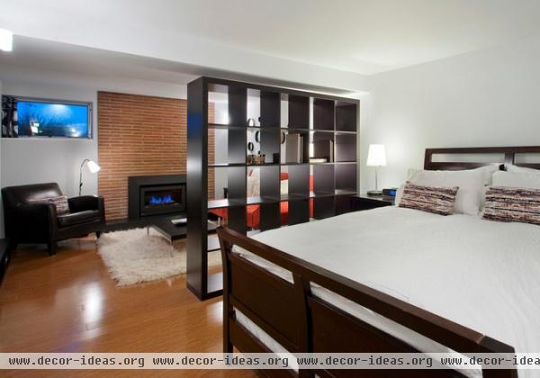
The current setup also gives friends and family a place to stay when they are in town.
Embracing the existing details of the home and retaining some of the original character were the keys to this remodel success story. The house blends nicely in its neighborhood context, and Sara and Jeremy have formed a strong bond with their neighbors.


