Houzz Tour: Modern Plays Nice in a Historic Houston Neighborhood
The Heights is a historic Houston neighborhood with wide, tree-lined streets and old-time charm. Ordinances here dictate that all remodeling projects and new-build homes must complement the existing structures — mostly Arts and Crafts and Victorian-era styles — and contribute to the quality of the neighborhood.
But architect Greg Swedberg, who’s lived in Houston his whole life, didn’t like how all the new homes in the Heights “tended to be copycats that pretended to be old houses,” he says. For clients Robert Lyke and Douglas Killinger, he wanted to design something unmistakably modern that could still pass the litmus test with the historic association. “I wanted to show that you can do a modern home that plays nice with the neighbors but is unapologetic about being a modern home,” he says.
He succeeded with a house that embraces Arts and Crafts style but surprises with subtle modern nuances that play with materials and irregular patterns. The plan worked: The neighborhood association unanimously approved the house, which has a lofty artist studio for Lyke, who works at an oil and gas firm, and a full-service hair salon for Killinger, a hair stylist and the salon's owner.
Houzz at a Glance
Who lives here: Robert Lyke and Douglas Killinger
Location: Houston
Size: 3,500 square feet; 3 bedrooms, 4 bathrooms
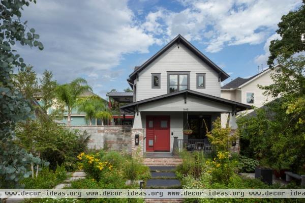
The home's contemporary quality adds just a bit of tension to the historic neighborhood. "It's very structured and organized but allows for loose, very fun, vibrant individuals to live there," Swedberg says.
The A-shape roof design is Swedberg's interpretation of an iconic house shape. “As a little kid drawing a house in school, it’s always a house with an A shape on top," he says. "For many modern houses, people want to put flat roofs so it looks like an office building, and I have projects like that. But if I can do a modern house that still has an A-frame or gable roof, it appeals to a lot more people, especially in a historic neighborhood.”
Swedberg made the house’s general proportions and scale fit with what old houses tended to look like, but he then did subtler and playful things with modern materials and details, like a metal handrail and siding that adds a bit of texture to the front and then transitions into corrugated metal in the back.
"And the low-pitched front roof is indicative of Arts and Crafts style," he says, "but the exaggerated portions of the overhangs and modern interpretation of brackets take the standard convention of an Arts and Crafts home and twist it a little bit, infusing nuances that feel more playful and current.”
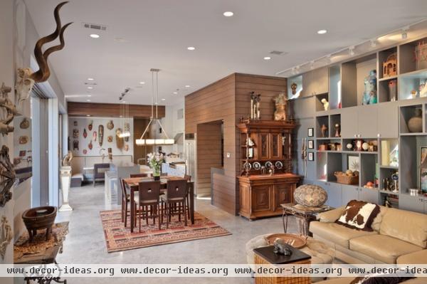
Lyke and Killinger wanted the interior to feel like a loft, but not too industrial. Because the space is narrow, it didn’t make sense for Swedberg to divide it with a bunch of walls, so he left the layout open. But with nearly 12-foot ceilings, he had to define the kitchen, dining and living room somehow. So he used wood accents as a kitchen header and a large wood-clad element that separates the living room from the kitchen and leads to a wet bar and a staircase to the second floor.
Swedberg designed a collage wall to display Lyke and Killinger's disparate collection of items from their travels in a larger composition, rather than on small nondescript shelves. "We wanted to be intentional about what thing went where and the different-sized spaces for different types of things," he says. "But it looks cool even when it's empty."
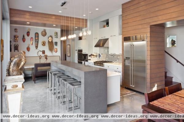
In the kitchen, windows near the cabinets look through to the staircase. (You can see people walking up and down on the stairs, and from the stairs you can see glimpses of people in the kitchen.) “It was a fun way to carve and slice into the home and give it little moments of intrigue,” Swedberg says.
The monolithic island slab is an engineered composite intended to look like concrete. Masks hang from cables above a custom banquette.
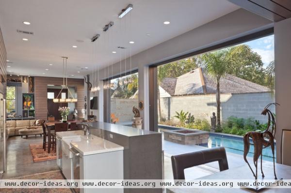
Because the public spaces form a big volume and have a lot of objects, Swedberg didn’t want to clutter things with light fixtures. He kept them out of the way as much as possible but made them flexible enough to brighten the space and highlight art pieces.
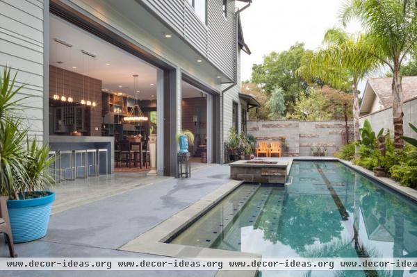
The public spaces completely open to a 50-foot lap pool and an outdoor kitchen area.
An irregular brick-pattern wall separates the backyard from the front. This motif of organized randomness comes up often in this house. The irregularity stems from Lyke’s artwork and the molecular patterns that inspire it. “I became fixated on the connection between the natural beauty that Lyke draws in the form of beetles and human forms and the machine-like quality that if you zoom in to things — the cellular structure of a leaf or how white blood cells clump together — there’s all these random patterns. I found that powerful,” Swedberg says.
So he created his own little patterns that make up something bigger than all their parts, including this courtyard wall, the living room collage wall and the kitchen windows. “That attitude of when to make pattern and when to break pattern sort of drove the more quirky and fun decisions,” he says.
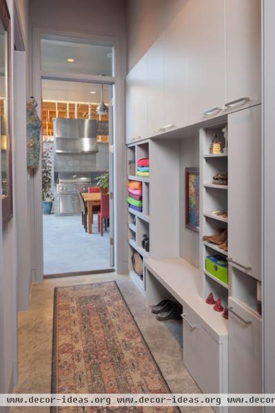
A mudroom behind the breakfast area connects the kitchen to an outdoor grilling station.
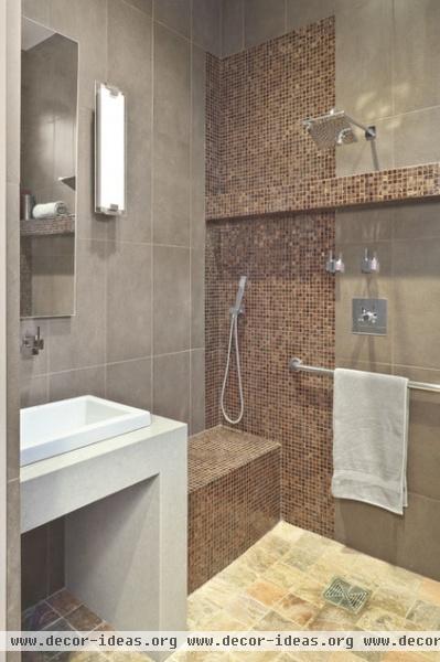
A powder room connects to the mudroom so guests wet from the pool can access the shower and facilities without going through the main living space.
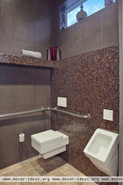
There's also a urinal.
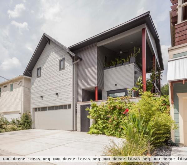
The main A-shape roof carries from the front to the back. The house then forms an L shape where an exposed steel structure intersects, forming a more modern portion of the design. “You can see how everything collides together,” Swedberg says.
The extra driveway space is for Killinger's clients, who access his hair salon through the private gate.
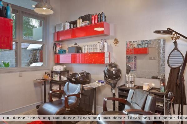
Killinger got a commercial permit to create his own salon, which complies with the codes in the Americans with Disabilities Act.
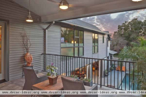
An outdoor staircase leads up to this porch, where guests sometimes sleep.
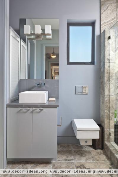
This is one of two identical guest bathrooms.
All the toilets in the house are by Duravit. The wall systems are by Geberit.
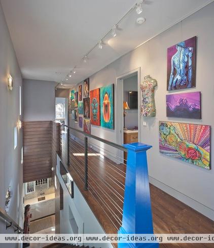
Because the house has such a contemporary feel on the inside, Swedberg wanted to have a little nod back to the roots of the neighborhood Arts and Crafts style. He got that in a custom wood newel post painted blue.
“People tend to not put their hands on a handrail, but they always put them on a newel post when they turn the corner,” he says. “It’s a natural reaction. So there’s something about putting your hand on that that feels more like a point of contact between human and house, so we wanted that point to be traditional in nature, but funky.”
Lyke’s artwork adorns the hallway.
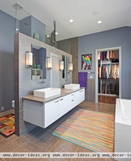
Swedberg selected the main bathroom backsplash tile for its irregular quality that fits with the patterns he used throughout the house. “There’s almost a computer randomness to it that reminds me of Frogger or Donkey Kong. It’s a neat quality,” he says.
A wall creates privacy for the toilet area on one side and a shower on the other, but also lets light into those spaces through high glass panels. “I didn’t want a bunch of doors and walls that would create dark space,” he says.
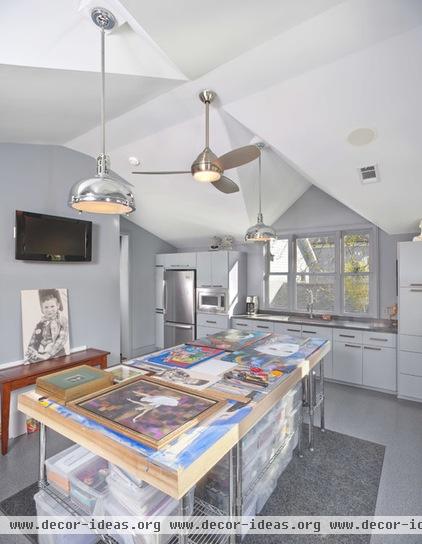
A major driving force for the house was to create a place that allows Lyke to create his art but not feel surrounded by it in a cluttered way. His second-floor studio contains a working table, bins for all his supplies, an industrial sink to clean tools, and a microwave and refrigerator to heat and cool things like waxes and oils.


