Houzz Tour: Downtown Cool in an Uptown Duplex
When a Lower Manhattan couple decided to move uptown to be closer to their children's schools, they didn't want to sacrifice their downtown style. "They weren't interested in the typical prewar, Upper West Side classic six," says architect West Chin, whose architecture and interiors firm, WCA, adapted spaces in a newer midrise building to suit the couple's taste for clean lines.
Spanning two floors, the apartment has a lower level that's a complete kid zone, and an upper floor that combines family-friendly spaces with areas more appropriate for adult entertaining. Most important, while they prefer cool, uncluttered downtown style, the couple likes their modernism warm and welcoming. Paying careful attention to how the family lives, Chin tucked clever storage solutions into thick walls and streamlined cabinetry, and created soft, inviting places where the family of four could hang out together. It's a rare combination of minimalism and family friendliness. Here's how he did it.
Houzz at a Glance
Who lives here: A young family of 4
Location: New York City
Size: 4,050 square feet; 4 bedrooms, 5½ bathrooms, 2 offices
Photography by Ken Fischer Photography
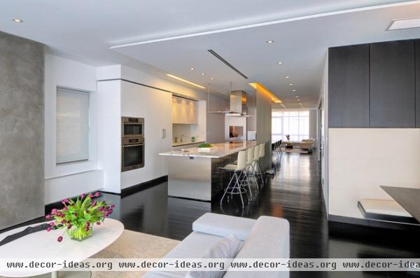
Chin combined three chopped-up apartments on two floors to create the home, knocking down walls and opening up the space. Because the building is located on a wide street, it enjoys lots of natural sunlight. Chin added many unique lighting solutions that punctuate the white walls and ceilings while emphasizing long lines, such as the recessed cove over the sink in the kitchen.
An elevator deposits visitors behind the counter stools, on the top floor of the apartment.
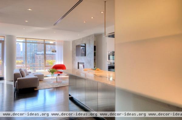
Here's a view of the top floor as one steps off the elevator. "There are different levels of privacy on the main level," Chin says. The frosted glass screen (right) can be slid back and forth to open up the kitchen to the rest of the space, or to conceal it from view when guests arrive for parties. The kitchen's palette of stainless steel, white lacquer and statuary marble blends seamlessly within the open plan.
The TV is mounted on a skimmed-concrete accent wall, with media storage and bookshelves tucked behind it.
Lowland sofa: Moroso; Saarinen Womb Chair: Knoll
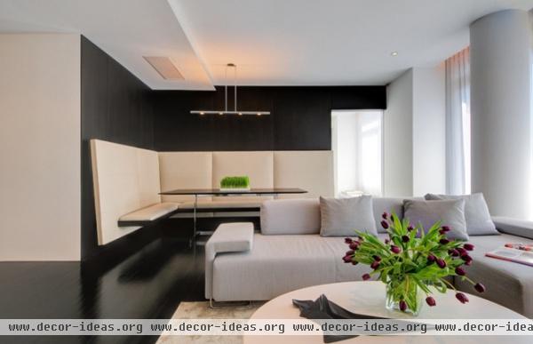
The entire home was designed to accommodate the way the family lives. The kitchen opens to this family/TV room, which is the family's main gathering space. Inevitably, the clan winds up eating in front of the tube sometimes, so Chin installed a floating banquette in the corner behind the sofa. It's also a great spot for playing board games.
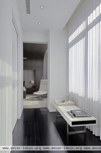
The doorway in the rear of the previous photo leads to this master suite hallway. The opening has an automatic sliding door similar to those you see at supermarkets, allowing the owners to control the level of privacy they want. During parties the suite can be closed off from the rest of the main living space, yet it still benefits from the light entering the hallway. Closets and the master bathroom are on the left.
Nice Bench: FTF

Chin added a cove over the bed to create a cozy, cocoon-like feeling in the minimalist master bedroom. The recessed headboard is leather; the millwork is bolivar wood veneers.
Wood veneers: Tabu Veneers Dyed Bolivar Wood 52.054
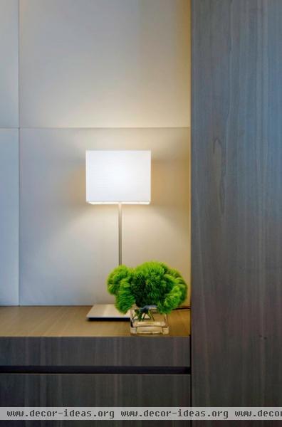
"The apartment is clutter free because there is hidden storage everywhere," Chin says. For example, storage is concealed within the built-ins around the bed.
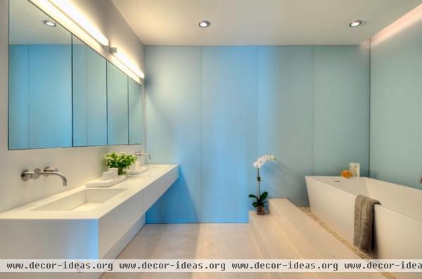
Blue glass adds cool serenity to the minimalist master bathroom. WCA's sister company, FTF, designed the floating vanity. The tub resides on a bed of white stones.
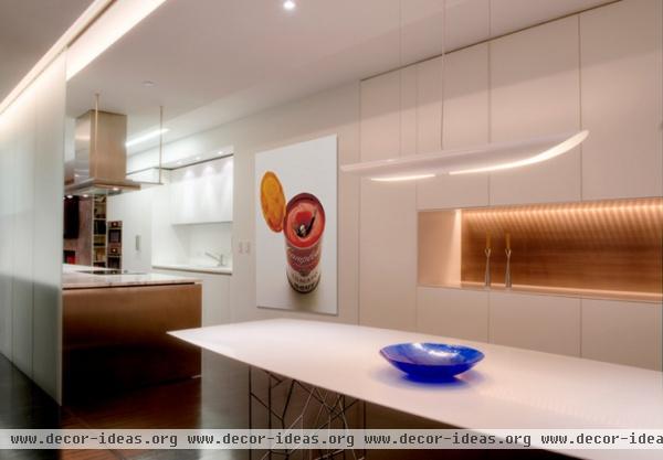
The dining area is adjacent to the kitchen.
Vent hood: Flat-Kap Hood with integrated lighting, Boffi
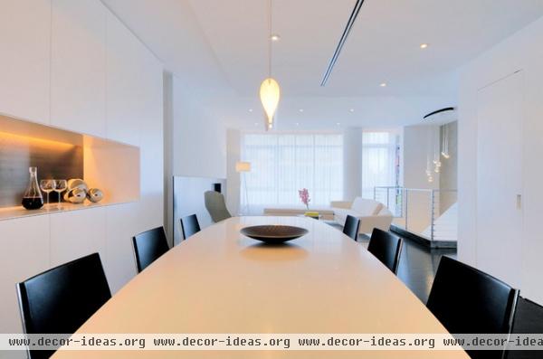
With so much white, Chin was careful to emphasize positive and negative spaces, creating visual interest through the play of light and shadow in features such as the buffet niche at left and recessed door pulls at right.
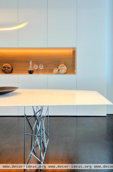
Sometimes you have to look very closely to even notice the storage. For example, a wall of streamlined cabinets provides plenty of storage without appearing bulky; the recessed niche serves as a wet bar and buffet. The statuary bronze backsplash and cove lighting punctuate this area and highlight the play between positive and negative space.
The dining table's sculptural legs play off the kitchen's stainless steel island.
Dining table: Synapsis by Jean Marie Massaud for Porro
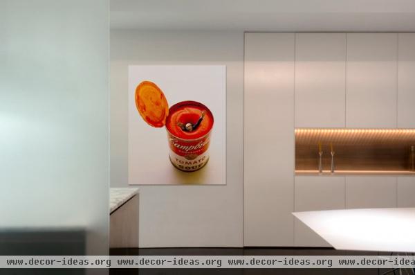
The father of one of the homeowners is renowned photographer Carl Fischer. Several of his works are proudly displayed in the home, including one depicting Andy Warhol drowning in a can of Campbell's soup, which appeared on the cover of Esquire.
Side note: The Atlantic has a great story about how this photo of an icon in his icon on an iconic Esquire cover came to be. The picture was created in the days before Photoshop.
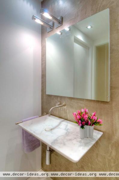
A Boffi wall-mounted faucet and sink save space in the powder room.
Sconces: Ozen, Boffi
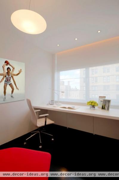
There are his-and-her offices upstairs. The basketball player photo is also by Fischer.
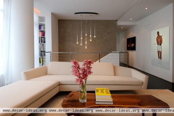
Another iconic Esquire cover photo hangs between the formal living room and the staircase. In it Fischer portrayed Muhammad Ali as St. Sebastian. The image appeared after the boxer was stripped of his title for refusing induction into the U.S. military (the subject of a recent HBO movie, Muhammad Ali's Greatest Fight).
A live-edge coffee table by George Nakashima adds warmth to all of the white, as does a creamy David Weeks sofa and velvety soft rug. A Falling Water 9 Suspension Lamp hangs above the far staircase, whose rear wall is adorned with a skim coat of concrete. A thick wall to the left of the staircase accommodates recessed Corian bookshelves.
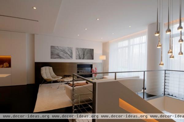
To provide continuity throughout the main living level, white oak floors were treated to a matte espresso stain. There's more negative-space play on the staircase, where the handrail is recessed and lit with cove lighting.
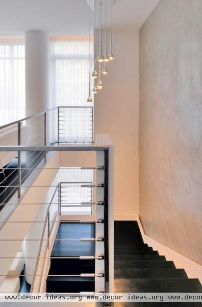
The lower level is the kid zone, complete with bedrooms, media room, music station, homework station and nanny's room.
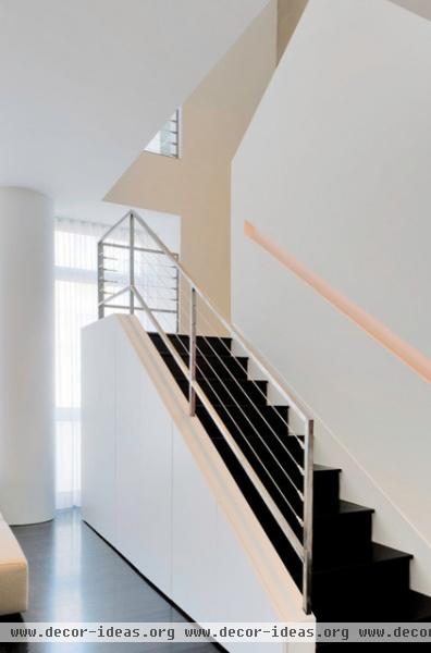
The staircase conceals extensive storage space. There is an entire snack bar for the kids tucked under there, as well as room for games and toys.
A recessed handrail is carved into the wall. "The cove lighting acts like a perfect highlighter in the negative space," Chin says.
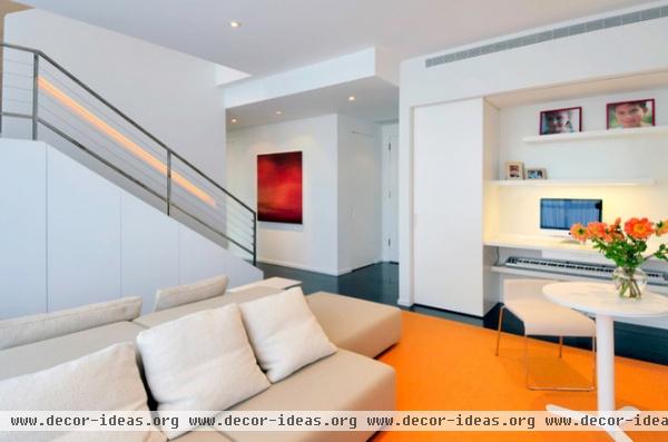
Welcome to kid central, where the youngsters can do their homework, watch TV, hang out with friends, snack after school, enjoy the music station and relax. This lower level even has its own separate entry.
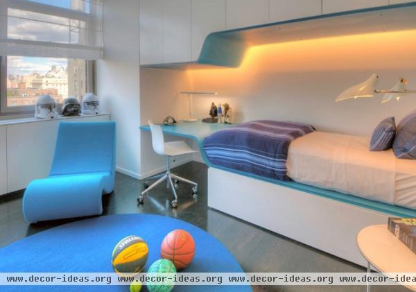
The son sleeps in a cozy yet futuristic cove bracketed by a trundle bed and overhead storage; a resin desktop extends off the footboard. There is also plenty of room in here for tossing balls and just being a kid.
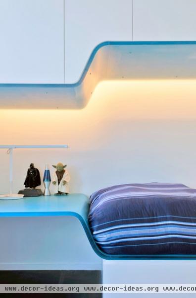
These Star Wars action figures provided some of the inspiration for the futuristic design.

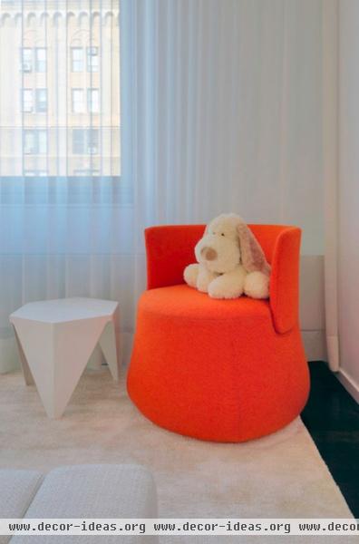
"We wanted to give the daughter a sweet canvas as a base, so she could find her own style," Chin recalls.
The new uptown digs have allowed the family to keep the warm modern downtown look they'd grown to love at their old place, while giving them plenty of space in which to hang out as a family and entertain their friends.
More: Houzz Tour: Sophisticated Family-Friendly Flat


